CSS3 定义了两种类型的渐变(gradients):
- 线性渐变(Linear Gradients)- 向下/向上/向左/向右/对角方向
- 径向渐变(Radial Gradients)- 由它们的中心定义
css3线性渐变
语法:
background: linear-gradient(direction, color-stop1, color-stop2, ...);
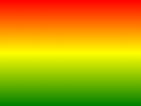
从上到下(默认):
#grad {
background: -webkit-linear-gradient(red, blue);/* Safari 5.1 - 6.0 */
background: -o-linear-gradient(red, blue);/* Opera 11.1 - 12.0 */
background: -moz-linear-gradient(red, blue);/* Firefox 3.6 - 15 */
background: linear-gradient(red, blue); /* 标准的语法 */
}
从左到右:
#grad {
background: -webkit-linear-gradient(left,red, blue);/* Safari 5.1 - 6.0 */
background: -o-linear-gradient(right,red, blue);/* Opera 11.1 - 12.0 */
background: -moz-linear-gradient(right,red, blue);/* Firefox 3.6 - 15 */
background: linear-gradient(to right,red, blue); /* 标准的语法 */
}
对角(左上角 - 右下角):
#grad {
background: -webkit-linear-gradient(left top,red, blue);/* Safari 5.1 - 6.0 */
background: -o-linear-gradient(bottom right ,red, blue);/* Opera 11.1 - 12.0 */
background: -moz-linear-gradient(bottom right,red, blue);/* Firefox 3.6 - 15 */
background: linear-gradient(to bottom right,red, blue); /* 标准的语法 */
}
使用角度
语法:
background: linear-gradient(angle, color-stop1, color-stop2);
角度是指水平线和渐变线之间的角度,逆时针方向计算。0deg 将创建一个从下到上的渐变,90deg 将创建一个从左到右的渐变。
使用透明度
使用 rgba() 函数来定义颜色结点。
重复的线性渐变
控制颜色百分比
#grad {
background: -webkit-linear-gradient(red 10%, blue 20%);/* Safari 5.1 - 6.0 */
background: -o-linear-gradient(red 10%, blue 20%);/* Opera 11.1 - 12.0 */
background: -moz-linear-gradient(red 10%, blue 20%);/* Firefox 3.6 - 15 */
background: linear-gradient(red 10%, blue 20%); /* 标准的语法 */
}
CSS3 径向渐变
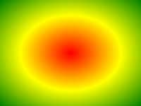
语法:
background: radial-gradient(center, shape size, start-color, ..., last-color);
颜色结点均匀分布的径向渐变:
颜色结点不均匀分布的径向渐变:
size 参数定义了渐变的大小。它可以是以下四个值:
- closest-side
- farthest-side
- closest-corner
- farthest-corner
重复的径向渐变
repeating-radial-gradient() 函数用于重复径向渐变:
一个重复的径向渐变: