1.淘宝的导航栏居中

html:
<!DOCTYPE html>
<html>
<head>
    <title></title>
<link rel="stylesheet" href="1.css">
<style type="text/css">

</style>
</head>

<body>
    <div class="wrapper">
        <div class="content">
            <div class="right">
                <ul>
                    <li>首页</li>
                    <li>我的淘宝</li>
                    <li>聚划算</li>
                </ul>
            </div>
            <div class="left">
                <ul>
                    <li>登陆</li>
                    <li>注册</li>
                </ul>
            </div>
        </div>
    </div>
</body>
</html>
css:
*{
    padding: 0;
    margin: 0;
}
.wrapper{
    height: 30px;
    background-color: #424242;

}
.content{
    height: 30px;
    width: 80%;
    background-color: #f40;
    margin: 0 auto;
}
.right{

    float: right;
}
.left{
    float: left;
    margin-left: 30px;
}
ul{
    list-style: none;
}
li{
    float: left;
    margin-right: 30px;
    line-height: 30px;
}

一个行级元素,一旦设置position:absolute; float:left/right; display属性值就会变成float。
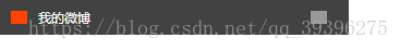
2.条目布局
HTML:
<!DOCTYPE html>
<html>
<head>
    <title></title>
<link rel="stylesheet" href="1.css">
<style type="text/css">

</style>
</head>

<body>
    <div>
        我的微博
    </div>
</body>
</html>
CSS:
*{
    padding: 0;
    margin: 0;
}
div{

    width: 300px;
    background-color: #424242;
    color: #fff;
    /*文字居中
        方法1:line-height=height;before和after的位置不会随div改变
        方法2:font-size=height ;再加上padding
    这里使用方法2,居中后,before和after会随着文字的位置移动,不用再单独调
    */
    padding: 10px 10px;
    height: 12px;
    line-height: 12px;
    font-size: 12px;

}
div::before{
    /*伪元素必须属性*/
    content: "";
    display: inline-block;

    margin-right: 10px;
    width: 15px;
    height: 12px;
    float: left;
    background-color: #f40;
}
div::after{
    content: "";
    display: inline-block;

    width: 15px;
    height: 12px;
    float: right;
    margin-right: 10px;
    background-color: #999;
}
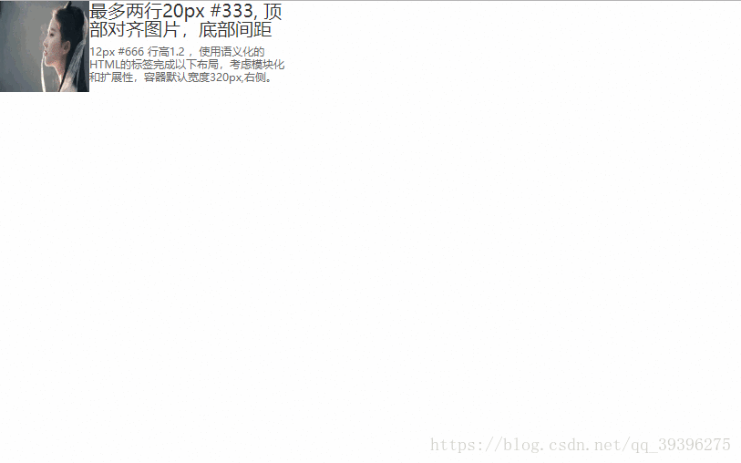
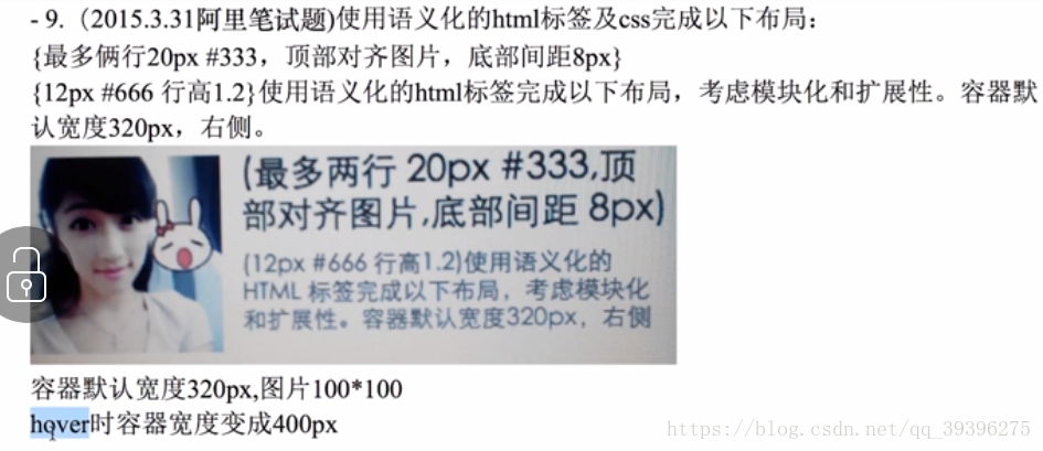
3.小测试题
html:
<!DOCTYPE html>
<html>
<head>
    <title></title>
<link rel="stylesheet" href="1.css">
<style type="text/css">

</style>
</head>

<body>
    <div class="wrapper">
        <div class="content">
            <img class="img" src="1.jpeg">
            <p class="content1">最多两行20px #333,

            顶部对齐图片,底部间距8px</p>
            <p class="content2">
                12px #666 行高1.2 ,使用语义化的HTML的标签完成以下布局,考虑模块化和扩展性,容器默认宽度320px,右侧。
            </p>
        </div>
    </div>
</body>
</html>
css:
*{
    padding: 0;
    margin: 0;
}
.wrapper{
    width: 320px;
}
.wrapper:hover{
    width: 400px;
}

.wrapper .img{
    width: 100px;
    height: 100px;
    float: left;
}

.content1{
    font-size: 20px;
    color: #333;
    margin-bottom: 8px;
    height: 40px;
    line-height: 20px;
    overflow: hidden;
}
.content2{
    font-size: 12px;
    color: #666;
    line-height: 1.2em;

}