一、实现效果
主页:

点击导航键:

二、实现方案
0x1 CSS3+javascript方案
1、实现思路

利用css3的transform变换
translate(x,y),translatex() translatey()
transition过渡
- <’ transition-property ‘>:检索或设置对象中的参与过渡的属性
- <’ transition-duration ‘>:检索或设置对象过渡的持续时间
- <’ transition-timing-function ‘>:检索或设置对象中过渡的动画类型
- linear:线性过渡。
ease:平滑过渡。
ease-in:由慢到快。
ease-out:由快到慢。
ease-in-out:由慢到快再到慢。
- linear:线性过渡。
- <’ transition-delay ‘>:检索或设置对象延迟过渡的时间
缩写:transition: all 0.2s ease-in-out;
2、网站主体
HTML部分
<body>
    <!-- 代码部分begin -->
    <section class="wraper-page">
        <header class="header">
            <span class="btn-slide-bar"></span>
            <h1 class="page-title">header</h1>
        </header>
        <p>请使用你的移动网页浏览本页面</p>
        <p>点击左上角按钮试试效果</p>
        <footer class="footer">footer</footer>
    </section>
    <section class="slide-bar">
        <ul>
            <li>首页</li>
            <li>菜单导航</li>
            <li>jQuery特效</li>
            <li>CSS3特效</li>
            <li>tab标签</li>
        </ul>
    </body>
CSS部分
//主体
body{
    transition: all 0.2s ease-in-out;
}
body.active{   //class=active的标签生效
    transform: translate3d(150px,0,0);
    transition: all 0.2s ease-in-out;
}
.header,.footer{position: fixed;left: 0;right: 0;text-align: center;height: 44px;line-height: 44px;z-index: 1;}
.header{border-bottom: 1px solid #e73068;top:0;}
.footer{border-top: 1px solid #e73068;bottom: 0;}
.header .btn-slide-bar{width: 44px;height: 44px;float: left;cursor: pointer;line-height: 2.8;}
//三道横杠::before加box-shadow实现
.header .btn-slide-bar::before{content: "";width: 20px;height: 2px;background-color: #999;display: inline-block;box-shadow: 0 7px 0 #999, 0 -7px 0 #999;}
.wraper-page{position: absolute;top:44px;right: 0;bottom: 44px;left: 0;overflow: hidden;}
.slide-bar{position: absolute;top: 0px;bottom: 0px;background-color: #333;width: 150px;left: 0;z-index: 2;
    transform: translate3d(-150px,0,0);
    transition: all 0.2s ease-in-out;
}
.slide-bar li{padding-left: 10px;height: 40px;line-height: 40px;text-align: left;color: #fff;border-bottom: 1px solid #222;}

//通用reset
html { font-family: "Helvetica Neue", Helvetica, STHeiTi, Arial, sans-serif; -ms-text-size-adjust: 100%; -webkit-text-size-adjust: 100%; font-size: 62.5%; }
body { margin: 0; font-size: 1.4rem; line-height: 1.5; color: #333333; background-color: white; height: 100%; overflow-x: hidden; -webkit-overflow-scrolling: touch; }
html,body{height: 100%;
    -webkit-tap-highlight-color: rgba(0, 0, 0, 0);
    -moz-tap-highlight-color: rgba(0, 0, 0, 0);
    -ms-tap-highlight-color: rgba(0, 0, 0, 0);
    -o-tap-highlight-color: rgba(0, 0, 0, 0);
    tap-highlight-color: rgba(0, 0, 0, 0);
}
article, aside, details, figcaption, figure, footer, header, hgroup, main, nav, section, summary { display: block; }
audio, canvas, progress, video { display: inline-block; vertical-align: baseline; }
audio:not([controls]) { display: none; height: 0; }
[hidden], template { display: none; }
svg:not(:root) { overflow: hidden; }

a { background: transparent; text-decoration: none; -webkit-tap-highlight-color: transparent; color: #0088cc; }
a:active { outline: 0; }
a:active { color: #006699; }
abbr[title] { border-bottom: 1px dotted; }
b, strong { font-weight: bold; }
dfn { font-style: italic; }
mark { background: #ff0; color: #000; }
small { font-size: 80%; }
sub, sup { font-size: 75%; line-height: 0; position: relative; vertical-align: baseline; }
sup { top: -0.5em; }
sub { bottom: -0.25em; }
img { border: 0; vertical-align: middle; }
hr { -moz-box-sizing: content-box; box-sizing: content-box; height: 0; }
pre { overflow: auto; white-space: pre; white-space: pre-wrap; word-wrap: break-word; }
code, kbd, pre, samp { font-family: monospace, monospace; font-size: 1em; }

button, input, optgroup, select, textarea { color: inherit; font: inherit; margin: 0; }
button { overflow: visible; }
button, select { text-transform: none; }
button, html input[type="button"], input[type="reset"], input[type="submit"] { -webkit-appearance: button; cursor: pointer; }
button[disabled], html input[disabled] { cursor: default; }
button::-moz-focus-inner, input::-moz-focus-inner { border: 0; padding: 0; }
input { line-height: normal; }
input[type="checkbox"], input[type="radio"] { box-sizing: border-box; padding: 0; }
input[type="number"]::-webkit-inner-spin-button, input[type="number"]::-webkit-outer-spin-button { height: auto; }
input[type="search"] { -webkit-appearance: textfield; -moz-box-sizing: border-box; -webkit-box-sizing: border-box; box-sizing: border-box; }
input[type="search"]::-webkit-search-cancel-button, input[type="search"]::-webkit-search-decoration { -webkit-appearance: none; }
fieldset { border: 1px solid #c0c0c0; margin: 0 2px; padding: 0.35em 0.625em 0.75em; }
legend { border: 0; padding: 0; }
textarea { overflow: auto; resize: vertical; }
optgroup { font-weight: bold; }

table { border-collapse: collapse; border-spacing: 0; }
td, th { padding: 0; }

html, button, input, select, textarea { font-family: "Helvetica Neue", Helvetica, STHeiTi, Arial, sans-serif; }
h1, h2, h3, h4, h5, h6, p, figure, form, blockquote { margin: 0; }
ul, ol, li, dl, dd { margin: 0; padding: 0; }
ul, ol { list-style: none outside none; }
h1, h2, h3 { font-weight: normal; }
h1 { font-size: 1.8rem; }
h2 { font-size: 1.6rem; }
h3 { font-size: 1.4rem; }
input::-moz-placeholder, textarea::-moz-placeholder { color: #cccccc; }
input:-ms-input-placeholder, textarea:-ms-input-placeholder { color: #cccccc; }
input::-webkit-input-placeholder, textarea::-webkit-input-placeholder { color: #cccccc; }

* { -webkit-box-sizing: border-box; -moz-box-sizing: border-box; box-sizing: border-box; }
JS部分
DOMContentLoaded事件
DOMContentLoaded事件是在html document加载完成之后触发的。
不用等我们的样式、图片以及subframes等加载完毕。
相当于$(document).ready()
onload事件是页面上所有的DOM,样式表,脚本,图片,flash
都已经加载完成后触发。
<script>
    document.addEventListener("DOMContentLoaded", function(){
        (function(){
            var _btn  = document.querySelector(".btn-slide-bar"),
                _body = document.querySelector("body");
                _btn.onclick = function(){
                    _body.classList.toggle("active");
                }
        })(window)
    },false);
</script>
0x2 jquery方案
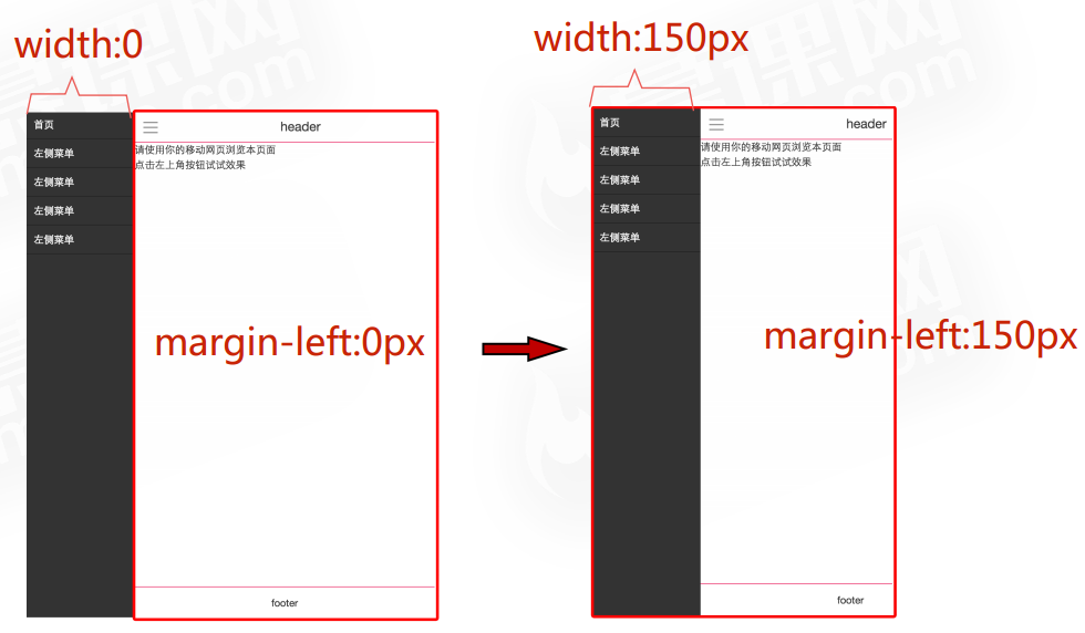
1、实现思路
运用经典的左侧固定,右侧自适应的布局方式
2、jQuery代码
采用面向对象的方式书写
var swiperFun = {
    init:function(){
        var _this = this ;
        //点击事件
        $('.btn-slide-bar').click(function(){
            if($(this).hasClass('active')){
                _this._swipeRight();
            }else{
                _this._swipeLeft();
            }
        });
    },
    _swipeLeft:function(){
        $('.slide-bar').animate({'width':'50%'},"50");
        $('.wraper-page').animate({'margin-left':'50%'},"50");
        $('.btn-slide-bar').addClass('active');
    },
    _swipeRight:function(){
        $('.slide-bar').animate({'width':'0'},"50");
        $('.wraper-page').animate({'margin-left':'0'},"50");
        $('.btn-slide-bar').removeClass('active');
    }
}
swiperFun.init();