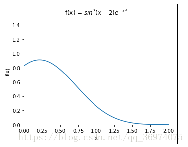
Exercise 11.1: Plotting a function
Plot the function :
,, over the interval [0; 2]. Add proper axis labels, a title, etc.
代码如下:
import numpy as np
import matplotlib.pyplot as plt
import seaborn as sns
import math

f, ax = plt.subplots(1, 1, figsize=(5, 4))

x = np.linspace(0, 2, 1000) #(0,2) 1000个点
y = ((np.sin(x -2))**2) * (math.e ** (-x**2))
ax.plot(x, y)
ax.set_xlim((0, 2)) #x范围
ax.set_ylim((0, 1.5))
ax.set_xlabel('x')
ax.set_ylabel('f(x)')
ax.set_title('f(x) = $sin^2(x-2)e^{-x^2}$')

plt.tight_layout()
plt.show()
运行截图如下:

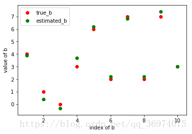
Exercise 11.2: Data
Create a data matrix X with 20 observations of 10 variables. Generate a vector b with parameters Then generate the response vector y = Xb+z where z is a vector with standard normally distributed variables. Now (by only using y and X), nd an estimator for b, by solving
Plot the true parameters b and estimated parameters
代码如下:
import matplotlib.pyplot as plt
import numpy as np


X = np.random.randn(20, 10) #20 * 10
b = numpy.random.randint(0, 10, 10).reshape(10, 1) #10 * 1
z = numpy.random.randn(20).reshape(20, 1) #reshape:重排矩阵元素, 20 * 1
y = numpy.dot(X, b)+z #20 * 1
b_est = numpy.linalg.lstsq(X, y)[0] #最小二乘法算出b的估计值
xi = np.linspace(1, 10, 10)
plt.scatter(x, b, c='r', marker='o', label='true_b')
plt.scatter(x, b_est, c='g', marker='o', label='estimated_b')
plt.legend()
plt.ylabel('value of b')
plt.xlabel('index of b')
plt.show()
截图如下:
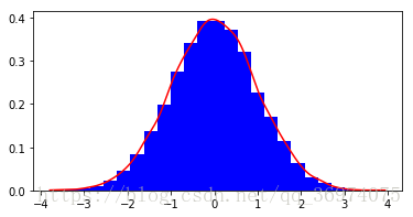
Exercise 11.3: Histogram and density estimation
Generate a vector z of 10000 observations from your favorite exotic distribution. Then make a plot that shows a histogram of z (with 25 bins), along with an estimate for the density, using a Gaussian kernel density estimator (see scipy.stats).
代码如下:
import matplotlib.pyplot as plt
import numpy as np
from scipy import stats

data = np.random.randn(10000)
data.sort()
f, ax = plt.subplots(1, 1, figsize=(6,3)) #第二个1表示一个图, ax: 图像
ax.hist(data, bins=25, density=True, color = 'b') #bins: 直方图有几个柱形
kde = stats.gaussian_kde(data)
ax.plot(data, kde.pdf(data), color='r')
plt.show()
运行截图如下: