<!DOCTYPE html>
<html>
<head>
<meta charset="UTF-8">
<title>发光输入框</title>
<style type="text/css">
input{width: 280px;height: 30px;}
textarea{width: 280px;height: 80px;}
input,textarea{
-webkit-transition: all 0.30s ease-in-out;
-moz-transition: all 0.30s ease-in-out;
-ms-transition: all 0.30s ease-in-out;
-o-transition: all 0.30s ease-in-out;
outline: none;
padding: 3px 0 3px 3px;
margin: 5px 1px 3px 0;
border: #ddd 1px solid;
}
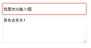
input:focus,textarea:focus {
box-shadow: 0 0 5px rgba(216,76,41,1);
padding: 3px 0 3px 3px;
margin: 5px 1px 3px 0;
border: rgba(216,76,41,1) 1px solid;
}
</style>
</head>
<body>
<input type="text" name="" id="" value="" />
<textarea></textarea>
</body>
</html>