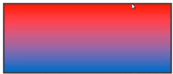
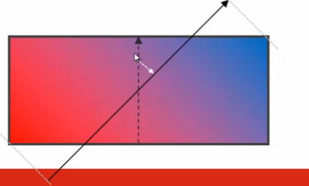
实现背景的线形渐变
linear - gradient()
[[ < angle> | to <side-or-corner> ] ,] ? <color-stop>[,<color-stop>] +
角度 | 线性的方向:到一个边或者一个角 | 颜色的断点
<side-or - corner> = [ left | right || [ top | bottom ]
<color-stop > = < color > [ <percentage> | <length > ] ?
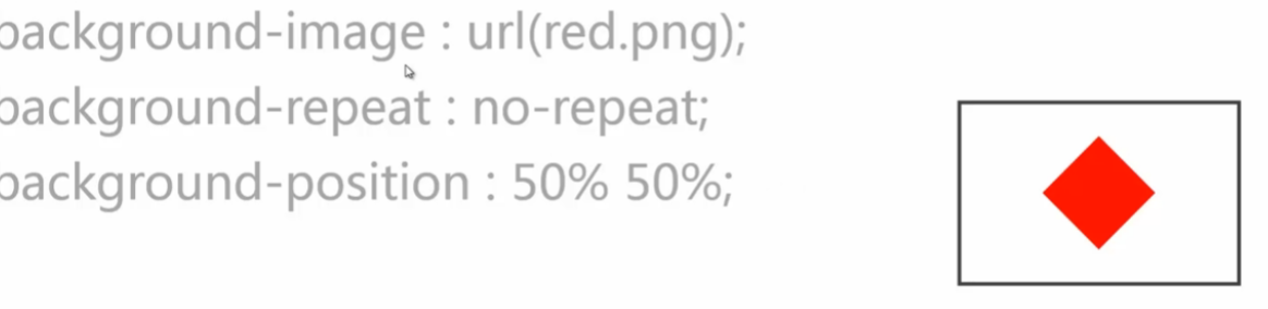
background-image : linear-gradient (red, blue); background-image: linear-gradient (to top,red,blue);
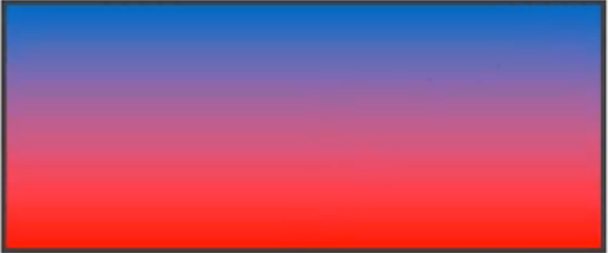
background-image : linear-gradient(to right bottom , red,blue); background - image : linear-gradient ( 0 deg,red,blue);


background - image : linear- gradient (45deg,red,blue); background-image: linear - gradient(red, green,blue); background-image: linear - gradient(red, green 20% ,blue);
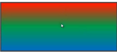
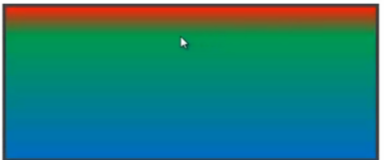
镜像渐变
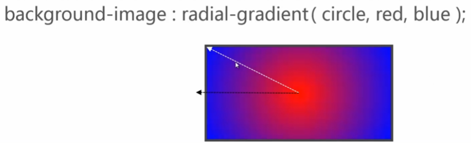
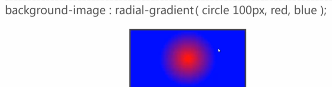
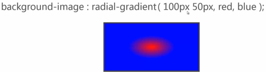
 沿着圆的半径向外散发 也可以是椭圆
radial - gradient
[ [ circle || <length> ] [ at < position>] ? , | 圆形 | 大小(半径) | 圆心所在的位置
[ ellipse || [ <length> | <percentage> ] {2} ] [ at < position> ] ? , | 椭圆 | 大小 | 百分比他是两个值的 因为椭圆半径是两个值的 | 圆心所在位置
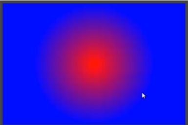
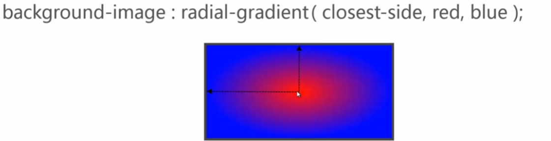
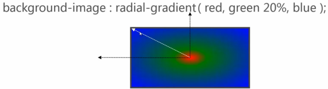
[ [ circle | ellipse ] || <extent - keyword > ] [ at <position>]? , | at < position > , ] ? <color -stop> [ , <color -stop > ] +
圆形|椭圆形 | 关键字 | 圆心位置 |
<extent - keyword > = closest - side | farthest -side | closest - corner | farthest - corner
离圆心最近的那条边| 离圆心最远的那条边| 离圆心最近的那个角 | 离圆心最远那个角
· 

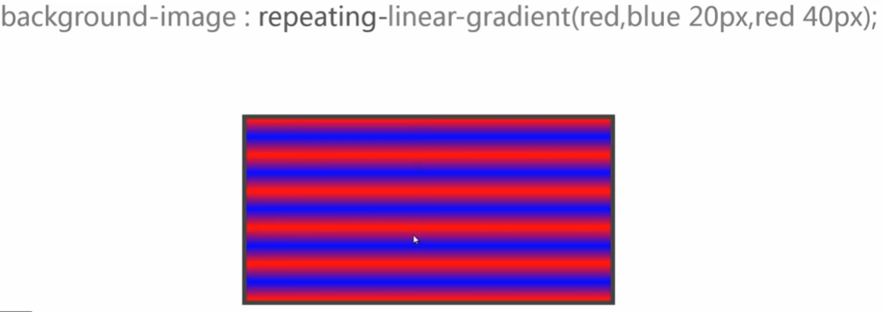
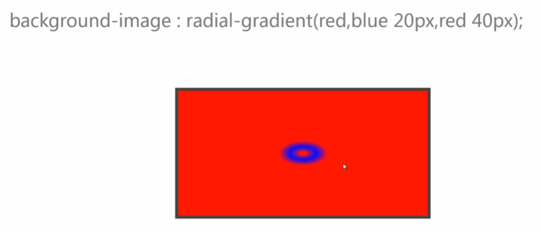
repeat- * -gradient


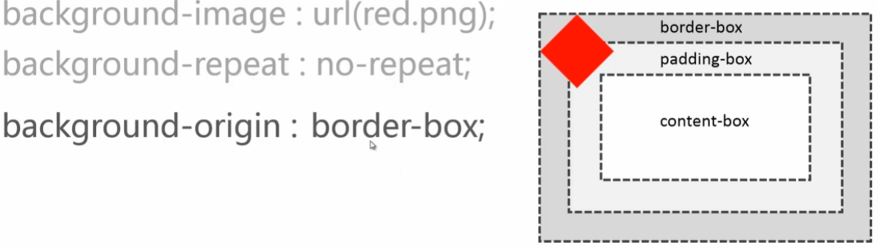
background - origin
<box> [ , <box> ] *
<box > = border - box (默认值) | padding - box | content- box


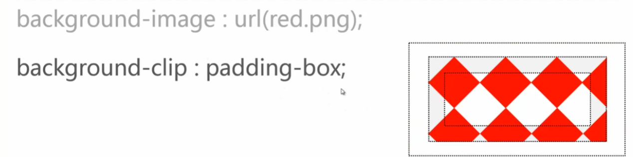
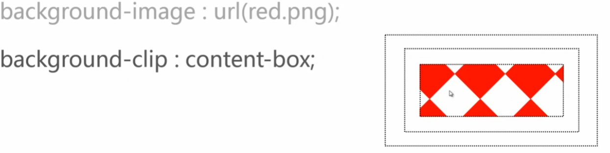
background - clip
<box> [ , <box> ] *
<box > = border - box(默认值) | padding - box | content -box


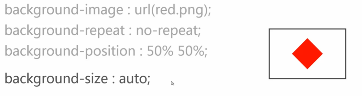
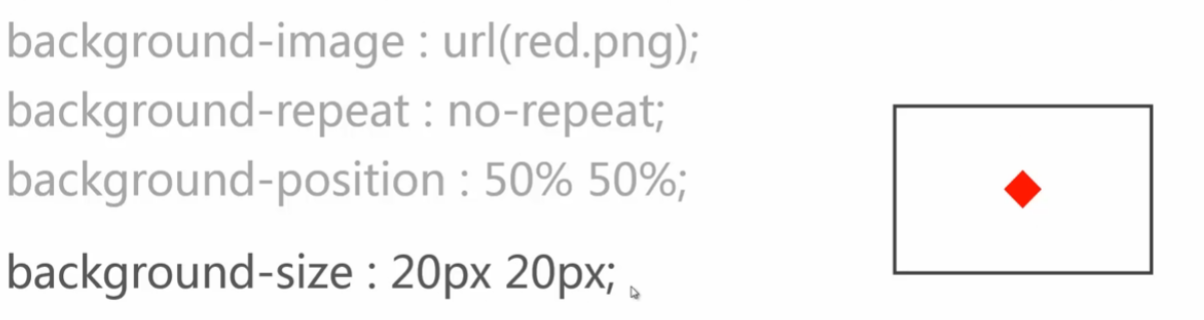
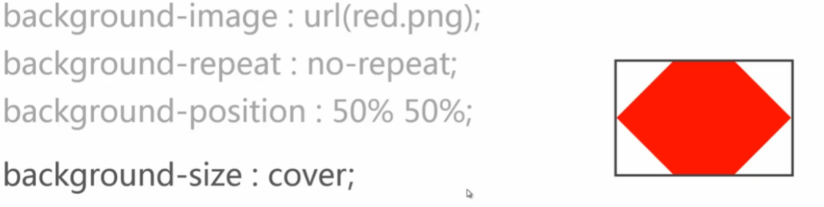
background - size 改变背景大小
<bg-size> [ , <bg-size> ] *
< bg - size > = [ <length> | <percentage > | auto ] {1,2} | cover | contain
大小 | 百分比 :相对于它的容器 | 自动 一到两个值 两个值的时候一个宽度一个高度 一个值的时候 ,第一值表示宽度,第二个值表示auto

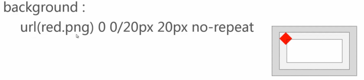
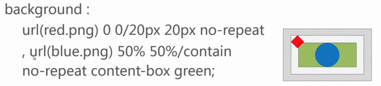
background
[ < bg - layer> , ] * <final - bg - layer >