分享个特效,原理十分简单。
①-webkit-filter:CSS滤镜属性,可以在元素呈现之前,为元素的渲染提供一些效果,如模糊、颜色转移之类的。滤镜常用于调整图像、背景、边框的渲染。
代码:
<!DOCTYPE>
<html>
<head>
<meta http-equiv="Content-Type" content="text/html; charset=utf-8" />
<meta http-equiv="Cache-control" content="private, must-revalidate" />
<title></title>
</head>
<style>
   *{margin: 0px;padding: 0px;}
    .to{width:500px;height:500px;border-radius:500px;overflow:hidden;position:absolute;
   //绝对定位,不占用位置
   top:50%;
   left: 50%;
   margin-top: -250px;
   margin-left: -250px;
   }
</style>
<body>
<img style="position: absolute;-webkit-filter:blur(40px);opacity:0.4;width:100%;
     height:100%;" src="1.jpg">
<div class="to">
<img style="margin-left:-950px;" src="1.jpg">
</div>
</body>
</html>
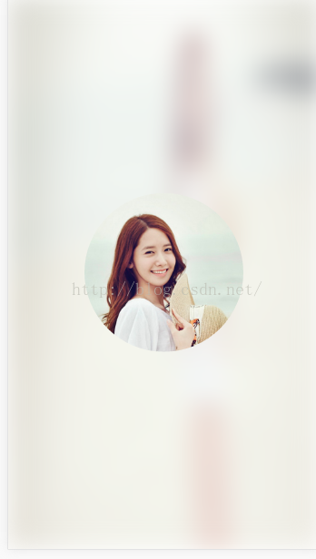
可以做成个人设置中心背景,效果挺好看的