首先补充以下:7种颜色 r g b y m c k (红,绿,蓝,黄,品红,青,黑)
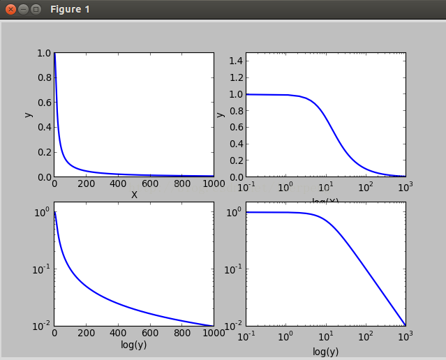
在科研的过程中,坐标系中的XY不一定就是等尺度的。例如在声波中对Y轴取对数。肆意我们也必须知道这种坐标系如何画出来的。
1,对数坐标图
有3个函数可以实现这种功能,分别是:semilogx(),semilogy(),loglog()。它们分别表示对X轴,Y轴,XY轴取对数。下面在一个2*2的figure里面来比较这四个子图(还有plot())。
-
1 import numpy as np
-
2 import matplotlib.pyplot as plt
-
3 w=np.linspace( 0.1, 1000, 1000)
-
4 p=np.abs( 1/( 1+ 0.1j*w))
-
5
-
6 plt.subplot( 221)
-
7 plt.plot(w,p,lw= 2)
-
8 plt.xlabel( 'X')
-
9 plt.ylabel( 'y')
-
10
-
11
-
12 plt.subplot( 222)
-
13 plt.semilogx(w,p,lw= 2)
-
14 plt.ylim( 0, 1.5)
-
15 plt.xlabel( 'log(X)')
-
16 plt.ylabel( 'y')
-
17
-
18 plt.subplot( 223)
-
19 plt.semilogy(w,p,lw= 2)
-
20 plt.ylim( 0, 1.5)
-
21 plt.xlabel( 'x')
-
22 plt.xlabel( 'log(y)')
-
23
-
24 plt.subplot( 224)
-
25 plt.loglog(w,p,lw= 2)
-
26 plt.ylim( 0, 1.5)
-
27 plt.xlabel( 'log(x)')
-
28 plt.xlabel( 'log(y)')
-
29 plt.show()
-
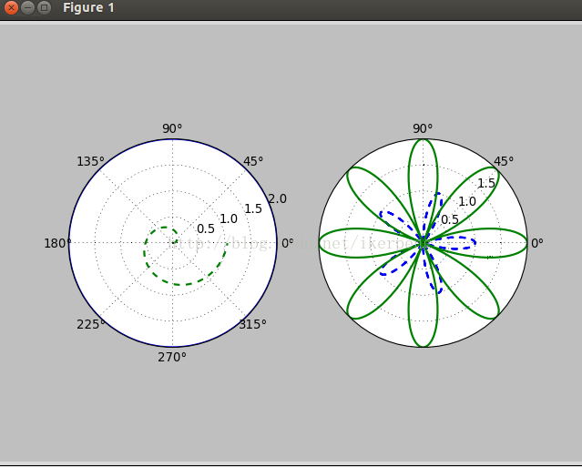
2,极坐标图像
极坐标系中的点由一个夹角和一段相对于中心位置的距离来表示。其实在plot()函数里面本来就有一个polar的属性,让他为True就行了。下面绘制一个极坐标图像:
-
1 import numpy as np
-
2 import matplotlib.pyplot as plt
-
3
-
4 theta=np.arange( 0, 2*np.pi, 0.02)
-
5
-
6 plt.subplot( 121,polar= True)
-
7 plt.plot(theta, 2*np.ones_like(theta),lw= 2)
-
8 plt.plot(theta,theta/ 6, '--',lw= 2)
-
9
-
10 plt.subplot( 122,polar= True)
-
11 plt.plot(theta,np.cos( 5*theta), '--',lw= 2)
-
12 plt.plot(theta, 2*np.cos( 4*theta),lw= 2)
-
13 plt.rgrids(np.arange( 0.5, 2, 0.5),angle= 45)
-
14 plt.thetagrids([ 0, 45, 90])
-
15
-
16 plt.show()
-
~

整个代码很好理解,在后面的13,14行没见过。第一个plt.rgrids(np.arange(0.5,2,0.5),angle=45) 表示绘制半径为0.5 1.0 1.5的三个同心圆,同时将这些半径的值标记在45度位置的那个直径上面。plt.thetagrids([0,45,90]) 表示的是在theta为0,45,90度的位置上标记上度数。得到的图像是:
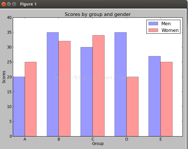
3,柱状图:核心代码matplotlib.pyplot.bar(left, height, width=0.8, bottom=None, hold=None, **kwargs)里面重要的参数是左边起点,高度,宽度。下面例子:
-
1 import numpy as np
-
2 import matplotlib.pyplot as plt
-
3
-
4
-
5 n_groups = 5
-
6
-
7 means_men = ( 20, 35, 30, 35, 27)
-
8 means_women = ( 25, 32, 34, 20, 25)
-
9
-
10 fig, ax = plt.subplots()
-
11 index = np.arange(n_groups)
-
12 bar_width = 0.35
-
13
-
14 opacity = 0.4
-
15 rects1 = plt.bar(index, means_men, bar_width,alpha=opacity, color= 'b',label= 'Men')
-
16 rects2 = plt.bar(index + bar_width, means_women, bar_width,alpha=opacity,col or= 'r',label= 'Women')
-
17
-
18 plt.xlabel( 'Group')
-
19 plt.ylabel( 'Scores')
-
20 plt.title( 'Scores by group and gender')
-
21 plt.xticks(index + bar_width, ( 'A', 'B', 'C', 'D', 'E'))
-
22 plt.ylim( 0, 40)
-
23 plt.legend()
-
24
-
25 plt.tight_layout()
-
26 plt.show()
4,散列图,有离散的点构成的。函数是:matplotlib.pyplot.scatter(x, y, s=20, c='b', marker='o', cmap=None, norm=None, vmin=None, vmax=None, alpha=None, linewidths=None, verts=None, hold=None,**kwargs),其中,xy是点的坐标,s点的大小,maker是形状可以maker=(5,1)5表示形状是5边型,1表示是星型(0表示多边形,2放射型,3圆形);alpha表示透明度;facecolor=‘none’表示不填充。例子如下:
-
1 import numpy as np
-
2 import matplotlib.pyplot as plt
-
3
-
4 plt.figure(figsize=( 8, 4))
-
5 x=np.random.random( 100)
-
6 y=np.random.random( 100)
-
7 plt.scatter(x,y,s=x* 1000,c= 'y',marker=( 5, 1),alpha= 0.5,lw= 2,facecolors= 'none')
-
8 plt.xlim( 0, 1)
-
9 plt.ylim( 0, 1)
-
10
-
11 plt.show()

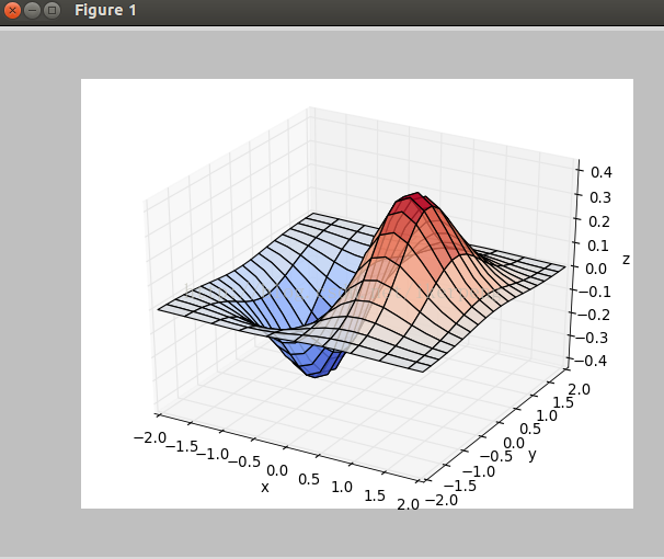
5,3D图像,主要是调用3D图像库。看下面的例子:
-
1 import numpy as np
-
2 import matplotlib.pyplot as plt
-
3 import mpl_toolkits.mplot3d
-
4
-
5 x,y=np.mgrid[ -2: 2: 20j, -2: 2: 20j]
-
6 z=x*np.exp(-x** 2-y** 2)
-
7
-
8 ax=plt.subplot( 111,projection= '3d')
-
9 ax.plot_surface(x,y,z,rstride= 2,cstride= 1,cmap=plt.cm.coolwarm,alpha= 0.8)
-
10 ax.set_xlabel( 'x')
-
11 ax.set_ylabel( 'y')
-
12 ax.set_zlabel( 'z')
-
13
-
14 plt.show()
得到的图像如下图所示:
到此,matplotlib基本操作的学习结束了,相信大家也可以基本完成自己的科研任务了。下面将继续学习python的相关课程,请继续关注。