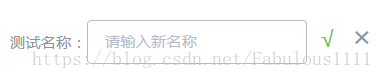
效果

组件源码
<template>
  <div class="edit-input">
    <div class="editBox">
      <div>
        <span class="list">{{ name }}:</span>
        <span class="listValue" v-if="!editStatus">{{value}}</span>
      </div>
      <span class="editLogo iconfont icon-Edit"  @click="editStatus = !editStatus" v-if="!editStatus"></span>
      <div class="edit" v-if="editStatus">
        <el-input v-model="newValue" :placeholder="placeholderDes"></el-input>
        <span class="confirmEdit" @click="changeValue">√</span>
        <span class="cancel" @click="editStatus = !editStatus">×</span>
      </div>
    </div>
  </div>
</template>

<script>
import '@/common/font/iconfont.css'
export default {
  props: {
    name: {
      type: String,
      require: true
    },
    value: {
      type: String,
      require: true
    },
    placeholderDes: {
      type: String,
      default: ''
    }
  },
  data () {
    return {
      newValue: '',
      editStatus: false
    }
  },
  methods: {
    changeValue () {
      this.$emit('valueChange', this.newValue)
      this.editStatus = false
    }
  }
}
</script>

<style lang="less" scoped>
.edit-input {
  .editBox { display: flex;
    margin-top: 10px;
    text-align: center;
    .list { color: #909399;
        font-size: 14px;
        line-height: 40px;
        display: inline-block;
      }
      .listValue {
        color: #303133;
        font-size: 14px;
        line-height: 26px;
      }
    .editLogo {
      color: #2695E4;
      padding-top: 12px;
      padding-left: 10px;
    }
    .edit{
      height: 50px;
      width: 260px;
      .confirmEdit { margin-left: 4px;
        width: 20px;
        height: 36px;
        display: inline-block;
        color: #67c23a;
        font-size: 20px;
        cursor: pointer;
      }
      .cancel {
        color: #929398;
        font-size: 20px;
        margin-left: 6px;
        cursor: pointer;
        width: 20px;
        height: 36px;
        display: inline-block;
        font-size: 26px;
        &:hover { color: #fa5555;
        }
      }
      .el-input {
        width: 200px;
      }
    }
  }
}
</style>
父组件中引用
<template>
  <div class="test">
    <v-edit-input placeholderDes="请输入新名称" name="测试名称" value="哈哈哈哈" @valueChange="changeValue"></v-edit-input>
  </div>
</template>

<script>
import VEditInput from '@/components/Common/EditInput'
export default {
  components: {
    VEditInput
  },
  methods: {
    changeValue (newVal) {
      // newVal即为修改后的新值,接下来用来与后端交互即可。
    }
  }
}
</script>注:组件源码中import '@/common/font/iconfont.css'目的是为了引入编辑图标,图标使用于iconfont官网使用svg制作,实际应用时请删除此行代码,改为你自己的图标,即给.editLogo加个背景图即可。