Matplotlib是NumPy的绘图库。通常,通过添加以下语句将包导入到 Python 脚本中:
from Matplotlib import pyplot as plt
(1)这里pyplot()是 matplotlib 库中最重要的函数,用于绘制 2D 数据
import numpy as np
from matplotlib import pyplot as plt
x = np.arange(1,11)
y =  2  * x +  5
plt.title("Matplotlib demo")
plt.xlabel("x axis caption")
plt.ylabel("y axis caption")
plt.plot(x,y)
plt.show()
输出:

其中,各种标记符请参考官网标识符。
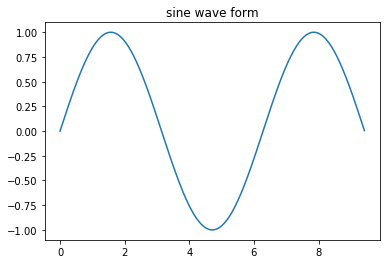
使用 matplotlib 生成正弦波图
x = np.arange(0,  3  * np.pi,0.01)
y = np.sin(x)
plt.title("sine wave form")
# 使用 matplotlib 来绘制点
plt.plot(x, y)
plt.show()
输出:
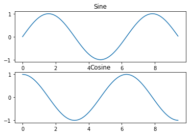
(2) subplot()函数允许在同一图中绘制不同的东西。
# 计算正弦和余弦曲线上的点的 x 和 y 坐标
x = np.arange(0,  3  * np.pi,  0.1)
y_sin = np.sin(x)
y_cos = np.cos(x)
# 建立 subplot 网格,高为 2,宽为 1
# 激活第一个 subplot
plt.subplot(2,  1,  1)
# 绘制第一个图像
plt.plot(x, y_sin)
plt.title('Sine')
# 将第二个 subplot 激活,并绘制第二个图像
plt.subplot(2,  1,  2)
plt.plot(x, y_cos)
plt.title('Cosine')
# 展示图像
plt.show()
输出:
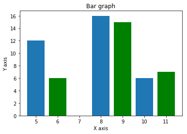
(3)bar()--函数用来生成条形图
x =  [5,8,10]
y =  [12,16,6]
x2 =  [6,9,11]
y2 =  [6,15,7]
plt.bar(x, y, align =  'center')
plt.bar(x2, y2, color =  'g', align =  'center')
plt.title('Bar graph')
plt.ylabel('Y axis')
plt.xlabel('X axis')
plt.show()
输出:
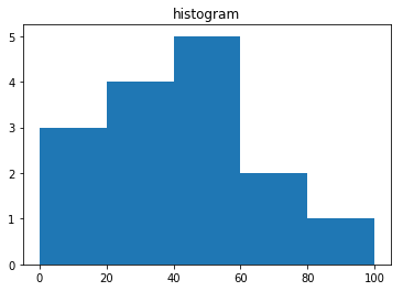
(4)np.histogram()函数将输入数组和bin作为两个参数。bin数组的连续的两个元素作为边界,查找输入数组个数。
a = np.array([20,87,2,43,56,73,55,54,11,20,51,5,79,31,27])
np.histogram(a,bins =  [0,20,40,60,80,100])
hist,bins = np.histogram(a,bins =  [0,20,40,60,80,100])
print(hist)
print(bins)
输出:
[3 4 5 2 1]
[  0  20  40  60  80 100]
另外:Matplotlib 可以将直方图的数字表示转换为图形。 pyplot子模块的plt()函数将包含数据和bin数组的数组作为参数,并转换为直方图。如下
a = np.array([22,87,5,43,56,73,55,54,11,20,51,5,79,31,27])
plt.hist(a, bins =  [0,20,40,60,80,100])
plt.title("histogram")
plt.show()
输出: