使用 @media 查询,你可以针对不同的媒体类型定义不同的样式。
如果浏览器窗口小于 500px, 背景将变为浅蓝色:
<!DOCTYPE html>
<html>
<head>
<meta name="viewport" content="width=device-width, initial-scale=1.0">
<meta charset="utf-8">
<title>自学教程(如约智惠.com)</title>
<style>
body {
background-color:lightgreen;
}
@media only screen and (max-width:500px) {
body {
background-color:lightblue;
}
}
</style>
</head>
<body>
<p>重置浏览器大小,当文档的宽度小于 500 像素,背景会变为浅蓝色,否则为浅绿色。</p>
</body>
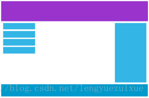
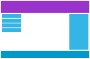
</html>添加端点
桌面设备
手机设备

使用媒体查询在 768px 添加断点:(当屏幕 (浏览器窗口) 小于 768px, 每一列的宽度是 100%:)
<!DOCTYPE html>
<html>
	<head>
		<meta name="viewport" content="width=device-width, initial-scale=1.0">
		<meta charset="utf-8">
		<title>自学教程(如约智惠.com)</title>
		<style>
			* {
    box-sizing: border-box;
}
.row:after {
    content: "";
    clear: both;
    display: block;
}
[class*="col-"] {
    float: left;
    padding: 15px;
}
html {
    font-family: "Lucida Sans", sans-serif;
}
.header {
    background-color: #9933cc;
    color: #ffffff;
    padding: 15px;
}
.menu ul {
    list-style-type: none;
    margin: 0;
    padding: 0;
}
.menu li {
    padding: 8px;
    margin-bottom: 7px;
    background-color :#33b5e5;
    color: #ffffff;
    box-shadow: 0 1px 3px rgba(0,0,0,0.12), 0 1px 2px rgba(0,0,0,0.24);
}
.menu li:hover {
    background-color: #0099cc;
}
.aside {
    background-color: #33b5e5;
    padding: 15px;
    color: #ffffff;
    text-align: center;
    font-size: 14px;
    box-shadow: 0 1px 3px rgba(0,0,0,0.12), 0 1px 2px rgba(0,0,0,0.24);
}
.footer {
    background-color: #0099cc;
    color: #ffffff;
    text-align: center;
    font-size: 12px;
    padding: 15px;
}
/* For desktop: */
.col-1 {width: 8.33%;}
.col-2 {width: 16.66%;}
.col-3 {width: 25%;}
.col-4 {width: 33.33%;}
.col-5 {width: 41.66%;}
.col-6 {width: 50%;}
.col-7 {width: 58.33%;}
.col-8 {width: 66.66%;}
.col-9 {width: 75%;}
.col-10 {width: 83.33%;}
.col-11 {width: 91.66%;}
.col-12 {width: 100%;}

@media only screen and (max-width: 768px) {
    /* For mobile phones: */
    [class*="col-"] {
        width: 100%;
    }
}
		</style>
	</head>
	<body>
		<div class="header">
<h1>Chania</h1>
</div>

<div class="row">

<div class="col-3 menu">
<ul>
<li>The Flight</li>
<li>The City</li>
<li>The Island</li>
<li>The Food</li>
</ul>
</div>

<div class="col-6">
<h1>The City</h1>
<p>Chania is the capital of the Chania region on the island of Crete. The city can be divided in two parts, the old town and the modern city.</p>
</div>
<div class="col-3 right">
<div class="aside">
<h2>What?</h2>
<p>Chania is a city on the island of Crete.</p>
<h2>Where?</h2>
<p>Crete is a Greek island in the Mediterranean Sea.</p>
<h2>How?</h2>
<p>You can reach Chania airport from all over Europe.</p>
</div>
</div>

</div>

<div class="footer">
<p>Resize the browser window to see how the content respond to the resizing.</p>
</div>
	</body>
</html>
为移动端优先设计
移动端优先意味着在设计桌面和其他设备时优先考虑移动端的设计。
这就意味着我们必须对 CSS 做一些改变。
我们在屏幕小于 768px 进行样式修改,同样在屏幕宽度大于 768px 时也需要修改样式。以下是移动端优先实例:
/* 为移动端设计: */
[class*="col-"] {
width: 100%;
}
@media only screen and (min-width: 768px) {
/* For desktop: */
.col-1 {width: 8.33%;}
.col-2 {width: 16.66%;}
.col-3 {width: 25%;}
.col-4 {width: 33.33%;}
.col-5 {width: 41.66%;}
.col-6 {width: 50%;}
.col-7 {width: 58.33%;}
.col-8 {width: 66.66%;}
.col-9 {width: 75%;}
.col-10 {width: 83.33%;}
.col-11 {width: 91.66%;}
.col-12 {width: 100%;}
}
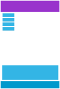
其他断点
你可以根据自己的需要添加断点。
我们同样可以为平板设备和移动手机设备设置断点。
桌面设备
平板设备
手机设备

在屏幕为 600px 时添加媒体查询,并设置新的样式(屏幕大于600px但小于768px):
<!DOCTYPE html>
<html>
	<head>
		<meta name="viewport" content="width=device-width, initial-scale=1.0">
		<meta charset="utf-8">
		<title>自学教程(如约智惠.com)</title>
		<style>
			* {
    box-sizing: border-box;
}
.row:after {
    content: "";
    clear: both;
    display: block;
}
[class*="col-"] {
    float: left;
    padding: 15px;
}
html {
    font-family: "Lucida Sans", sans-serif;
}
.header {
    background-color: #9933cc;
    color: #ffffff;
    padding: 15px;
}
.menu ul {
    list-style-type: none;
    margin: 0;
    padding: 0;
}
.menu li {
    padding: 8px;
    margin-bottom: 7px;
    background-color :#33b5e5;
    color: #ffffff;
    box-shadow: 0 1px 3px rgba(0,0,0,0.12), 0 1px 2px rgba(0,0,0,0.24);
}
.menu li:hover {
    background-color: #0099cc;
}
.aside {
    background-color: #33b5e5;
    padding: 15px;
    color: #ffffff;
    text-align: center;
    font-size: 14px;
    box-shadow: 0 1px 3px rgba(0,0,0,0.12), 0 1px 2px rgba(0,0,0,0.24);
}
.footer {
    background-color: #0099cc;
    color: #ffffff;
    text-align: center;
    font-size: 12px;
    padding: 15px;
}
/* For mobile phones: */
[class*="col-"] {
    width: 100%;
}
@media only screen and (min-width: 600px) {
    /* For tablets: */
    .col-m-12 {width: 8.33%;}
    .col-m-2 {width: 16.66%;}
    .col-m-3 {width: 25%;}
    .col-m-4 {width: 33.33%;}
    .col-m-5 {width: 41.66%;}
    .col-m-6 {width: 50%;}
    .col-m-7 {width: 58.33%;}
    .col-m-8 {width: 66.66%;}
    .col-m-9 {width: 75%;}
    .col-m-10 {width: 83.33%;}
    .col-m-11 {width: 91.66%;}
    .col-m-12 {width: 100%;}
}
@media only screen and (min-width: 768px) {
    /* For desktop: */
    .col-1 {width: 8.33%;}
    .col-2 {width: 16.66%;}
    .col-3 {width: 25%;}
    .col-4 {width: 33.33%;}
    .col-5 {width: 41.66%;}
    .col-6 {width: 50%;}
    .col-7 {width: 58.33%;}
    .col-8 {width: 66.66%;}
    .col-9 {width: 75%;}
    .col-10 {width: 83.33%;}
    .col-11 {width: 91.66%;}
    .col-12 {width: 100%;}
}
		</style>
	</head>
	<body>
		<div class="header">
<h1>Chania</h1>
</div>

<div class="row">
<div class="col-3 col-m-3 menu">
<ul>
<li>The Flight</li>
<li>The City</li>
<li>The Island</li>
<li>The Food</li>
</ul>
</div>

<div class="col-6 col-m-9">
<h1>The City</h1>
<p>Chania is the capital of the Chania region on the island of Crete. The city can be divided in two parts, the old town and the modern city.</p>
</div>

<div class="col-3 col-m-12">
<div class="aside">
<h2>What?</h2>
<p>Chania is a city on the island of Crete.</p>
<h2>Where?</h2>
<p>Crete is a Greek island in the Mediterranean Sea.</p>
<h2>How?</h2>
<p>You can reach Chania airport from all over Europe.</p>
</div>
</div>

</div>

<div class="footer">
<p>Resize the browser window to see how the content respond to the resizing.</p>
</div>
	</body>
</html>
方向:横屏/竖屏
结合CSS媒体查询,可以创建适应不同设备的方向(横屏landscape、竖屏portrait等)的布局。
语法:
orientation:portrait | landscape
- portrait:指定输出设备中的页面可见区域高度大于或等于宽度
- landscape: 除portrait值情况外,都是landscape
<!DOCTYPE html>
<html>
	<head>
		<meta name="viewport" content="width=device-width, initial-scale=1.0">
		<meta charset="utf-8">
		<title>自学教程(如约智惠.com)</title>
		<style>
			body {
				background-color: lightgreen;
			}

			@media only screen and (orientation: landscape) {
				body {
					background-color: lightblue;
				}
			}
		</style>
	</head>
	<body>
		<p>重置浏览器大小,当文档的宽度大于高度时,背景会变为浅蓝色。否则为浅绿色。</p>
	</body>
</html>