css中媒体查询是什么?怎么使用?
媒体查询限制CSS样式的范围,以便仅在满足某些媒体条件时才适用。
简单来说:媒体查询可以让我们根据设备显示器的特性(如视口宽度、屏幕比例、设备方向:横向或纵向)为其设定CSS样式。
媒体查询可用于检测的媒体特性,比如: width 、 height 和 color (等)。使用媒体查询,可以在不改变页面内容的情况下,为特定的一些输出设备定制显示效果。
媒体查询具体使用
@media [not | only] [and] ();
@media screen {
	body{ color: #f00; }
}

@media screen and (min-width: 960px) {//这里指的是最小宽度为960px
	body{ background: #999; }
}
@media screen and(min-width:100px) and (max:960px){
	body{ background: #999; }
}
媒体类型
all:匹配所有设备。

print:匹配打印机和用于再现打印显示的设备,例如在“预览”中显示文档的Web浏览器。

screen:匹配所有与打印或语音不匹配的设备。

speech:匹配屏幕阅读器和“读出”页面的类似设备。
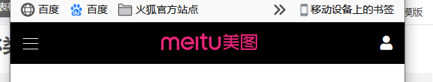
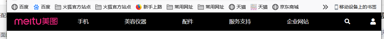
媒体查询的例子–仿美图导航栏

代码如下
<!DOCTYPE html>
<html lang="en">
<head>
    <meta charset="UTF-8">
    <meta name="viewport" content="width=device-width, initial-scale=1.0">
    <meta http-equiv="X-UA-Compatible" content="ie=edge">
    <title>Document</title>
    <link rel="stylesheet" href="./css/reset.css">
    <link rel="stylesheet" href="./fa/css/all.min.css">
    <link rel="stylesheet" href="./meitu/style.css">
</head>
<body>
    <!--
        响应式设计的网页:
            ① 移动端优先
            ② 渐进增强
     -->

     <!-- 外部容器 -->
<div class="top-bar-wrapper">
    <div class="top-bar">
        <!-- 左侧菜单 -->
        <div class="left-menu">
            <!-- 创建菜单图标 -->
            <ul class="menu-icon">
                <li></li>
                <li></li>
                <li></li>
            </ul>

            <!-- 创建菜单 -->
            <ul class="nav">
                <li><a href="#">手机</a></li>
                <li><a href="#">美容仪器</a></li>
                <li><a href="#">配件</a></li>
                <li><a href="#">服务支持</a></li>
                <li><a href="#">企业网站</a></li>
                <li>
                    <a href="#"><i class="fas fa-search"></i></a>
                    <span>搜索 Meitu.com</span>
                </li>
            </ul>
        </div>

        <!-- logo -->
        <h1 class="logo">
            <a href="/">美图手机</a>
        </h1>

        <!-- 用户信息 -->
        <div class="user-info">
            <a href="#">
                <i class="fas fa-user"></i>
            </a>
        </div>
    </div>
</div>

</body>
</html>
style.less
a{


    text-decoration: none;
    color: #fff;

    &:hover{


        color: rgb(197, 196, 196);
    }
}

// 导航条的外部容器

.top-bar-wrapper{


    background-color: #000;
}
.top-bar{


    max-width: 1200px;
    margin: 0 auto;
    height: 48px;
    padding: 0 14px;
    display: flex;
    align-items: center;
    justify-content: space-between;

}

// 设置左侧的导航
.left-menu{


    &:active{


        //显示隐藏的菜单
        .nav{


            display: block;
        }
    }
    // position: relative;
    // 设置菜单
    .nav{


        display: none;
        position: absolute;
        top:48px;
        left: 0;
        bottom: 0;
        right: 0;
        // 设置背景颜色
        background-color: #000;
        padding-top: 60px;

        li{


            width: 80%;
            margin: 0 auto;
            border-bottom: 1px solid #757474;

            a{


                display: block;
                line-height: 44px;
                font-size: 14px;

            }

            &:last-child a{


                display: inline-block;
                margin-right: 6px;
            }

            span{


                color: #fff;
                font-size: 14px;
            }
        }

    }

    // 图标
    .menu-icon{


        width: 18px;
        height: 48px;
        position: relative;

        // 导航的线
        li{


            width: 18px;
            height: 1px;
            background-color: #fff;
            position: absolute;

            // 修改变形的原点
            transform-origin:left center;

            transition: 0.5s
        }

        li:nth-child(1){


            top:18px;
        }

        li:nth-child(2){


            top:24px;
        }

        li:nth-child(3){


            top:30px;

        }

        // 鼠标移入以后的效果,正常项目时,效果需要通过js来实现
        &:active{


            li:nth-child(1){


                // 向下旋转
                transform: rotateZ(40deg);
            }

            li:nth-child(2){


                // 隐藏
                opacity: 0;
            }

            li:nth-child(3){


                transform: rotateZ(-40deg);
            }
        }
    }
}

//设置logo
.logo{


    a{


        text-indent: -9999px;
        display: block;
        width: 122px;
        height: 32px;
        background-image: url('../img/18/[email protected]');
        background-size: 400px 400px;
    }
}

//设置媒体查询
@media only screen{


    // 断点 768px
    @media (min-width: 768px){


       .left-menu{


           order: 2;
           flex: auto;
           //显示菜单
           .nav{


               display: flex;
               position: static;
               padding: 0;
               justify-content: space-around;
               li{


                   width: auto;
                   border-bottom: none;
                   margin: 0;
                   a{


                       line-height: 48px;
                   }

                   span{


                       display: none;
                   }
               }
           }
           //隐藏菜单图标
           .menu-icon{


               display: none;
           }

       }
       .logo{


           order: 1;
       }
       .user-info{


           order: 3;
       }
    }
}
总结一下吧,这设置了一个断点,当min-width: 768px页面小于768像素时,会变成移动端的界面,这个案例总体来说比较简单,可以练练手!!