- 绘制多个x轴
import matplotlib.pyplot as plt
from mpl_toolkits import axisartist
from mpl_toolkits.axes_grid1 import host_subplot
from models.model7 import read_logdata


plt.rcParams['font.sans-serif'] = ['SimHei']
plt.rcParams['axes.unicode_minus'] = False
plt.rcParams['font.size'] = 10
plt.rcParams['mathtext.fontset'] = 'stix'
filename = '../data/final.xlsx'
df = read_logdata(filename)
fig = plt.figure(figsize=(5, 8))
host = host_subplot(111, axes_class=axisartist.Axes, figure=fig)
host.axis['top'].set_visible(True)
ax1 = host.twiny()
ax2 = host.twiny()
ax3 = host.twiny()
ax4 = host.twiny()
ax5 = host.twiny()
ax6 = host.twiny()
ax7 = host.twiny()
ax8 = host.twiny()

axes = [ax1, ax2, ax3, ax4, ax5, ax6, ax7, ax8]


# 手动设置区间
# xlims = [[0,180],
#          [0,30],
#          [0,180],
#          [0,50],
#          [0,180],
#          [0,180],
#          [0,180],
#          [0,180],
#         ]
# xmax = df.iloc[:, 1:].max().values
colors = ['red', 'black', 'green', 'blue', 'darkblue', 'purple', 'orange', 'lightblue']
xlabels = ["属性1","属性2","属性3","属性4","属性5","属性6","属性7","属性8"]
for i, ax in enumerate(axes):
    ax.axis["top"] = ax.new_fixed_axis(loc="top", offset=(0, 25 * i))
    ax.plot(df.iloc[:, 1 + i], df.iloc[:, 0], lw=0.8)

    xmin = df.iloc[:, 1 + i].min()
    xmax = df.iloc[:, 1 + i].max()
    L = (xmax - xmin) * len(axes)
    x1 = xmin - i / len(axes) * L
    x2 = xmin + (len(axes) - i) / len(axes) * L
    x1 = int(x1)
    x2 = int(x2) + 1
    # x1 = max(x1,0) # 限制x1最小为0
    ax.set_xlim(x1, x2)  # 设置显示标签范围
    #     ax.set_xlim(xlims[i])#手动控制
    ax.set_xticks([x1, x2]) # 设置只显示最大值和最小值
    #     ax.set-xticks(xlims[i]) #手动控制
    ax.axis["top"].set_label(xlabels[i])  # 设置标签
    ax.axis["top"].label.set_color(colors[i]) # 设置标签的颜色
    ax.axis['top'].line.set_color(colors[i]) # 设置线条的颜色
    ax.axis['top'].major_ticks.set_color(colors[i])
    ax.axis['top'].major_ticklabels.set_color(colors[i])

    ax.axis['left'].set_visible(False)
    ax.axis['right'].set_visible(False)
    ax.axis['bottom'].set_visible(False)

host.set_xticks([])
host.set_ylim(df.iloc[:, 0].min(), df.iloc[:, 0].max())
host.invert_yaxis()  # 倒序显示y轴坐标
host.set_ylabel("深度")  # 设置y轴标签
# 调整整体布局,以便图例不超出图片范围,rect为矩形区域的参数,
# [0.05, 0.05]是矩形的左下角坐标的相对位置(相对于整个图像区域的宽度和高度),而1和0.95分别是矩形的宽度和高度的相对比例
plt.tight_layout(rect=[0.05, 0.05, 1, 0.95])
# 添加位于图底部的标题
plt.figtext(0.5, 0.02, '绘图', ha='center', fontsize=14, fontweight='bold')  # 设置文本在图的底部中间位置
plt.show()
绘图结果:
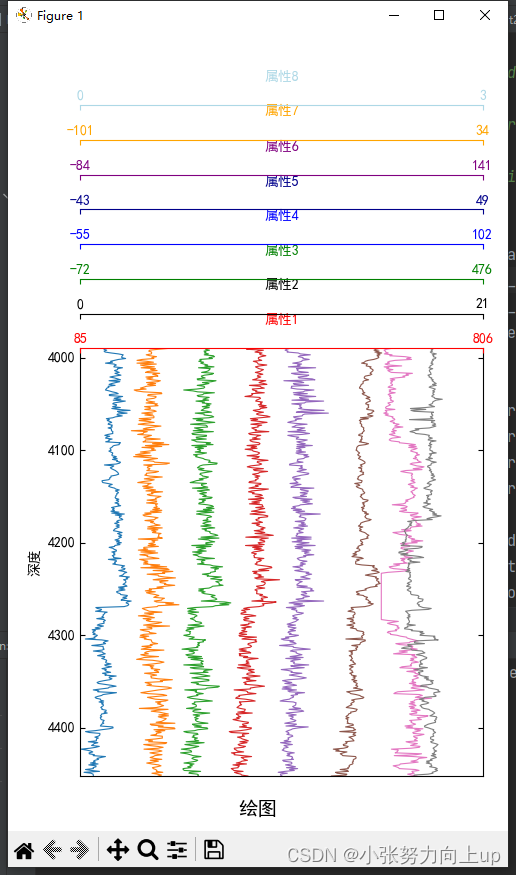 修改成方法,可以进行传参
def draw_picture3(depth, properties, title):
    plt.rcParams['font.sans-serif'] = ['SimHei']
    plt.rcParams['axes.unicode_minus'] = False
    plt.rcParams['font.size'] = 10
    plt.rcParams['mathtext.fontset'] = 'stix'
    fig = plt.figure(figsize=(6, 8))

    host = host_subplot(111, axes_class=axisartist.Axes, figure=fig)
    host.axis['top'].set_visible(True)
    ax1 = host.twiny()
    ax2 = host.twiny()
    ax3 = host.twiny()
    ax4 = host.twiny()
    ax5 = host.twiny()
    ax6 = host.twiny()
    ax7 = host.twiny()
    ax8 = host.twiny()

    axes = [ax1, ax2, ax3, ax4, ax5, ax6, ax7, ax8]
    properties_new = properties.values  # 所有属性值数据
    colors1 = ['red', 'black', 'green', 'blue', 'fuchsia', 'purple', 'orange', 'lightblue']
    xlabels = properties.columns

    for i in range(properties.shape[1]):
        ax = axes[i]
        ax1 = axes[0]
        ax.axis["bottom"] = ax.new_fixed_axis(loc="top", offset=(0, 30 * i))
        ax.plot(properties_new[:, i], depth, lw=1.2, color=colors1[i])
        x1 = 0
        x2 = 3
        ax.set_xlim(x1, x2)
        ax.set_xticks([x1, x2])
        ax.xaxis.set_major_formatter(plt.FormatStrFormatter('%.2f'))  # 设置标签显示为两位小数
        ax.axis["bottom"].set_label(xlabels[i])
        ax.axis["bottom"].label.set_color(colors1[i])
        ax.axis['bottom'].line.set_color(colors1[i])
        ax.axis['bottom'].major_ticks.set_color(colors1[i])
        ax.axis['bottom'].major_ticklabels.set_color(colors1[i])
        ax.axis['left'].set_visible(False)
        ax.axis['right'].set_visible(False)
        ax.axis['bottom'].set_visible(True)

    host.set_xticks([])
    host.set_ylim(depth.min(), depth.max())
    host.set_ylabel("深度(m)")  # 设置y轴标签
    host.invert_yaxis()  # 倒序显示y轴坐标
    plt.tight_layout(rect=[0.05, 0.05, 1, 0.95])
    # 放置标题
    # 添加位于图底部的标题
    plt.figtext(0.5, 0.02, title, ha='center', fontsize=14, fontweight='bold')  # 设置文本在图的底部中间位置
    plt.show()
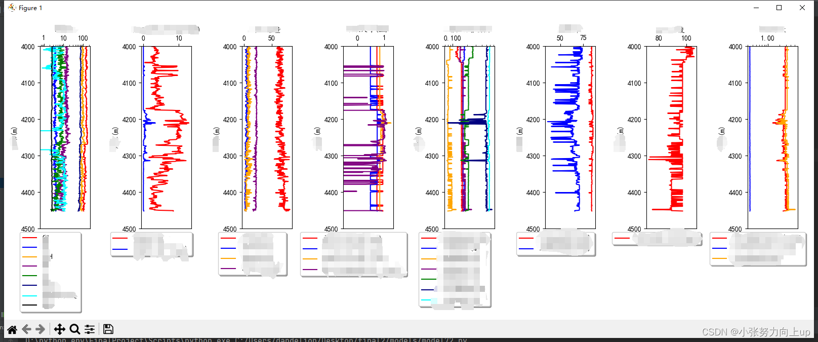
- 将所有的数据画在一个画布上,多次调用同一个函数
import joblib
import numpy as np
import pandas as pd
import matplotlib.pyplot as plt
def draw_picture1(depth1, properties1, title):
    # 支持中文,解决中文和负号显示问题
    plt.rcParams['font.sans-serif'] = ['KaiTi']  # 指定默认字体
    plt.rcParams['axes.unicode_minus'] = False  # 显示负号
    global global_fig, subplot_index,axs

    depth = depth1.sort_values()  # 深度数据
    properties = properties1.values  # 所有属性值数据
    # 颜色列表,用于绘制不同属性值的颜色
    # colors = ['cyan', 'green', 'orange','blue', 'darkblue', 'red', 'teal', 'black']
    colors = ['red', 'blue','orange', 'purple', 'green','navy', 'cyan', 'black']

    columns = properties1.columns

    # 如果是第一次调用,则创建一个新的画布和子图
    if global_fig is None:
        global_fig, axs = plt.subplots(1, 8, figsize=(16, 6), sharey=False)  # 使用sharey参数共享y轴
        global_fig.subplots_adjust(wspace=0.7)  # 设置子图之间的间距


    # 绘制深度与属性值的关系
    for j in range(properties.shape[1]):
        # if properties[:, j].min() < 1e-6:  # 判断属性值是否太小
        if (properties[:, j].max() - properties[:, j].min()) < 1.5:  # 判断属性值是否太小
            axs[subplot_index].semilogx(properties[:, j], depth, color=colors[j], label=columns[j])

        else:
            axs[subplot_index].plot(properties[:, j], depth, color=colors[j], label=columns[j])

        # 设置图例位置和样式
        axs[subplot_index].legend(loc='upper center', bbox_to_anchor=(0.2, -0.00005),
          fancybox=True, shadow=True, ncol=1)
        # 设置标题和轴标签
        axs[subplot_index].set_xlabel(title)
        axs[subplot_index].set_ylabel('井深(m)')
        # 将x轴标签显示在上方
        axs[subplot_index].xaxis.set_label_position('top')
        # 将x轴刻度线显示在上方
        axs[subplot_index].xaxis.tick_top()
        axs[subplot_index].set_ylim(4000, 4500)
        # axs[subplot_index].set_xlim(xrange)

        axs[subplot_index].tick_params(axis='x', which='both', labelbottom=False, labeltop=True)
        # 将x轴标签中的科学计数法写成小数的形式
        axs[subplot_index].xaxis.set_major_formatter(plt.ScalarFormatter())
        # 坐标显示倒序
        axs[subplot_index].invert_yaxis()

    # 更新子图索引
    subplot_index += 1

    # 如果已经绘制完8个子图,则显示图形并重置全局变量
    if subplot_index == 8:
        plt.tight_layout()
        plt.subplots_adjust(bottom=0.3,  top=0.9)  # 调整整体布局,以便图例不超出图片范围
        plt.show()
        global_fig = None
        subplot_index = 0

if __name__ == '__main__':
    # # 定义全局变量用于存储画布
    global_fig = None
    subplot_index = 0
    axs = None
    draw_picture1(depth, properties1, title1)
调用示例: