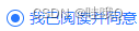
1、修改uni-data-checkbox多选框的样式为单选框的样式
我原先是用的单选,但是单选并不支持选中后,再次点击取消选中;所以我改成了多选,然后改变多选样式,让他看起来像单选
在所在使用的页面上修改样式即可
<uni-data-checkbox multiple selectedColor='#2979ff' selectedTextColor="#000" v-model="agree"
					:localdata="agreedata">
					<label>
						<checkbox />
						<view>我已阅读并同意
							<text class="col-g" @click="handleXI">《用户协议》</text>
							<text class="col-g" @click="handleYX">《隐私协议》</text>
						</view>
					</label>
				</uni-data-checkbox>
<style lang="scss">
//修改多选框的样式为单选样式
.uni-data-checklist .checklist-group .checklist-box.is--default.is-checked .checkbox__inner .checkbox__inner-icon {
opacity: 1;
background-color: #2979ff !important;
}
.uni-data-checklist .checklist-group .checklist-box .checkbox__inner .checkbox__inner-icon {
width: 8px !important;
height: 8px !important;
border-radius: 10px !important;
top: 3px !important;
left: 3px !important;
height: 8px;
width: 4px;
border: 0px solid #2979ff !important;
}
.uni-data-checklist .checklist-group .checklist-box .checkbox__inner {
border-radius: 8px !important;
display: flex;
flex-shrink: 0;
box-sizing: border-box;
justify-content: center;
align-items: center;
position: relative;
width: 16px;
height: 16px;
border: 1px solid #DCDFE6;
border-radius: 16px;
background-color: #fff !important;
z-index: 1;
}
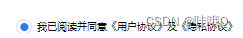
</style>2、修改checkbox的样式
<checkbox-group>
					<label style="display: flex;">
						<checkbox value="agree" class="checkbox" />
						<view>我已阅读并同意
							<text class="col-g" @click="handleYH">《用户协议》</text>及
							<text class="col-g" @click="handleYS">《隐私协议》</text>
						</view>
					</label>
				</checkbox-group>
样式必须得写在app.vue中
.login_container {
		//自定义checkbox的样式( 元素使用的时候就是使用类名:checkbox )
		checkbox.checkbox .wx-checkbox-input,
		checkbox.checkbox .uni-checkbox-input {
			border-radius: 8px !important;
			display: flex;
			flex-shrink: 0;
			box-sizing: border-box;
			justify-content: center;
			align-items: center;
			position: relative;
			width: 16px;
			height: 16px;
			border: 1px solid #DCDFE6;
			border-radius: 16px;
			background-color: #fff !important;
			z-index: 1;
		}

		// 选中后的 对勾样式
		checkbox.checkbox .uni-checkbox-input-checked::before,
		checkbox.checkbox .wx-checkbox-input-checked::before {
			width: 8px;
			height: 8px;
			border-radius: 10px !important;
			line-height: 20px;
			text-align: center;
			font-size: 18px;
			color: #fff;
			background: #2979ff;
			transform: translate(-70%, -50%) scale(1);
			-webkit-transform: translate(-70%, -50%) scale(1);
			position: absolute;
			top: 7px !important;
			left: 9px !important;
			border: 0px solid #2979ff !important;
		}
	}
3、uni-row的gutter无效
gutter的单位不是px是rpx,所以在设置的时候,要设置大一些
4、固定底部按钮
给底部留白,需要在盒子加上viewport-fit=cover,在配合env(safe-area-inset-bottom),这个变量最好和padding或height一起使用
<template>
	<view class="address">
		<view style="height: 87vh;overflow: hidden;overflow-y: scroll;">
			顶部内容
		</view>


        //固定底部按钮,第一步,添加viewport-fit=cover
		<view class="add" viewport-fit=cover>
			<button style="margin-right: 20rpx;" @click="add()">新增</button>
		</view>
	</view>
</template>

<style lang="scss" scoped>
	.address {
		padding: 30rpx;

		.add {
			position: fixed;
			bottom: 10rpx;
			width: 95vw;
			padding-bottom: env(safe-area-inset-bottom);//第二步
		}
	}
</style>