序言
TabLayout我们经常使用,用来和ViewPager2进行组合使用,做多Fragment切换页面效果。
TabLayout我们经常看到的的显示效果是上面文字,下面一个线段,在各大浏览器/新闻类APP可以看到,这个效果也是对TabLayout配置参数可以实现的,但是我们想要实现这种效果
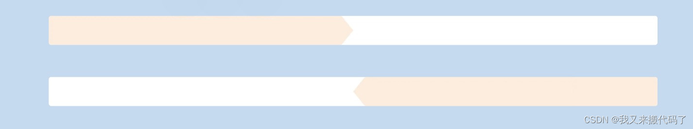
我们有两个Tab,左边和右边的,选中左边的之后,左边的就是橙色,然后箭头指向右边,选中右边的,右边变成橙色,然后箭头指向左边。
这个需要对TabLayout进行配置。
实现
首先Tablayout在xml里面的配置
    <com.google.android.material.tabs.TabLayout
        android:id="@+id/tab"
        android:layout_width="match_parent"
        android:layout_height="wrap_content"
        android:layout_gravity="fill"
        android:background="@color/white"
        android:paddingStart="0dp"
        android:paddingEnd="0dp"
        app:tabGravity="fill"
        app:tabIndicatorColor="@color/white"
        app:tabIndicatorHeight="0dp"
        app:tabMaxWidth="0dp"
        app:tabMode="fixed"
        app:tabPaddingEnd="-1dp"
        app:tabPaddingStart="-1dp"
        app:tabRippleColor="@null" />
其中这个
      app:tabPaddingEnd="-1dp"
      app:tabPaddingStart="-1dp"
是因为Tab本身自己是有默认的Padding的,这样是为了能让我们图片充满TabLayout的空间。
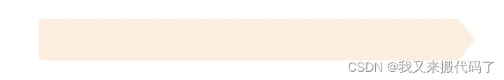
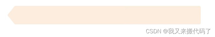
然后我们需要准备好这种图片放在项目里面
接下来就是很正常的操作了,创建Adapter继承FragmentStateAdapter,然后往里面加内容
class TabAdapter(
    val fragment: FragmentActivity,
    val mContext: Context,
    val index: Int
) : FragmentStateAdapter(fragment) {


    private class ViewPagerData(var imageBgId: Int, var imageIcon: Int, var textId: Int)

    private val viewPagerDataList: MutableList<ViewPagerData> = mutableListOf()

    init {


        viewPagerDataList.add(
            ViewPagerData(
                R.drawable.ic_un_selected,
                R.mipmap.ic_un_change,
                R.string.lable_type
            )
        )
        viewPagerDataList.add(
            ViewPagerData(
                R.drawable.ic_un_selected,
                R.mipmap.ic_un_change,
                R.string.installation
            )
        )
    }

    override fun getItemCount(): Int = viewPagerDataList.size

    override fun createFragment(position: Int): Fragment {


        return when (position) {


            0 -> OneFragment()
            1 -> TwoFragment()
            else -> OneFragment()
        }
    }

    @SuppressLint("MissingInflatedId")
    fun getTabView(position: Int): View? {


        val view =
            LayoutInflater.from(mContext).inflate(R.layout.view_layout, null)
        val tabBg = view.findViewById<LinearLayout>(R.id.ll_bg)
        val tabTextView = view.findViewById<TextView>(R.id.tv_name)
        val tabImageView = view.findViewById<ImageView>(R.id.iv_icon)
        // 在这里设置初始颜色和图标
        tabTextView.setText(viewPagerDataList[position].textId)
        tabTextView.setTextColor(mContext.resources.getColor(R.color.color_first_level_word))
        tabImageView.setImageResource(viewPagerDataList[position].imageIcon)
        tabBg.setBackgroundResource(viewPagerDataList[position].imageBgId)
        return view
    }
}
里面的view_layout文件
<?xml version="1.0" encoding="utf-8"?>
<LinearLayout xmlns:android="http://schemas.android.com/apk/res/android"
    android:id="@+id/ll_bg"
    android:layout_width="match_parent"
    android:layout_height="wrap_content"
    android:gravity="center"
    android:orientation="horizontal">

    <ImageView
        android:id="@+id/iv_tab_icon"
        android:layout_width="@dimen/agree_user_width_22"
        android:layout_height="@dimen/agree_user_width_22"
        android:layout_gravity="center_vertical" />

    <TextView
        android:id="@+id/tv_name"
        android:layout_width="wrap_content"
        android:layout_height="@dimen/Standard_height48"
        android:layout_marginStart="@dimen/margin_8"
        android:gravity="center_vertical"
        android:textColor="@color/color_first_level_word"
        android:textSize="@dimen/textSize_18sp" />
</LinearLayout>
注意:在设置这个Tab的高度的时候,有时候可能因为系统的问题,导致我们设置的Tab图片无法充满这个TabLayout的空间,解决办法上面有提到,其中左右无法充满就是使用这个方法解决,在TabLayout里面加
      app:tabPaddingEnd="-1dp"
      app:tabPaddingStart="-1dp"
这个上面提到了,但是上下不充满的话就无法使用这个设置了,
需要我们在设置TabLayout的时候
1.设置TabLayout的上下高度
android:layout_height="wrap_content"
2.在设置我们每个Tab的xml文件时,就是上面的view_layout文件里面设置高度,但是不要在父View里面设置高度,就像上面的view_layout里面,父View是LinearLayout,不能将LinearLayout的高度设置成我们需要的,要将其设置成

android:layout_height="wrap_content"
然后在里面的子View里面,将某个高度设置成我们需要的高度,撑起这个布局,比如我们将TextView的高度设置成48dp,这也是我们需要的TabLayout的高度,这样的话可以解决我们的Tab图片在上下方向上不能充满TabLayout的空间的问题。
然后我们就可以在Activity里面使用了
val adapter = TabAdapter(this, this, 0)
binding.viewPager.adapter = adapter
binding.viewPager.setIsFocusableInTouchModeKtx(false)
binding.viewPager.isUserInputEnabled = false
TabLayoutMediator(binding.tab, binding.viewPager) {

     tab: TabLayout.Tab, position: Int ->
     tab.customView = adapter.getTabView(position)
}.attach()
binding.tab.isTabIndicatorFullWidth = false
binding.viewPager.setCurrentItem(0, false)
//初始修改选中的item文字图片颜色
binding.tab.getTabAt(0)?.customView?.findViewById<LinearLayout>(R.id.ll_bg)?.setBackgroundResource(R.mipmap.ic_select)
binding.tab.getTabAt(0)?.customView?.findViewById<ImageView>(R.id.iv_icon)?.setImageResource(R.mipmap.ic_change)
binding.tab.getTabAt(0)?.customView?.findViewById<TextView>(R.id.tv_name)?.setTextColor(getColor(R.color.color_brand))
这样我们就已经将TabLayout和ViewPager2绑定成功了,但是我们在选择Tab的时候,还是要根据选择的Tab更换相应的背景和图片的。
我们要对这个TabLayout监听
binding.tab.addOnTabSelectedListener(object :
   TabLayout.OnTabSelectedListener {


   //选中的item处理
   override fun onTabSelected(tab: TabLayout.Tab) {


       val view = tab.customView
       if (view != null) {


           val tabBg = view.findViewById<LinearLayout>(R.id.ll_bg)
           val tabImageView =
               view.findViewById<ImageView>(R.id.iv_icon)
           val tabTextView =
               view.findViewById<TextView>(R.id.tv_name)
           val position = tab.position
           if (position == 0) {


           //因为我们只有两个Item的Tab,所以这个0代表的是第一个,也就是左边的Tab被选中了,
           //此时我们要更换图片和其他需要更换的东西,同理当我们选中其他的Tab也是要这么做的
               tabBg.setBackgroundResource(R.mipmap.ic_select)
               tabImageView.setImageResource(R.mipmap.ic_change)
               abTextView.setTextColor(getColor(R.color.color_brand)) // 替换成选中颜色
           } else {


               tabBg.setBackgroundResource(R.mipmap.ic_right_select)
               tabImageView.setImageResource(R.mipmap.ic_change)
               tabTextView.setTextColor(getColor(R.color.color_brand)) // 替换成选中颜色
           }
       }
   }

   //未选中的item处理
   override fun onTabUnselected(tab: TabLayout.Tab) {


       val view = tab.customView
       if (view != null) {


           val tabBg = view.findViewById<LinearLayout>(R.id.ll_bg)
           val tabImageView =
               view.findViewById<ImageView>(R.id.iv_icon)
           val tabTextView =
               view.findViewById<TextView>(R.id.tv_name)
           val position = tab.position
           if (position == 0) {


           //0代表第一个没有被选中
           //跟上面的处理逻辑一样
           } else {


           //跟上面的处理逻辑一样

           }
       }
   }

   override fun onTabReselected(tab: TabLayout.Tab) {


   // 不需要处理
   }
})