一、Button
Button组件主要用来响应点击操作,可以包含子组件。
示例代码:
@Entry
@Component
struct Index {
build() {
Row() {
Column() {
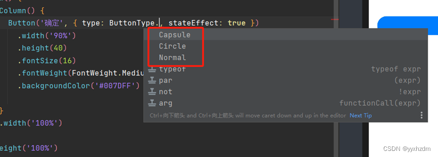
Button('确定', { type: ButtonType.Capsule, stateEffect: true })
.width('90%')
.height(40)
.fontSize(16)
.fontWeight(FontWeight.Medium)
.backgroundColor('#007DFF')
}
.width('100%')
}
.height('100%')
}
}
效果图:

二、设置按钮样式
type用于定义按钮样式,示例代码中ButtonType.Capsule表示胶囊形按钮;stateEffect用于设置按钮按下时是否开启切换效果,当状态置为false时,点击效果关闭,默认值为true。
我们可以设置多种样式的Button,除了Capsule可以以设置Normal和Circle:
代码:
@Entry
@Component
struct Index {
  build() {
    Row() {
      Column() {
        Button('确定', { type: ButtonType.Normal, stateEffect: true })
          .width('90%')
          .height(50)
          .fontSize(20)
          .backgroundColor('#007DFF')
        Blank(10)
        Button('确定1', { type: ButtonType.Capsule, stateEffect: true })
          .width('90%')
          .height(50)
          .fontSize(20)
          .backgroundColor('#007DFF')
        Blank(10)
        Button('确定', { type: ButtonType.Circle, stateEffect: true })
          .width('90%')
          .height(100)
          .fontSize(20)
          .backgroundColor('#007DFF')

      }
      .width('100%')
    }
    .height('100%')
  }
}
- Capsule:胶囊型按钮(圆角默认为高度的一半)。
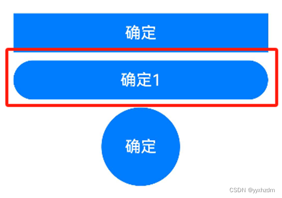
- Circle:圆形按钮。

- Normal:普通按钮(默认不带圆角)。

三、设置按钮点击事件
可以给Button绑定onClick事件,每当用户点击Button的时候,就会回调执行onClick方法,调用里面的逻辑代码。
Button('登录', { type: ButtonType.Capsule, stateEffect: true })
  ...
  .onClick(() => {
  // 处理点击事件逻辑
  })
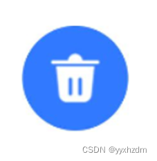
四、包含子组件
Button组件可以包含子组件,让您可以开发出更丰富多样的Button,下面的示例代码中Button组件包含了一个Image组件:
Button({ type: ButtonType.Circle, stateEffect: true }) {
  Image($r('app.media.icon_delete'))
    .width(30)
    .height(30)
}
.width(55)
.height(55)
.backgroundColor(0x317aff)
效果图如下: