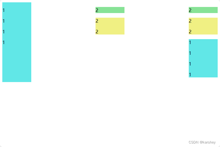
有情况如下:三个div的高度是随着内容自适应的,但希望每列的高度都相同,即,都与最高的相同。
<!DOCTYPE html>
<html lang="en">

<head>
    <meta charset="UTF-8">
    <meta name="viewport" content="width=device-width, initial-scale=1.0">
    <title>Document</title>
    <style>
        .container {


            display: flex;
            justify-content: space-between;
        }

        .item {


            width: 100px;
        }

        .aqua {


            background-color: rgb(97, 231, 231);

        }

        .green {


            background-color: rgb(135, 226, 150);
        }

        .yellow {


            background-color: rgb(240, 240, 131);
        }
    </style>
</head>

<body>
    <div class="container">
        <div class="item aqua">
            <p>1</p>
            <p>1</p>
            <p>1</p>
            <p>1</p>
        </div>
        <div class="item">
            <div class="item1 green">
                <p>2</p>
            </div>
            <div class="item1 yellow">
                <p>2</p>
                <p>2</p>
            </div>
        </div>
        <div class="item">
            <div class="item1 green">
                <p>2</p>
            </div>
            <div class="item1 yellow">
                <p>2</p>
                <p>2</p>
            </div>
            <div class="item aqua">
                <p>1</p>
                <p>1</p>
                <p>1</p>
                <p>1</p>
            </div>
        </div>
    </div>
</body>

</html>
实现方法:令父元素flex,且align-items: stretch;

想要让子元素下面的元素贴底,可以令子元素:
display: flex;
flex-direction: column;
justify-content: space-between;
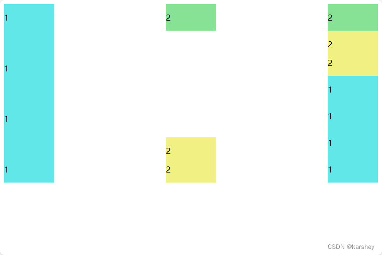
可以把这段css放到一个新的类里,命名为alignHeight,在任何想要实现此效果的div中加入此类。
修改后的代码:
<!DOCTYPE html>
<html lang="en">

<head>
    <meta charset="UTF-8">
    <meta name="viewport" content="width=device-width, initial-scale=1.0">
    <title>Document</title>
    <style>
        .container {


            display: flex;
            justify-content: space-between;
            align-items: stretch;
        }

        .alignHeight {


            display: flex;
            flex-direction: column;
            justify-content: space-between;
        }

        .item {


            width: 100px;

        }

        .aqua {


            background-color: rgb(97, 231, 231);

        }

        .green {


            background-color: rgb(135, 226, 150);
        }

        .yellow {


            background-color: rgb(240, 240, 131);
        }
    </style>
</head>

<body>
    <div class="container">
        <div class="item aqua alignHeight">
            <p>1</p>
            <p>1</p>
            <p>1</p>
            <p>1</p>
        </div>
        <div class="item alignHeight">
            <div class="item1 green">
                <p>2</p>
            </div>
            <div class="item1 yellow">
                <p>2</p>
                <p>2</p>
            </div>
        </div>
        <div class="item alignHeight">
            <div class="item1 green">
                <p>2</p>
            </div>
            <div class="item1 yellow">
                <p>2</p>
                <p>2</p>
            </div>
            <div class="item aqua">
                <p>1</p>
                <p>1</p>
                <p>1</p>
                <p>1</p>
            </div>
        </div>
    </div>
</body>

</html>