大家好,今天给大家介绍一个Python数据分析项目实战,不仅包含代码,还提供分析数据集。
员工流失或是员工离开公司的比率是公司关注的一个重要问题。它不仅会导致宝贵人才的流失,还会产生成本并破坏生产力。了解员工辞职的原因对于组织制定有效的员工保留策略至关重要。

在这个数据分析项目中,我们通过分析数据集来探讨员工流失背后的因素。通过分析年龄、性别、薪资、工作角色和工作与生活平衡等各种因素,我们的目标是发现可以帮助组织改善员工保留工作的模式和见解。
通过我们的分析,我们将确定员工选择离职的原因,并为寻求增强员工保留策略的组织提供有价值的信息。通过解决这些关键因素,组织可以创造一个促进员工满意度和长期承诺的工作环境。
通过这个数据驱动的旅程,我们深入研究员工流失的复杂性,并获得见解,使组织能够减少流失并建立一支强大、积极主动的员工队伍,推动业务成功。
对于该项目,将使用 IBM 的 HR 分析数据集。
本文相关文件及代码都已上传,在公众号:Python学习与数据挖掘,后台回复【员工流失】即可获取。
推介
我们打造了《100个超强算法模型》,特点:从0到1轻松学习,原理、代码、案例应有尽有,所有的算法模型都是按照这样的节奏进行表述,所以是一套完完整整的案例库。
很多初学者是有这么一个痛点,就是案例,案例的完整性直接影响同学的兴致。因此,我整理了 100个最常见的算法模型,在你的学习路上助推一把!
如果你也想学习交流,资料获取,均可加交流群获取,添加时最好的备注方式为:来源+兴趣方向,方便找到志同道合的朋友。
方式①、添加微信号:dkl88194,备注:来自CSDN + 交流群
方式②、微信搜索公众号:Python学习与数据挖掘,后台回复:交流群
/ 01 / 数据概览
先导入必要的 Python 库和数据集开始探索性数据分析。
# 导入相关Python库
import pandas as pd
import numpy as np
import matplotlib.pyplot as plt
import seaborn as sns
import hvplot.pandas
import plotly.express as px

import warnings
import plotly.graph_objects as go
import scipy
from scipy.stats import chi2_contingency
from plotly.subplots import make_subplots
from plotly.offline import init_notebook_mode
from statistics import stdev
from pprint import pprint
from sklearn.model_selection import train_test_split
from sklearn.preprocessing import RobustScaler, StandardScaler
from sklearn.model_selection import RandomizedSearchCV
from sklearn.ensemble import RandomForestClassifier
from sklearn.metrics import accuracy_score, roc_auc_score
warnings.filterwarnings("ignore")
import plotly.figure_factory as ff

# 读取数据
df = pd.read_csv("WA_Fn-UseC_-HR-Employee-Attrition.csv")
在我们进行深度可视化之前,我们想要确保我们的数据看起来如何?这将更好地帮助我们更好地掌握在整个项目后期应该如何处理数据。查看数据集的前 5 行。
df.head(5)

在此数据中,我们有 35 列。在上图中,我们刚刚打印了数据集的前五行。
以下是数据集需要考虑的一些关键问题:
- 列和行:数据集中有多少列和行?
- 缺失数据:数据集中是否存在缺失值?
- 数据类型:在此数据集中使用的数据有哪些不同类型?
- 数据分布:数据分布是右偏、左偏还是对称?了解分布对于统计分析和建模很有用。
- 数据含义:数据代表什么?在此数据集中,许多变量都是有序的,表示有序的分类尺度。例如,工作满意度范围从 1(低)到 4(非常高)。
- 标签:数据集中的输出或标签变量是什么?
通过解决这些问题,可以简要了解我们的数据集、其特征以及它可以提供的见解。

print(df.info())
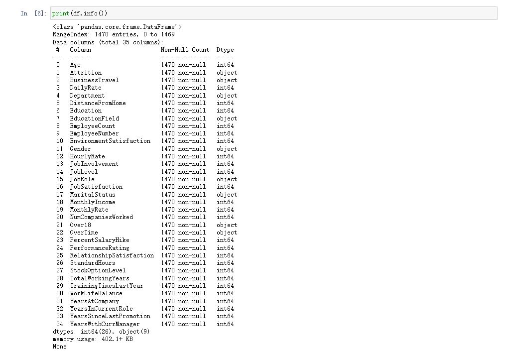
数据集由 1470 个观测值(行)和 35 个特征(变量)组成。幸运的是,数据集中没有缺失值,这简化了我们的分析过程。数据集中的数据类型包括字符串和整数,明确区分了两者。
我们分析的主要焦点是“流失(Attrition)”标签,因为我们的目标是了解员工离开组织背后的原因。值得注意的是,数据集是不平衡的,大约 84% 的案例代表没有离职的员工,16% 代表确实离职的员工。这表明员工留在组织的情况比离开组织的情况要多。
有了这些详细信息,我们就可以对数据集进行全面分析,探索导致员工流失的因素,并了解组织内员工保留的动态。
/ 02 / 年龄概览
需要考虑的几个问题:
- 年轻员工和年长员工的流失率是否存在差异?
- 不同年龄组的流失模式是否存在基于性别的差异?
- 流失率与年龄的趋势如何?他们之间有关系吗?
age_att=df.groupby(['Age','Attrition']).apply(lambda x:x['DailyRate'].count()).reset_index(name='Counts')
px.line(age_att,x='Age',y='Counts',color='Attrition',title='Age Overview')
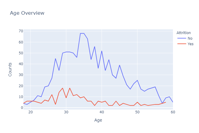
上图显示,人员流失率最高的年龄段是 28-32 岁,这表明随着年龄的增长,个人希望保持工作角色的稳定性。
相反,员工在较年轻的年龄(特别是 18 至 20 岁之间)离开组织的可能性也有所增加,因为他们正在探索不同的机会。
随着年龄的增长,流失率逐渐下降,直到21岁左右达到平衡点。35岁以后,流失率逐渐减少。
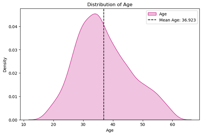
plt.figure(figsize=(8,5))
sns.kdeplot(x=df['Age'],color='MediumVioletRed',shade=True,label='Age')
plt.axvline(x=df['Age'].mean(),color='k',linestyle ="--",label='Mean Age: 36.923')
plt.legend()
plt.title('Distribution of Age')
plt.show()
fig, axes = plt.subplots(1, 2, sharex=True, figsize=(15,5))
fig.suptitle('Attrition Age Distribution by Gender')
sns.kdeplot(ax=axes[0],x=df[(df['Gender']=='Male')&(df['Attrition']=='Yes')]['Age'], color='r', shade=True, label='Yes')
sns.kdeplot(ax=axes[0],x=df[(df['Gender']=='Male')&(df['Attrition']=='No')]['Age'], color='#01CFFB', shade=True, label='No')
axes[0].set_title('Male')
axes[0].legend(title='Attrition')
sns.kdeplot(ax=axes[1],x=df[(df['Gender']=='Female')&(df['Attrition']=='Yes')]['Age'], color='r', shade=True, label='Yes')
sns.kdeplot(ax=axes[1],x=df[(df['Gender']=='Female')&(df['Attrition']=='No')]['Age'], color='#01CFFB', shade=True, label='No')
axes[1].set_title('Female')
axes[1].legend(title='Attrition')
plt.show()

- 流失率和年龄:分析显示,年轻员工和年长员工的流失率存在显着差异。最高的离职率出现在 28-32 岁的年龄范围内,这表明随着年龄的增长,个人对工作稳定性的渴望。相反,随着员工探索不同的机会,年轻员工(18-20 岁)离开组织的可能性会增加。随着年龄的增长,员工流失率逐渐下降,直到21岁左右达到平衡点。35岁之后,员工流失率进一步下降,表明老年员工的工作保留率更高。
- 基于性别的差异:分析还揭示了流失模式中基于性别的差异。从分布图可以明显看出,与女性员工相比,男性员工的流失率更高。进一步探索按性别划分的不同年龄组的流失模式,可以深入了解影响特定人口统计数据中流失的因素。
/ 03 / 性别概览
下面是几点需要考虑的问题。
- 男性员工和女性员工各有多少人?
- 女性和男性的流失率是否不同?
- 男性和女性组的工资中位数是多少?
- 在公司的总工作年限和性别之间有关系吗?
在本节中,我们将尝试看看组织中的男性和女性之间是否存在差异。此外,我们还将查看其他基本信息,例如年龄、工作满意度水平和按性别划分的平均工资。
att1=df.groupby(['Gender'],as_index=False)['Age'].count()
att1.rename(columns={

    'Age':'Count'},inplace=True)
fig = make_subplots(rows=1, cols=2, specs=[[{

    "type": "pie"},{

    "type": "pie"}]],subplot_titles=('',''))
fig.add_trace(go.Pie(values=att1['Count'],labels=['Female','Male'],hole=0.7,marker_colors=['Red','Blue']),row=1,col=1)
fig.add_layout_image(
    dict(
        source="https://encrypted-tbn0.gstatic.com/images?q=tbn:ANd9GcT8aOWxpkvZGU2EzQ0_USzl6PhuWLi_36xptjeWVXvSqQ2a13MNAjCWyBnhMlkr_ZbFACk&usqp=CAU",
        xref="paper",
        yref="paper",
        x=0.94, y=0.272,
        sizex=0.35, sizey=1,
        xanchor="right", yanchor="bottom", sizing= "contain",
    )
)
fig.update_traces(textposition='outside', textinfo='percent+label')
fig.update_layout(title_x=0.5,template='simple_white',showlegend=True,legend_title_text="<b>Gender",title_text='<b style="color:black; font-size:120%;">Gender Overview',font_family="Times New Roman",title_font_family="Times New Roman")
fig.update_traces(marker=dict(line=dict(color='#000000', width=1.2)))
fig.update_layout(title_x=0.5,legend=dict(orientation='v',yanchor='bottom',y=1.02,xanchor='right',x=1))
fig.add_annotation(x=0.715,
                   y=0.18,
                   text='<b style="font-size:1.2vw" >Male</b><br><br><b style="color:DeepSkyBlue; font-size:2vw">882</b>',
                   showarrow=False,
                   xref="paper",
                   yref="paper",
                  )
fig.add_annotation(x=0.89,
                   y=0.18,
                   text='<b style="font-size:1.2vw" >Female</b><br><br><b style="color:MediumVioletRed; font-size:2vw">588</b>',
                   showarrow=False,
                   xref="paper",
                   yref="paper",
                  )
fig.show()

att1=df.groupby('Attrition',as_index=False)['Age'].count()
att1['Count']=att1['Age']
att1.drop('Age',axis=1,inplace=True)
att2=df.groupby(['Gender','Attrition'],as_index=False)['Age'].count()
att2['Count']=att2['Age']
att2.drop('Age',axis=1,inplace=True)
fig=go.Figure()
fig=make_subplots(rows=1,cols=3)
fig = make_subplots(rows=1, cols=3, specs=[[{

    "type": "pie"}, {

    "type": "pie"}, {

    "type": "pie"}]],subplot_titles=('<b>Employee Attrition', '<b>Female Attrition','<b>Male Attrition'))


fig.add_trace(go.Pie(values=att1['Count'],labels=att1['Attrition'],hole=0.7,marker_colors=['DeepSkyBlue','LightCoral'],name='Employee Attrition',showlegend=False),row=1,col=1)
fig.add_trace(go.Pie(values=att2[(att2['Gender']=='Female')]['Count'],labels=att2[(att2['Gender']=='Female')]['Attrition'],hole=0.7,marker_colors=['DeepSkyBlue','LightCoral'],name='Female Attrition',showlegend=False),row=1,col=2)
fig.add_trace(go.Pie(values=att2[(att2['Gender']=='Male')]['Count'],labels=att2[(att2['Gender']=='Male')]['Attrition'],hole=0.7,marker_colors=['DeepSkyBlue','LightCoral'],name='Male Attrition',showlegend=True),row=1,col=3)
fig.update_layout(title_x=0,template='simple_white',showlegend=True,legend_title_text="<b style=\"font-size:90%;\">Attrition",title_text='<b style="color:black; font-size:120%;"></b>',font_family="Times New Roman",title_font_family="Times New Roman")
fig.update_traces(marker=dict(line=dict(color='#000000', width=1)))

在这个公司里,员工流失率为16%。
与女性员工相比,男性员工的流失率最高。
男性员工的流失率为 17%,女性员工的流失率为 14.8%。
fig=px.box(df,x='Gender',y='MonthlyIncome',color='Attrition',template='simple_white',color_discrete_sequence=['LightCoral','DeepSkyBlue'])
fig=fig.update_xaxes(visible=True)
fig=fig.update_yaxes(visible=True)
fig=fig.update_layout(title_x=0.5,template='simple_white',showlegend=True,title_text='<b style="color:black; font-size:105%;">Employee Attrition based on Monthly Income</b>',font_family="Times New Roman",title_font_family="Times New Roman")
fig.show()

工资较低的员工流失率较高。
fig=px.box(df,x='Gender',y='TotalWorkingYears',color='Attrition',template='simple_white',color_discrete_sequence=['LightCoral','DeepSkyBlue'])
fig=fig.update_xaxes(visible=True)
fig=fig.update_yaxes(visible=True)
fig=fig.update_layout(title_x=0.5,template='simple_white',showlegend=True,title_text='<b style="color:black; font-size:105%;">Employee Attrition based on Total working Years</b>',font_family="Times New Roman",title_font_family="Times New Roman")
fig.show()
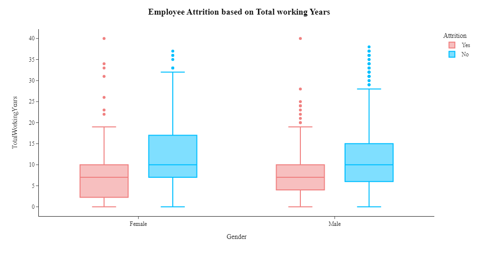
从上面的箱线图我们可以看出,女性往往在公司呆的时间更长。工龄19年的男女员工已离职。
fig, axes = plt.subplots(1, 2, sharex=True, figsize=(15,5))
fig.suptitle('Attrition Salary Distribution by Gender')
sns.kdeplot(ax=axes[0],x=df[(df['Gender']=='Male')&(df['Attrition']=='Yes')]['MonthlyIncome'], color='r', shade=True, label='Yes')
sns.kdeplot(ax=axes[0],x=df[(df['Gender']=='Male')&(df['Attrition']=='No')]['MonthlyIncome'], color='#00BFFF', shade=True, label='No')
axes[0].set_title('Male')
axes[0].legend(title='Attrition')
sns.kdeplot(ax=axes[1],x=df[(df['Gender']=='Female')&(df['Attrition']=='Yes')]['MonthlyIncome'], color='r', shade=True, label='Yes')
sns.kdeplot(ax=axes[1],x=df[(df['Gender']=='Female')&(df['Attrition']=='No')]['MonthlyIncome'], color='#00BFFF', shade=True, label='No')
axes[1].set_title('Female')
axes[1].legend(title='Attrition')
plt.show()

- 男性和女性员工数量:确定公司中男性和女性员工的数量有助于了解劳动力的性别构成。我们有 882 名男性和 588 名女性
- 按性别划分的离职率:分析显示,男性和女性员工的离职率存在差异。男性员工的离职率较高,男性员工离职率为 17%,而女性员工的离职率略低,为 14.8%。这表明性别可能在员工流失中发挥作用。
- 按性别划分的工资中位数:检查男性和女性员工的工资中位数可以深入了解影响员工流失的任何潜在的与工资相关的因素。据观察,中位工资为2,886的女性员工已经离开公司,而中位工资为3,400的男性员工也出现了流失。这表明工资较低的员工更有可能离开组织。
- 总工作年限与性别之间的关系:箱线图分析表明在公司的总工作年限与性别之间存在潜在关系。与男性相比,女性在公司工作的时间往往更长。值得注意的是,工龄19年的男性和女性员工均已离开公司,这表明员工留任的潜在门槛或转折点。
/ 04 / 其它因素
1. 婚姻状况是一个影响因素吗?
att1=df.groupby('Attrition',as_index=False)['Age'].count()
att1['Count']=att1['Age']
att1.drop('Age',axis=1,inplace=True)
att2=df.groupby(['MaritalStatus','Attrition'],as_index=False)['Age'].count()
att2['Count']=att2['Age']
att2.drop('Age',axis=1,inplace=True)
fig=go.Figure()
fig=make_subplots(rows=1,cols=4)
fig = make_subplots(rows=1, cols=4, specs=[[{

    "type": "pie"}, {

    "type": "pie"}, {

    "type": "pie"},{

    "type": "pie"} ]],subplot_titles=('<b>Employee Attrition', '<b>Married Attrition','<b>Single Attrition','<b>Divorced Attrition'))


fig.add_trace(go.Pie(values=att1['Count'],labels=att1['Attrition'],hole=0.7,marker_colors=['DeepSkyBlue','LightCoral'],name='Employee Attrition',showlegend=False),row=1,col=1)
fig.add_trace(go.Pie(values=att2[(att2['MaritalStatus']=='Married')]['Count'],labels=att2[(att2['MaritalStatus']=='Married')]['Attrition'],hole=0.7,marker_colors=['DeepSkyBlue','LightCoral'],name='Married Attrition',showlegend=False),row=1,col=2)
fig.add_trace(go.Pie(values=att2[(att2['MaritalStatus']=='Single')]['Count'],labels=att2[(att2['MaritalStatus']=='Single')]['Attrition'],hole=0.7,marker_colors=['DeepSkyBlue','LightCoral'],name='Single Attrition',showlegend=True),row=1,col=3)
fig.add_trace(go.Pie(values=att2[(att2['MaritalStatus']=='Divorced')]['Count'],labels=att2[(att2['MaritalStatus']=='Divorced')]['Attrition'],hole=0.7,marker_colors=['DeepSkyBlue','LightCoral'],name='Divorced Attrition',showlegend=True),row=1,col=4)
fig.update_layout(title_x=0,template='simple_white',showlegend=True,legend_title_text="<b style=\"font-size:90%;\">Attrition",title_text='<b style="color:black; font-size:120%;"></b>',font_family="Times New Roman",title_font_family="Times New Roman")
fig.update_traces(marker=dict(line=dict(color='#000000', width=1)))
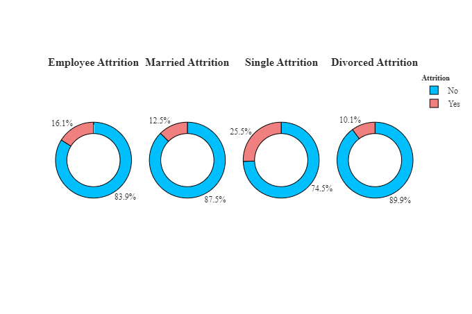
与已婚和离婚的人相比,单身人士的流失率更高。离婚者的流失率较低。
2. 收入是员工流失的主要因素吗?
rate_att=df.groupby(['MonthlyIncome','Attrition']).apply(lambda x:x['MonthlyIncome'].count()).reset_index(name='Counts')
rate_att['MonthlyIncome']=round(rate_att['MonthlyIncome'],-3)
rate_att=rate_att.groupby(['MonthlyIncome','Attrition']).apply(lambda x:x['MonthlyIncome'].count()).reset_index(name='Counts')
fig=px.line(rate_att,x='MonthlyIncome',y='Counts',color='Attrition',title='Monthly Income basis counts of People in an Organization')
fig.show()
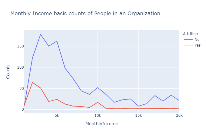
如上图所示,在收入水平非常低(每月不到 5,000 人)的情况下,自然流失率显然很高。
这一数字进一步下降,但在 10k 左右出现了小幅峰值,表明中产阶级的生活水平。
他们倾向于追求更好的生活水平,因此转向不同的工作。
当月收入相当不错时,员工离开组织的可能性很低——如平线所示。
plt.figure(figsize=(8,5))
sns.kdeplot(x=df['MonthlyIncome'],color='MediumVioletRed',shade=True,label='Monthly Income')
plt.axvline(x=df['MonthlyIncome'].mean(),color='k',linestyle ="--",label='Average: 6502.93')
plt.xlabel('Monthly Income')
plt.legend()
plt.title('Distribution of Monthly Income')
plt.show()

plot_df = data.groupby(['Department', 'Attrition', 'Gender'])['MonthlyIncome'].median()
plot_df = plot_df.mul(12).rename('Salary').reset_index().sort_values('Salary', ascending=False).sort_values('Gender')
fig = px.bar(plot_df, x='Department', y='Salary', color='Gender', text='Salary',
             barmode='group', opacity=0.75, color_discrete_map={

    'Female': '#ACBCE3','Male': '#ACBCA3'},
             facet_col='Attrition', category_orders={

    'Attrition': ['Yes', 'No']})
fig.update_traces(texttemplate='$%{text:,.0f}', textposition='outside',
                  marker_line=dict(width=1, color='#28221F'))
fig.update_yaxes(zeroline=True, zerolinewidth=1, zerolinecolor='#28221F')
fig.update_layout(title_text='Median Salaries by Department', font_color='#28221F',
                  yaxis=dict(title='Salary',tickprefix='$',range=(0,79900)),width=950,height=500,
                  paper_bgcolor='#F4F2F0', plot_bgcolor='#F4F2F1')
fig.show()

plot_df = data.copy()
plot_df['JobLevel'] = pd.Categorical(
    plot_df['JobLevel']).rename_categories(
    ['Entry level', 'Mid level', 'Senior', 'Lead', 'Executive'])
col=['#73AF8E', '#4F909B', '#707BAD', '#A89DB7','#C99193']
fig = px.scatter(plot_df, x='TotalWorkingYears', y='MonthlyIncome',
                 color='JobLevel', size='MonthlyIncome',
                 color_discrete_sequence=col,
                 category_orders={

    'JobLevel': ['Entry level', 'Mid level', 'Senior', 'Lead', 'Executive']})
fig =fig.update_layout(legend=dict(orientation="h", yanchor="bottom", y=1.02, xanchor="right", x=1),
                       title='Correlation between Monthly income and total number of years worked and job level <br>',
                       xaxis_title='Total Working Years', yaxis=dict(title='Income',tickprefix='$'),
                       legend_title='', font_color='#28221D',
                       margin=dict(l=40, r=30, b=80, t=120),paper_bgcolor='#F4F2F0', plot_bgcolor='#F4F2F0')
fig.show()
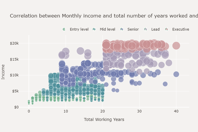
根据上面的散点图,月收入与总工作年限呈正相关,并且员工的收入与其工作级别之间存在很强的相关性。
3. 工作部门会影响人员流失吗?
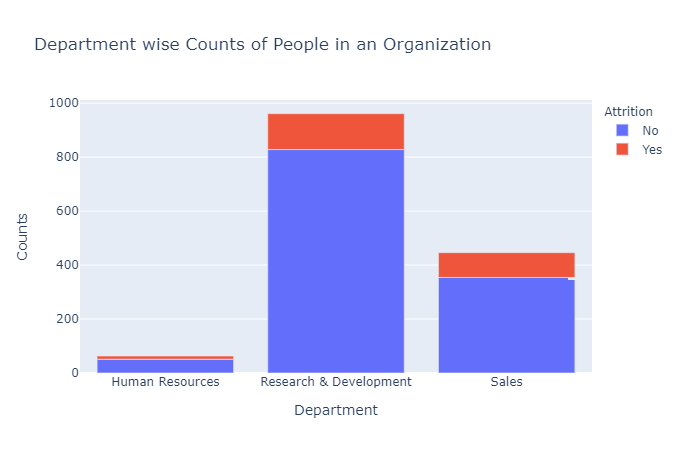
dept_att=df.groupby(['Department','Attrition']).apply(lambda x:x['DailyRate'].count()).reset_index(name='Counts')
fig=px.bar(dept_att,x='Department',y='Counts',color='Attrition',title='Department wise Counts of People in an Organization')
fig.show()
k=df.groupby(['Department','Attrition'],as_index=False)['Age'].count()
k.rename(columns={

    'Age':'Count'},inplace=True)
fig=go.Figure()
fig=make_subplots(rows=1,cols=3)
fig = make_subplots(rows=1, cols=3, specs=[[{

    "type": "pie"}, {

    "type": "pie"}, {

    "type": "pie"}]],subplot_titles=('Human Resources', 'Research & Development','Sales'))

fig =fig.add_trace(go.Pie(values=k[k['Department']=='Human Resources']['Count'],labels=k[k['Department']=='Human Resources']['Attrition'],hole=0.7,marker_colors=['DeepSkyBlue','LightCoral'],name='Human Resources',showlegend=False),row=1,col=1)
fig =fig.add_trace(go.Pie(values=k[k['Department']=='Research & Development']['Count'],labels=k[k['Department']=='Research & Development']['Attrition'],hole=0.7,marker_colors=['DeepSkyBlue','LightCoral'],name='Research & Development',showlegend=False),row=1,col=2)
fig =fig.add_trace(go.Pie(values=k[k['Department']=='Sales']['Count'],labels=k[k['Department']=='Sales']['Attrition'],hole=0.7,marker_colors=['DeepSkyBlue','LightCoral'],name='Sales',showlegend=True),row=1,col=3)

fig =fig.update_layout(title_x=0.5,template='simple_white',showlegend=True,legend_title_text="Attrition",title_text='<b style="color:black; font-size:100%;">Department wise Employee Attrition',font_family="Times New Roman",title_font_family="Times New Roman")
fig =fig.update_traces(marker=dict(line=dict(color='#000000', width=1)))
fig.show()

该数据仅包含3个主要部门,其中销售部门的流失率最高(25.84%),其次是人力资源部(19.05%)。
研究与开发部门的流失率最低,这表明该部门的稳定性和内容,如上图所示(13.83%)。
bus=df.groupby(['EducationField','Attrition'],as_index=False)['Age'].count()
bus.rename(columns={

    'Age':'Count'},inplace=True)
fig=go.Figure()
fig = make_subplots(rows=2, cols=3, specs=[[{

    "type": "pie"}, {

    "type": "pie"}, {

    "type": "pie"}],[{

    "type": "pie"}, {

    "type": "pie"}, {

    "type": "pie"}]],subplot_titles=('Life Sciences', 'Medical','Marketing','Technical Degree','Human Resources','Other'))

fig.add_trace(go.Pie(values=bus[bus['EducationField']=='Life Sciences']['Count'],labels=bus[bus['EducationField']=='Life Sciences']['Attrition'],hole=0.7,marker_colors=['DeepSkyBlue','LightCoral'],name='Life Sciences',showlegend=False),row=1,col=1)
fig.add_trace(go.Pie(values=bus[bus['EducationField']=='Medical']['Count'],labels=bus[bus['EducationField']=='Medical']['Attrition'],hole=0.7,marker_colors=['DeepSkyBlue','LightCoral'],name='Medical',showlegend=False),row=1,col=2)
fig.add_trace(go.Pie(values=bus[bus['EducationField']=='Marketing']['Count'],labels=bus[bus['EducationField']=='Marketing']['Attrition'],hole=0.7,marker_colors=['DeepSkyBlue','LightCoral'],name='Marketing',showlegend=True),row=1,col=3)
fig.add_trace(go.Pie(values=bus[bus['EducationField']=='Technical Degree']['Count'],labels=bus[bus['EducationField']=='Technical Degree']['Attrition'],hole=0.7,marker_colors=['DeepSkyBlue','LightCoral'],name='Technical Degree',showlegend=False),row=2,col=1)
fig.add_trace(go.Pie(values=bus[bus['EducationField']=='Human Resources']['Count'],labels=bus[bus['EducationField']=='Human Resources']['Attrition'],hole=0.7,marker_colors=['DeepSkyBlue','LightCoral'],name='Human Resources',showlegend=False),row=2,col=2)
fig.add_trace(go.Pie(values=bus[bus['EducationField']=='Other']['Count'],labels=bus[bus['EducationField']=='Other']['Attrition'],hole=0.7,marker_colors=['DeepSkyBlue','LightCoral'],name='Other',showlegend=False),row=2,col=3)

fig.update_layout(title_x=0.5,template='simple_white',showlegend=True,legend_title_text="Attrition",title_text='<b style="color:black; font-size:100%;">Employee Attrition based on Education Feild',font_family="Times New Roman",title_font_family="Times New Roman")
fig.update_traces(marker=dict(line=dict(color='#000000', width=1)))
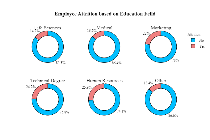
人力资源、营销和技术学位教育领域的员工流失率最高。
医疗、生命科学领域教育的员工流失率较低。
k=df.groupby(['JobRole','Attrition'],as_index=False)['Age'].count()
a=k[k['Attrition']=='Yes']
b=k[k['Attrition']=='No']
a['Age']=a['Age'].apply(lambda x: -x)
k=pd.concat([a,b],ignore_index=True)
k['Count']=k['Age']
k.rename(columns={

    'JobRole':'Job Role'},inplace=True)
fig=px.bar(k,x='Job Role',y='Count',color='Attrition',template='simple_white',text='Count',color_discrete_sequence=['LightCoral','DeepSkyBlue'])
fig=fig.update_yaxes(range=[-200,300])
fig=fig.update_traces(marker=dict(line=dict(color='#000000', width=1)),textposition = "outside")
fig=fig.update_xaxes(visible=True)
fig=fig.update_yaxes(visible=True)
fig=fig.update_layout(title_x=0.5,template='simple_white',showlegend=True,title_text='<b style="color:black; font-size:105%;">Employee Attrition based on Job Roles</b>',font_family="Times New Roman",title_font_family="Times New Roman")
fig.show()

大多数员工的职位是销售主管、研究科学家和实验室技术员。
流失率最高的员工职位是销售主管、销售代表、实验室技术员和研究科学家。
员工流失最少的职位是研究总监、经理和医疗保健代表。
4. 环境满意度如何影响员工流失?
sats_att=df.groupby(['JobSatisfaction','Attrition']).apply(lambda x:x['DailyRate'].count()).reset_index(name='Counts')
fig = px.area(sats_att,x='JobSatisfaction',y='Counts',color='Attrition',title='Job Satisfaction level Counts of People in an Organization')
fig.show()
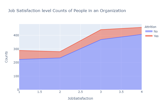
上图表明,较高的工作满意度与较低的员工流失率相关。
此外,在环境满意度为 1-2 的范围内,人员流失会减少,但从 2-3 开始增加,表明个人可能会为了更好的机会而离开。
5. 公司为员工提供的股票会影响员工流失吗?
stock_att=df.groupby(['StockOptionLevel','Attrition']).apply(lambda x:x['DailyRate'].count()).reset_index(name='Counts')
fig = px.bar(stock_att,x='StockOptionLevel',y='Counts',color='Attrition',title='Stock facilities level wise People in an Organization')
fig.show()
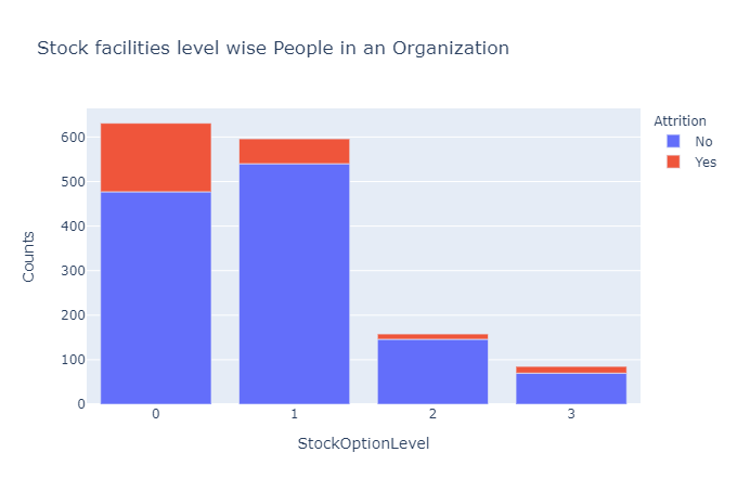
较少的股票期权大大增加了员工离开组织的可能性。
股票的可用性对于员工在公司工作几年来说是一种巨大的经济激励。
但是拥有少量的股票期权或没有股票期权的个人会更容易离开组织,因为他们没有将他们与公司联系在一起的相同经济激励。
6. 工作经验如何影响员工流失?
ncwrd_att=df.groupby(['NumCompaniesWorked','Attrition']).apply(lambda x:x['DailyRate'].count()).reset_index(name='Counts')
fig = px.area(ncwrd_att,x='NumCompaniesWorked',y='Counts',color='Attrition',title='Work Experience Distribution: Analyzing the Level of Work Experience in an Organization')
fig.show()
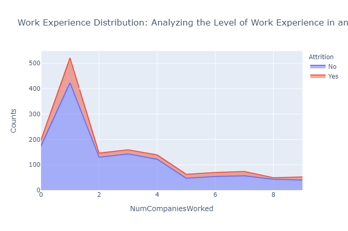
上图清楚地表明,在公司开始职业生涯或在职业生涯早期加入的员工更有可能离开到另一个组织。
相反,在多家公司获得丰富工作经验的个人往往表现出更高的忠诚度,并且更有可能留在他们加入的公司。
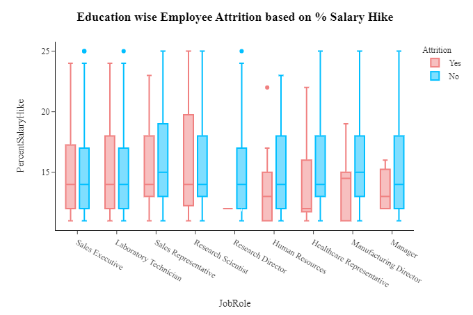
7. 加薪百分比会影响流失吗?
hike_att=df.groupby(['PercentSalaryHike','Attrition']).apply(lambda x:x['DailyRate'].count()).reset_index(name='Counts')
px.line(hike_att,x='PercentSalaryHike',y='Counts',color='Attrition',title='Distribution of Hike Percentage')

更高的加薪会激励人们更好地工作并留在组织中。
因此,我们看到员工离开加薪较低的组织的比例,远远高于加薪良好的公司。
fig=px.box(df,x='JobRole',y='PercentSalaryHike',color='Attrition',color_discrete_sequence=['LightCoral','DeepSkyBlue'],template='simple_white')
fig.update_xaxes(visible=True)
fig.update_yaxes(visible=True)
fig.update_layout(title_x=0.5,template='simple_white',showlegend=True,title_text='<b style="color:black; font-size:105%;">Education wise Employee Attrition based on % Salary Hike </b>',font_family="Times New Roman",title_font_family="Times New Roman")
fig.show()
8. 管理者是人们辞职的原因吗?
man_att=df.groupby(['YearsWithCurrManager','Attrition']).apply(lambda x:x['DailyRate'].count()).reset_index(name='Counts')
px.line(man_att,x='YearsWithCurrManager',y='Counts',color='Attrition',title='Count of people spending years with a Manager in an Organization')
当我们分析员工与其经理的关系时,我们注意到流失率出现了 3 个主要峰值。
一开始,考虑到他们与前任经理的关系,与经理相处的时间相对较少,人们往往会离职。
平均两年,当员工觉得自己需要改进时,他们也往往会寻求改变。
当与经理相处的时间稍长(大约 7 年)时,人们往往会发现自己的职业发展停滞不前,并倾向于寻求改变。
但当与经理相处的相对时间非常多时,人们就会对他们的工作感到满意。因此,员工辞职的可能性非常低。
/ 05 / 总结
接下来是关于本次数据分析项目的一些建议。
- 解决员工流失的性别差异:调查并解决导致男性员工流失率较高的因素。
- 聚焦薪酬:深入分析薪酬结构,确保竞争力。
- 增强工作与生活的平衡:通过灵活的时间表和员工支持计划优先考虑工作与生活的平衡。
- 加强经理与员工的关系:投资建立牢固的关系并提供管理培训。
- 提供成长和发展机会:提供培训、指导和明确的职业发展路径。
- 评估和提高工作满意度:定期评估满意度并解决问题。
- 审查并优化薪酬和福利:确保提供有竞争力的薪酬和有吸引力的激励措施。
- 专注于留住销售和人力资源员工:实施针对这些部门的留住策略。