1. 简介
Flexbox-layout,是Google推出的流式布局。具体的基本介绍可以参考Github上的Wiki。看一下类的英文说明:
/**
 * A layout that arranges its children in a way its attributes can be specified like the
 * CSS Flexible Box Layout Module.
 * This class extends the {@link ViewGroup} like other layout classes such as {@link LinearLayout}
 * or {@link RelativeLayout}, the attributes can be specified from a layout XML or from code.
 *
 * The supported attributes that you can use are:
 * <ul>
 * <li>{@code flexDirection}</li>
 * <li>{@code flexWrap}</li>
 * <li>{@code justifyContent}</li>
 * <li>{@code alignItems}</li>
 * <li>{@code alignContent}</li>
 * <li>{@code showDivider}</li>
 * <li>{@code showDividerHorizontal}</li>
 * <li>{@code showDividerVertical}</li>
 * <li>{@code dividerDrawable}</li>
 * <li>{@code dividerDrawableHorizontal}</li>
 * <li>{@code dividerDrawableVertical}</li>
 * </ul>
 * for the FlexboxLayout.
 *
 * And for the children of the FlexboxLayout, you can use:
 * <ul>
 * <li>{@code layout_order}</li>
 * <li>{@code layout_flexGrow}</li>
 * <li>{@code layout_flexShrink}</li>
 * <li>{@code layout_flexBasisPercent}</li>
 * <li>{@code layout_alignSelf}</li>
 * <li>{@code layout_minWidth}</li>
 * <li>{@code layout_minHeight}</li>
 * <li>{@code layout_maxWidth}</li>
 * <li>{@code layout_maxHeight}</li>
 * <li>{@code layout_wrapBefore}</li>
 * </ul>
 */
应该很容易看懂,主要是提供类似于CSS中Flexible Box Layout的能力。
2. 属性值
针对FlexboxLayout
| 属性 |
|---|
| flexDirection |
| flexWrap |
| justifyContent |
| alignItems |
| alignContent |
| showDivider |
| showDividerHorizontal |
| showDividerVertical |
| dividerDrawable |
| dividerDrawableHorizontal |
| dividerDrawableVertical |
针对FlexboxLayout中的子元素
| 属性 |
|---|
| layout_order |
| layout_flexGrow |
| layout_flexShrink |
| layout_flexBasisPercent |
| layout_alignSelf |
| layout_minWidth |
| layout_minHeight |
| layout_maxWidth |
| layout_maxHeight |
| layout_wrapBefore |
3. FlexboxLayout属性自测
3.1 flexDirection
flexDirection属性支持row , row_reverse , column , column_reverse 四个取值。分别代表左右,右左,上下,下上。
| flexDIrection | 效果图 |
|---|---|
| row | 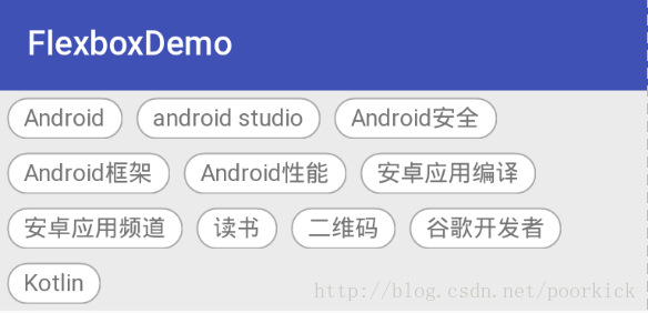 |
| row_reverse |  |
| column |  |
| column_reverse |  |
3.2 flexWrap
flexWrap, 表示换行与否,支持wrap , nowrap , wrap_reverse。默认为noWrap,表示不换行,wrap表示自动换行,还有一个wrap_reverse 表示副轴反转。
以flexDirection为row时为例
| flexWrap | |
|---|---|
| wrap | |
| nowrap |  |
| wrap_reverse |  |
3.3 justifyContent
justifyContent,表示控件沿主轴对齐方向。支持flex_start , flex_end , center , space_between , space_around五种取值。
下面以flexDirection为row , flexWrap为wrap为例,注意比较效果之间的差异,就可以很直观的了解到每个属性值的作用。
| justifyContent | 效果图 |
|---|---|
| flex_start | |
| flex_end |  |
| center |  |
| space_between |  |
| space_around |  |
3.4 alignItems
alignItems , 描述元素在副轴上的对齐方向(针对单行) , 支持flex_start , flex_end , center , baseline , stretch五种取值。
以flexDirection为row , flexWrap为nowrap为例,注意比较不同属性之间的效果差异。由于上面示例中我们针对flexboxlayout的高度使用的时wrap_content , 下面这个示例中我们给flexboxlayout一个合适的固定高度活着改成match_parent更容易看出效果
| alignItems | 效果图 |
|---|---|
| flex_start |  |
| flex_end |  |
| center |  |
| baseline |  |
| stretch |  |
3.5 alignContent
alignContent , 表示控件在副轴上的对齐方向(针对多行元素)。支持flex_start , flex_end , center , space_between , space_around , stretch六种取值
flexboxlayout改成match_parent , 以flexDirection为row , flexWrap为wrap为例, 看看效果
| alignContent | 效果图 |
|---|---|
| flex_start | 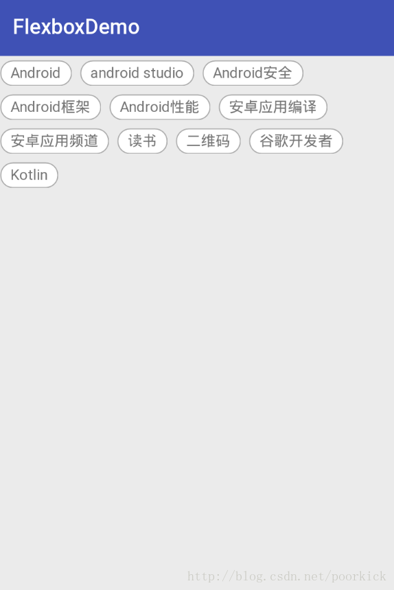 |
| flex_end | 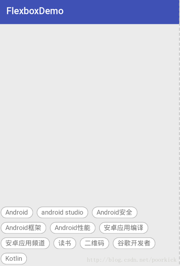 |
| center | 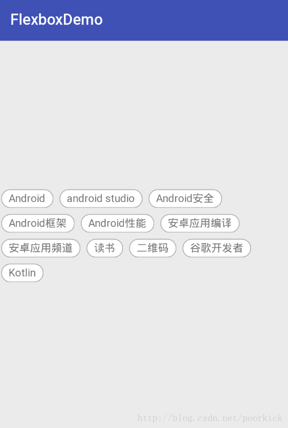 |
| space_between | 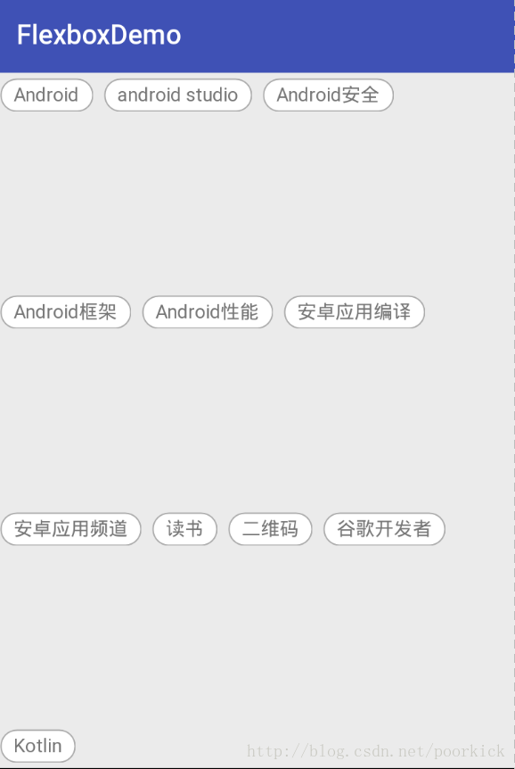 |
| space_around | 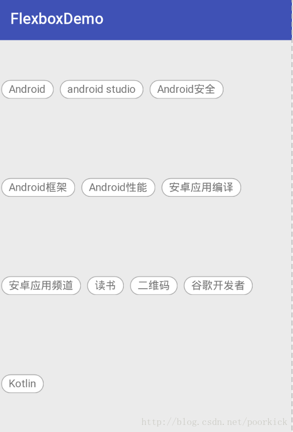 |
| stretch | 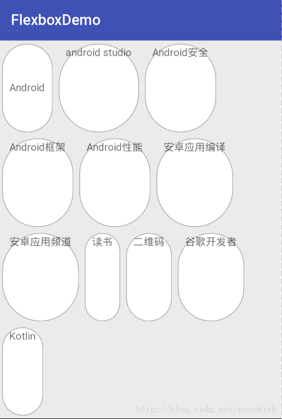 |
3.6 showDivider and dividerDrawable
showDivider , 显示分割线。支持none , beginning , middle , end 四种取值
绘制一条分割线,然后flexDirection为row , flexWrap为wrap,dividerDrawable为@drawable/divider为例,看看效果
<?xml version="1.0" encoding="utf-8"?>
<shape xmlns:android="http://schemas.android.com/apk/res/android">
    <solid android:color="@color/colorAccent"></solid>
    <size android:width="2dp"/>
</shape>| showDivider | 效果图 |
|---|---|
| none | |
| beginning | 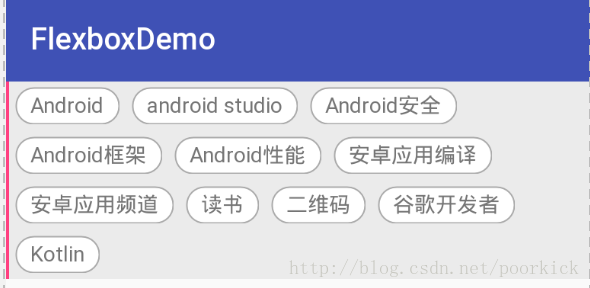 |
| middle | 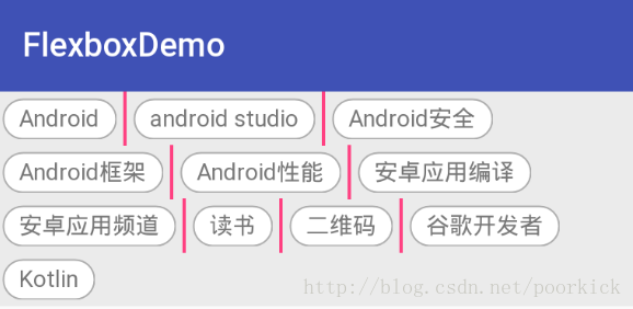 |
| end | 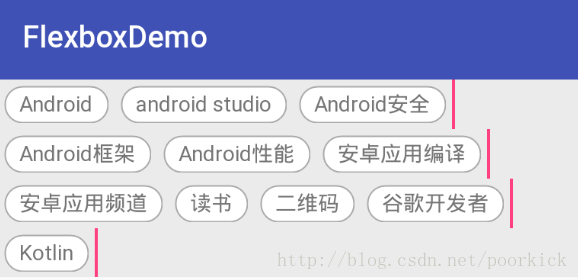 |
3.7 showDividerHorizontal and dividerDrawableHorizontal
横向分割线,支持none , beginning , middle , end 四种取值,四种取值和上面的使用差不多,我们只举一个例子
分割线
<?xml version="1.0" encoding="utf-8"?>
<shape xmlns:android="http://schemas.android.com/apk/res/android">
    <solid android:color="@color/colorAccent"></solid>
    <size  android:height="2dp"/>
</shape>
布局文件
<?xml version="1.0" encoding="utf-8"?>
<RelativeLayout xmlns:android="http://schemas.android.com/apk/res/android"
    xmlns:app="http://schemas.android.com/apk/res-auto"
    android:layout_width="match_parent"
    android:layout_height="match_parent">

    <com.google.android.flexbox.FlexboxLayout
        android:layout_width="match_parent"
        android:layout_height="wrap_content"
        android:background="#EBEBEB"
        app:flexDirection="column"
        app:showDividerHorizontal="middle"
        app:dividerDrawableHorizontal="@drawable/divider"
        app:flexWrap="wrap">

        <TextView
            android:paddingLeft="10dp"
            android:paddingRight="10dp"
            android:paddingTop="4dp"
            android:paddingBottom="4dp"
            android:layout_width="wrap_content"
            android:layout_height="wrap_content"
            android:layout_margin="4dp"
            android:background="@drawable/item_bg"
            android:text="Android" />

        <TextView
            android:layout_width="wrap_content"
            android:layout_height="wrap_content"
            android:layout_margin="4dp"
            android:background="@drawable/item_bg"
            android:paddingLeft="10dp"
            android:paddingRight="10dp"
            android:paddingTop="4dp"
            android:paddingBottom="4dp"
            android:text="android studio" />

        <TextView
            android:layout_width="wrap_content"
            android:layout_height="wrap_content"
            android:layout_margin="4dp"
            android:background="@drawable/item_bg"
            android:paddingLeft="10dp"
            android:paddingRight="10dp"
            android:paddingTop="4dp"
            android:paddingBottom="4dp"
            android:text="Android安全" />

        <TextView
            android:layout_width="wrap_content"
            android:layout_height="wrap_content"
            android:layout_margin="4dp"
            android:background="@drawable/item_bg"
            android:paddingLeft="10dp"
            android:paddingRight="10dp"
            android:paddingTop="4dp"
            android:paddingBottom="4dp"
            android:text="Android框架" />
    </com.google.android.flexbox.FlexboxLayout>
</RelativeLayout>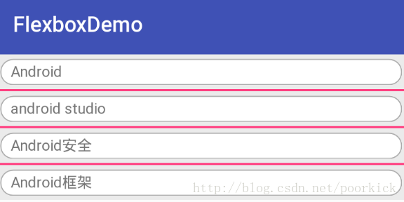
3.8 showDividerVertical and dividerDrawableVertical
和上面的用法相似,看下效果把
分割线
<?xml version="1.0" encoding="utf-8"?>
<shape xmlns:android="http://schemas.android.com/apk/res/android">
    <solid android:color="@color/colorAccent"></solid>
    <size  android:width="2dp"/>
</shape>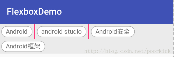
4. FlexboxLayout子元素属性自测
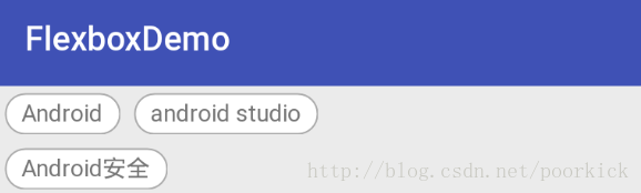
4.1 layout_order
默认情况
<?xml version="1.0" encoding="utf-8"?>
<RelativeLayout xmlns:android="http://schemas.android.com/apk/res/android"
    xmlns:app="http://schemas.android.com/apk/res-auto"
    android:layout_width="match_parent"
    android:layout_height="match_parent">

    <com.google.android.flexbox.FlexboxLayout
        android:layout_width="match_parent"
        android:layout_height="wrap_content"
        android:background="#EBEBEB"
        app:flexDirection="row"
        app:flexWrap="wrap">

        <TextView
            android:paddingLeft="10dp"
            android:paddingRight="10dp"
            android:paddingTop="4dp"
            android:paddingBottom="4dp"
            android:layout_width="wrap_content"
            android:layout_height="wrap_content"
            android:layout_margin="4dp"
            android:background="@drawable/item_bg"
            android:gravity="center"
            android:text="Android" />

        <TextView
            android:layout_width="wrap_content"
            android:layout_height="wrap_content"
            android:layout_margin="4dp"
            android:background="@drawable/item_bg"
            android:paddingLeft="10dp"
            android:paddingRight="10dp"
            android:paddingTop="4dp"
            android:paddingBottom="4dp"
            android:text="android studio" />

        <TextView
            android:layout_width="wrap_content"
            android:layout_height="wrap_content"
            android:layout_margin="4dp"
            android:background="@drawable/item_bg"
            android:paddingLeft="10dp"
            android:paddingRight="10dp"
            android:paddingTop="4dp"
            android:paddingBottom="4dp"
            android:text="Android安全" />
    </com.google.android.flexbox.FlexboxLayout>
</RelativeLayout>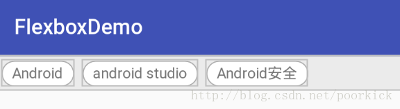
顺序排一下 2,3,1
<?xml version="1.0" encoding="utf-8"?>
<RelativeLayout xmlns:android="http://schemas.android.com/apk/res/android"
    xmlns:app="http://schemas.android.com/apk/res-auto"
    android:layout_width="match_parent"
    android:layout_height="match_parent">

    <com.google.android.flexbox.FlexboxLayout
        android:layout_width="match_parent"
        android:layout_height="wrap_content"
        android:background="#EBEBEB"
        app:flexDirection="row"
        app:flexWrap="wrap">

        <TextView
            android:paddingLeft="10dp"
            android:paddingRight="10dp"
            android:paddingTop="4dp"
            android:paddingBottom="4dp"
            app:layout_order="2"
            android:layout_width="wrap_content"
            android:layout_height="wrap_content"
            android:layout_margin="4dp"
            android:background="@drawable/item_bg"
            android:gravity="center"
            android:text="Android" />

        <TextView
            android:layout_width="wrap_content"
            android:layout_height="wrap_content"
            android:layout_margin="4dp"
            app:layout_order="3"
            android:background="@drawable/item_bg"
            android:paddingLeft="10dp"
            android:paddingRight="10dp"
            android:paddingTop="4dp"
            android:paddingBottom="4dp"
            android:text="android studio" />

        <TextView
            android:layout_width="wrap_content"
            android:layout_height="wrap_content"
            android:layout_margin="4dp"
            android:background="@drawable/item_bg"
            android:paddingLeft="10dp"
            android:paddingRight="10dp"
            app:layout_order="1"
            android:paddingTop="4dp"
            android:paddingBottom="4dp"
            android:text="Android安全" />
     </com.google.android.flexbox.FlexboxLayout>
</RelativeLayout>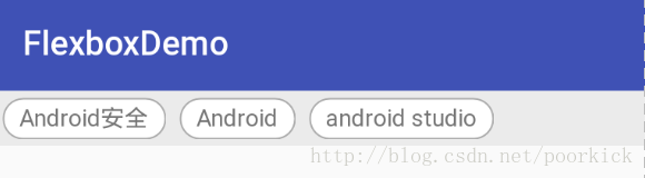
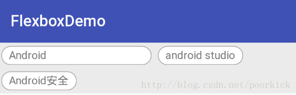
4.2 layout_flexGrow
layout_flexGrow ,子元素的放大比例, 决定如何分配剩余空间(如果存在剩余空间的话),默认值为0,不会分配剩余空间,如果某一行中有一个item的 layout_flexGrow 是一个正值,那么会将这行全部剩余空间分配给这个Item , 如果这一行有多个Item这个属性都为正值,那么剩余空间的按照layout_flexGrow定义的比例(有点像LinearLayout的layout_weight属性)进行分配
<?xml version="1.0" encoding="utf-8"?>
<RelativeLayout xmlns:android="http://schemas.android.com/apk/res/android"
    xmlns:app="http://schemas.android.com/apk/res-auto"
    android:layout_width="match_parent"
    android:layout_height="match_parent">

    <com.google.android.flexbox.FlexboxLayout
        android:layout_width="match_parent"
        android:layout_height="wrap_content"
        android:background="#EBEBEB"
        app:flexDirection="row"
        app:flexWrap="wrap">

        <TextView
            android:paddingLeft="10dp"
            android:paddingRight="10dp"
            android:paddingTop="4dp"
            android:paddingBottom="4dp"
            android:layout_width="wrap_content"
            android:layout_height="wrap_content"
            android:layout_margin="4dp"
            android:background="@drawable/item_bg"
            app:layout_flexGrow="10.0"
            android:text="Android" />

        <TextView
            android:layout_width="wrap_content"
            android:layout_height="wrap_content"
            android:layout_margin="4dp"
            android:background="@drawable/item_bg"
            android:paddingLeft="10dp"
            android:paddingRight="10dp"
            android:paddingTop="4dp"
            android:paddingBottom="4dp"
            android:text="android studio" />

        <TextView
            android:layout_width="wrap_content"
            android:layout_height="wrap_content"
            android:layout_margin="4dp"
            android:background="@drawable/item_bg"
            android:paddingLeft="10dp"
            android:paddingRight="10dp"
            android:paddingTop="4dp"
            android:paddingBottom="4dp"
            app:layout_flexGrow="10.0"
            android:text="Android安全" />
     </com.google.android.flexbox.FlexboxLayout>
</RelativeLayout>
可以看到黄色框内的两个元素(也就是第一个子元素和第三个子元素)按照1:1 的比例分配了这一行中剩余的空间。
4.3 layout_flexShrink
layout_flexShrink , 子元素缩小比例 , 与上面的属性值有点对应关系,当空间不足时,子元素需要缩小(针对单行),默认值为1,如果所有子元素的layout_flexShrink 值为1,空间不足时,都等比缩小,如果有一个为0,其他为1,空间不足时,为0的不缩小,负值无效。
这里引用Github上的一个图,看看效果

4.4 layout_alignSelf
layout_alignSelf 属性可以给子元素设置对齐方式,上面讲的alignItems属性可以设置对齐,这个属性的功能和alignItems一样,只不过alignItems作用于所有子元素,而layout_alignSelf 作用于单个子元素。默认值为auto, 表示继承alignItems属性,如果为auto以外的值,则会覆盖alignItems属性。支持auto , flex_start , flex_end , center , baseline , stretch六种取值。除了auto以外,其他和alignItems属性一样,而auto表示继承alignItems的属性,所以基本上效果相同,这里不做过多解释。
4.5 layout_flexBasisPercent
layout_flexBasisPercen , 表示设置子元素的长度为它父容器长度的百分比。这个值只有设置了父容器的长度时才有效(也就是MeasureSpec mode 是 MeasureSpec.EXACTLY)。默认值时-1。
设置第一个元素
app:layout_flexBasisPercent=”50%”
4.6 layout_minWidth / layout_minHeight
强制限制 FlexboxLayout的子元素(宽或高)不会小于最小值,不管layout_flexShrink这个属性的值为多少,子元素不会被缩小到小于设置的这个最小值。
4.7 layout_maxWidth / layout_maxHeight
这个和上面的刚好相反,强制限制FlexboxLayout子元素不会大于这个最大值, 不管layout_flexGrow的值为多少,子元素不会被放大到超过这个最大值。
4.8 layout_wrapBefore
layout_wrapBefore 属性控制强制换行,默认值为false,如果将一个子元素的这个属性设置为true,那么这个子元素将会成为一行的第一个元素。这个属性将忽略flex_wrap 设置的 noWrap值。
设置第三个元素
app:layout_wrapBefore=”true”
可以看到第三个元素另起了一行