一.Teleport的介绍
Teleport是Vue 3.0 新增的一个内置组件,主要是为了解决一些特殊场景下模态对话框组件、组件的渲染。
Teleport 是一种能够将我们的模板移动到 DOM 中 Vue app 之外的其他位置的技术。
如果我们嵌套在 Vue app 内的某个组件内部,那么处理嵌套组件的定位、z-index 和样式就会变得很困难。使用 Teleport 就可以方便的解决组件间 css 层级问题。
二.Teleport用法
用法非常简单,只需要使用 to 这个属性就可以把组件渲染到想要的位置
// 渲染到body标签下
<teleport to="body">
<div class="modal">
I'm a teleported modal!
</div>
</teleport>
也可以使用
<teleport to="#some-id"/>
<teleport to=".some-class"/>
<teleport to="[data-teleport]"/>
必须是有效的查询选择器或 HTMLElement。
三.场景使用
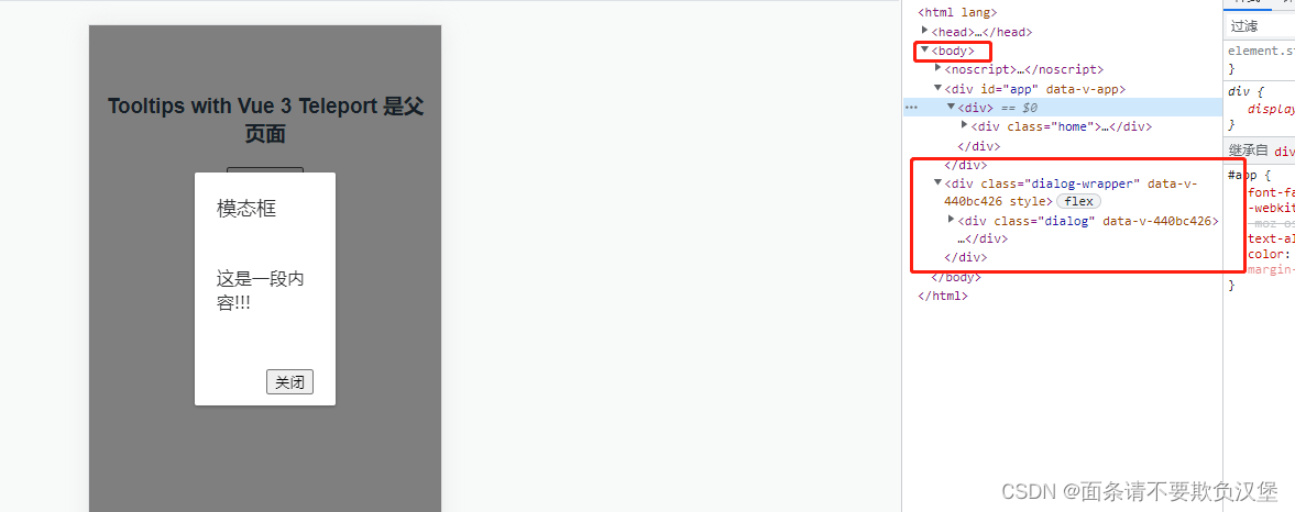
在一些场景中,比如使用modal时,我们想要将modal放在具体的vue页面中,功能与位置保持一致。但是在展示时,又希望直接将它放在body下,方便实现定位样式。面对功能位置与样式位置的不统一,vue3中提供一对<teleport ></teleport>标签用于移动dom的位置到指定元素。
下面情况是没加teleport的时候

teleport to="body"的情况
代码如下:
<template>
	<div class="home">
		<h3>Tooltips with Vue 3 Teleport 是父页面</h3>
		<button @click="openDialog">打开弹窗 </button>
		<modal :title="title" :isShow="isShow" @close="openDialog">
            这是一段内容!!!
        </modal>
	</div>
</template>

<script>
import {ref} from 'vue'
import modal from './modal.vue'
export default {
	components: {
        modal
	},
	setup(){
        let title = ref('模态框');
        let isShow= ref(false);
        const openDialog = (res)=>{
            isShow.value = typeof res=='boolean'? false:true;
        }
        return {
            title,
            isShow,
            openDialog
        }
    }
};
</script>

子组件moadl
<template>
  <teleport to="body">
    <transition name="dialog-fade">
      <div class="dialog-wrapper" v-show="isShow">
        <div class="dialog">
          <div class="dialog-header">
            <slot name="title">
              <span class="dialog-title">
                {

   { title }}
              </span>
            </slot>
          </div>
          <div class="dialog-body">
            <slot></slot>
          </div>
          <div class="dialog-footer">
            <slot name="footer">
              <button @click="onClose">关闭</button>
            </slot>
          </div>
        </div>
      </div>
    </transition>
  </teleport>
</template>

<script>
export default {
    props:{
        title:{
            type:String,
            default:''
        },
        isShow:{
            type:Boolean,
            default:false
        }
    },
    emits:['close'],
	setup(props,ctx){
        const onClose = () => {
            ctx.emit('close',!props.isShow);
        };
        return {
            onClose
        }
    }
};

</script>
<style scoped>
.dialog-wrapper {
    position: fixed;
    top: 0;
    right: 0;
    bottom: 0;
    left: 0;
    height: 100%;
    background-color: #00000080;
    overflow: auto;
    display: flex;
    justify-content: center;
    align-items: center;
  }
  .dialog-wrapper>.dialog {
    width: 40%;
    background-color: #fff;
    border-radius: 2px;
    box-shadow: #0000004d 0 1px 3px;
    color: #303133;
}
.dialog>.dialog-header {
    font-size: 18px;
    line-height: 1.4;
    padding: 20px 20px 10px;
}
.dialog>.dialog-body {
    line-height: 1.4;
    padding: 30px 20px;
}
.dialog>.dialog-footer {
    line-height: 1.4;
    padding: 20px 20px 10px;
    display: flex;
    justify-content: flex-end;
}
</style>