目录
扫描二维码关注公众号,回复:
17046253 查看本文章

方法二:给子元素2设置display: inline-block
编辑 方法四:给其中一个子元素添加一个父元素,将子元素的margin值修改为父元素的pading值
margin塌陷和margin重叠都是垂直方向上的,水平方向没有这些问题。
父子元素之间的margin塌陷问题
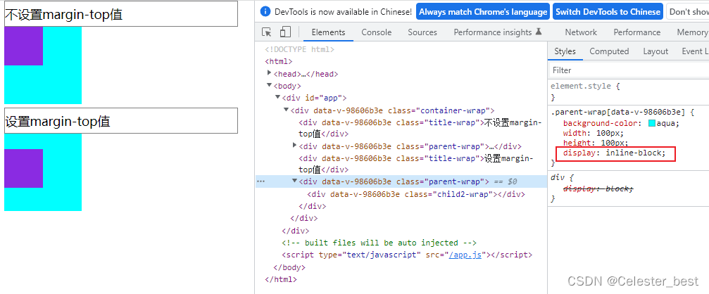
现象
<template>
<div>
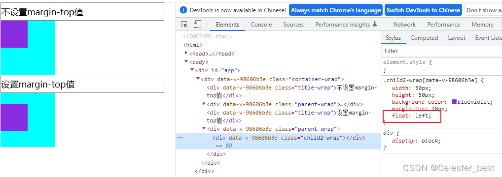
<div class="title-wrap">不设置margin-top值</div>
<div class="parent-wrap">
<div class="child-wrap"></div>
</div>
<div class="title-wrap">设置margin-top值</div>
<div class="parent-wrap">
<div class="child2-wrap" ></div>
</div>
</div>
</template>
<script>
export default {
name: "MarginDemo",
};
</script>
<style scoped>
.title-wrap {
width: 300px;
border: 1px solid gray;
padding: 5px 0;
}
.parent-wrap {
background-color: aqua;
width: 100px;
height: 100px;
}
.child-wrap {
width: 50px;
height: 50px;
background-color: blueviolet;
}
.child2-wrap {
width: 50px;
height: 50px;
background-color: blueviolet;
margin-top: 20px;
}
</style>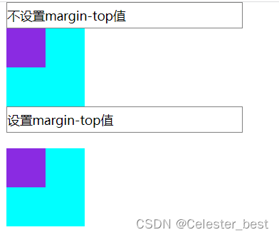
不对子元素设置margin-top时,父子元素都和title元素的底部边框线对齐,但是当我对子元素设置margin-top时(本意只想影响子元素),父子元素一起向下移动,都有了一定的间距。这种现象就是margin塌陷。
解决方法:
注意以下解决方法可能会引起副作用,所以在使用时应该根据实际情况进行选择。
方法一:设置子元素浮动元素
.child2-wrap {
  width: 50px;
  height: 50px;
  background-color: blueviolet;
  margin-top: 20px;
  float: left;
}
方法二:父元素设置浮动元素
<template>
  <div class="container-wrap">
    <div class="parent-wrap">
      <div class="child2-wrap"></div>
    </div>
  </div>
</template>
<script>
export default {
  name: "MarginDemo",
};
</script>
<style scoped>
.container-wrap {
  margin-left: 10px;
}
.parent-wrap {
  background-color: aqua;
  width: 100px;
  height: 100px;
  float: left;
}

.child2-wrap {
  width: 50px;
  height: 50px;
  background-color: blueviolet;
  margin-top: 20px;
}
</style>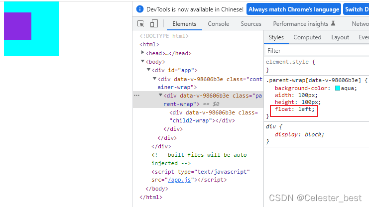
方法三:父元素设置行内块元素
.parent-wrap {
  background-color: aqua;
  width: 100px;
  height: 100px;
  display:inline-block;
}
方法四:父元素设置绝对定位
<template>
  <div class="container-wrap">
    <div class="parent-wrap">
      <div class="child2-wrap"></div>
    </div>
  </div>
</template>
<script>
export default {
  name: "MarginDemo",
};
</script>
<style scoped>
.container-wrap {
  margin-left: 10px;
}
.parent-wrap {
  background-color: aqua;
  width: 100px;
  height: 100px;
  position: absolute;
}

.child2-wrap {
  width: 50px;
  height: 50px;
  background-color: blueviolet;
  margin-top: 20px;
}
</style>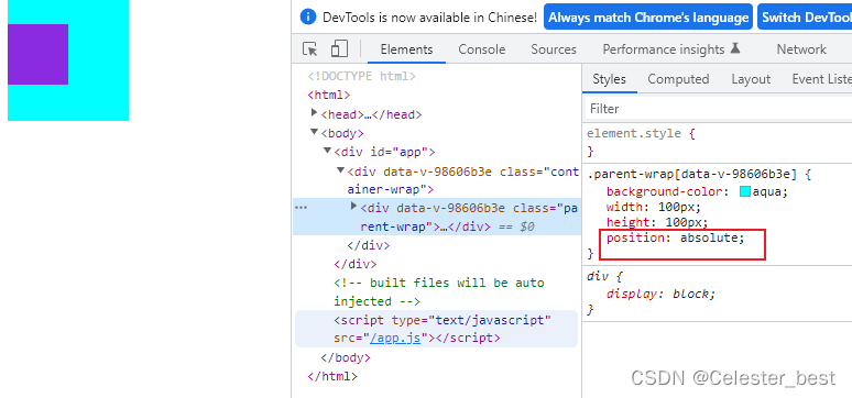
方法五:给父元素设置overflow: hidden
<template>
  <div class="container-wrap">
    <div class="parent-wrap">
      <div class="child2-wrap"></div>
    </div>
  </div>
</template>
<script>
export default {
  name: "MarginDemo",
};
</script>
<style scoped>
.container-wrap {
  margin-left: 10px;
}
.parent-wrap {
  background-color: aqua;
  width: 100px;
  height: 100px;
  overflow: hidden;
}

.child2-wrap {
  width: 50px;
  height: 50px;
  background-color: blueviolet;
  margin-top: 20px;
}
</style> 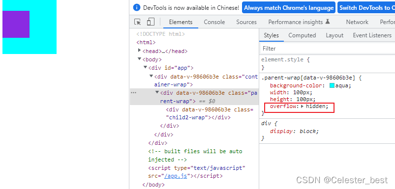
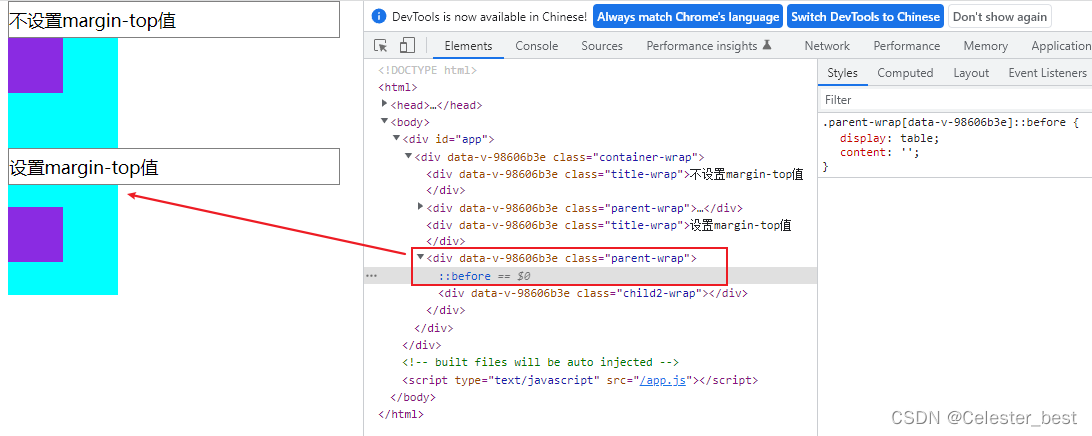
方法六:为父元素设置一个before伪元素
.parent-wrap::before{
    display: table;
    content: '';
} 
方法七:在子元素前添加一个空白元素
<template>
  <div class="container-wrap">
    <div class="parent-wrap">
      <!-- 空白元素 -->
      <div class="space-wrap"></div>
      <div class="child2-wrap"></div>
    </div>
  </div>
</template>
<script>
export default {
  name: "MarginDemo",
};
</script>
<style scoped>
.container-wrap {
  margin-left: 10px;
}
.parent-wrap {
  background-color: aqua;
  width: 100px;
  height: 100px;
}

.child2-wrap {
  width: 50px;
  height: 50px;
  background-color: blueviolet;
  margin-top: 19px;
}
/* 本意设置margin-top是20px,现在通过margin-top的19px和空白元素的height的1px实现20px的空白*/
.space-wrap {
  width: 100%;
  height: 1px;
}
</style>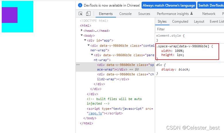
兄弟元素之间的margin重叠问题
现象
<template>
  <div class="container-wrap">
    <div class="child1-wrap"></div>
    <div class="child2-wrap"></div>
  </div>
</template>
<script>
export default {
  name: "MarginDemo",
};
</script>
<style scoped>
.container-wrap {
  margin-left: 10px;
  width: 110px;
  height: 500px;
  border: 1px solid gray;
}
.child1-wrap {
  width: 100px;
  height: 100px;
  background-color: aqua;
  margin-bottom: 200px;
}
.child2-wrap {
  width: 100px;
  height: 100px;
  background-color: blue;
  margin-top: 100px;
}
</style>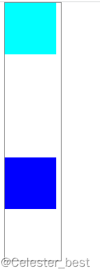
给子元素1设置了margin-bottom: 200px,给子元素2设置了margin-top: 100px,按理来说应该两个子元素上下间隔应该是300px,但是实际两个子元素的上下间隔只有200px。
这种兄弟元素垂直外边距重合,选取兄弟元素中设置的margin的最大值的现象就是margin重合。
解决方法:
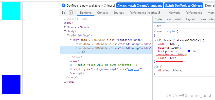
方法一:给子元素2设置成浮动元素
.child2-wrap {
  width: 100px;
  height: 100px;
  background-color: blue;
  margin-top: 100px;
  float: left;
}
方法二:给子元素2设置display: inline-block
.child2-wrap {
  width: 100px;
  height: 100px;
  background-color: blue;
  margin-top: 100px;
  display: inline-block;
}
方法三:在兄弟元素之间添加一个空白div
<template>
<div class="container-wrap">
<div class="child1-wrap"></div>
<div class="space-wrap"></div>
<div class="child2-wrap"></div>
</div>
</template>
<script>
export default {
name: "MarginDemo",
};
</script>
<style scoped>
.container-wrap {
margin-left: 10px;
width: 110px;
height: 500px;
border: 1px solid gray;
}
.child1-wrap {
width: 100px;
height: 100px;
background-color: aqua;
margin-bottom: 200px;
}
.child2-wrap {
width: 100px;
height: 100px;
background-color: blue;
margin-top: 99px;
}
.space-wrap {
width: 100%;
height: 1px;
}
</style>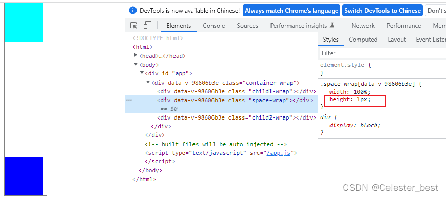 方法四:给其中一个子元素添加一个父元素,将子元素的margin值修改为父元素的pading值
<template>
  <div class="container-wrap">
    <div class="child1-wrap"></div>
    <div class="parent2-wrap">
      <div class="child2-wrap"></div>
    </div>
  </div>
</template>
<script>
export default {
  name: "MarginDemo",
};
</script>
<style scoped>
.container-wrap {
  margin-left: 10px;
  width: 110px;
  height: 500px;
  border: 1px solid gray;
}
.child1-wrap {
  width: 100px;
  height: 100px;
  background-color: aqua;
  margin-bottom: 200px;
}
.parent2-wrap {
  padding-top: 100px;
}
.child2-wrap {
  width: 100px;
  height: 100px;
  background-color: blue;
}
</style>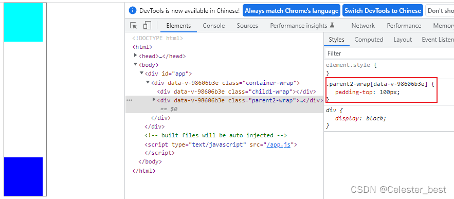
方法五:给第二个子元素添加一个父元素,并通过BFC解决问题
给第二个子元素的父元素添加以下属性都可以解决问题:
1、 float: left;
2、 display: inline-block;
3、 overflow: hidden;
4、position: absolute;
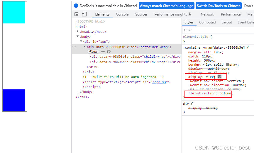
方法六:父元素设置display:flex
.container-wrap {
  margin-left: 10px;
  width: 110px;
  height: 500px;
  border: 1px solid gray;
  display: flex;
  flex-direction: column;
}