Your First CSS(Cascading Style Sheets)
Cascading means it always takes selector that is at the end 即后面的可以覆盖前面的。 比如
在以下css文件中定义了两次 <p></p> 的颜色,最终它会呈现green。
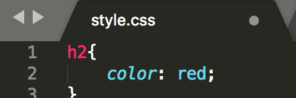
 1 h2{
 2     color: red;
 3 }
 4
 5 p{
 6     color: pink;
 7 }
 8
 9 p{
10     color: green;
11 }
syntactic rule is very straightforward:
Selector{
    Property: value;
}
How to comment:
command + /
比如我们很喜欢某个网站的feature
we can right click
do'inspect'

我想<h2>Home</h2>变成红色,怎么办
 1 <!DOCTYPE html>
 2 <html>
 3 <head>
 4     <title>CSS learning</title>
 5 </head>
 6 <body>
 7     <header>
 8         <ul>
 9             <li>Home</li>
10             <li><a href="about.html">About</a></li>
11             <li><a href="login.html">login</a></li>
12         </ul>
13     </header>
14     <section>
15         <h2>Home</h2>
16         <p>Lollll</p>
17     </section>
18 </body>
19 </html>
新一个css文件
但是refresh之后,为何index.html的h2没变色?
Obviously
How does index.html know style.css exist ?
We need to link each other
So we add link in the <head></head>
 1 <!DOCTYPE html>
 2 <html>
 3 <head>
 4     <title>CSS learning</title>
 5     <link rel="stylesheet" type="text/css" href="style.css">
 6 </head>
 7 <body>
 8     <header>
 9         <ul>
10             <li>Home</li>
11             <li><a href="about.html">About</a></li>
12             <li><a href="login.html">login</a></li>
13         </ul>
14     </header>
15     <section>
16         <h2>Home</h2>
17         <p>Lollll</p>
18     </section>
19 </body>
20 </html>
And make sure these two files in the same folder
we can create multiply style sheets 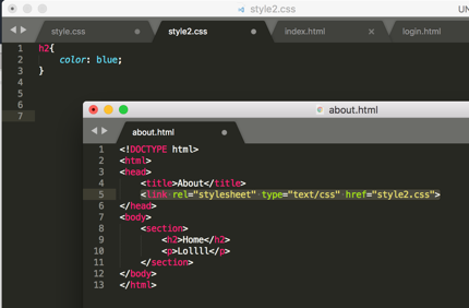
Beside <1>creating style.css file, we can also <2>'inline style' which is by specifying within the element
 1 <!DOCTYPE html>
 2 <html>
 3 <head>
 4     <title>CSS learning</title>
 5     <link rel="stylesheet" type="text/css" href="style.css">
 6 </head>
 7 <body>
 8     <header style="background-color: yellow">
 9         <ul>
10             <li>Home</li>
11             <li><a href="about.html">About</a></li>
12             <li><a href="login.html">login</a></li>
13         </ul>
14     </header>
15     <section>
16         <h2>Home</h2>
17         <p>Lollll</p>
18     </section>
19 </body>
20 </html>
<3> using 'style' tags inside of <head></head>
 1 <!DOCTYPE html>
 2 <html>
 3 <head>
 4     <title>CSS learning</title>
 5     <link rel="stylesheet" type="text/css" href="style.css">
 6     <style >
 7         li{
 8             background-color: purple;
 9         }
10     </style>
11 </head>
12 <body>
13     <header style="background-color: yellow">
14         <ul>
15             <li>Home</li>
16             <li><a href="about.html">About</a></li>
17             <li><a href="login.html">login</a></li>
18         </ul>
19     </header>
20     <section>
21         <h2>Home</h2>
22         <p>Lollll</p>
23     </section>
24 </body>
25 </html>
CSS Properties
recommend website for CSS Properties : CSS Tricks
make your text in the center
text-align: center;
define the border
border: 5px solid purple;
add background image
/*本地图片*/
body{
    background-image: url(backgroundimage.jpg);
}
/*网上图片*/
body{
    background-image: url(www.unsplash.com/image2);
}
make background image fits the screen
body{
    background-image: url(www.unsplash.com/image2);
    background-size: cover;
}
add cursor(光标)
p{
    color: pink;
    cursor: pointer;
}
display in line
li{
    list-style: none;
    display: inline-block;
}
find the specific color: paletton.com
choose hex or RGB whichever way
h2{
    color: #AA9739;
    text-align: center;
    border: 5px solid rgb(170, 151, 57);
}
Cascading Style Sheets at the most basic level it indicates that the order of CSS rules matter.
.class
we can give any value we want, whatever we want to call it
<p class="webtext">Lollll</p>
.webtext{
    border:  5px dashed purple;
}
#id
similar to .class except that you can use only once
    <div id="div1">
            <p class="webtext">Lollll</p>
            <p>Lollll</p>
            <p>Lollll</p>
        </div>
#id{
    background: blue;
}
element
p{
    color: green;
}
element, element
h2, p {
    color: #AA9739;
    text-align: center;
    border: 5px solid rgb(170, 151, 57);
}
element element
I want you to select all 'p' s inside 'h2'
<h2>Home<p>Jennifer's home</p></h2>
h2  p {
    color: #AA9739;
    text-align: center;
    border: 5px solid rgb(170, 151, 57);
}
element > element
I want to select all 'p's that have a parent of 'h2'
h2 > p {
    color: #AA9739;
    text-align: center;
    border: 5px solid rgb(170, 151, 57);
}
element + element
I want to select any 'p' that is exactly after an 'h2' element
h2 + p {
    color: #AA9739;
    text-align: center;
    border: 5px solid rgb(170, 151, 57);
}
:hover
nothing happens but when I hover my mouse, it changes the style to what we just wrote down
h2 + p: hover{
    color: #AA9739;
    text-align: center;
    border: 5px solid rgb(170, 151, 57);
}
:last-child
only the last child of each webtext changes
.webtext:last-child{
    border:  5px dashed purple;
}
:first-child
same as last-child
!important (not recommended)
overrides any of the css rules and say, hey I don't care what anybody else says , 'p' should always be pink
p{
    color: pink !important;
    cursor: pointer;
}

p{
    color: green;
}
add underline to text
p{
    text-decoration: underline;
}
change text to uppercase
p{
    text-transform: uppercase;
}
make space between text
p{
    line-height: 20px;
}
change font style
font-family: "Times New Roman", Georgia; means if former one doesn't exist, pick the latter one
Use Google Fonts, we can add some specific fonts in own website
当然,这样会减慢你的网页反应速度
因为你的字体需要通过Google的链接响应
p{
    line-height: 20px;
    font-style: italic;
    font-weight: bold;
    font-size: 80%;
    font-family: "Times New Roman", Georgia;
}
add image
<img src="https://previews.123rf.com/images/tharun15/tharun151606/tharun15160600056/58764289-a-circular-geometric-design-for-summer-solstice-day-in-june-on-a-white-background.jpg" width="50px" height="40">
critical render path
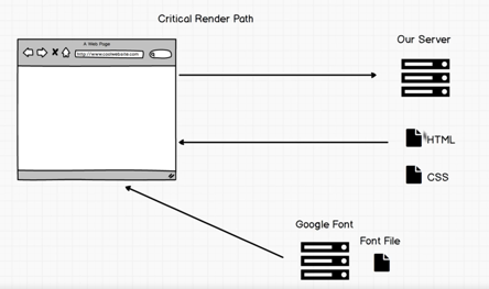
For now, sever is our computer
we request html
and the browser check I need css file
grab css file
hold on, the browser check I need font file
after that, it could render the page(display)
So you won't be able to render a web page until you receive css file and
sometimes font files you also have to wait for the font file to render the page
So if want your website faster, use your own font files and don't make css file too big
So you can enter you css code into minify CSS https://www.cleancss.com/css-minify/ to make it seem smaller
Flexbox
Flex 是 Flexible Box 的缩写,意为"弹性布局",用来为盒状模型提供最大的灵活性。
https://css-tricks.com/snippets/css/a-guide-to-flexbox/
http://flexboxfroggy.com/
<!DOCTYPE html>
<html>
<head>
    <title>CSS</title>
    <link rel="stylesheet" type="text/css" href="style.css">
</head>
<body>
    <h1>Life in the wild</h1>
    <div class="container">
        <img src="https://static.pexels.com/photos/52500/horse-herd-fog-nature-52500.jpeg">
        <img src="https://static.pexels.com/photos/66898/elephant-cub-tsavo-kenya-66898.jpeg">
        <img src="https://static.pexels.com/photos/213399/pexels-photo-213399.jpeg">
        <img src="https://static.pexels.com/photos/158471/ibis-bird-red-animals-158471.jpeg
">
        <img src="https://static.pexels.com/photos/133459/pexels-photo-133459.jpeg">
        <img src="https://static.pexels.com/photos/50988/ape-berber-monkeys-mammal-affchen-50988.jpeg">
    </div>

</body>
</html>
.container{
    display: flex;
    flex-wrap: wrap;
    justify-content: center;
}

h1{
    font-family: fantasy;
    font-size: 3em;
    border-bottom: 2px solid pink;
    border-right: 2px solid pink;
    width: 400px;
    text-align: center;
}

img{
    width: 450px;
    height: 300px;
    margin: 10px;
}
Exercise
 1 <!DOCTYPE html>
 2 <html>
 3 <head>
 4     <title>RoboPage</title>
 5     <link rel="stylesheet" type="text/css" href="style.css">
 6     <link href="https://fonts.googleapis.com/css?family=Roboto" rel="stylesheet">
 7 </head>
 8 <body>
 9     <h1>Robot Friend</h1>
10     <div class="robots">
11         <div class="android">
12             <div class="head">
13                 <div class="eyes">
14                     <div class="left_eye"></div>
15                     <div class="right_eye"></div>
16                 </div>
17             </div>
18             <div class="upper_body">
19                 <div class="left_arm"></div>
20                 <div class="torso"></div>
21                 <div class="right_arm"></div>
22             </div>
23             <div class="lower_body">
24                 <div class="left_leg"></div>
25                 <div class="right_leg"></div>
26             </div>
27         </div>
28     </div>
29 </body>
30 </html>
  1 h1 {
  2     text-align: center;
  3     font-family: 'Roboto', sans-serif;
  4 }
  5
  6 .robots {
  7     flex-wrap: wrap;
  8     display: flex;
  9     justify-content: center;
 10 }
 11
 12 .head,
 13 .left_arm,
 14 .torso,
 15 .right_arm,
 16 .left_leg,
 17 .right_leg {
 18      background-color: #5f93e8;
 19 }
 20
 21 .head {
 22     width: 200px;
 23     margin: 0 auto;
 24     height: 150px;
 25     border-radius: 200px 200px 0 0;
 26     margin-bottom: 10px;
 27 }
 28
 29 .eyes {
 30     display: flex
 31 }
 32
 33 .head:hover {
 34     width: 300px;
 35     transition: 1s ease-in-out;
 36 }
 37
 38 .upper_body {
 39     width: 300px;
 40     height: 150px;
 41     display: flex;
 42 }
 43
 44 .left_arm, .right_arm {
 45     width: 40px;
 46     height: 125px;
 47     border-radius: 100px;
 48 }
 49
 50 .left_arm {
 51     margin-right: 10px;
 52 }
 53
 54 .right_arm {
 55     margin-left: 10px;
 56 }
 57
 58 .torso {
 59     width: 200px;
 60     height: 200px;
 61     border-radius: 0 0 50px 50px;
 62 }
 63
 64 .lower_body {
 65     width: 200px;
 66     height: 200px;
 67     /* This is another useful property. Hmm what do you think it does?*/
 68     margin: 0 auto;
 69     display: flex;
 70 }
 71
 72 .left_leg, .right_leg {
 73     width: 40px;
 74     height: 120px;
 75     border-radius: 0 0 100px 100px;
 76 }
 77
 78 .left_leg {
 79     margin-left: 45px;
 80 }
 81
 82 .left_leg:hover {
 83     -webkit-transform: rotate(20deg);
 84     -moz-transform: rotate(20deg);
 85     -o-transform: rotate(20deg);
 86     -ms-transform: rotate(20deg);
 87     transform: rotate(20deg);
 88 }
 89
 90 .right_leg {
 91     margin-left: 30px;
 92 }
 93
 94 .left_eye, .right_eye {
 95     width: 20px;
 96     height: 20px;
 97     border-radius: 15px;
 98     background-color: white;
 99 }
100
101 .left_eye {
102     /* These properties are new and you haven't encountered
103     in this course. Check out CSS Tricks to see what it does! */
104     position: relative;
105     top: 100px;
106     left: 40px;
107 }
108
109 .right_eye {
110     position: relative;
111     top: 100px;
112     left: 120px;
113 }
Responsive UI
should be a priority when building websites

It would show you what your website will look like on iPhone
Reponsive means your website, on no matter what platform, looks good, no cut-offs