1.代码
<template>
<view class="animations">
<view class="animation animation1">
<view class="animate1"></view>
<view class="animate2"></view>
<view class="animate3"></view>
</view>
<view class="animation animation2">
<view class="animate1"></view>
<view class="animate2"></view>
<view class="animate3"></view>
</view>
<view class="animation animation3">
<view class="animate1"></view>
<view class="animate2"></view>
<view class="animate3"></view>
</view>
</view>
</template>
<script>
export default {
data() {
return {};
},
methods: {}
};
</script>
<style scoped lang="scss">
// 帧动画定义
@keyframes move {
0% {
transform: rotate(0deg);
}
100% {
transform: rotate(360deg);
}
}
.animations {
width: 100%;
height: 800rpx;
background-color: lightblue;
position: relative;
// 动画组通用样式
.animation {
position: absolute;
view {
position: absolute;
left: 0;
top: 0;
width: 500rpx;
height: 500rpx;
border-radius: 50%;
animation: move linear infinite;
}
.animate1 {
background: url(../../static/1.png) no-repeat;
background-size: 100%;
animation-duration: 25s;
animation-direction: reverse;
}
.animate2 {
background: url(../../static/2.png) no-repeat;
background-size: 100%;
animation-duration: 15s;
animation-direction: normal;
}
.animate3 {
background: url(../../static/3.png) no-repeat;
background-size: 100%;
animation-duration: 10s;
animation-direction: reverse;
}
}
// 每组动画位置大小透明度
.animation1 {
left: 0%;
top: 0%;
transform: scale(1);
}
.animation2 {
left: 0%;
top: 65%;
transform: scale(.5);
opacity: .5;
}
.animation3 {
left: 60%;
top: 65%;
transform: scale(.5);
}
}
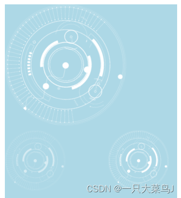
</style>2.运行结果