面试题里有时还会强调 子盒子宽高是否已知,要注意一下
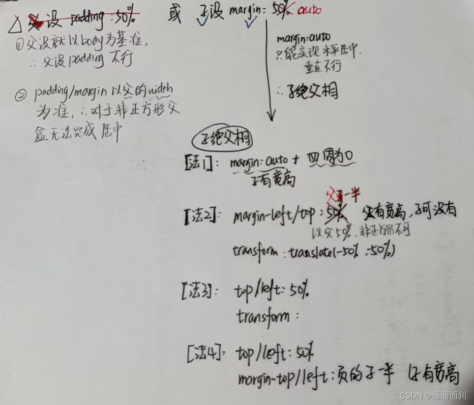
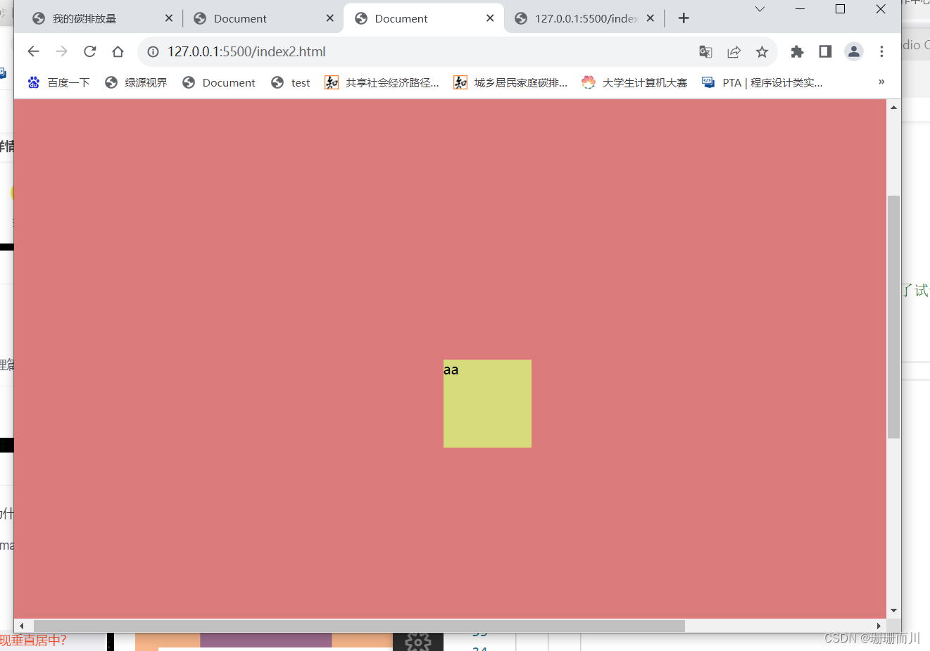
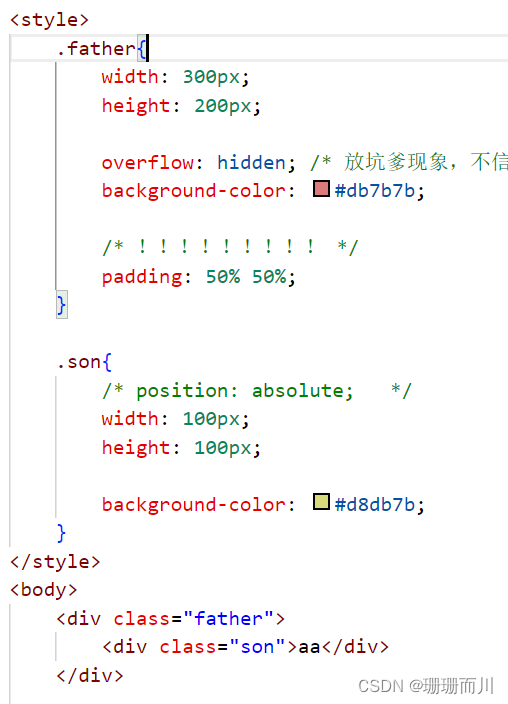
尝试一:给父盒子设置padding 或者子盒子设置margin
<style>
    .father{


        width: 300px;
        height: 200px;

        overflow: hidden; /* 放坑爹现象,不信你删了试试 */
        background-color: #db7b7b;
    }

    .son{


        width: 100px;
        height: 100px;

        margin: auto;

        background-color: #d8db7b;
    }
</style>
<body>
    <div class="father">
        <div class="son">aa</div>
    </div>
</body>
失败,只能水平居中,垂直不可以!!!!!!!
原因
http://t.csdn.cn/AOMJ1
http://t.csdn.cn/cFsg6
margin:auto为什么不垂直居中
margin:auto是具有强烈计算意味的关键字,用来计算元素对应方向上应该获得的剩余空间大小。
行内元素margin:auto; 不能水平居中在一行的中央位置(行内元素不独占一行)。
块级元素设置宽度后仍占据一行空间,因此margin:auto;会将这一行的剩余空间平均分配给左右外边距。
margin:auto 能使块级元素水平居中,但是不能垂直居中,因为垂直方向上默认没有剩余的空间。
注:行内元素margin:auto既不能水平居中也不能垂直居中,因为行内元素水平垂直方向上默认都没有剩余的空间。
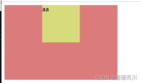
解一:子绝父相+margin:auto+四周是0(子有宽高
<style>
    .father{


        position: relative;  /* !!!! */
        width: 300px;
        height: 200px;

        overflow: hidden; /* 放坑爹现象,不信你删了试试 */
        background-color: #db7b7b;
    }

    .son{


        position: absolute;  /* !!!! */
        width: 100px;
        height: 100px;

         /* !!!! */
         top:0;
         left:0;
         bottom:0;
         right:0;

        margin: auto;

        background-color: #d8db7b;
    }
</style>
<body>
    <div class="father">
        <div class="son">aa</div>
    </div>
但这种情况不适用于 子盒子 不定宽高 的情况,例如子盒子会盛满整个父盒子
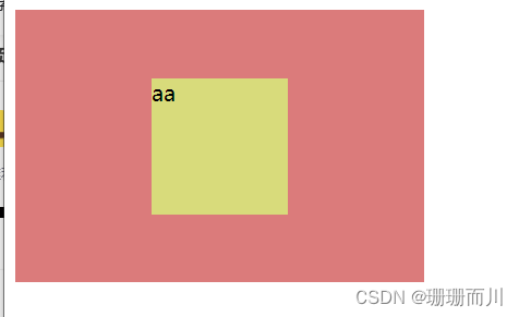
尝试二:子绝父相+margin-top/left:50%+transform
子盒子 宽高已知
<style>
    .father{


        position: relative;  /* !!!! */
        width: 300px;
        height: 200px;

        overflow: hidden; /* 放坑爹现象,不信你删了试试 */
        background-color: #db7b7b;
    }

    .son{


        position: absolute;  /* !!!! */
        width: 100px;
        height: 100px;

         /* !!!! */
        margin-top: 50%;
        margin-left: 50%;
        transform: translate(-50%,-50%);

        background-color: #d8db7b;
    }
</style>
<body>
    <div class="father">
        <div class="son">aa</div>
    </div>
</body>
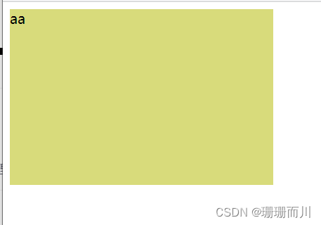
如果你以为这个方法可以通用,那你就错了,因为
margin和padding无论left还是right还是top还是bottom都是相对于父元素的width的,若如果没有,找其父辈元素的宽度,均没设宽度时,相对于屏幕的宽度。
http://t.csdn.cn/Pwcy6
http://t.csdn.cn/YSubI

所以说,尝试一,给父盒子加padding,根本不行,父盒子的padding参考body的大小,所以就把父盒子撑大了
 所以不要试padding了!!!
解二:子绝父相+margin-left/top:父盒子一半+transform(子定宽高
<style>
    .father{


        position: relative;
        width: 300px;
        height: 200px;
        overflow: hidden; /* 放坑爹现象,不信你删了试试 */
        background-color: #db7b7b;
    }

    .son{


        position: absolute;
        width: 100px;
        height: 100px;

         /* !!!! */
        margin-top: 100px;
        margin-left: 150px;
        transform: translate(-50%,-50%);

        background-color: #d8db7b;
    }
</style>
<body>
    <div class="father">
        <div class="son">aa</div>
    </div>
</body>
解三:子绝父相+top/left:50%+transform(子不定宽高
子盒子可以 不定宽高
<style>
    .father{


        position: relative;  /* !!!! */
        width: 300px;
        height: 200px;

        overflow: hidden; /* 放坑爹现象,不信你删了试试 */
        background-color: #db7b7b;
    }

    .son{


        position: absolute;  /* !!!! */
        width: 100px;
        height: 100px;


        top: 50%;
        left: 50%;
        transform: translate(-50%,-50%);

        background-color: #d8db7b;
    }
</style>
解四:子绝父相+top/left:50%+magin-top/left: 负 子一半(子宽高已知
也就是把transform: translate(-50%,-50%); 替换成margin-top: -50px;margin-left: -25px;所以,子盒子宽高已知
<style>
    .father{


        position: relative;
        width: 300px;
        height: 200px;

        overflow: hidden; /* 放坑爹现象,不信你删了试试 */
        background-color: #db7b7b;
    }

    .son{


        position: absolute;
        width: 50px;  /* !!!! */
        height: 100px;


        top: 50%;
        left: 50%;
        /* transform: translate(-50%,-50%); */
        margin-top: -50px;
        margin-left: -25px;

        background-color: #d8db7b;
    }
</style>
flex
父盒子flex布局,并设置justify-content: center; align-items: center;
<style>
    .father{


        display: flex;
        justify-content: center;
        align-items: center;

        width: 300px;
        height: 200px;


        background-color: #db7b7b;
    }

    .son{


        background-color: #d8db7b;
    }
</style>
table - cell
将父盒子设置display: table-cell; 并设置text-align: center; vertical-align: middle; 子盒子设置display: inline-block;
http://t.csdn.cn/cmr2B
<style>
    .father{


        display: table-cell;
        text-align: center;
        vertical-align: middle;

        width: 300px;
        height: 200px;


        background-color: #db7b7b;
    }

    .son{


        display: inline-block;
        background-color: #d8db7b;
    }
</style>
grid
父盒子设置为网格元素display: grid; 并设置 place-items: center;
<style>
    .father{


        display: grid;
        place-items: center;

        width: 300px;
        height: 200px;


        background-color: #db7b7b;
    }

    .son{


        background-color: #d8db7b;
    }
</style>
总结:
1.试方法要多个栗子,不能只试正方形,这样就发现不了margin依据父的宽度
2.子盒子不定宽高,只能设置top/left:50%,不能设置margin-left:50%,是因为top/left:50%不像margin都参照父的width