方法一. line-height (只适用于文字类)
css:
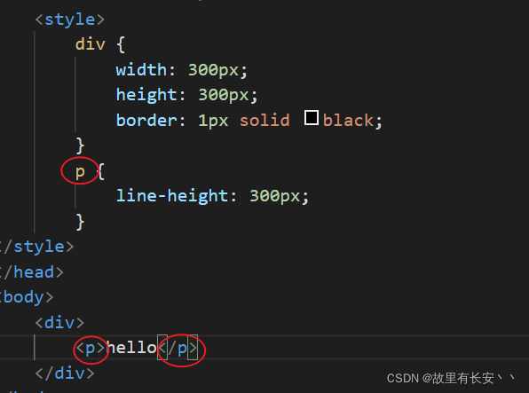
<style>
        div {


            width: 300px;
            height: 300px;
            border: 1px solid black;
        }
        span {


            line-height: 300px;
        }
</style>
html:
<div>
	<span>hello</span>
</div>
效果:
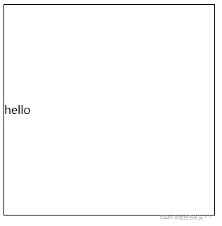
注意:此方法只适用于文字类水平居中。
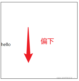
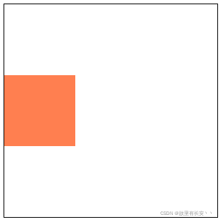
如果把上面子元素的span标签换成p标签
就发现子元素无法居中,会稍微偏下:
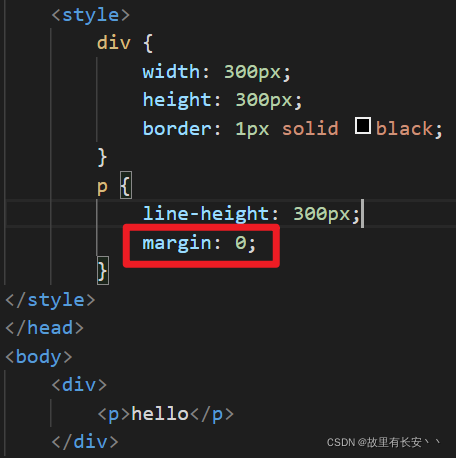
此时,我们只需要让p标签的margin值为0即可(因为p标签默认会有margin值)
方法二: flex布局
css:
<style>
	.father {


		/*第一步:将父元素转换为flex布局 */
    	display: flex;
    	/*第二步:设置align-item垂直对齐*/
    	align-items: center;
    	width: 300px;
	   	height: 300px;
   		border: 1px solid black;
	}
	.son {


    	width: 100px;
    	height: 100px;
    	background-color: coral;
	}
</style>
html:
<div class="father">
	<div class="son"></div>
</div>
效果:
缺点:兼容性不够好(兼容IE9以上)
方法三: 定位 + transform
css:
<style>
.father {
/*第一步:将父元素设置相对定位 */
/*解释:若不给父元素添加定位属性,下面的子元素会相对于浏览器窗口定位*/
position: relative;
width: 300px;
height: 300px;
border: 1px solid black;
}
.son {
/*第二步:将子元素设置绝对定位*/
position: absolute;
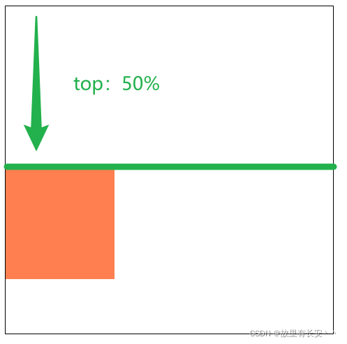
/*第三步:子元素向下挪动50%(相对于父元素高度)*/
top: 50%;
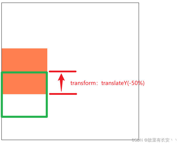
/*第四步:将子元素沿Y轴向上位移50%(相对于子元素自身高度)*/
transform: translateY(-50%);
width: 100px;
height: 100px;
background-color: coral;
}
</style>
html:
<div class="father">
	<div class="son"></div>
</div>
效果:
可能有的小伙伴不太明白这个方法,下面我用图例向大家解释(若明白请跳过):
缺点:因为设置定位,所以脱离了文档流,可能会与其他元素产生布局冲突(如:与其他元素重叠)
方法三: table-cell
css:
<style>
	.father {


		/*第一步:设置父元素为table-cell布局*/
		display: table-cell;
		/*第二步:设置垂直对齐(注意:这里的值是middle,不是center!)*/
        vertical-align: middle;
    	width: 300px;
	   	height: 300px;
   		border: 1px solid black;
	}
	.son {


    	width: 100px;
    	height: 100px;
    	background-color: coral;
	}
</style>
html:
<div class="father">
	<div class="son"></div>
</div>
效果: