设计器的使用
设计器预览
在window和usercontrol中,在代码中修改了控件,代码正确情况下,设计器中就可以实时看到变化,但是在样式(Styles)文件中,无法直接看到,需要使用设计器预览Design.PreviewWith标签
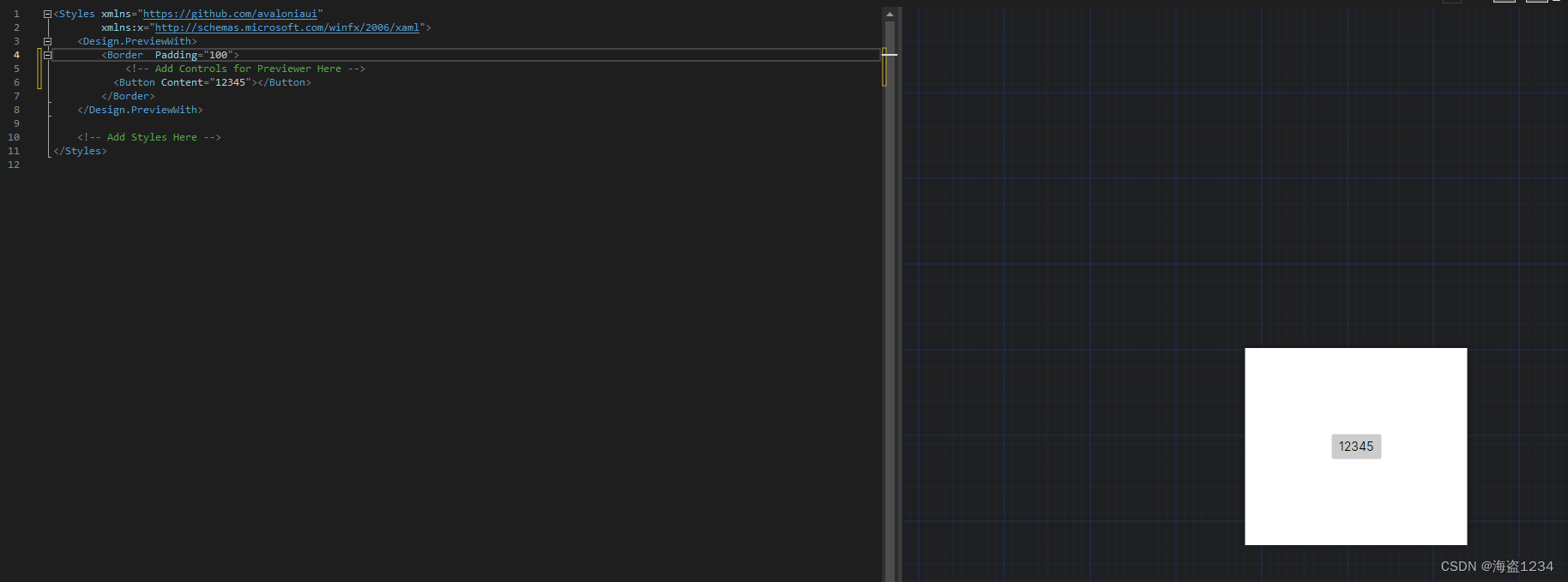
在Design.PreviewWith中修改Border的Padding等属性设置预览区域大小,
  <Design.PreviewWith>
      <Border Width="500" Height="500" Padding="20">
          <!-- Add Controls for Previewer Here -->
      </Border>
  </Design.PreviewWith>
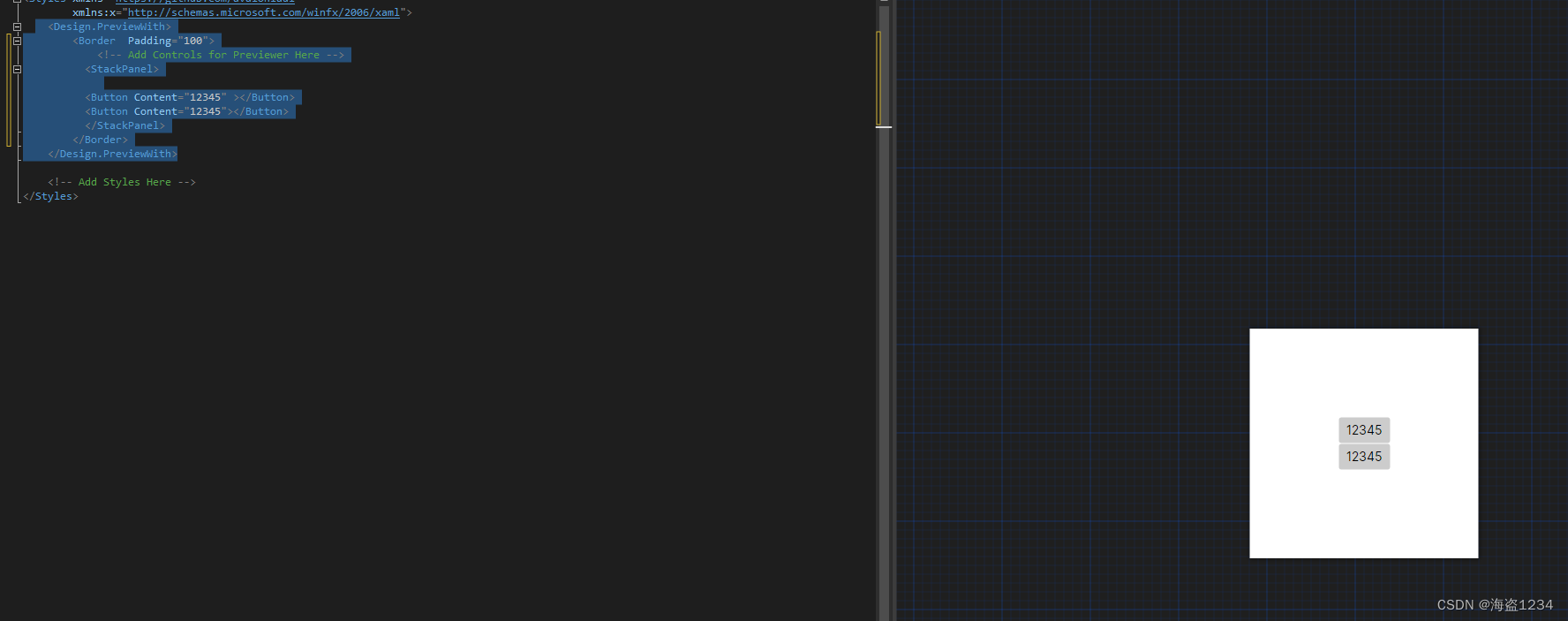
在Border内部添加需要预览的控件即可
如果要预览多个控件,就跟在WPF中规则一样,先在Border加一个布局控件,然后在布局控件中随便放多少个都行
绑定预览
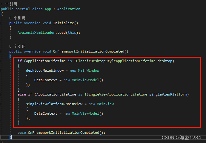
在V11版本中,默认使用了mvvm模式,所以很多属性通过绑定实现,但是在开发过程中需要预览,则需要使用Design.DataContext标签,在里面放上对面的viewmodel。
 <Design.DataContext>
   <!-- This only sets the DataContext for the previewer in an IDE,
        to set the actual DataContext for runtime, set the DataContext property in code (look at App.axaml.cs) -->
   <vm:MainViewModel />
 </Design.DataContext>
需要注意:这个只是预览用,需要运行绑定则需要在别的地方设置
根据代码注释可以知道:这仅设置 IDE 中预览器的 DataContext,要设置运行时的实际 DataContext,请在代码中设置 DataContext 属性(查看app.axaml.cs)
在app.axaml.cs中设置
样式、资源
样式、资源文件的定义和引用,见另一篇:Net跨平台UI框架Avalonia入门-资源和样式
样式
样式基础
一个样式基本的定义,使用Style定义样式,Setter定义具体的控件属性和值,然后通过选择器Selector来定义一个样式的名称。
样式使用,在控件通过Classes来使用样式
官方模版:
<Style Selector="selector syntax">
     <Setter Property="property name" Value="new value"/>
     ...
</Style>
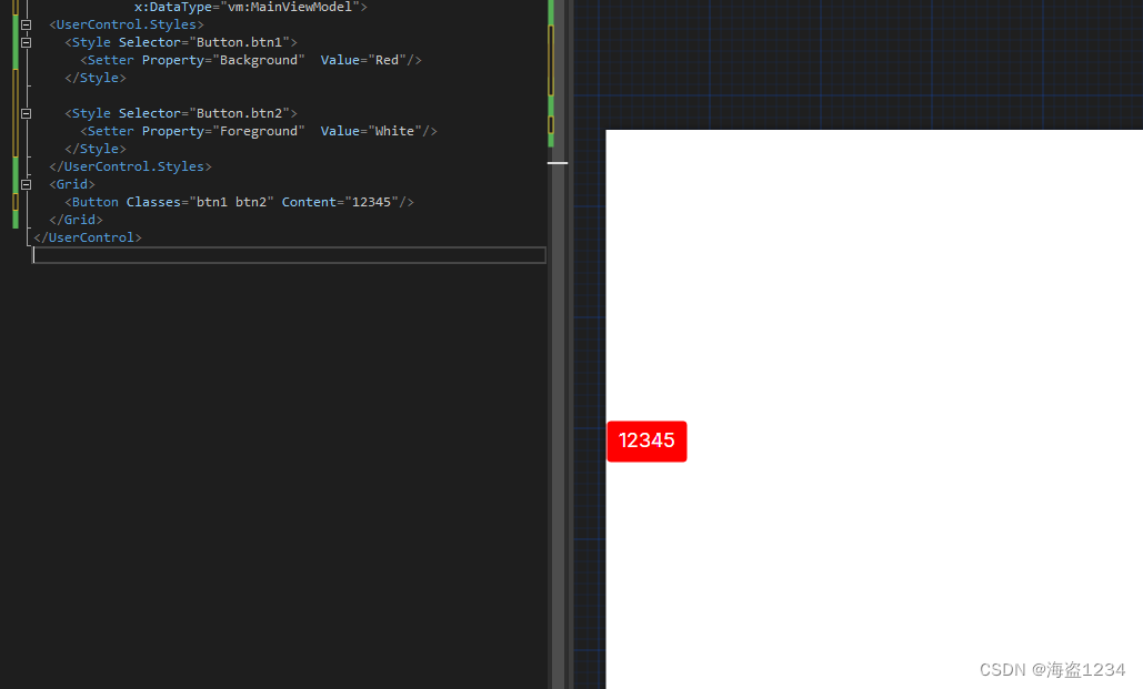
示例
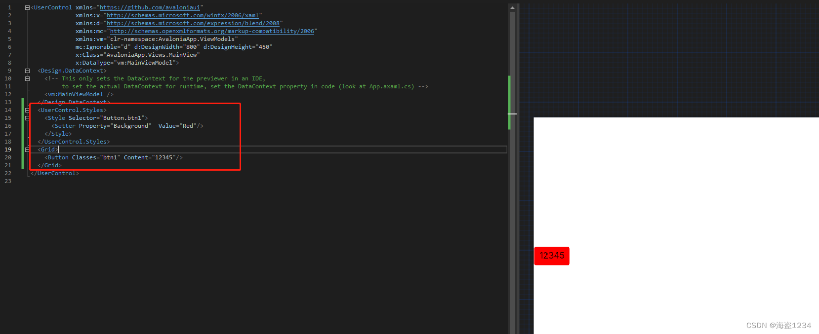
<UserControl ....>
  <UserControl.Styles>
    <Style Selector="Button.btn1">
      <Setter Property="Background"  Value="Red"/>
    </Style>
  </UserControl.Styles>
  <Grid>
    <Button Classes="btn1" Content="12345"/>
  </Grid>
</UserControl>
效果:
样式选择器(Selector)语法
avalonia样式中,使用Setter对属性和值的定义与WPF一样,选择器Selector更类似于CSS中使用的语法
1.选择器定义控件类型
Selector="ControlType(控件类型)" 表示在style应用范围里的这类控件都默认使用这个样式,控件不需要写Classes来使用样式
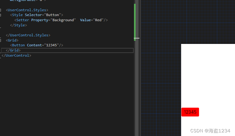
<Style Selector="Button">
示例:
 <UserControl ....>
 <UserControl.Styles>
   <Style Selector="Button">
     <Setter Property="Background"  Value="Red"/>
   </Style>

 </UserControl.Styles>
 <Grid>
   <Button Content="12345"/>
 </Grid>
 </UserControl>
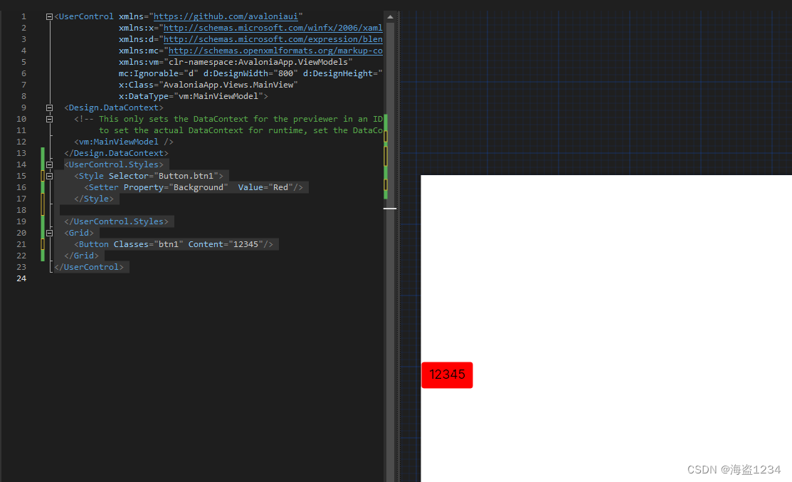
2.定义样式名称
在选择器中定义样式的名称Selector="ControlType(控件类型).Name(样式名称)",然后通过Classes来使用对应的样式
<!--定义-->
<Style Selector="Button.btn1"></Style>
<!--使用-->
<Button Classes="btn1"/>
示例:
   <UserControl ....>
  <UserControl.Styles>
    <Style Selector="Button.btn1">
      <Setter Property="Background"  Value="Red"/>
    </Style>

  </UserControl.Styles>
  <Grid>
    <Button Classes="btn1" Content="12345"/>
  </Grid>
</UserControl>
3.同时使用多个样式
在Classes中通过空格分隔写多个样式名称
Classes="style1 style2"
示例:
<UserControl ...>
  <UserControl.Styles>
    <Style Selector="Button.btn1">
      <Setter Property="Background"  Value="Red"/>
    </Style>

    <Style Selector="Button.btn2">
      <Setter Property="Foreground"  Value="White"/>
    </Style>
  </UserControl.Styles>
  <Grid>
    <Button Classes="btn1 btn2" Content="12345"/>
  </Grid>
</UserControl>
效果:
4.交互状态效果的实现
控件悬停、按下、获取焦点等等特殊状态,在Avalonia中通过伪类(Pseudo Classes)来实现,伪类在选择器中的名称始终以冒号开头。
在Avalonia中可以用的相关伪类如下:
| 伪类 | 描述 |
|---|---|
:pointerover |
指针输入当前悬停在(控件的边界内部) |
:focus |
控件拥有输入焦点 |
:disabled |
控件无法响应用户交互 |
:pressed |
按钮控件处于按下状态 |
:checked |
复选框控件已选中(显示勾选标记) |
有条件的也可以自己定义。Pseudo Classes
使用伪类定义样式
Selector中直接Selector="ControlType(控件类型):PseudoClasses(伪类)" 和 Selector="ControlType(控件类型).Name(样式名称):PseudoClasses(伪类)"两种定义方式都可以,使用方式跟上面的一样,直接生效或者使用样式名称。
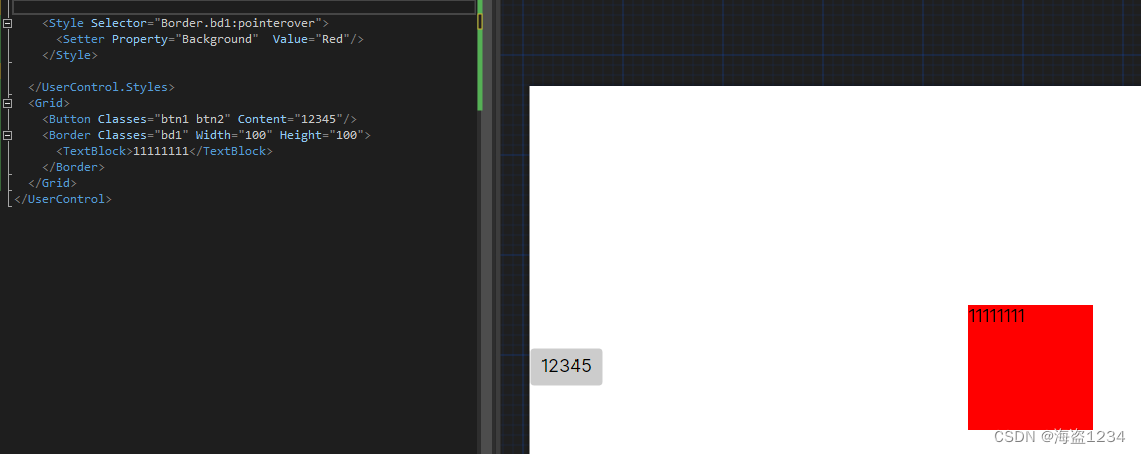
示例:
 <Style Selector="Border:pointerover">
      <Setter Property="Background" Value="Red"/>
  </Style>

 <Style Selector="Border.bd1:pointerover">
   <Setter Property="Background"  Value="Red"/>
 </Style>
效果:
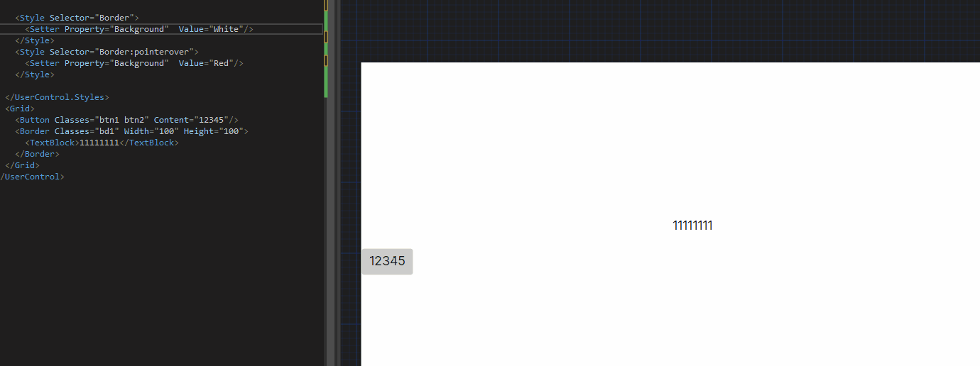
使用伪类的坑
1.Border必须有内容或者背景有初始化值,否则无法触发进入的效果,鼠标放在空白区域

解决方案:
在样式中给属性添加默认值
注意:不能直接在控件上赋默认值,否则就无法触发
两种写法:
一种另写一个样式
 <Style Selector="Border">
   <Setter Property="Background"  Value="White"/>
 </Style>
 <Style Selector="Border:pointerover">
   <Setter Property="Background"  Value="Red"/>
 </Style>
效果:
另一种:就是嵌套样式(在下面嵌套样式小节),效果一样
2.另一个坑就是其他控件,如Button,使用伪类直接改Button属性还是无效
如下,设置悬停颜色为红色,但是无效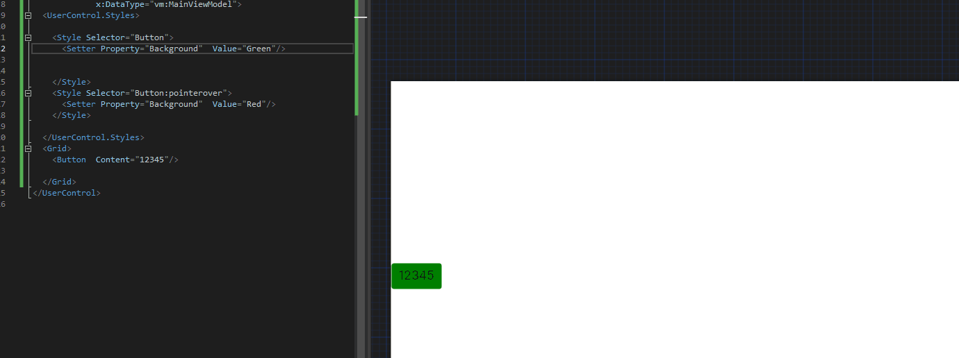
这跟avalonia样式写法和工作原理有关,在下面选择器控制模版(template)里面的控件详细写
5.嵌套样式
在Style中定义一个Style,里面的Selector延续外面的Selector,使用^来替代上一级选择器的内容
    <Style Selector="Border">
      <Setter Property="Background"  Value="White"/>

      <Style Selector="^:pointerover">
        <Setter Property="Background"  Value="Red"/>
      </Style>
    </Style>
效果:
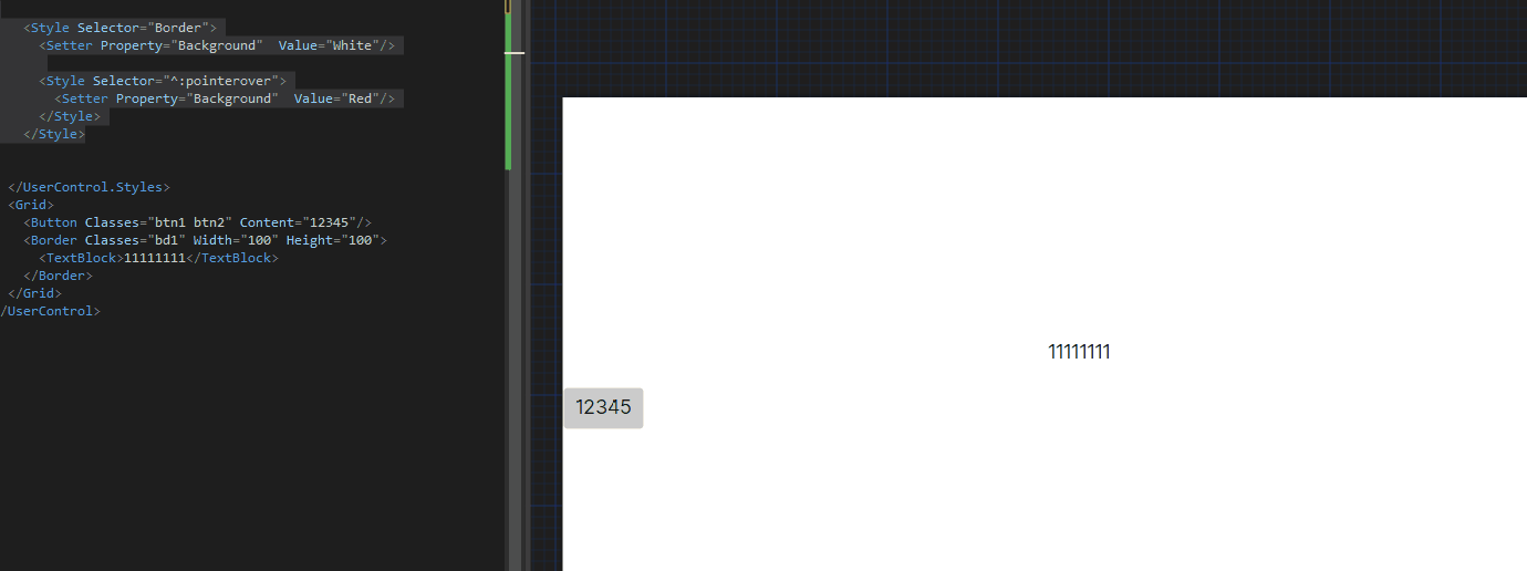
可以看到他的效果和跟下面分开两个样式的效果是一样的
 <Style Selector="Border">
   <Setter Property="Background"  Value="White"/>
 </Style>
 <Style Selector="Border:pointerover">
   <Setter Property="Background"  Value="Red"/>
 </Style>
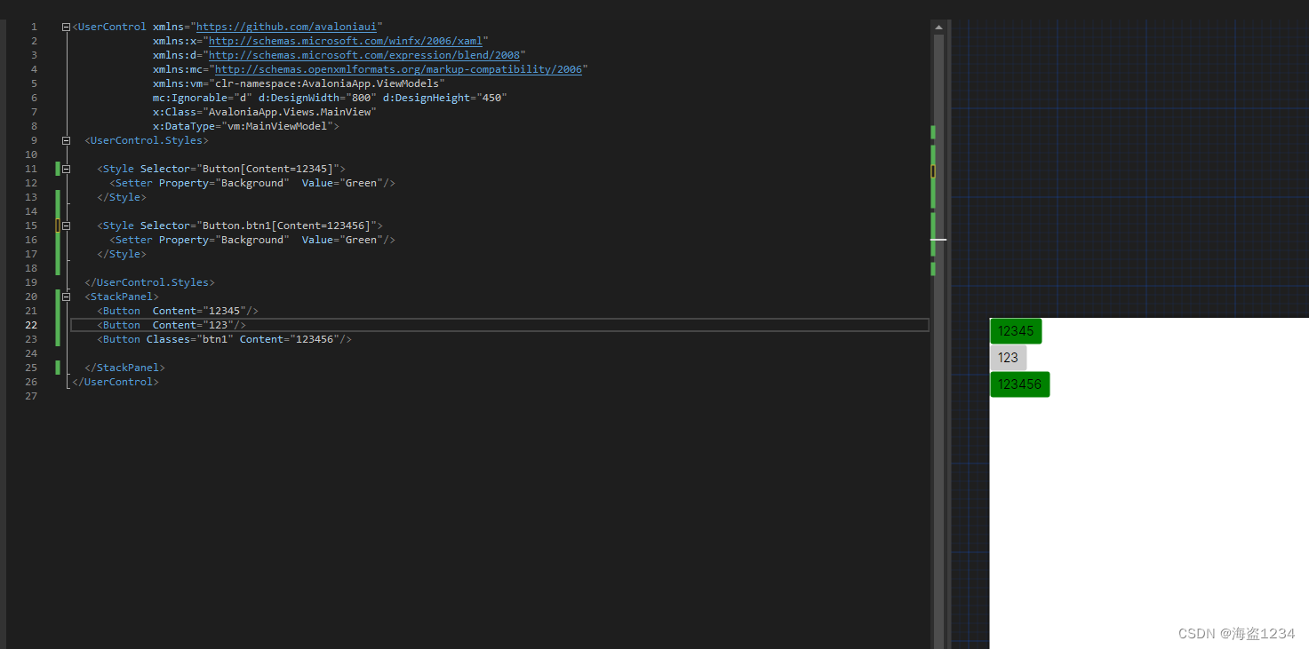
6.样式增加属性条件
让样式在一定条件下生效,可以在Selector中增加[Property=value]来限制条件
示例:
  <UserControl ...>
  <UserControl.Styles>

    <Style Selector="Button[Content=12345]">
      <Setter Property="Background"  Value="Green"/>
    </Style>

    <Style Selector="Button.btn1[Content=123456]">
      <Setter Property="Background"  Value="Green"/>
    </Style>

  </UserControl.Styles>
  <StackPanel>
    <Button  Content="12345"/>
    <Button  Content="123"/>
    <Button Classes="btn1" Content="123456"/>

  </StackPanel>
</UserControl>
效果
7. 控制控件模板内部样式
Avalonia大部分控件都是继承于TemplatedControl控件,在默认的控件主题(ControlTheme)中定义了Template属性,有时候需要编写自己的样式,就需要直接操作Templae里面的控件。
并且在源码中很多伪类的样式,如pointerover、pressed等都的样式都已经定义了基本的样式,所以导致了上面定义Button之类的控件的伪类样式无效。
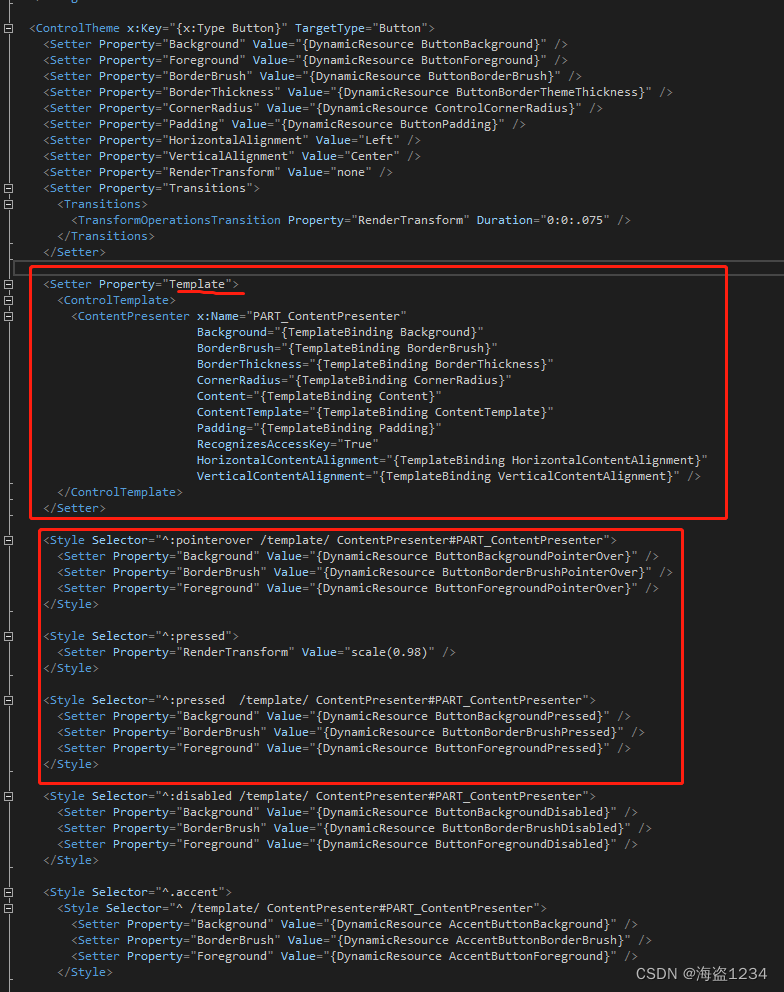
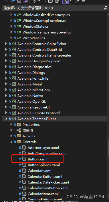
如果要进行Template里面一些控件样式的控制和修改(直接写了样式无法生效的情况),最好先有一份Avalonia的源码,照着源码改。下图就是一个button的源码(在Avalonia.Themes.Fluent项目的Controls文件夹下)。
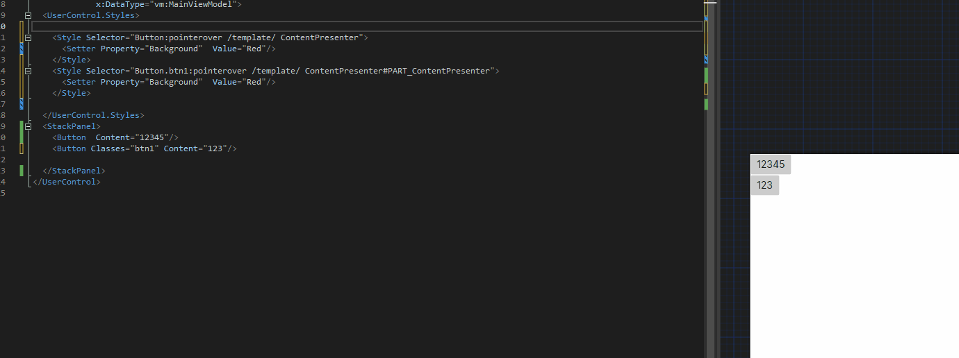
Selector的写法Selector="控件类型:伪类 /template/ 内部控件的类型#内部控件的名称",如果内部控件类型唯一,可以不写内部控件的名称。
如下示例写了一个悬停变红的样式,如下几种写法都是正确的,跟之前几项语法可以自由组合
 <Style Selector="Button:pointerover /template/ ContentPresenter">
   <Setter Property="Background"  Value="Red"/>
 </Style>
    <Style Selector="Button:pointerover /template/ ContentPresenter#PART_ContentPresente">
     <Setter Property="Background"  Value="Red"/>
   </Style>

   <Style Selector="Button.btn1:pointerover /template/ ContentPresenter#PART_ContentPresenter">
     <Setter Property="Background"  Value="Red"/>
   </Style>
实现的效果: