Vue3.x使用Swiper Vue插件最新详细教程(包含修改swiper样式)
简介
Vue和swiper版本:
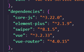
安装Swiper
我这里通过
npm i swiper -S来安装
参考Swiper官方文档链接:Getting Started With Swiper (swiperjs.com)
完整代码如下
可以直接写到你的组件当中,不需要从别的地方引入
<template>
	<div class="swiperbox">
		<swiper
			:slidesPerView="1"
			:spaceBetween="30"
			:loop="true"
			:centeredSlides="true"
			:pagination="{


				clickable: true
			}"
			:autoplay="{


				delay: 2500,
				disableOnInteraction: false
			}"
			:navigation="true"
			:modules="modules"
			class="mySwiper"
		 >
			<swiper-slide><img src="@/assets/ValAddedBiz/Banner.jpg" alt="" /></swiper-slide>
			<swiper-slide><img src="@/assets/ValAddedBiz/newsdyn-home.png" alt="" /></swiper-slide>
			<swiper-slide><img src="@/assets/ValAddedBiz/index-pic-1.png" alt="" /></swiper-slide>
			<swiper-slide><img src="@/assets/ValAddedBiz/case-home.png" alt="" /></swiper-slide>
		</swiper>
	</div>
</template>

<script setup>
import {

     Swiper, SwiperSlide } from 'swiper/vue'; // swiper所需组件
// 这是分页器和对应方法,swiper好像在6的时候就已经分离了分页器和一些其他工具
import {

     Autoplay, Navigation, Pagination, A11y } from 'swiper';
// 引入swiper样式,对应css 如果使用less或者css只需要把scss改为对应的即可
import 'swiper/css';
import 'swiper/css/navigation';
import 'swiper/css/pagination';
//默认滑动效果(这里面注释掉的可以不要)
// const onSwiper = swiper => {


// 	console.log(swiper);
// };
// const onSlideChange = e => {


// 	// swiper切换的时候执行的方法
// 	console.log('slide change', e.activeIndex);
// };
// setup语法糖只需要这样创建一个变量就可以正常使用分页器和对应功能,如果没有这个数组则无法使用对应功能
const modules = [Autoplay, Pagination, Navigation, A11y];
</script>
注意:我这里第一次npm run serve 运行的时候报了两个错 都是少装了依赖,把缺少的依赖装一下再重新运行,以下是我的报错以及解决方法,大家可以参考
终端报错截图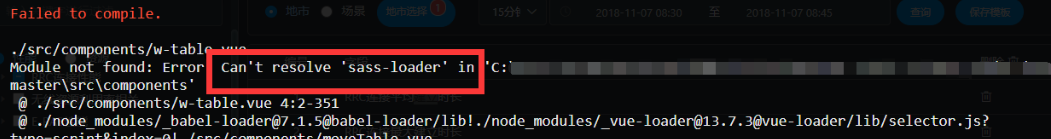
解决方法:
npm install sass-loader -D
npm install node-sass -D
注意:如果使用npm install node-sass -D 安装的时候再报错的话建议使用npm cache clean -f 先清除缓存 再使用npm install sass-loader sass webpack --save-dev 来进行安装
npm cache clean -f
npm install sass-loader sass webpack --save-dev
修改swiper分页器样式
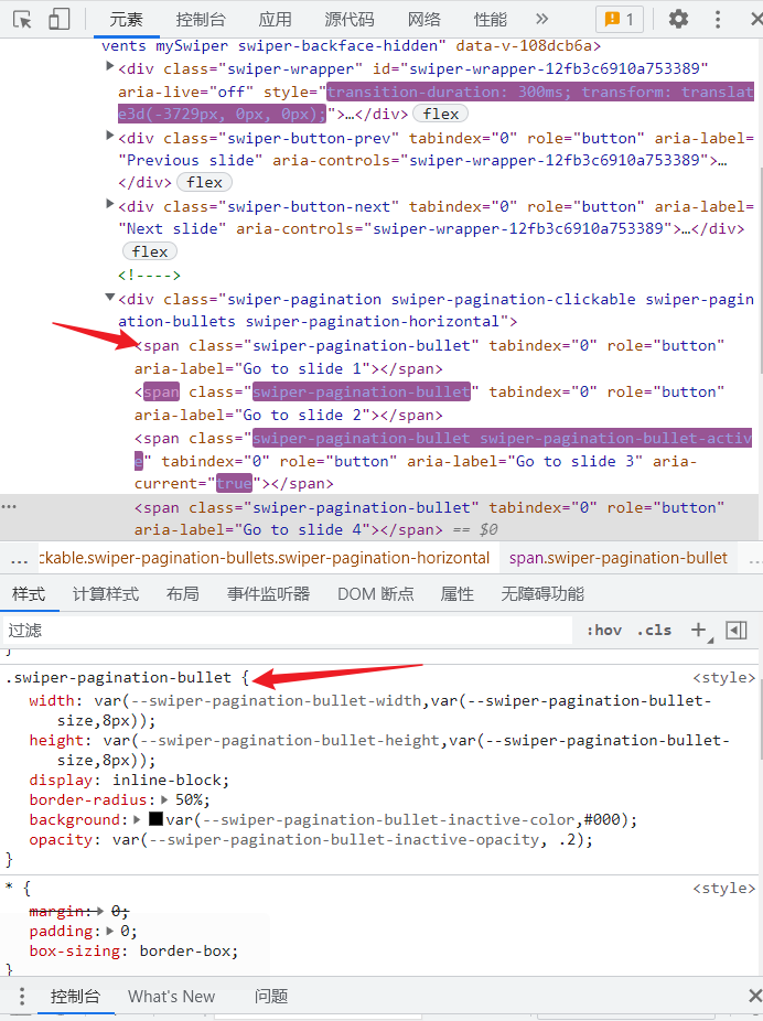
从页面上我们先找到控制分页器的类名.swiper-pagination-bullet,然后在我们的添加的swiper的组件中,这里以我要修改分页器和上下页箭头的大小颜色为例。
注意:这里的修改样式有两种方法,第一种是全局样式样式修改(不推荐),第二种是利用样式穿透的方法
- 第一种:全局修改样式(不推荐)
容易造成样式污染
<style>//注意这里没有加scoped
.mySwiper {


	width: 100%;
	height: 700px;
}
.swiper-slide {


	text-align: center;
	font-size: 18px;
	background: #fff;

	/* Center slide text vertically */
	display: -webkit-box;
	display: -ms-flexbox;
	display: -webkit-flex;
	display: flex;
	-webkit-box-pack: center;
	-ms-flex-pack: center;
	-webkit-justify-content: center;
	justify-content: center;
	-webkit-box-align: center;
	-ms-flex-align: center;
	-webkit-align-items: center;
	align-items: center;
}
.mySwiper img {


	width: 100%;
	height: 100%;
	object-fit: cover;
}
 修改分页器圆点颜色
.swiper-pagination .swiper-pagination-bullet.swiper-pagination-bullet-active {


	background-color: rgb(229, 180, 127);
}
 //修改分页器圆点大小
.swiper-pagination-bullet {


	width: 14px;
	height: 14px;
	background-color: #fff;
}
 //修改分页器圆点之间的距离
.swiper-horizontal > .swiper-pagination-bullets .swiper-pagination-bullet,
.swiper-pagination-horizontal.swiper-pagination-bullets .swiper-pagination-bullet {


	margin: 0 8px;
}
 //修改上下页箭头样式
.swiper-button-prev,
.swiper-button-next {


	color: rgb(229, 180, 127);
}
</style>
-
第二种:利用样式穿透修改(推荐)
在vue3里面
::v-deep将被弃用,目前使用:deep(选择器)(推荐)来解决scoped带来的副作用,当然也可以用>>>来进行样式穿透,但是这里考虑到兼容性问题这里还是不推荐使用>>><style scoped> .mySwiper { width: 100%; height: 700px; } .swiper-slide { text-align: center; font-size: 18px; background: #fff; /* Center slide text vertically */ display: -webkit-box; display: -ms-flexbox; display: -webkit-flex; display: flex; -webkit-box-pack: center; -ms-flex-pack: center; -webkit-justify-content: center; justify-content: center; -webkit-box-align: center; -ms-flex-align: center; -webkit-align-items: center; align-items: center; } .mySwiper img { width: 100%; height: 100%; object-fit: cover; } //这里使用的:deep样式穿透 :deep(.swiper-pagination) .swiper-pagination-bullet.swiper-pagination-bullet-active { background-color: rgb(229, 180, 127); } :deep(.swiper-pagination-bullet) { width: 14px; height: 14px; background-color: #fff; } .swiper-horizontal > .swiper-pagination-bullets .swiper-pagination-bullet, :deep(.swiper-pagination-horizontal.swiper-pagination-bullets) .swiper-pagination-bullet { margin: 0 8px; } :deep(.swiper-button-prev), :deep(.swiper-button-next) { color: rgb(229, 180, 127); } </style>
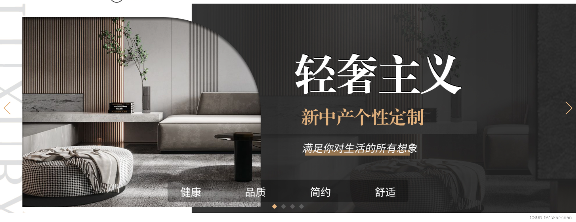
效果演示
如果觉得有帮助的希望点赞关注支持一下~