React 中的动画以及整个 Web 中的动画是随着时间的推移更改页面上 UI 元素的视觉状态的过程。视觉状态是什么意思?影响元素外观的任何属性:高度、形状、相对于其他元素的位置等。动画的核心思想是,随着时间的推移,您正在更改页面上某些内容的某些可见属性。

有几种方法可以在 React 中创建动画,但它们都分为两大类:CSS 动画,通过应用 CSS 规则来更改视觉状态;以及JavaScript动画,它使用JavaScript来更改元素的属性。在这两个类别中,您可以从头开始实现动画,也可以使用库。在 CSS 方面,您可以使用 CSS 规则合成动画,也可以使用 Animate.css 等第三方库。
如果您选择使用 JavaScript,则可以编写自定义代码来创建动画,也可以使用 GSAP 或 Framer Motion 等库。每个库都有其优点,并且每个库都有不同的编写动画的方法。在本文中,我们将探索 Framer Motion,这是一个由 Framer 设计团队创建和维护的 React 动画库。
您将学习支撑所有 Framer Motion 动画的核心组件,深入了解使 Framer Motion 成为出色工具的一些功能,发现充分利用库的最佳实践,并通过分步示例将其全部付诸实践。
文章目录
开始之前,您需要一些基础知识储备:
- React,HTML,CSS 和 JS 的知识
- 命令行和 npm 的知识
为什么用 Framer Motion 创建 React 动画?
为什么要考虑在 React 项目中使用 Framer Motion?Framer Motion是一个相当受欢迎且积极维护的库,在Github上有19k star,以及大量的资源来支持它。
但最重要的是,Framer Motion 是围绕允许您使用尽可能少的代码编写复杂的生产级动画的想法构建的。使用Framer Motion非常方便,您可以通过添加一行代码来实现拖放!Framer Motion 还大大简化了 SVG 动画和动画布局偏移等任务。
Framer Motion 组件和 API
Framer Motion具有直观的动画方法。它提供了一组组件,这些组件包装标记并接受属性,以允许您指定所需的动画类型。Framer Motion 的核心组件包括:
motion组件AnimatePresence组件
该 motion 组件提供了所有动画的基础。它将 HTML 元素包装在你的 React 组件中,并使用传递给 initial 和 animate 的状态对这些元素进行动画处理。下面是一个示例。拿一个你可以在网络上任何地方找到的普通div:
<div>I have some content here</div>
假设您希望此 div 在加载时淡入页面。您只需要以下代码:
<motion.div
  initial={

     {

      opacity:0 }}
  animate={

     {

      opacity:1 }}
>
  I have some content in here
</motion.div>
当页面加载时,div 将从透明平滑地动画到完全不透明,逐渐淡入页面。通常,在安装运动组件时,将 initial 中指定的值应用于组件,然后对组件进行动画处理,直到达到 animate 中指定的值。
接下来,让我们看看 AnimatePresence .此组件适用于 motion 并且是允许您从 DOM 中删除的元素在从页面中删除之前显示退出动画所必需的。 AnimatePresence 仅适用于满足以下两个条件之一的直接子项:
- 子项用
motion组件包装 - 子项具有一个用
motion组件包装的元素作为其子项之一
所需的退出动画必须通过将 exit 属性添加到 motion 来指定。下面是一个 AnimatePresence 示例:
<AnimatePresence>
  <motion.div
    exit={

     {

      x: "-100vh", opacity: 0 }}
  >
    Watch me go woosh!
  </motion.div>
</AnimatePresence>
当包裹的 AnimatePresence div 从 DOM 中删除时,它不会消失,而是会向左滑动 100vh,在此过程中淡入透明状态。只有在那之后,div 才会从页面中删除。请注意,当多个组件是 的直接子组件时,它们都需要有一个 key 具有唯一值,以便 AnimatePresence 可以在 DOM 中跟踪它们。
这两个组件是许多动画所需的全部组件,但 Framer Motion 具有允许更复杂的用途的功能。其中一个功能是组件的一组属性,允许 motion 组件触发动画以响应最终用户所做的手势,例如悬停、点击或拖动页面元素。这些属性被称为手势。下面是一个显示悬停手势用法的快速示例:
<motion.div
  whileHover={

     {


    opacity: 0
  }}
>
  Hover over me and I'll disappear!
</motion.div>
whileHover 属性是悬停手势。上面的代码将在将鼠标悬停在 div 上时淡出它,并在鼠标离开时将其返回到以前的状态。
在尝试更大的示例之前,让我们先看一下最后一个功能。如果要调整动画的各个方面,例如调整持续时间或延迟,请使用什么?Framer Motion 提供了一个 transition 属性,允许您指定这些内容。Framer Motion 还允许您在不同类型的动画之间进行选择,例如 Spring 动画和 Tween(基于缓动)动画,并且 transition 属性允许您控制这一点。下面是一个示例:
<motion.div
  initial={

     {

      opacity:0 }}
  animate={

     {

      opacity:1 }}
  transition={

     {

      duration: 0.5, delay: 0.1 }}
>
  I have some content here
</motion.div>
这与之前的淡入动画相同,但由于 transition 属性的原因,动画将等待 0.1 秒开始,并将持续 0.5 秒。
使用 Framer Motion 在 React 应用程序中实现动画
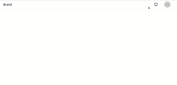
让我们用我们学到的一切来组合一个更复杂的例子。在本文结束时,你将构建一个动画通知托盘,如下所示:
初始化项目
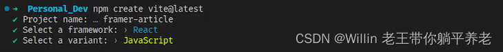
首先导航到您希望示例所在的目录。接下来,打开您的终端并使用以下命令使用 Vite 创建一个入门 React 应用程序:
npm create vite@latest
然后,像这样回答提示:
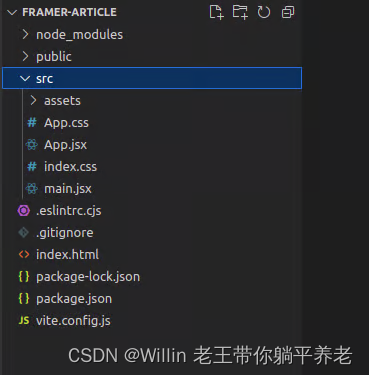
现在,进入您刚刚创建的项目,运行 npm install , 然后运行 npm run dev 。您的项目文件夹现在应如下所示:
删除 src/assets 文件夹和 App.css .现在,编写导航托盘的代码,不带任何动画。从项目的 CSS 开始,将 的内容 index.css 替换为以下内容:
:root {


  font-family: Inter, system-ui, Avenir, Helvetica, Arial, sans-serif;
  font-weight: 400;
}
body {


  margin: 0;
  min-width: 320px;
  min-height: 100vh;
  background-color: #fff;
  color: #111827;
}
header {


  height: 4rem;
  font-size: 1.1rem;
  border-bottom: 1px solid #e5e7eb;
  display: flex;
  align-items: center;
  padding: 0 2rem;
}
header > .header__left {


  width: 50%;
  font-size: 1.5rem;
}
header > .header__right {


  width: 50%;
  display: flex;
  justify-content: flex-end;
  align-items: center;
  list-style-type: none;
  margin: 0;
  padding: 0;
}
.header__right > * {


  margin: 0 1.5rem;
  position: relative;
}
.header__right > .notification__button {


  height: 2rem;
  width: 2rem;
  cursor: pointer;
}
.header__right > .notification__icon {


  height: 100%;
  width: 100%;
}
.header__right > .image {


  border-radius: 50%;
  height: 3rem;
  width: 3rem;
  overflow: hidden;
}
.header__right > .image > img {


  height: 100%;
  width: 100%;
}
.notification__tray {


  border-radius: 6px;
  box-shadow: 0px 0px 8px #e5e7eb;
  position: fixed;
  width: 24rem;
  top: 4.5rem;
  right: 2rem;
  color: rgb(65, 65, 81);
  font-size: 0.875rem;
  line-height: 1.25rem;
}
.notification__tray > ul {


  list-style-type: none;
  margin: 0;
  padding: 0;
}
.notification__tray li {


  padding: 1rem 2rem;
  border-bottom: 1px solid #e5e7eb;
  display: flex;
  align-items: center;
  justify-content: space-between;
}
.notification__tray li:hover {


  background-color: #e5e7eb;
  color: #111827;
}
.notification__tray li .clear__button {


  width: 1.5rem;
  height: 1.5rem;
  cursor: pointer;
}
.notification__tray li .clear__icon {


  width: 100%;
  height: 100%;
}
.todo__header {


  text-align: center;
}
.todo__container {


  list-style-type: none;
}
.todo__item {


  border: 1px solid #e5e7eb;
  border-radius: 5px;
  box-shadow: 0px 0px 8px #e5e7eb;
  color: #111827;
  margin: 1.5rem auto;
  width: 350px;
  padding: 1.5rem 2rem;
  background-color: #e5e7eb;
}
接下来是页眉的代码。在 中 src ,创建一个名为 Header.jsx 的文件,并用以下内容填充它:
import {

     useState } from "react";
import NotificationTray from "./NotificationTray";

const initialNotifications = [
  "User #20 left you a like!",
  "User #45 sent you a friend request",
  "Your song has been uploaded!",
  "Thanks for signing up!",
];

const Header = () => {


  const [showNotifications, setShowNotifications] = useState(false);
  const [notificationContent, setNotificationContent] =
    useState(initialNotifications);

  const handleDeleteNotification = (content) => {


    setNotificationContent(
      notificationContent.filter((item) => item !== content)
    );
  };

  return (
    <header>
      <div className="header__left">Brand</div>
      <ul className="header__right">
        <li
          className="notification__button"
          onClick={

    () => {


            setShowNotifications(!showNotifications);
          }}
        >
          <svg
            xmlns="http://www.w3.org/2000/svg"
            fill="none"
            viewBox="0 0 24 24"
            strokeWidth="1.5"
            stroke="currentColor"
            className="notification__icon"
          >
            <path
              strokeLinecap="round"
              strokeLinejoin="round"
              d="M14.857 17.082a23.848 23.848 0 005.454-1.31A8.967 8.967 0 0118 9.75v-.7V9A6 6 0 006 9v.75a8.967 8.967 0 01-2.312 6.022c1.733.64 3.56 1.085 5.455 1.31m5.714 0a24.255 24.255 0 01-5.714 0m5.714 0a3 3 0 11-5.714 0M3.124 7.5A8.969 8.969 0 015.292 3m13.416 0a8.969 8.969 0 012.168 4.5"
            />
          </svg>
        </li>
        <li className="image">
          <img src="https://www.dummyimage.com/48x48" />
        </li>
      </ul>

      {

    showNotifications ? (
        <NotificationTray
          notificationContent={

    notificationContent}
          handleDeleteNotification={

    handleDeleteNotification}
        ></NotificationTray>
      ) : null}
    </header>
  );
};
export default Header;
为简洁起见,我们不会详细介绍起始代码,但本质上它做了几件事:
- 导入通知托盘的组件
- 为托盘创建状态并定义帮助程序函数以从状态中删除通知
- 为标头创建标记,并有条件地呈现托盘
接下来,编写通知托盘组件的代码。创建一个调用 NotificationTray.jsx 的文件并将以下代码放入其中:
const NotificationTray = ({


  notificationContent,
  handleDeleteNotification,
}) => {


  return (
    <div className="notification__tray">
      <ul>
        {

    notificationContent.map((content) => {


          return (
            <li key={

    content}>
              <span>{

    content}</span>
              <span
                className="clear__button"
                onClick={

    () => {


                  handleDeleteNotification(content);
                }}
              >
                <svg
                  xmlns="http://www.w3.org/2000/svg"
                  fill="none"
                  viewBox="0 0 24 24"
                  strokeWidth={

    1.5}
                  stroke="currentColor"
                  className="clear__icon"
                  title="Clear notification"
                >
                  <path
                    strokeLinecap="round"
                    strokeLinejoin="round"
                    d="M9.75 9.75l4.5 4.5m0-4.5l-4.5 4.5M21 12a9 9 0 11-18 0 9 9 0 0118 0z"
                  />
                </svg>
              </span>
            </li>
          );
        })}
      </ul>
    </div>
  );
};
export default NotificationTray;
此代码:
- 将托盘的状态呈现为
<ul>,每个<li>都有通知 - 使用
Header.jsx程序函数在单击通知的清除按钮时删除通知
最后,像这样呈现标头 App.jsx :
import Header from "./Header"

function App() {


  return (
    <>
      <Header></Header>
    </>
  )
}
export default App
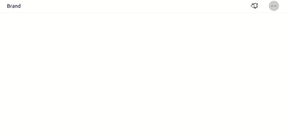
所有这些都涵盖了使通知托盘正常工作所需的代码。如果你在浏览器中查看你的 React 应用程序,你应该有一个看起来像这样的网页:
添加 Framer Motion 动画
我们将开始为铃铛图标制作动画。悬停时触发的振铃运动是通过沿 z 轴旋转 SVG 图标,先向一个方向旋转,然后再向另一个方向旋转,然后将其恢复正常来创建的。
方法如下:在 Header.jsx 顶部,导入 motion 和 AnimatePresence :
import {

    motion, AnimatePresence} from "framer-motion";
然后,在 Header.jsx 中添加 SVG 动画:
<motion.svg
  whileHover={

     {


    rotateZ: [0, -20, 20, -20, 20, -20, 20, 0],
    transition: {

      duration: 0.5 },
  }}
  xmlns="http://www.w3.org/2000/svg"
  fill="none"
  viewBox="0 0 24 24"
  strokeWidth="1.5"
  stroke="currentColor"
  className="notification__icon"
>
  <path
    strokeLinecap="round"
    strokeLinejoin="round"
    d="M14.857 17.082a23.848 23.848 0 005.454-1.31A8.967 8.967 0 0118 9.75v-.7V9A6 6 0 006 9v.75a8.967 8.967 0 01-2.312 6.022c1.733.64 3.56 1.085 5.455 1.31m5.714 0a24.255 24.255 0 01-5.714 0m5.714 0a3 3 0 11-5.714 0M3.124 7.5A8.969 8.969 0 015.292 3m13.416 0a8.969 8.969 0 012.168 4.5"
  />
</motion.svg>
以下是 SVG 的更改方式:
- 它包裹着
motion - 它有手势
whileHover作为属性,所以动画仅在SVG悬停时触发 - 在传递给
whileHover的对象,您在数组中指定了值范围。此数组称为关键帧,这意味着 Framer Motion 不会将 SVG 动画化为关键帧中指定的每个值,而是将 SVG 动画化 - 在传递给
transition的对象中,您指定希望动画持续半秒
应用后,当您将鼠标悬停在网页上时,您应该会看到铃声响起:

您将实现的下一个动画是通知托盘上的条目淡入动画。创建 Notification.jsx 并导入 motion 和 AnimatePresence :
import {

     motion, AnimatePresence } from "framer-motion";
然后,像这样修改 div 外面的代码:
<motion.div
  className="notification__tray"
  initial={

     {

      opacity: 0 }}
  animate={

     {

      opacity: 1 }}
>
  <ul>
    .....
  </ul>
</motion.div>
所有改变的是 div 变成了 motion.div ,你设置 initial 和 animate props 的值,这样 div 从 opacity 0 开始并动画化以完全可见。返回的 <li> 重复此操作 map ,并添加 0.2 秒的持续时间,如下所示:
{


  notificationContent.map((content) => {


    return (
      <motion.li
        key={

    content}
        initial={

    {

     opacity: 0 }}
        animate={

    {

     opacity: 1 }}
        transition={

    {

     duration: 0.2 }}
      >
        ...
      </motion.li>
    )
  })
}
作为额外的触摸,让我们对每个通知的退出进行动画处理。为此,您将通过在从托盘中移除 时 li 添加滑移动画来执行此操作。您现在需要做的就是用组件包装 <li> s,然后使用 exit prop 指定删除每个 <li> 组件时 AnimatePresence 会发生什么。让我们看看它是如何工作的:
<ul>
  <AnimatePresence>
    {notificationContent.map((content) => {
      return (
        <motion.li
          key={content}
          initial={

     {

      opacity: 0 }}
          animate={

     {

      opacity: 1 }}
          exit={

     {

      x: "-12rem", opacity: 0 }}
          transition={

     {

      duration: 0.2 }}
          layout
        >
          ....
        </motion.li>
      )
    })}
  </AnimatePresence>
</ul>
exit 属性说,当移除 <li> ,它应该向左移动 12rem(托盘宽度的一半),然后在卸载之前消失。该 layout 属性告诉 Framer Motion 对由布局偏移引起的元素位置的任何变化进行动画处理。这意味着当 a 从托盘中移除时,与其说它的 <li> 兄弟姐妹跳起来填充空间,不如说它们会平稳地滑入新位置。花点时间亲自检查一下。
此部分的最后一个任务是动画托盘的退出(当您单击铃铛后托盘消失时)。要应用 <li> 的动画 : 向左滑动并淡出的退出动画相同。
返回 Header.jsx 并用以下 AnimatePresence 包装 NotificationTray 组件:
<AnimatePresence>
  {showNotifications ? (
    <NotificationTray
      notificationContent={notificationContent}
      handleDeleteNotification={handleDeleteNotification}
    ></NotificationTray>
  ) : null}
</AnimatePresence>
然后,在 NotificationTray.jsx ,添加一个 exit 到最外面的div:
<motion.div
  className="notification__tray"
  initial={

     {

      opacity: 0 }}
  animate={

     {

      opacity: 1 }}
  exit={

     {

      opacity: 0, x: "-12rem" }}
>
  <ul>...</ul>
</motion.div>
这样就完成了我们动画的基础!您的托盘现在应该具有如下所示的动画:
