文章目录
开发的时候遇到如下问题
当给一个容器的样式同时添加 justify-content :center 和 overflow-x: auto 属性,当内容长度超过容器的长度的时候会出现左侧内容被裁剪的问题。
<style>
    .prop-list {


      width: 500px;
      height: 100px;
      background: rgba(167, 155, 180, 0.3);
      border: 3px solid rgba(68, 203, 245, 0.3);
      border-radius: 10px;
      display: flex;
      justify-content: space-around;
      align-items: center;
      overflow-x: auto;
      margin: auto;
    }
    .prop-item {


      min-width: 70px;
      height: 70px;
      margin: 0 10px;
      background-color: lightcyan;
      border: 3px solid rgba(255, 255, 255, 0.3);
      border-radius: 10px;
      text-align: center;
      line-height: 70px;
      font-size: 20px;
      font-weight: 900;
    }
  </style>
  <body>
    <div class="prop-list">
      <div class="prop-item">1</div>
      <div class="prop-item">2</div>
      <div class="prop-item">3</div>
      <div class="prop-item">4</div>
      <div class="prop-item">5</div>
      <div class="prop-item">6</div>
      <div class="prop-item">7</div>
      <div class="prop-item">8</div>
    </div>
  </body>
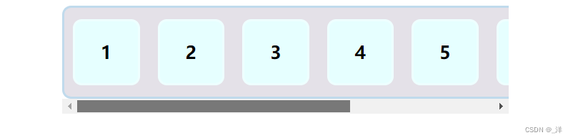
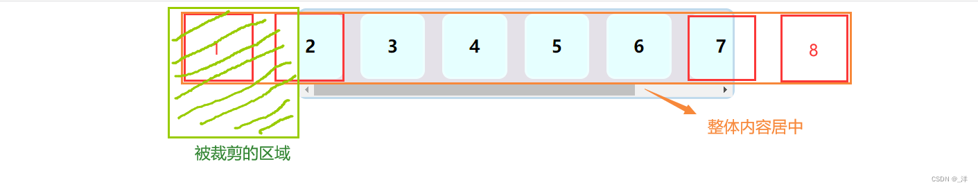
效果:
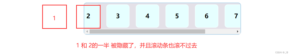
原因
设置 justify-content :center 使元素居中,超过容器的地方会被认为成是溢出,再结合 overflow-x: auto ,右侧超出容器的地方会被滚动条滚动显示,但是左侧的地方已经被 “裁剪了”,无法显示。
解决
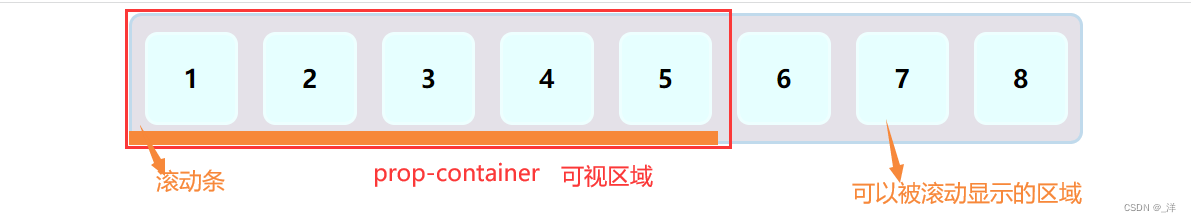
既然是因为元素居中导致元素被隐藏,那就不在 prop-list 容器上使用overflow-x: auto;了, 可以在 prop-list 容器外面再套一层容器 prop-container 实现 overflow-x: auto;作为可视区域的容器, prop-list 容器则作为被滚动显示的容器,此时 prop-container 容器的子元素默认从左边开始显示,就不会有因为子元素剧中导致的裁切问题了。
- 原理:
- 实现
<!DOCTYPE html>
<html lang="en">
  <head>
    <meta charset="UTF-8" />
    <meta http-equiv="X-UA-Compatible" content="IE=edge" />
    <meta name="viewport" content="width=device-width, initial-scale=1.0" />
    <title>Document</title>
  </head>
  <style>
    .prop-container {


      width: 500px;
      overflow-x: auto;
      margin: auto;
    }
    .prop-list {


      min-width: 500px;
      height: 100px;
      background: rgba(167, 155, 180, 0.3);
      border: 3px solid rgba(68, 203, 245, 0.3);
      border-radius: 10px;
      display: flex;
      justify-content: space-around;
      align-items: center;
    }
    .prop-item {


      /* 需要设置下,要不然会强制压缩 */
      min-width: 70px;
      height: 70px;
      margin: 0 10px;
      background-color: lightcyan;
      border: 3px solid rgba(255, 255, 255, 0.3);
      border-radius: 10px;
      text-align: center;
      line-height: 70px;
      font-size: 20px;
      font-weight: 900;
    }
  </style>
  <body>
    <div class="prop-container">
      <div class="prop-list">
        <div class="prop-item">1</div>
        <div class="prop-item">2</div>
        <div class="prop-item">3</div>
        <div class="prop-item">4</div>
        <div class="prop-item">5</div>
        <div class="prop-item">6</div>
        <div class="prop-item">7</div>
        <div class="prop-item">8</div>
      </div>
    </div>
  </body>
</html>
- 效果
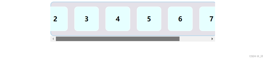
啊哦,还是被裁剪了。这是神什么原因呢?这个因为 设置 prop-list 容器display: flex; 那么容器的默认宽度就是父元素 prop-container 的宽度(符合默认的block属性),然后设置子元素居中显示,所以还是会被裁剪。
- 解决:
设置 prop-list 容器display: inline-flex;那么 prop-list 容器就符合inline-block属性,宽度是被子元素撑开的。
效果: