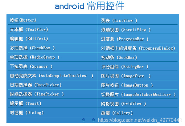
Android 中一些常用的 UI 控件有:
TextView(文本框)、
EditView(输入框)、
Button(按钮)、
RadioButton(单选按钮)、
ImageView(图像视图)、
ToggleButton(开关按钮) 等等
1、TextView(文本框)
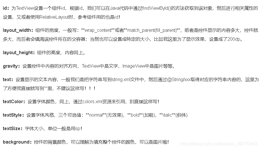
TextView 中的一些属性说明:
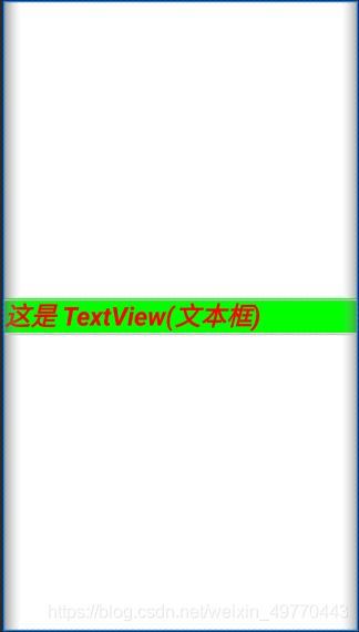
layout 布局代码如下:
<?xml version="1.0" encoding="utf-8"?>
<LinearLayout xmlns:android="http://schemas.android.com/apk/res/android"
    android:layout_width="match_parent"
    android:layout_height="match_parent">

    <TextView
        android:id="@+id/TextView1"
        android:layout_width="match_parent"
        android:layout_height="wrap_content"
        android:text="这是 TextView(文本框)"
        android:textColor="#FF0000"
        android:textStyle="bold|italic"
        android:textSize="30sp"
        android:layout_gravity="center"
        android:background="#00FF00"/>

</LinearLayout>
页面效果如下:
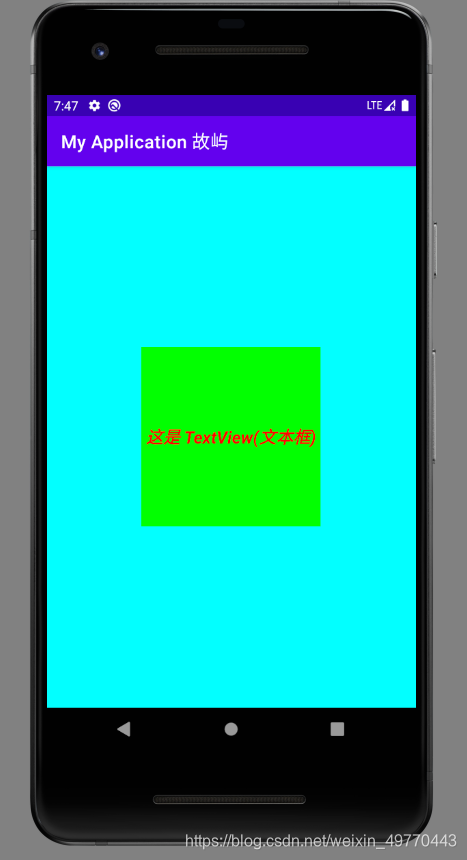
- 另若想要文本框和字体都居中效果时
layout 布局代码如下:
<?xml version="1.0" encoding="utf-8"?>
<LinearLayout xmlns:android="http://schemas.android.com/apk/res/android"
    android:layout_width="match_parent"
    android:layout_height="match_parent"
    android:gravity="center"
    android:background="#00FFFF">

    <TextView
        android:id="@+id/TextView1"
        android:layout_width="200dp"
        android:layout_height="200dp"
        android:text="这是 TextView(文本框)"
        android:textColor="#FF0000"
        android:textStyle="bold|italic"
        android:textSize="19sp"
        android:gravity="center"
        android:background="#00FF00"/>

</LinearLayout>
页面效果如下:
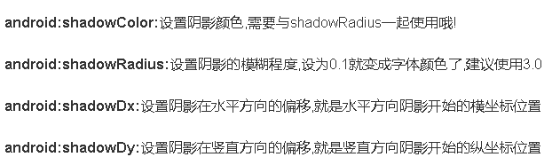
①带阴影的 TextView 属性
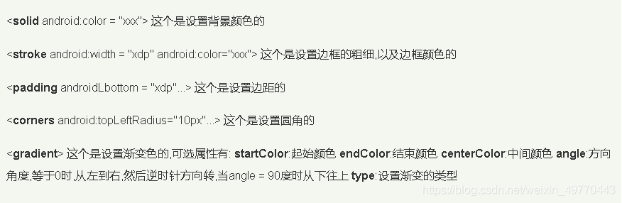
②带边框的 TextView
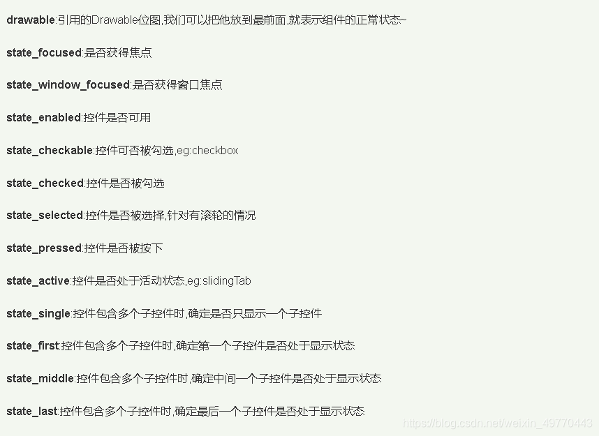
shapeDrawable 资源文件的几个节点以及属性说明:
③带图片(drawableXxx)的 TextView
基本用法:
设置图片的核心其实就是: drawableXxx; 可以设置四个方向的图片:drawableTop(上),
drawableButtom(下),
drawableLeft(左),
drawableRight(右)另外,也可以使用 drawablePadding 来设置图片与文字间的间距!
④使用 autoLink 属性识别链接类型
当文字中出现了 URL,E-Mail,电话号码,地图的时候,我们可以通过设置 autoLink 属性;当我们点击 文字中对应部分的文字,即可跳转至某默认 APP,比如一串号码,点击后跳转至拨号界面等等!
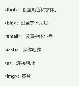
⑤ TextView 使用 HTML:
常用的标签:
2、EditText(输入框)
和 TextView(文本框)非常类似,最大的区别是:EditText 可以接受用户编辑输入!EditText 继承 TextView, 可以进行编辑操作,将用户信息传递给 Android 程序。还可以为 EditText 控件设置监听器,用来测试用户输入的内容是否合法等等。
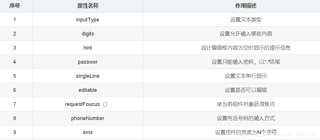
hint 设置默认提示文本,编辑输入文本内容后,提示内容消失
获得焦点后全选组件内所有文本内容
限制输入类型
设置最小行,最多行,单行,多行,自动换行…
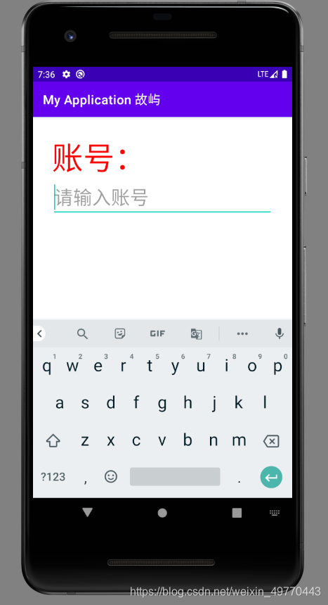
layout 布局代码如下:
<?xml version="1.0" encoding="utf-8"?>
<LinearLayout xmlns:android="http://schemas.android.com/apk/res/android"
    android:layout_width="match_parent"
    android:layout_height="match_parent"
    android:orientation="vertical"
    android:padding="30dp">

    <TextView
        android:layout_width="match_parent"
        android:layout_height="wrap_content"
        android:text="账号:"
        android:textSize="50sp"
        android:textColor="#FF0000"/>

    <EditText
        android:layout_width="match_parent"
        android:layout_height="wrap_content"
        android:hint="请输入账号"
        android:textSize="30sp"
        android:maxLines="2"/>

</LinearLayout>
页面效果如下:
3、Button 与 ImageButton(图像按钮):
StateListDrawable 是 Drawable 资源的一种,可以根据不同的状态,设置不同的图片效果,关键节点 < selector >,我们只需要将 Button 的 background 属性设置为该 drawable 资源即可轻松实现,按下按钮时不同的按钮颜色或背景!
设置的属性:
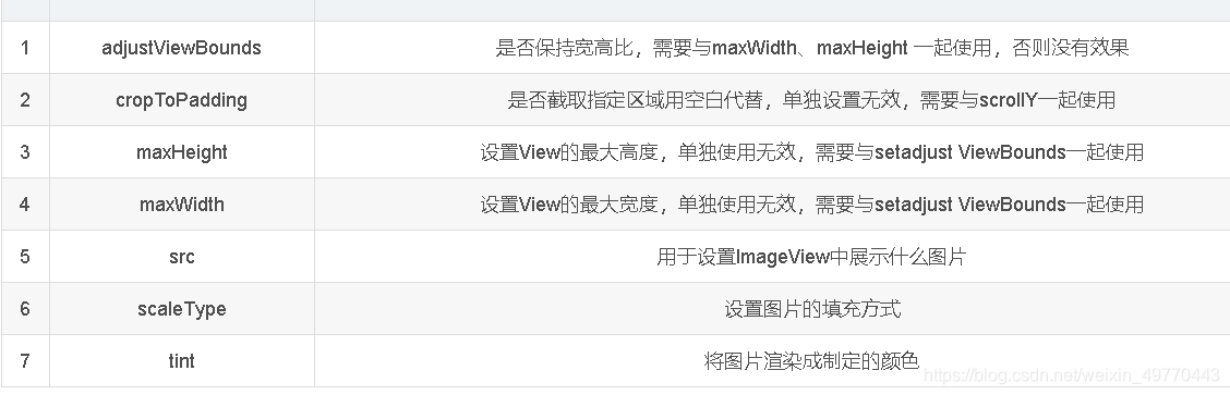
4、ImageView(图像视图):
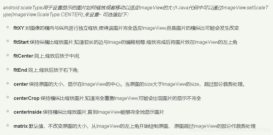
scaleType 设置缩放类型值:
- 布局中指定图片 android:src="@drawable/image_1"
5、RadioButton(单选按钮) & Checkbox(复选框):
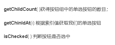
RadioButton 方法获取相关信息;
RadioGroup 是单选组合框,由多个单选按钮RadioButton 组成,实现单选状态。RadioButton(单选按钮) 需要与 RadioGroup 配合使用,提供两个或多个互斥选项集。
layout 布局代码如下:
<?xml version="1.0" encoding="utf-8"?>
<LinearLayout xmlns:android="http://schemas.android.com/apk/res/android"
    android:orientation="vertical"
    android:layout_width="match_parent"
    android:layout_height="match_parent"
    android:gravity="center">

    <LinearLayout
        android:id="@+id/gender_line"
        android:layout_width="match_parent"
        android:layout_height="wrap_content"
        android:layout_marginRight="15dp"
        android:layout_marginLeft="15dp"
        android:layout_marginTop="10dp"
        android:layout_marginBottom="10dp">

        <TextView
            android:layout_width="wrap_content"
            android:layout_height="wrap_content"
            android:text="性         别:"
            android:textSize="14sp">
        </TextView>
        <RadioGroup
            android:id="@+id/gender"
            android:layout_width="match_parent"
            android:layout_height="wrap_content"
            android:orientation="horizontal">
            <RadioButton
                android:layout_width="wrap_content"
                android:layout_height="wrap_content"
                android:text="男"
                android:textSize="14sp"
                android:layout_marginLeft="30dp"
                android:layout_marginRight="20dp">
            </RadioButton>
            <RadioButton
                android:layout_width="wrap_content"
                android:layout_height="wrap_content"
                android:text="女"
                android:textSize="14sp"
                android:layout_marginLeft="30dp"
                android:layout_marginRight="20dp">
            </RadioButton>
        </RadioGroup>
    </LinearLayout>

    <LinearLayout
        android:id="@+id/likes_line"
        android:layout_width="match_parent"
        android:layout_height="wrap_content"
        android:layout_marginRight="15dp"
        android:layout_marginLeft="15dp"
        android:layout_marginTop="10dp">
        <TextView
            android:layout_width="wrap_content"
            android:layout_height="wrap_content"
            android:text="喜         好:"
            android:textSize="14sp">
        </TextView>
        <CheckBox
            android:id="@+id/play_game"
            android:layout_width="wrap_content"
            android:layout_height="wrap_content"
            android:text="敲代码"
            android:textSize="14sp"
            android:layout_marginLeft="30dp"
            android:layout_marginRight="20dp"
            android:checked="true">
        </CheckBox>
        <CheckBox
            android:id="@+id/play_balls"
            android:layout_width="wrap_content"
            android:layout_height="wrap_content"
            android:text="打球"
            android:textSize="14sp"
            android:layout_marginLeft="10dp"
            android:layout_marginRight="20dp">
        </CheckBox>
        <CheckBox
            android:id="@+id/play_man"
            android:layout_width="wrap_content"
            android:layout_height="wrap_content"
            android:text="打人"
            android:textSize="14sp"
            android:layout_marginLeft="10dp">
        </CheckBox>
    </LinearLayout>
</LinearLayout>
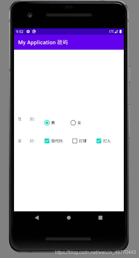
页面效果如下:
6、ToggleButton(开关按钮) & Switch(开关):
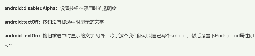
①开关按钮相关属性:
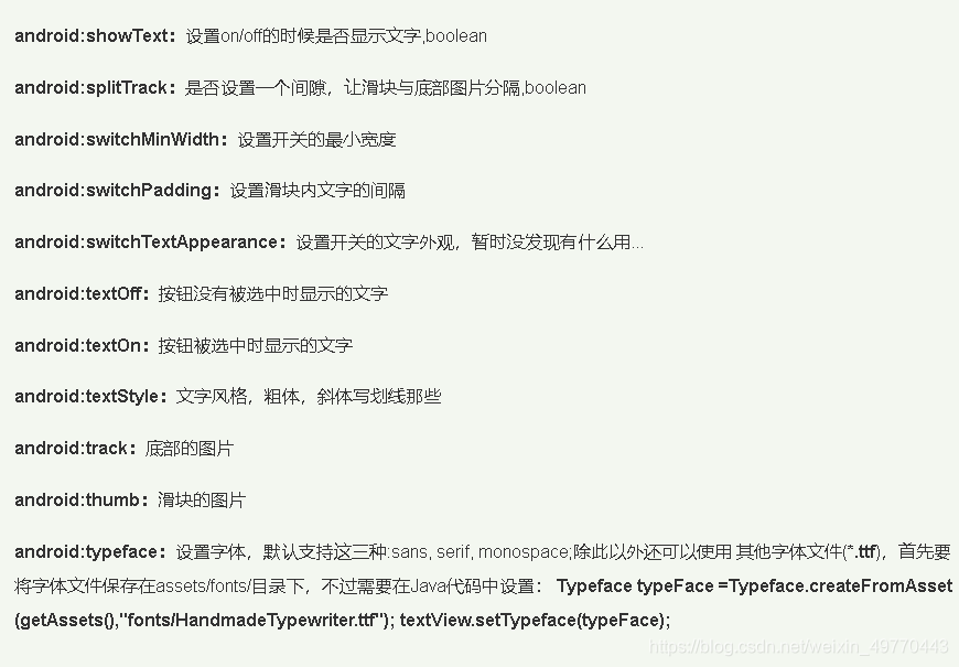
②开关相关属性:
Note:
欢迎点赞,留言,转载请在文章页面明显位置给出原文链接
知者,感谢您在茫茫人海中阅读了我的文章
没有个性 哪来的签名!
详情请关注点我
持续更新中
| © 2021 05 - Guyu.com | 【版权所有 侵权必究】 |