推荐:使用 NSDT场景编辑器快速搭建3D应用场景
介绍
在数据科学和分析领域,数据的力量不仅通过提取见解来释放,而且还通过有效地传达这些见解来释放;这就是数据可视化发挥作用的地方。

数据可视化是信息和数据的图形表示。它使用图表、图形和地图等可视元素,可以更轻松地查看原始数据中的模式、趋势和异常值。对于数据科学家和分析师来说,数据可视化是一种必不可少的工具,有助于更快、更准确地理解数据,支持用数据讲故事,并有助于做出数据驱动的决策。
在本文中,您将学习如何使用 Python 和 Dash 框架创建一个仪表板,以可视化 Netflix 的内容分发和分类。
什么是Dash?
Dash是由Plotly开发的开源低代码框架,用于在纯Python中创建分析Web应用程序。传统上,出于此类目的,可能需要使用JavaScript和HTML,这需要您具备后端(Python)和前端(JavaScript,HTML)技术方面的专业知识。
然而,达世币弥合了这一差距,使数据科学家和分析师能够仅使用Python构建交互式、美观的仪表板。低代码开发的这一方面使达世币成为创建分析仪表板的合适选择,特别是对于那些主要熟悉Python的人。
数据集分析
现在您已经熟悉了达世币,让我们开始我们的动手项目。您将使用由 Shivam Bansal 创建的 Kaggle 上提供的 Netflix 电影和电视节目数据集。
此数据集包含截至 2021 年 Netflix 上可用的电影和电视节目的详细信息,例如内容类型、标题、导演、演员、制作国家/地区、发行年份、评级、时长等。
尽管该数据集是在 2021 年创建的,但它仍然是开发数据可视化技能和了解媒体娱乐趋势的宝贵资源。
使用此数据集,您将创建一个仪表板,该仪表板允许可视化以下几点:
- 地理内容分布:显示多年来不同国家/地区内容制作变化的地图图表。
- 内容分类:此可视化将 Netflix 的内容分为电影和电影,以查看哪些类型最突出。
设置项目工作空间
让我们开始为名为 netflix-dashboard 的项目创建目录,然后通过以下命令初始化并激活 Python 虚拟环境:
# Linux & MacOS
mkdir netflix-dashboard && cd netflix-dashboard
python3 -m venv netflix-venv && source netflix-venv/bin/activate
# Windows Powershell
mkdir netflix-dashboard && cd netflix-dashboard
python -m venv netflix-venv && .\netflix-venv\Scripts\activate接下来,您需要安装一些外部包。您将用于数据操作、创建仪表板、创建图形以及向仪表板添加一些样式:pandasdashplotlydash-bootstrap-components
# Linux & MacOS
pip3 install pandas dash plotly dash-bootstrap-components
# Windows Powershell
pip install pandas dash plotly dash-bootstrap-components清理数据集
浏览 Netflix 数据集,您会在 、 和 列中找到缺失的值。将列值转换为以便于分析也很方便。directorcastcountrydate_addedstringdatetime
若要清理数据集,可以使用以下代码创建一个新的文件clean_netflix_dataset.py,然后运行它:
import pandas as pd

# Load the dataset
df = pd.read_csv('netflix_titles.csv')

# Fill missing values
df['director'].fillna('No director', inplace=True)
df['cast'].fillna('No cast', inplace=True)
df['country'].fillna('No country', inplace=True)

# Drop missing and duplicate values
df.dropna(inplace=True)
df.drop_duplicates(inplace=True)

# Strip whitespaces from the `date_added` col and convert values to `datetime`
df['date_added'] = pd.to_datetime(df['date_added'].str.strip())

# Save the cleaned dataset
df.to_csv('netflix_titles.csv', index=False)
Dash入门
设置工作区并清理数据集后,即可开始处理仪表板。使用以下代码创建一个新的文件 app.py:
from dash import Dash, dash_table, html
import pandas as pd

# Initialize a Dash app
app = Dash(__name__)

# Define the app layout
app.layout = html.Div([
        html.H1('Netflix Movies and TV Shows Dashboard'),
        html.Hr(),
])

# Start the Dash app in local development mode
if __name__ == '__main__':
    app.run_server(debug=True)
让我们在 app.py 中分解代码:
app = Dash(__name__):此行初始化一个新的达世币应用程序。将其视为应用程序的基础。app.layout = html.Div(…):该属性允许您编写类似 HTML 的代码来设计应用程序的用户界面。上面的布局使用仪表板标题的标题元素和标题下方的水平规则元素。app.layouthtml.H1(…)html.Hr()app.run(debug=True):此行启动一个开发服务器,该服务器在本地开发模式下为您的达世币应用程序提供服务。达世币使用Flask,一个轻量级的Web服务器框架,为您的应用程序提供到Web浏览器。
运行 app.py 后,您将在终端中看到一条消息,指示您的达世币应用程序正在运行,http://127.0.0.1:8050/ 即可访问。在 Web 浏览器中打开此 URL 以查看它:
您的第一个达世币应用程序!
结果看起来很简单,对吧?不用担心!本节旨在展示最基本的达世币应用程序结构和组件。您很快就会添加更多功能和组件,使其成为一个很棒的仪表板!
整合仪表板引导组件
下一步是为仪表板的布局编写代码并为其添加一些样式!为此,您可以使用达世币引导组件(DBC),这是一个为达世币提供引导组件的库,使您能够开发具有响应式布局的风格应用程序。
仪表板将以选项卡布局设置样式,这提供了一种紧凑的方式来组织同一空间内不同类型的信息。每个选项卡将对应于不同的可视化效果。
让我们继续修改 app.py 的内容以合并 DBC:
from dash import Dash,dcc, html
import pandas as pd
import dash_bootstrap_components as dbc

# Initialize the Dash app and import the Bootstrap theme to style the dashboard
app = Dash(__name__, external_stylesheets=[dbc.themes.BOOTSTRAP])

app.layout = dbc.Container(
    [
        dcc.Store(id='store'),
        html.H1('Netflix Movies and TV Shows Dashboard'),
        html.Hr(),
        dbc.Tabs(
            [
                dbc.Tab(label='Geographical content distribution', tab_id='tab1'),
                dbc.Tab(label='Content classification', tab_id='tab2'),
            ],
            id='tabs',
            active_tab='tab1',
        ),
        html.Div(id='tab-content', className='p-4'),
    ]
)

if __name__ == '__main__':
    app.run(debug=True)
在此修改后的布局中,您将看到新组件:
dbc.Container:用作顶级组件将整个仪表板布局包装在一个响应迅速且灵活的容器中。dbc.Containerdcc.Store:此Dash Core组件允许您在客户端(在用户的浏览器上)存储数据,通过将数据保存在本地来提高应用程序的性能。dbc.Tabs和 :每个表示一个单独的选项卡,该选项卡将包含不同的可视化效果。该属性是显示在选项卡本身上的内容,用于标识选项卡。的属性用于指定达世币应用程序启动时的活动选项卡。dbc.Tabdbc.Tablabeltab_idactive_tabdbc.Tabs
现在运行 app.py。 生成的仪表板现在将具有具有两个空选项卡的引导样式布局:
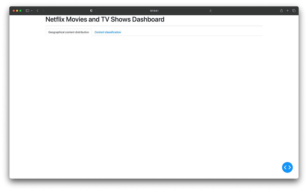
合并引导程序以获得选项卡样式的布局
好去!你终于准备好向仪表板添加可视化效果了。
添加回调和可视化
使用达世币时,交互性是通过回调函数实现的。回调函数是在输入属性更改时自动调用的函数。它之所以被命名为“回调”,是因为每当应用程序中发生更改时,达世币都会“回调”它。
在此仪表板中,您将使用回调在所选选项卡中呈现相关可视化效果,并且每个可视化效果将存储在其自己的 Python 文件中的新组件目录下,以便更好地组织和模块化项目结构。
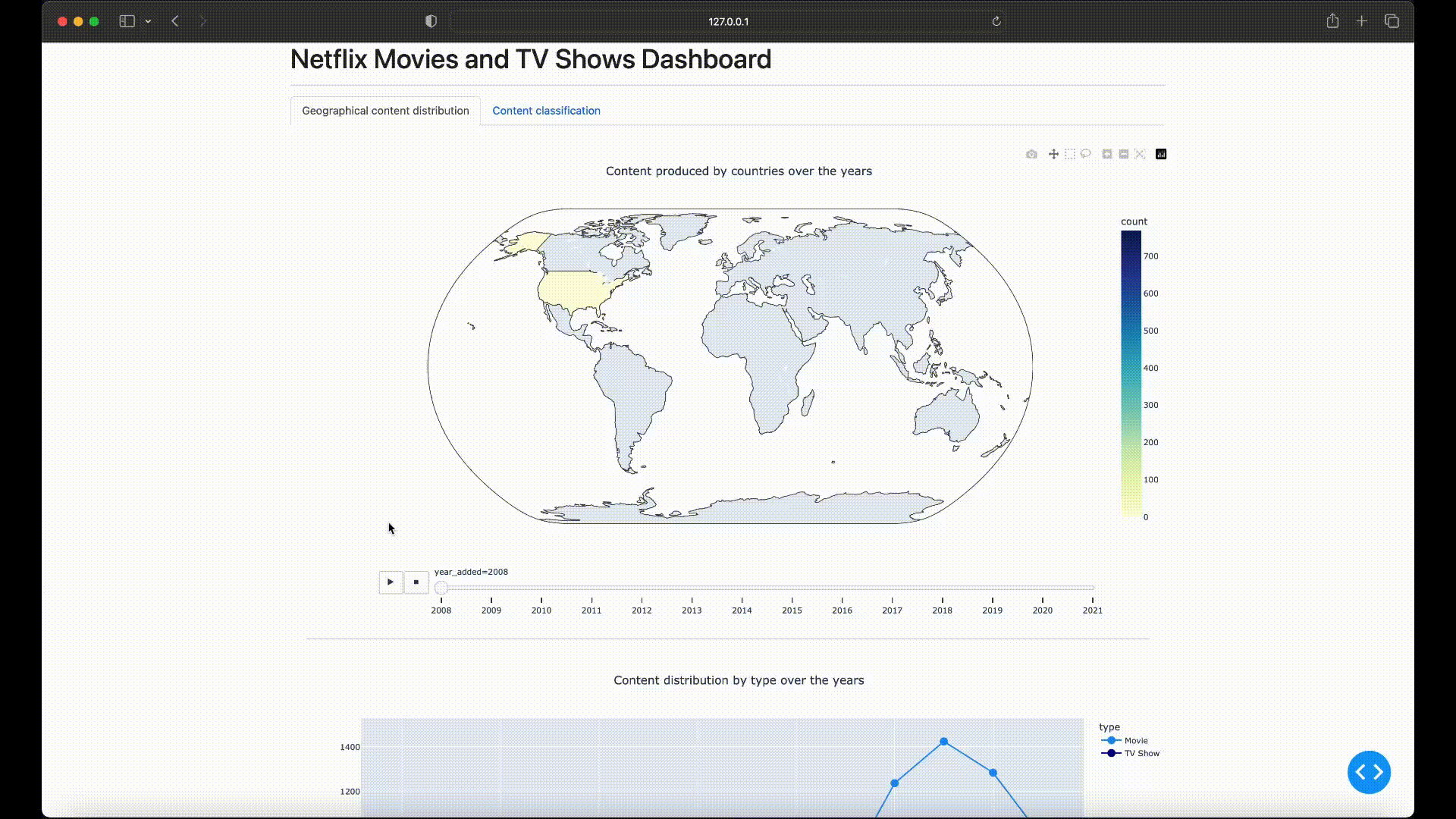
地理内容分布可视化
让我们创建一个名为 components 的新目录,并在其中创建 geographical_content.py 文件,该文件将生成一个分区统计图,说明 Netflix 的内容制作多年来因国家/地区而异:
import pandas as pd
import plotly.express as px
from dash import dcc, html

df = pd.read_csv('netflix_titles.csv')

# Filter out entries without country information and if there are multiple production countries,
# consider the first one as the production country
df['country'] = df['country'].str.split(',').apply(lambda x: x[0].strip() if isinstance(x, list) else None)

# Extract the year from the date_added column
df['year_added'] = pd.to_datetime(df['date_added']).dt.year
df = df.dropna(subset=['country', 'year_added'])

# Compute the count of content produced by each country for each year
df_counts = df.groupby(['country', 'year_added']).size().reset_index(name='count')

# Sort the DataFrame by 'year_added' to ensure the animation frames are in ascending order
df_counts = df_counts.sort_values('year_added')

# Create the choropleth map with a slider for the year
fig1 = px.choropleth(df_counts,
                     locations='country',
                     locationmode='country names',
                     color='count',
                     hover_name='country',
                     animation_frame='year_added',
                     projection='natural earth',
                     title='Content produced by countries over the years',
                     color_continuous_scale='YlGnBu',
                     range_color=[0, df_counts['count'].max()])
fig1.update_layout(width=1280, height=720, title_x=0.5)

# Compute the count of content produced for each year by type and fill zeros for missing type-year pairs
df_year_counts = df.groupby(['year_added', 'type']).size().reset_index(name='count')

# Create the line chart using plotly express
fig2 = px.line(df_year_counts, x='year_added', y='count', color='type',
               title='Content distribution by type over the years',
               markers=True, color_discrete_map={'Movie': 'dodgerblue', 'TV Show': 'darkblue'})
fig2.update_traces(marker=dict(size=12))
fig2.update_layout(width=1280, height=720, title_x=0.5)

layout = html.Div([
    dcc.Graph(figure=fig1),
    html.Hr(),
    dcc.Graph(figure=fig2)
])
上面的代码按 和 对数据进行筛选和分组,然后计算数据帧中每个国家/地区每年生成的内容计数。'country''year_added'df_counts
然后,该函数使用数据帧中的列作为其参数的值来构建地图图:px.choropletdf_counts
locations='country':允许您指定列中包含的地理位置值。'country'locationmode='country names':此参数“告诉函数”提供的是国家/地区名称,因为 Plotly Express 还支持其他位置模式,如 ISO-3 国家/地区代码或美国州。locationscolor='count':用于指定用于为地图着色的数字数据。在这里,它指的是列,其中包含每个国家/地区每年制作的内容计数。'count'color_continous_scale='YlGnBu':当 表示的列包含数值数据时,为地图中的每个国家/地区构建连续色阶。coloranimation_frame='year_added':此参数在列上创建动画。它向地图图表中添加了一个年份滑块,允许您查看表示每个国家/地区内容制作年复一年演变的动画。'year_added'projection='natural earth':此参数不使用数据帧中的任何列;但是,该值是使用地球世界地图设置投影所必需的。df_counts'natural earth'
在分区统计图的正下方,包括一个带有标记的折线图,展示了多年来按类型(电视节目或电影)分类的内容量的变化。
若要生成折线图,将创建一个新的数据帧,该数据帧按和列对原始数据进行分组,并统计每个组合的内容计数。df_year_countsdf'year_added''type'
然后,此分组数据与 其中 和 参数分别分配给 和 列,并将参数设置为 以区分电视节目和电影。px.line'x''y''year_added''count''color''type'
内容分类可视化
下一步是创建一个名为 content_classification.py 的新文件,该文件将生成一个树状图,从类型和类型的角度可视化 Netflix 的内容:
import pandas as pd
import plotly.express as px
from dash import dcc, html

df = pd.read_csv('netflix_titles.csv')

# Split the listed_in column and explode to handle multiple genres
df['listed_in'] = df['listed_in'].str.split(', ')
df = df.explode('listed_in')

# Compute the count of each combination of type and genre
df_counts = df.groupby(['type', 'listed_in']).size().reset_index(name='count')

fig = px.treemap(df_counts, path=['type', 'listed_in'], values='count', color='count',
                 color_continuous_scale='Ice', title='Content by type and genre')

fig.update_layout(width=1280, height=960, title_x=0.5)
fig.update_traces(textinfo='label+percent entry', textfont_size=14)

layout = html.Div([
    dcc.Graph(figure=fig),
])在上面的代码中,加载数据后,通过拆分和分解流派来调整列以处理每个内容的多个流派,为每个内容类型的每个流派创建一个新行。'listed_in'
接下来,创建数据帧以按 和列对数据进行分组,并计算每个类型组合的计数。df_counts'type''listed_in'
然后,数据帧中的列用作函数参数的值,如下所示:df_countspx.treemap
path=['type', 'listed_in']:这些是树状图中表示的层次结构类别。和列分别包含内容类型(电视节目或电影)和类型。'type''listed_in'values='count':树状图中每个矩形的大小对应于列,表示每个类型-流派组合的内容量。'count'color='count':该列还用于为树状图中的矩形着色。'count'color_continous_scale='Ice':当表示 的列包含数值数据时,为树状图中的每个矩形构建连续色阶。color
创建两个新的可视化文件后,当前项目结构应如下所示:
netflix-dashboard
├── app.py
├── clean_netflix_dataset.py
├── components
│   ├── content_classification.py
│   └── geographical_content.py
├── netflix-venv
│   ├── bin
│   ├── etc
│   ├── include
│   ├── lib
│   ├── pyvenv.cfg
│   └── share
└── netflix_titles.csv
实现回调
最后一步是修改 app.py 以导入组件目录中的两个新可视化效果,并实现回调函数以在选择选项卡时呈现图形:
from dash import Dash, dcc, html, Input, Output
import dash_bootstrap_components as dbc
from components import (
    geographical_content,
    content_classification
)

app = Dash(__name__, external_stylesheets=[dbc.themes.BOOTSTRAP])

app.layout = dbc.Container(
    [
        dcc.Store(id='store'),
        html.H1('Netflix Movies and TV Shows Dashboard'),
        html.Hr(),
        dbc.Tabs(
            [
                dbc.Tab(label='Geographical content distribution', tab_id='tab1'),
                dbc.Tab(label='Content classification', tab_id='tab2'),
            ],
            id='tabs',
            active_tab='tab1',
        ),
        html.Div(id='tab-content', className='p-4'),
    ]
)


# This callback function switches between tabs in a dashboard based on user selection.
# It updates the 'tab-content' component with the layout of the newly selected tab.
@app.callback(Output('tab-content', 'children'), [Input('tabs', 'active_tab')])
def switch_tab(at):
    if at == 'tab1':
        return geographical_content.layout
    elif at == 'tab2':
        return content_classification.layout


if __name__ == '__main__':
app.run(debug=True)回调装饰器侦听组件属性中的更改,由对象表示。@app.callback'active_tab''tabs'Input
每当更改时,都会触发该函数。此函数检查 id 并返回要在 Div 中呈现的相应布局,如对象所示。因此,当您切换选项卡时,将显示相关的可视化效果。'active_tab'switch_tab'active_tab''tab-content'Output
最后,再次运行 app.py 以查看包含新可视化效果的更新仪表板:
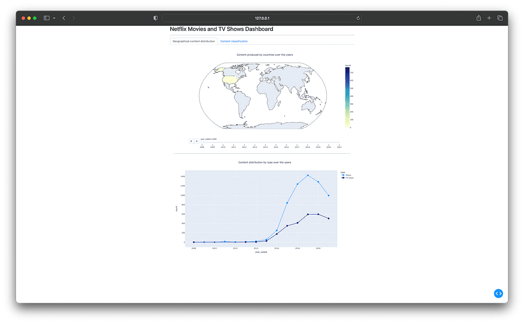
Netflix 电影和电视节目仪表板 — 最终结果
总结
本文介绍了如何创建仪表板来探索和可视化 Netflix 的内容分发和分类。通过利用Python和Dash的强大功能,您现在可以创建自己的可视化,为数据提供宝贵的见解。
您可以在以下 GitHub 存储库中查看此项目的完整代码:GitHub - gutyoh/netflix-dashboard