主要利用CSS3的3D转换和animation动画制作的,主要就是练习CSS3D转换
别忘记给父盒子加透视和呈现立体空间的属性
如果我们不想看见其他盒子,可以使用这个属性:
backface-visibility —— 是否显示背面元素【hidden:隐藏,visible:显示】
透视perspective属性:目的让用户产生3D立体效果,属性值越大,则盒子就越小;属性值越小,则盒子就越大。更好的体现图像近大远小的效果,透视属性是写在父级盒子上的
perspective:500px; —— 透视
3D呈现transform-style属性:目的是控制子元素是否开启3D效果。3D呈现是写在父盒子上,子元素开启3D立体空间效果
它有两个属性值:flat:2D平面效果(默认)
preserve-3d:3D立体效果
transform-style:preserve-3d;
transform:translateZ(100px) ——— 正值越大,盒子也越大,向外移动
重点掌握:transform:rotate3d() —— 3d旋转
| 属性值 | 方向 |
| rotateX(45deg) | 左手掌心向外,大拇指向右,其他手指的弯曲的方向就是rotateX的正方向 【例如单杠】 |
| rotateY(45deg) | 左手掌心向外,大拇指向自己,其他手指的弯曲的方向就是rotateY的正方向 【例如钢管舞】 |
| rotateZ(45deg) | 向外移动,为正值; 向内移动,为负值。 【例如抽奖】 |
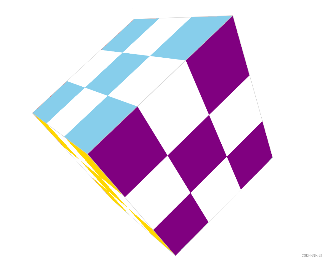
旋转小魔方案例效果图如下:
<!DOCTYPE html>
<html lang="en">

<head>
    <meta charset="UTF-8">
    <meta http-equiv="X-UA-Compatible" content="IE=edge">
    <meta name="viewport" content="width=device-width, initial-scale=1.0">
    <title>旋转小魔方</title>
    <style>
        * {
            margin: 0;
            padding: 0;
        }

        body {
            perspective: 800px;
        }

        /* 魔方 */
        .nav {
            width: 360px;
            height: 360px;
            position: relative;
            margin: 200px auto;
            transition: all 0.4s;
            /* 呈现立体空间 */
            transform-style: preserve-3d;
            box-sizing: border-box;
            animation: run 3s linear infinite forwards;
        }

        @keyframes run {
            0% {}

            100% {
                transform: rotate3d(1, 1, 0, 360deg);
            }
        }

        .front,
        .bottom,
        .left,
        .right,
        .top,
        .back {
            /*设置定位,让div重叠一起*/
            position: absolute;
            top: 0;
            left: 0;
            width: 100%;
            height: 100%;
            border: 1px solid #ccc;
        }

        .front {
            background-color: pink;
            /* z-index: 1; */

            /* 保证正方体的中心点在中间 */
            transform: translateZ(180px);
        }

        .bottom {
            background-color: purple;
             /*转换时有移动和其他属性,则移动放在前面*/
            transform: translateY(180px) rotateX(-90deg);
        }

        .left {
            background-color: skyblue;
            transform: translateX(-180px) rotateY(-90deg);
        }

        .right {
            background-color: aquamarine;
            transform: translateX(180px) rotateY(-90deg);
        }

        .top {
            background-color: red;
            transform: translateY(-180px) rotateX(-90deg);
        }

        .back {
            background-color: gold;
            /* 保证正方体的中心点在中间 */
            transform: translateZ(-180px);
        }

        ul li {
            float: left;
            list-style: none;
            width: 120px;
            height: 120px;
            text-align: center;
            line-height: 120px;

        }

        ul li:nth-child(even) {
            background-color: #fff;
        }

    </style>
</head>

<body>

    <!-- 魔方 -->
    <div class="nav">

        <div class="front">
            <ul>
                <li></li>
                <li></li>
                <li></li>
                <li></li>
                <li></li>
                <li></li>
                <li></li>
                <li></li>
                <li></li>
            </ul>
        </div>
        <div class="bottom">
            <ul>
                <li></li>
                <li></li>
                <li></li>
                <li></li>
                <li></li>
                <li></li>
                <li></li>
                <li></li>
                <li></li>
            </ul>
        </div>
        <div class="left">
            <ul>
                <li></li>
                <li></li>
                <li></li>
                <li></li>
                <li></li>
                <li></li>
                <li></li>
                <li></li>
                <li></li>
            </ul>
        </div>
        <div class="right">
            <ul>
                <li></li>
                <li></li>
                <li></li>
                <li></li>
                <li></li>
                <li></li>
                <li></li>
                <li></li>
                <li></li>
            </ul>
        </div>
        <div class="top">
            <ul>
                <li></li>
                <li></li>
                <li></li>
                <li></li>
                <li></li>
                <li></li>
                <li></li>
                <li></li>
                <li></li>
            </ul>
        </div>
        <div class="back">
            <ul>
                <li></li>
                <li></li>
                <li></li>
                <li></li>
                <li></li>
                <li></li>
                <li></li>
                <li></li>
                <li></li>
            </ul>
        </div>
    </div>


</body>

</html>
旋转木马案例效果图如下:

<!DOCTYPE html>
<html lang="en">

<head>
    <meta charset="UTF-8">
    <meta http-equiv="X-UA-Compatible" content="IE=edge">
    <meta name="viewport" content="width=device-width, initial-scale=1.0">
    <title>旋转木马</title>
    <style>
        * {
            margin: 0;
            padding: 0;
        }

        body {
            /*设置透视*/
            perspective: 800px;
        }

        /* 旋转木马 */
        section {
            position: relative;
            width: 300px;
            height: 200px;
            margin: 300px auto;
            /*给父盒子设置3D立体呈现*/
            transform-style: preserve-3d;
            /* 添加动画效果 */
            animation: rotate 5s linear infinite;
            background: url(img/pig.jpg);
        }

        section:hover {
            /* 鼠标放入section,停止动画 */
            animation-play-state: paused;
        }

        section div {
            /*将section中的div重叠在一起*/
            position: absolute;
            top: 0;
            left: 0;
            width: 100%;
            height: 100%;
            background: url('./img/dog.jpg') no-repeat;
        }

        section div:nth-child(1) {
            /*Z轴平移,向外移动是正值,向内移动是负值*/
            transform: translateZ(300px);
        }

        section div:nth-child(2) {
            /* 先旋转好了之后,再移动 */
            transform: rotateY(60deg) translateZ(300px);
        }

        section div:nth-child(3) {
            transform: rotateY(120deg) translateZ(300px);
        }

        section div:nth-child(4) {
            transform: rotateY(180deg) translateZ(300px);
        }

        section div:nth-child(5) {
            transform: rotateY(240deg) translateZ(300px);
        }

        section div:nth-child(6) {
            transform: rotateY(300deg) translateZ(300px);
        }

        @keyframes rotate {
            0% {
                transform: rotateY(0deg);
            }

            100% {
                transform: rotateY(360deg);
            }
        }
    </style>
</head>

<body>

    <!-- 旋转木马 -->
    <section>
        <div></div>
        <div></div>
        <div></div>
        <div></div>
        <div></div>
        <div></div>
    </section>


</body>

</html>