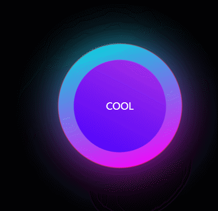
效果
话不多说 代码如下
<div class="container">
	<civ class="circle"></civ>
	<span>COOL</span>
</div>
样式
      .container {


        position: relative;
        width: 100%;
        height: 100vh;
        border: 1px solid red;
        display: flex;
        justify-content: center;
        align-items: center;
        background-color: #000;
      }

      .circle {


        display: flex;
        justify-content: center;
        align-items: center;
        position: absolute;
        width: 200px;
        height: 200px;
        border: 1px solid red;
        border-radius: 50%;
        background-image: linear-gradient(to right, #00dbde 0%, #fc00ff 100%);
        animation: rotate 1s linear infinite;
      }

      .circle::before {


        content: "";
        position: absolute;
        width: 200px;
        height: 200px;
        border: 1px solid red;
        border-radius: 50%;
        background-image: linear-gradient(to right, #00dbde 0%, #fc00ff 100%);
        filter: blur(35px);
      }

      .circle::after {


        content: "";
        position: absolute;
        width: 150px;
        height: 150px;
        border-radius: 50%;
        background-image: linear-gradient(-225deg, #AC32E4 0%, #7918F2 48%, #4801FF 100%);
      }


      span {


        position: absolute;
        color: #fff;
      }

      @keyframes rotate {


        0% {


          transform: rotate(0deg);
        }

        100% {


          transform: rotate(360deg);
        }
      }