一、Python 散点图 大小映射 颜色映射 分类散点图 双变量同时映射大小和颜色
二、Python 散点图 回归拟合 带误差
三、Python 散点密度图 趋势分析 图例位置调整
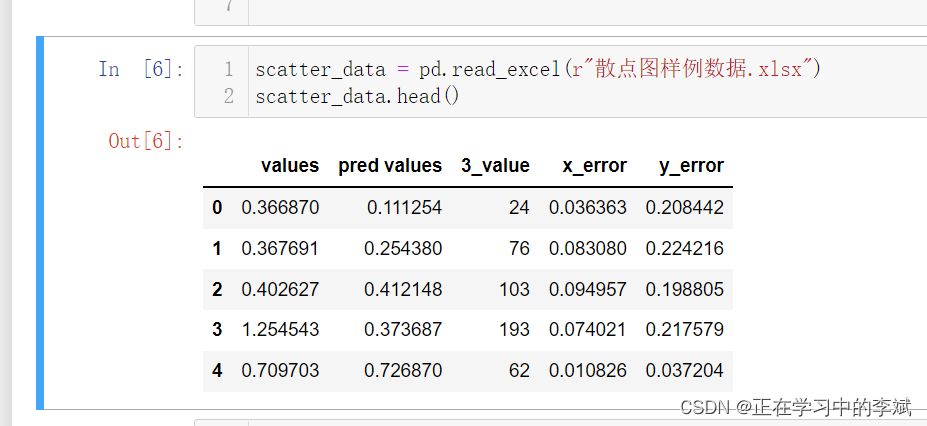
1.1 数据展示(需要数据的可以留言)
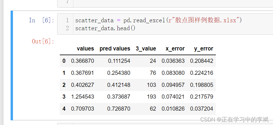
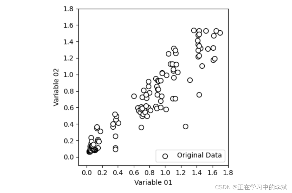
1.2 完整代码
import numpy as np
import pandas as pd
import matplotlib.pyplot as plt

scatter_data = pd.read_excel(r"散点图样例数据.xlsx")
scatter_data.head()

x = scatter_data["values"]
y = scatter_data["pred values"]

# figsize画布大小; dpi像素密度; facecolor背景填充色w白色;
fig,ax = plt.subplots(figsize=(4,4),dpi=100,facecolor="w")

# s散点大小; c散点填充颜色颜色; ec散点边框颜色
scatter = ax.scatter(x=x,y=y,s=50,c="w",ec="k",label="Original Data")

# 不显示网格
ax.grid(False)

# xlim ylim xy轴的范围
# xticks yticks xy轴上显示的刻度
# xlabel ylabel xy轴标签
ax.set(xlim=(-0.1, 1.8),ylim=(-0.1, 1.8),
       xticks=(np.arange(0, 2, step=0.2)),
       yticks=(np.arange(0, 2, step=0.2)),
       xlabel="Variable 01",ylabel="Variable 02")

# 图例显示在右下
ax.legend(loc="lower right")
plt.tight_layout()
1.3 添加 marker 参数 改变形状
scatter = ax.scatter(x=x,y=y,s=50,marker="s",c="w",ec="k",label="Original Data")

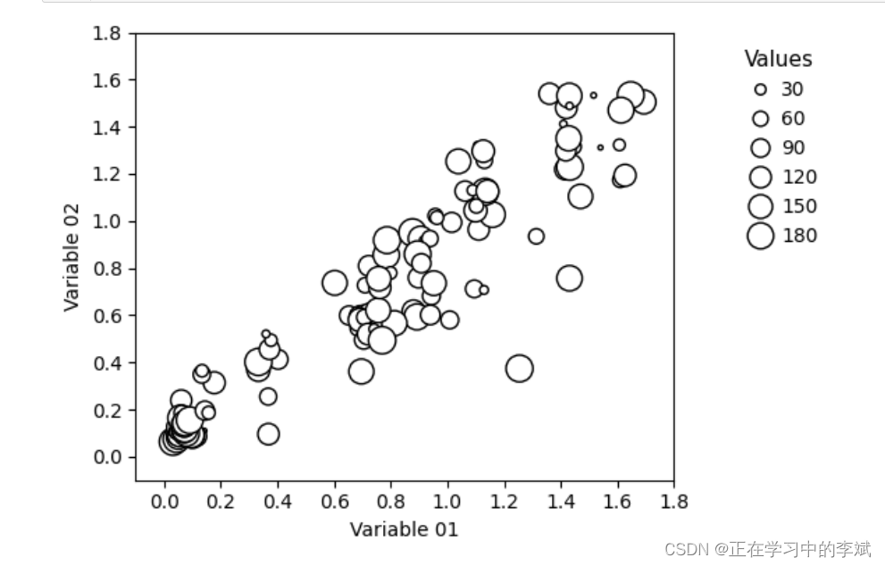
1.4 添加散点大小映射变量,完整代码。
import numpy as np
import pandas as pd
import matplotlib.pyplot as plt

scatter_data = pd.read_excel(r"散点图样例数据.xlsx")
scatter_data.head()

x = scatter_data["values"]
y = scatter_data["pred values"]
size = scatter_data["3_value"]
color = scatter_data["3_value"]

# figsize画布大小; dpi像素密度; facecolor背景填充色w白色;
fig,ax = plt.subplots(figsize=(6,4),dpi=100,facecolor="w")

# s散点大小; c散点填充颜色颜色; ec散点边框颜色
scatter = ax.scatter(
    x=x,y=y,c="w",ec="k",label="Original Data",
    s=size
)

# 不显示网格
ax.grid(False)

# xlim ylim xy轴的范围
# xticks yticks xy轴上显示的刻度
# xlabel ylabel xy轴标签
ax.set(xlim=(-0.1, 1.8),ylim=(-0.1, 1.8),
       xticks=(np.arange(0, 2, step=0.2)),
       yticks=(np.arange(0, 2, step=0.2)),
       xlabel="Variable 01",ylabel="Variable 02")

#添加图例
kw = dict(prop="sizes", num=5, color="w",mec="k",
         fmt="{x:.0f}",func=lambda s: s)
# bbox_to_anchor 设置图例具体位置
# frameon 取消图例边框
# title_fontsize图例标题字体大小; fontsize图例字体大小
legend = ax.legend(*scatter.legend_elements(**kw),
                bbox_to_anchor=(1.3, 1.),
                title="Values",fontsize=10,title_fontsize=11,
                handletextpad=.1,frameon=False)

plt.tight_layout()
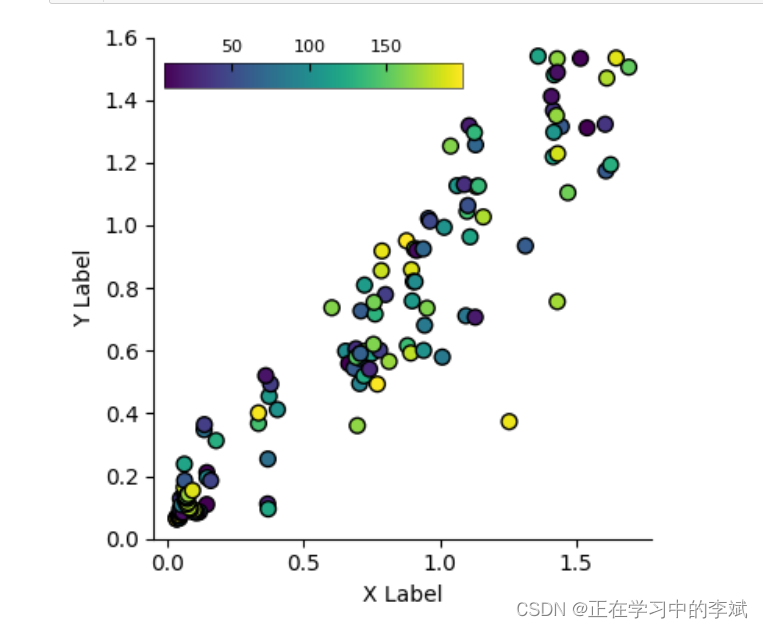
1.5 添加散点颜色映射变量
import numpy as np
import pandas as pd
import matplotlib.pyplot as plt

scatter_data = pd.read_excel(r"散点图样例数据.xlsx")
scatter_data.head()

x = scatter_data["values"]
y = scatter_data["pred values"]
size = scatter_data["3_value"]
color = scatter_data["3_value"]
# figsize画布大小; dpi像素密度; facecolor背景填充色w白色;
fig,ax = plt.subplots(figsize=(4,4),dpi=100,facecolor="w")

# s散点大小; c散点填充颜色颜色; ec散点边框颜色
scatter = ax.scatter(x=x,y=y,s=50,c=color,ec="k",
                     cmap="viridis",
                     label="Original Data")

# 不显示上 右 边框
for spine in ["top","right"]:
    ax.spines[spine].set_visible(False)

# 设置色带的位置和大小分别是 起始xy 宽 高
cax = ax.inset_axes([0.02, .9, 0.6, 0.05], transform=ax.transAxes)
colorbar = fig.colorbar(scatter, ax=scatter, cax=cax,orientation="horizontal")

# direction 设置色带主刻度在里面
colorbar.ax.tick_params(bottom=True,direction="in",labelsize=8,pad=3)
# colorbar.ax.tick_params(which="minor",direction="in")
# 设置图例标签的位置在图例上方
colorbar.ax.xaxis.set_ticks_position('top')
# 设置色带外边框宽度0.4
colorbar.outline.set_linewidth(.4)

# 不显示网格
ax.grid(False)
ax.set_xlabel("X Label")
ax.set_ylabel("Y Label")
ax.set_ylim(0,1.6)
# ax.legend(loc="lower right")
plt.tight_layout()
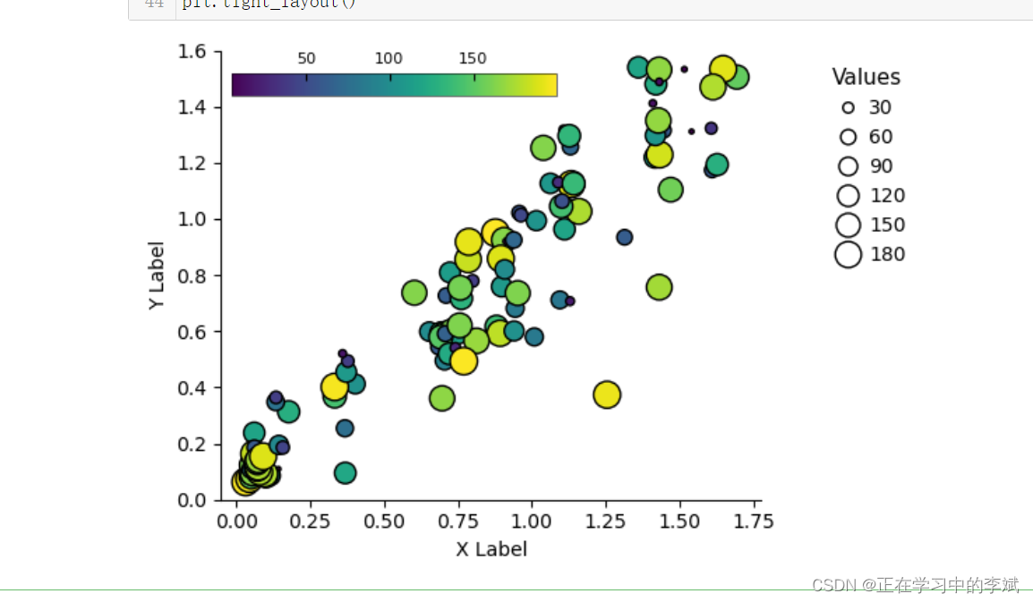
1.6 同时映射双变量
import numpy as np
import pandas as pd
import matplotlib.pyplot as plt

scatter_data = pd.read_excel(r"散点图样例数据.xlsx")
scatter_data.head()

x = scatter_data["values"]
y = scatter_data["pred values"]
# 这边数据里面没有两个变量,就随意写一样了
size = scatter_data["3_value"]
color = scatter_data["3_value"]

# figsize画布大小; dpi像素密度; facecolor背景填充色w白色;
fig,ax = plt.subplots(figsize=(6,4),dpi=100,facecolor="w")

# s散点大小; c散点填充颜色颜色; ec散点边框颜色
scatter = ax.scatter(x=x,y=y,s=size,c=color,ec="k",
                     cmap="viridis",
                     label="Original Data")

# 不显示上 右 边框
for spine in ["top","right"]:
    ax.spines[spine].set_visible(False)

cax = ax.inset_axes([0.02, .9, 0.6, 0.05], transform=ax.transAxes)
colorbar = fig.colorbar(scatter, ax=scatter, cax=cax,orientation="horizontal")

# direction 设置色带主刻度在里面
colorbar.ax.tick_params(bottom=True,direction="in",labelsize=8,pad=3)
# colorbar.ax.tick_params(which="minor",direction="in")
# 设置图例标签的位置在图例上方
colorbar.ax.xaxis.set_ticks_position('top')
# 设置色带外边框宽度0.4
colorbar.outline.set_linewidth(.4)

# 不显示网格
ax.grid(False)
ax.set_xlabel("X Label")
ax.set_ylabel("Y Label")
ax.set_ylim(0,1.6)

#添加图例
kw = dict(prop="sizes", num=5, color="w",mec="k",
         fmt="{x:.0f}",func=lambda s: s)
# bbox_to_anchor 设置图例具体位置
# frameon 取消图例边框
# title_fontsize图例标题字体大小; fontsize图例字体大小
legend = ax.legend(*scatter.legend_elements(**kw),
                bbox_to_anchor=(1.3, 1.),
                title="Values",fontsize=10,title_fontsize=11,
                handletextpad=.1,frameon=False)

plt.tight_layout()
1.7 分类散点图
再添加一组数据,赋值不同的颜色即可
scatter = ax.scatter(x=x2,y=y2,s=50,c="r",ec="k",label="Original Data")
二、Python 散点图 回归拟合 带误差
2.1 数据展示(需要数据的可以留言)
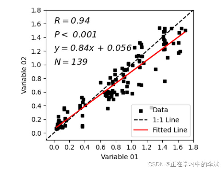
import numpy as np
import pandas as pd
import matplotlib.pyplot as plt
from scipy import stats

scatter_data = pd.read_excel(r"散点图样例数据.xlsx")
x = scatter_data["values"]
y = scatter_data["pred values"]

slope, intercept, r_value, p_value, std_err = stats.linregress(x,y)

#绘制1:1线
best_line_x = np.linspace(-10,10)
best_line_y=best_line_x
# 拟合线
y3 = slope*x + intercept
# RMSE
fig,ax = plt.subplots(figsize=(4,3.5),dpi=100,facecolor="w")
scatter = ax.scatter(x=x,y=y,edgecolor=None, c='k', s=20,marker='s',label="Data")
bestline = ax.plot(best_line_x,best_line_y,color='k',linewidth=1.5,linestyle='--',label="1:1 Line")
linreg = ax.plot(x,y3,color='r',linewidth=1.5,linestyle='-',label="Fitted Line")
ax.set_xlim((-.1, 1.8))
ax.set_ylim((-.1, 1.8))
ax.set_xticks(np.arange(0, 2, step=0.2))
ax.set_yticks(np.arange(0, 2, step=0.2))
ax.grid(False)

# 添加文本信息
fontdict = {

    "size":13,"fontstyle":"italic"}
ax.text(0.,1.6,r'$R=$'+str(round(r_value,2)),fontdict=fontdict)
ax.text(0.,1.4,"$P <$ "+str(0.001),fontdict=fontdict)
ax.text(0.,1.2,r'$y=$'+str(round(slope,3))+'$x$'+" + "+str(round(intercept,3)),fontdict=fontdict)
ax.text(0.,1.0,r'$N=$'+ str(len(x)),fontdict=fontdict)
ax.set_xlabel("Variable 01")
ax.set_ylabel("Variable 02")
ax.legend(loc="lower right")

plt.tight_layout()
# fig.savefig('散点图_cor_error.pdf',bbox_inches='tight')
2.2 带误差
添加 xerr=x_err,yerr=y_err
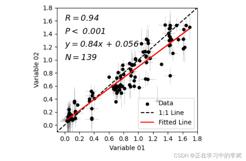
import numpy as np
import pandas as pd
import matplotlib.pyplot as plt
from scipy import stats

scatter_data = pd.read_excel(r"散点图样例数据.xlsx")
x = scatter_data["values"]
y = scatter_data["pred values"]
x_err = scatter_data["x_error"]
y_err = scatter_data["y_error"]

slope, intercept, r_value, p_value, std_err = stats.linregress(x,y)

#绘制1:1拟合线
best_line_x = np.linspace(-10,10)
best_line_y=best_line_x
#绘制拟合线
y3 = slope*x + intercept
#开始绘图
fig,ax = plt.subplots(figsize=(4,3.5),dpi=100,facecolor="w")
scatter = ax.scatter(x=x,y=y,edgecolor=None, c='k', s=20,label="Data")
bestline = ax.plot(best_line_x,best_line_y,color='k',linewidth=1.5,linestyle='--',label="1:1 Line")
linreg = ax.plot(x,y3,color='r',linewidth=1.5,linestyle='-',label="Fitted Line")
# 添加误差线
errorbar = ax.errorbar(x,y,xerr=x_err,yerr=y_err,ecolor="k",
                       elinewidth=.4,capsize=0,alpha=.4,
                       linestyle="",mfc="none",mec="none",zorder=-1)
ax.set_xlim((-.1, 1.8))
ax.set_ylim((-.1, 1.8))
ax.set_xticks(np.arange(0, 2, step=0.2))
ax.set_yticks(np.arange(0, 2, step=0.2))
# 添加文本信息
fontdict = {

    "size":13,"fontstyle":"italic"}
ax.text(0.,1.6,r'$R=$'+str(round(r_value,2)),fontdict=fontdict)
ax.text(0.,1.4,"$P <$ "+str(0.001),fontdict=fontdict)
ax.text(0.,1.2,r'$y=$'+str(round(slope,3))+'$x$'+" + "+str(round(intercept,3)),fontdict=fontdict)
ax.text(0.,1.0,r'$N=$'+ str(len(x)),fontdict=fontdict)

ax.set_xlabel("Variable 01")
ax.set_ylabel("Variable 02")
ax.legend(loc="lower right")
ax.grid(False)
plt.tight_layout()
# fig.savefig('散点图_cor_error.pdf',bbox_inches='tight')
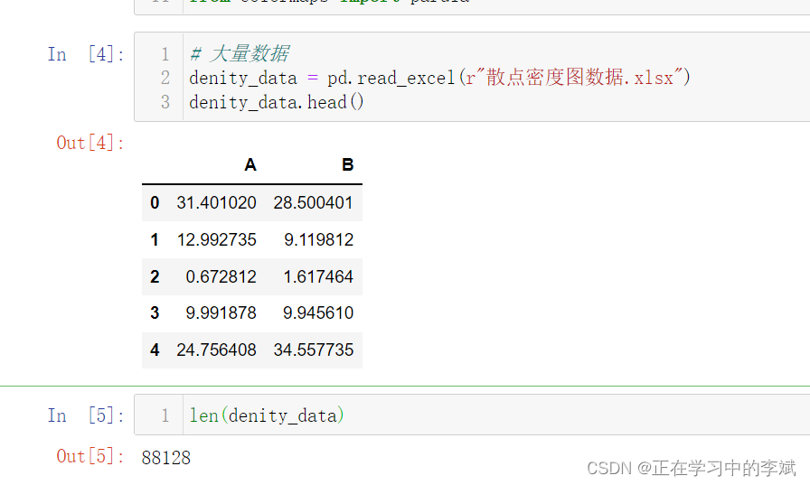
三、Python 散点密度图 趋势分析 图例位置调整
3.1 数据展示(需要的可以留言)
import numpy as np
import pandas as pd
import matplotlib.pyplot as plt
from scipy import stats
from scipy.stats import linregress
# 大量数据
denity_data = pd.read_excel(r"散点密度图数据.xlsx")
# 数据预处理
x = denity_data["A"]
y = denity_data["B"]
nbins = 150
H, xedges, yedges = np.histogram2d(x, y, bins=nbins)
# H needs to be rotated and flipped
H = np.rot90(H)
H = np.flipud(H)
Hmasked = np.ma.masked_where(H==0,H) # Mask pixels with a value of zero
#开始绘图
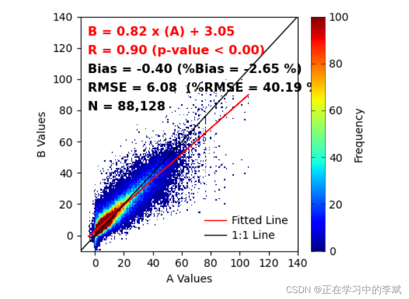
fig,ax = plt.subplots(figsize=(4.5,3.8),dpi=100,facecolor="w")
density_scatter = ax.pcolormesh(xedges, yedges, Hmasked, cmap="jet",vmin=0,vmax=100)
colorbar = fig.colorbar(density_scatter,aspect=17,label="Frequency")
colorbar.ax.tick_params(left=True,direction="in",width=.4,labelsize=10)
colorbar.ax.tick_params(which="minor",right=False)
colorbar.outline.set_linewidth(.4)
# 设置坐标轴区间
ax.set_xlim(-10, 140)
ax.set_ylim(-10, 140)
# 设置坐标轴刻度
ax.set_xticks(ticks=np.arange(0,160,20))
ax.set_yticks(ticks=np.arange(0,160,20))
# 设置坐标轴名称
ax.set_xlabel("A Values")
ax.set_ylabel("B Values")
#添加文本注释信息
#添加文本信息
## Bias (relative Bias), RMSE (relative RMSE), R, slope, intercept, pvalue
Bias = np.mean(x-y)
rBias = (Bias/np.mean(y))*100.0
RMSE = np.sqrt( np.mean((x-y)**2) )
rRMSE = (RMSE/np.mean(y))*100.0
# slope, intercept, r_value, p_value, std_err = stats.linregress(x,y)
slope = linregress(x, y)[0]
intercept = linregress(x, y)[1]
R = linregress(x, y)[2]
Pvalue = linregress(x, y)[3]
N = len(x)
N = "{:,}".format(N)
# 绘制拟合线
lmfit = (slope*x)+intercept
ax.plot(x, lmfit, color='r', linewidth=1,label='Fitted Line')
# 绘制x:y 1:1 线
ax.plot([-10, 140], [-10, 140], color='black',linewidth=1,label="1:1 Line")
# 添加文本信息
# ha 设置文本对齐 left 左居中对齐
fontdict = {
"size":11.5,"weight":"bold"}
ax.text(-5,130,"B = %.2f x (A) + %.2f" %(slope,intercept),fontdict=fontdict,color='red',
ha = "left",va="center")
ax.text(-5,118,"R = %.2f (p-value < %.2f)" %(R,Pvalue),fontdict=fontdict,color='red',
ha = "left",va="center")
ax.text(-5,106,"Bias = %.2f (%%Bias = %.2f %%)" %(Bias,rBias),fontdict=fontdict,color='k',
ha = "left",va="center")
ax.text(-5,94,"RMSE = %.2f (%%RMSE = %.2f %%)" %(RMSE,rRMSE),fontdict=fontdict,color='k',
ha = "left",va="center")
ax.text(-5,82,'N = %s' %N,fontdict=fontdict,color='k',
ha = "left",va="center")
ax.legend(loc="lower right",frameon=False,labelspacing=.4,handletextpad=.5,fontsize=10)
# 紧皱布局
plt.tight_layout()
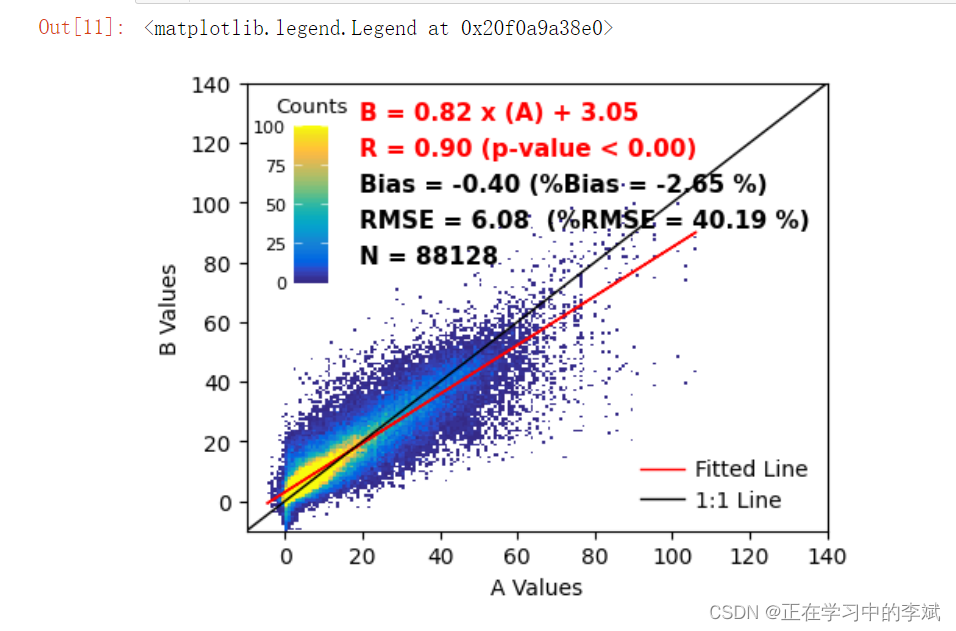
3.2 将图例画在里面
import numpy as np
import pandas as pd
import matplotlib.pyplot as plt
from scipy import stats
from scipy.stats import linregress
from mpl_toolkits.axes_grid1.inset_locator import inset_axes

# 大量数据
denity_data = pd.read_excel(r"散点密度图数据.xlsx")
x = denity_data["A"]
y = denity_data["B"]
nbins = 150
H, xedges, yedges = np.histogram2d(x, y, bins=nbins)
# H needs to be rotated and flipped
H = np.rot90(H)
H = np.flipud(H)
# Mask zeros
Hmasked = np.ma.masked_where(H==0,H) # Mask pixels with a value of zero
#开始绘图
fig,ax = plt.subplots(figsize=(4.8,3.8),dpi=100,facecolor="w")

density_scatter = ax.pcolormesh(xedges, yedges, Hmasked, cmap=parula,
                                vmin=0, vmax=100)
# colorbar 添加 调整位置 大小
axins = inset_axes(ax,
                    width="6%",
                    height="35%",
                    loc='upper left',
                    bbox_transform=ax.transAxes,
                    bbox_to_anchor=(-0.03, 0.05, 1, 1),
                    borderpad=3)

cbar = fig.colorbar(density_scatter,cax=axins)
#cbar.ax.set_xticks(ticks=np.arange(0,125,25))

# direction 刻度标签指向 内
cbar.ax.tick_params(left=True,labelleft=True,labelright=False,
                    direction="in",width=.4,labelsize=8,color="w")
cbar.ax.tick_params(which="minor",right=False)
cbar.ax.set_title("Counts",fontsize=9.5)
#cbar.outline.set_linewidth(.4)
# 外边框不显示
cbar.outline.set_visible(False)

ax.set_xlim(-10, 140)
ax.set_ylim(-10, 140)
ax.set_xticks(ticks=np.arange(0,160,20))
ax.set_yticks(ticks=np.arange(0,160,20))

#添加文本信息
## Bias (relative Bias), RMSE (relative RMSE), R, slope, intercept, pvalue
Bias = np.mean(x-y)
rBias = (Bias/np.mean(y))*100.0
RMSE = np.sqrt( np.mean((x-y)**2) )
rRMSE = (RMSE/np.mean(y))*100.0
slope = linregress(x, y)[0]
intercept = linregress(x, y)[1]
R = linregress(x, y)[2]
Pvalue = linregress(x, y)[3]
N = len(x)

lmfit = (slope*x)+intercept
ax.plot(x, lmfit, color='r', linewidth=1,label='Fitted Line')
ax.plot([-10, 140], [-10, 140], color='black',linewidth=1,label="1:1 Line")

# 添加文本信息
fontdict = {

    "size":11,"weight":"bold"}
ax.text(19,130,"B = %.2f x (A) + %.2f" %(slope,intercept),fontdict=fontdict,color='red',
       ha = "left",va="center")
ax.text(19,118,"R = %.2f (p-value < %.2f)" %(R,Pvalue),fontdict=fontdict,color='red',
       ha = "left",va="center")
ax.text(19,106,"Bias = %.2f (%%Bias = %.2f %%)" %(Bias,rBias),fontdict=fontdict,color='k',
       ha = "left",va="center")
ax.text(19,94,"RMSE = %.2f  (%%RMSE = %.2f %%)" %(RMSE,rRMSE),fontdict=fontdict,color='k',
       ha = "left",va="center")
ax.text(19,82,'N = %d' %N,fontdict=fontdict,color='k',
       ha = "left",va="center")

ax.set_xlabel("A Values")
ax.set_ylabel("B Values")
ax.legend(loc="lower right",frameon=False,labelspacing=.4,handletextpad=.5,fontsize=10)
# plt.tight_layout()
# fig.savefig('散点图_density02.pdf',bbox_inches='tight')
# fig.savefig('散点图_density02.png', bbox_inches='tight',dpi=300)
3. 方式二,不需要自己预处理数据
此时要用 plt.hist2d ,不能用ax
import numpy as np
import pandas as pd
import matplotlib.pyplot as plt
from scipy import stats
from scipy.stats import linregress

denity_data = pd.read_excel(r"散点密度图数据.xlsx")
x = denity_data["A"]
y = denity_data["B"]
nbins = 150
#开始绘图
fig,ax = plt.subplots(figsize=(4.8,3.8),dpi=100,facecolor="w")
plt.hist2d(x=x,y=y,bins=nbins,cmin=0.1, vmax=100)
colorbar = plt.colorbar(aspect=17,label="Frequency")
colorbar.ax.tick_params(left=True,direction="in",width=.4,labelsize=10)
colorbar.ax.tick_params(which="minor",right=False)
colorbar.outline.set_linewidth(.4)

ax.set_xlim(-10, 140)
ax.set_ylim(-10, 140)
ax.set_xticks(ticks=np.arange(0,160,20))
ax.set_yticks(ticks=np.arange(0,160,20))
ax.set_xlabel("A Values")
ax.set_ylabel("B Values")
#添加文本信息
## Bias (relative Bias), RMSE (relative RMSE), R, slope, intercept, pvalue
Bias = np.mean(x-y)
rBias = (Bias/np.mean(y))*100.0
RMSE = np.sqrt( np.mean((x-y)**2) )
rRMSE = (RMSE/np.mean(y))*100.0
slope = linregress(x, y)[0]
intercept = linregress(x, y)[1]
R = linregress(x, y)[2]
Pvalue = linregress(x, y)[3]
N = len(x)
N = "{:,}".format(N)

lmfit = (slope*x)+intercept
ax.plot(x, lmfit, color='r', linewidth=1,label='Fitted Line')
ax.plot([-10, 140], [-10, 140], color='black',linewidth=1,label="1:1 Line")

# 添加文本信息
fontdict = {

    "size":11.5,"weight":"bold"}
ax.text(-5,130,"B = %.2f x (A) + %.2f" %(slope,intercept),fontdict=fontdict,color='red',
       ha = "left",va="center")
ax.text(-5,118,"R = %.2f (p-value < %.2f)" %(R,Pvalue),fontdict=fontdict,color='red',
       ha = "left",va="center")
ax.text(-5,106,"Bias = %.2f (%%Bias = %.2f %%)" %(Bias,rBias),fontdict=fontdict,color='k',
       ha = "left",va="center")
ax.text(-5,94,"RMSE = %.2f  (%%RMSE = %.2f %%)" %(RMSE,rRMSE),fontdict=fontdict,color='k',
       ha = "left",va="center")
ax.text(-5,82,'N = %s' %N,fontdict=fontdict,color='k',
       ha = "left",va="center")
ax.legend(loc="lower right",frameon=False,labelspacing=.4,handletextpad=.5,fontsize=10)
plt.tight_layout()