之前使用matplotlib绘制曲线图直接使用的是plot()方法,其实绘制基础的散点图很简单,只要使用scatter()方法就可以了,其他的设置方式与曲线图的设置方式也是一致的。
例如:
import matplotlib.pyplot as plt
import numpy as np

x1 = [1, 2, 3, 4]
y1 = [1, 2, 3, 4]     #第一组数据

x2 = [1, 2, 3, 4]
y2 = [2, 3, 4, 5]    #第二组数据

n = 10
x3 = np.random.randint(0, 5, n)
y3 = np.random.randint(0, 5, n)   #使用随机数产生

plt.scatter(x1, y1, marker = 'x',color = 'red', s = 40 ,label = 'First')
#                   记号形状       颜色           点的大小    设置标签
plt.scatter(x2, y2, marker = '+', color = 'blue', s = 40, label = 'Second')
plt.scatter(x3, y3, marker = 'o', color = 'green', s = 40, label = 'Third')
plt.legend(loc = 'best')    # 设置 图例所在的位置 使用推荐位置

plt.show()
效果:

顺便复习一下坐标轴的设置:
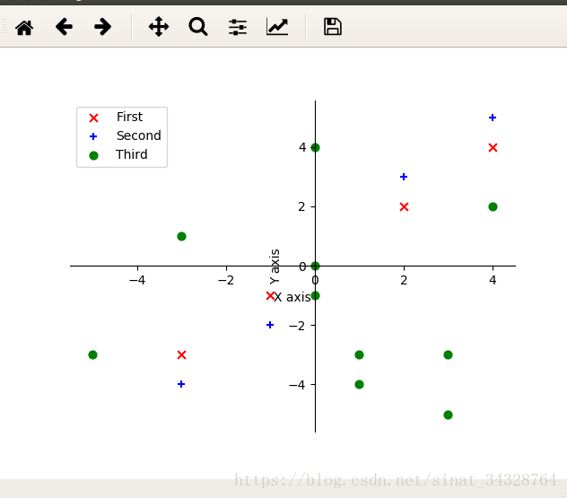
import matplotlib.pyplot as plt
import numpy as np

x1 = [-1, 2, -3, 4]
y1 = [-1, 2, -3, 4]

x2 = [-1, 2, -3, 4]
y2 = [-2, 3, -4, 5]

n = 10
x3 = np.random.randint(-5, 5, n)
y3 = np.random.randint(-5, 5, n)

plt.scatter(x1, y1, marker = 'x',color = 'red', s = 40 ,label = 'First')
plt.scatter(x2, y2, marker = '+', color = 'blue', s = 40, label = 'Second')
plt.scatter(x3, y3, marker = 'o', color = 'green', s = 40, label = 'Third')
plt.legend(loc = 'best')

plt.xlabel('X axis')
plt.ylabel('Y axis')             # 设置坐标轴标签

ax = plt.gca()
ax.spines['right'].set_color('none')
ax.spines['top'].set_color('none')   #设置 上、右 两条边框不显示

ax.xaxis.set_ticks_position('bottom')
ax.yaxis.set_ticks_position('left')       #将下、左 两条边框分别设置为 x y 轴

ax.spines['bottom'].set_position(('data', 0))   # 将两条坐标轴的交点进行绑定
ax.spines['left'].set_position(('data', 0))

plt.show()
效果:
以上~