昨天帮同学做了一个简单的作品介绍网页,用来应付期中作业,在这里把源码分享给大家。
适合刚接触HTML和CSS的同学练练手。
开发工具
VS code
项目简介
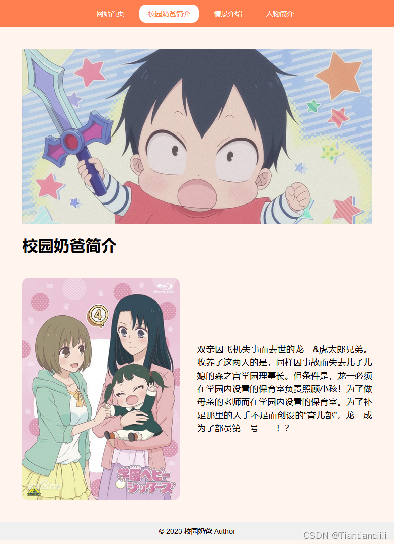
这个网页是一个校园奶爸主题的静态网站,包括两个页面:scene.html和people.html。其中,scene.html主要介绍了校园奶爸的简介,people.html则是人物简介,两个页面共用同一个导航条和底部。
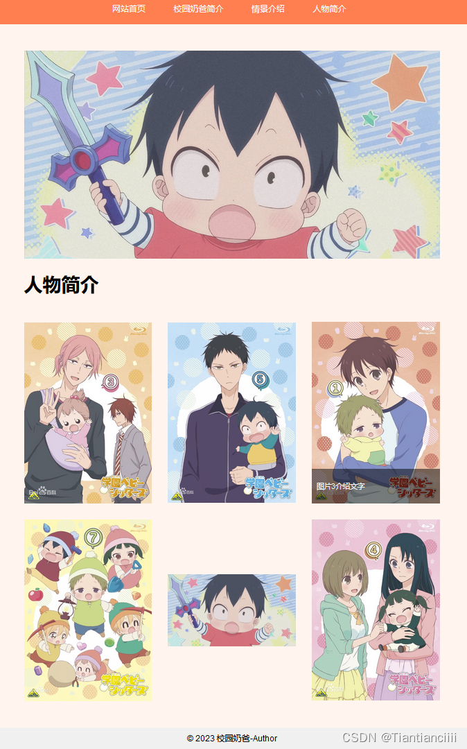
在布局上,两个页面都有相似的结构,有导航栏、banner和底部区域,其中people.html还新增了两行横向排列的图片及文字介绍。两个页面的样式都定义在对应的.css文件中,其中main.css主要定义主页的样式,people.css则定义了人物页面的排版。通过CSS的灵活运用,使得整个网站看起来简洁美观且易于维护和修改。
项目结构
项目源码
scene.html
<!DOCTYPE html>
<html lang="zh-CN">
<head>
<meta charset="UTF-8">
<title>校园奶爸 - 校园奶爸简介</title>
<link rel="stylesheet" href="css\main.css">
</head>
<body>
<!-- 导航栏 -->
<nav>
<a href="scene.html">网站首页</a>
<a href="scene.html">校园奶爸简介</a>
<a href="people.html">情景介绍</a>
<a href="people.html">人物简介</a>
</nav>
<!-- 主要区域 -->
<div id="main">
<div id="banner">
<div class="banner-container">
<div class="img-container1">
<img src="image/5.jpg" alt="banner">
</div>
<div class="text-container1">
<h1>校园奶爸简介</h1>
</div>
<div class="image-text-container">
<img src="image/6.jpg" alt="校园奶爸">
<p>双亲因飞机失事而去世的龙一&虎太郎兄弟。收养了这两人的是,同样因事故而失去儿子儿媳的森之宫学园理事长。但条件是,龙一必须在学园内设置的保育室负责照顾小孩!为了做母亲的老师而在学园内设置的保育室。为了补足那里的人手不足而创设的“育儿部”,龙一成为了部员第一号……!?</p>
</div>
</div>
</div>
</div>
</div>
<!-- 底部 -->
<footer>
© 2023 校园奶爸-Author
</footer>
</body>
</html>
scene.css
/* 基本样式 */
body {


  margin: 0;
  padding: 0;
  font-family: Arial, sans-serif;
  background-color:#FFF5EE;
}

/* 导航栏样式 */
nav {


  background-color: #ff7f50; /* 粉色背景 */
  color: #fff;
  text-align: center;
  border-radius: 15px;
  padding: 10px 50px;
}
nav a {


  display: inline-block;
  padding: 10px 20px;
  text-decoration: none;
  color: inherit;
  border-radius: 15px; /* 格子部分圆滑处理 */
  margin-right: 10px; /* 部分格子之间增加间距 */
}
nav a:hover {


  background-color: #ffffff; /* 鼠标悬停时的背景颜色 */
  color: #ff7f50; /* 鼠标悬停时的文字颜色 */
}

 /* 主要区域样式 */
#main {


  max-width: 800px;
  margin: 50px auto;
  padding: 0 20px;
}

.banner-container {


  position: relative;
}

.img-container1 {


  height: 400px;
  overflow: hidden;
}

.img-container1 img {


  width: 100%;
  height: auto;
  object-fit: cover;
}

.text-container1  h1 {


  font-size: 36px;
  font-weight: bold;
  margin-top: 10; /* 去除标题顶部的默认边距 */
  text-align: left; /* 将标题文字左对齐 */
}

.image-text-container {


  margin-top: 50px;
}

.image-text-container {


  display: flex;
  align-items: center;
  justify-content: center;
  margin-top: 50px;
}

.image-text-container img {


  max-width: 45%;
  border-radius: 15px;
  margin-right: 5%;
}

.image-text-container p {


  max-width: 50%;
  font-size: 20px;
  line-height: 1.5;
  text-align: justify;
}

/* 底部样式 */
footer {


  background-color: #f0f0f0;
  padding: 10px;
  text-align: center;
  border-radius: 15px;
}
people.html
<!DOCTYPE html>
<html lang="zh-CN">
<head>
<meta charset="UTF-8">
<title>校园奶爸 - 人物简介</title>
<link rel="stylesheet" href="css\people.css">
</head>
<body>
<!-- 导航栏 -->
<nav>
<a href="scene.html">网站首页</a>
<a href="scene.html">校园奶爸简介</a>
<a href="people.html">情景介绍</a>
<a href="people.html">人物简介</a>
</nav>
<!-- 主要区域 -->
<div id="main">
<div id="banner">
<div class="banner-container">
<div class="img-container1">
<img src="image/5.jpg" alt="banner">
</div>
<div class="text-container1">
<h1>人物简介</h1>
</div>
<div class="image-text-container">
<div class="image-text-row">
<div class="image-text-item">
<img src="image/1.jpg" alt="">
<div class="image-text-info">
<p>图片1介绍文字</p>
</div>
</div>
<div class="image-text-item">
<img src="image/2.jpg" alt="">
<div class="image-text-info">
<p>图片2介绍文字</p>
</div>
</div>
<div class="image-text-item">
<img src="image/3.jpg" alt="">
<div class="image-text-info">
<p>图片3介绍文字</p>
</div>
</div>
</div>
<div class="image-text-row">
<div class="image-text-item">
<img src="image/4.jpg" alt="">
<div class="image-text-info">
<p>图片4介绍文字</p>
</div>
</div>
<div class="image-text-item">
<img src="image/5.jpg" alt="">
<div class="image-text-info">
<p>图片5介绍文字</p>
</div>
</div>
<div class="image-text-item">
<img src="image/6.jpg" alt="">
<div class="image-text-info">
<p>图片6介绍文字</p>
</div>
</div>
</div>
</div>
</div>
</div>
</div>
<!-- 底部 -->
<footer>
© 2023 校园奶爸-Author
</footer>
</body>
</html>
people.css
/* 基本样式 */
body {


    margin: 0;
    padding: 0;
    font-family: Arial, sans-serif;
    background-color:#FFF5EE;
  }

  /* 导航栏样式 */
  nav {


    background-color: #ff7f50; /* 粉色背景 */
    color: #fff;
    text-align: center;
    border-radius: 15px;
    padding: 10px 50px;
  }
  nav a {


    display: inline-block;
    padding: 10px 20px;
    text-decoration: none;
    color: inherit;
    border-radius: 15px; /* 格子部分圆滑处理 */
    margin-right: 10px; /* 部分格子之间增加间距 */
  }
  nav a:hover {


    background-color: #ffffff; /* 鼠标悬停时的背景颜色 */
    color: #ff7f50; /* 鼠标悬停时的文字颜色 */
  }
   /* 主要区域样式 */
  #main {


    max-width: 800px;
    margin: 50px auto;
    padding: 0 20px;
  }

  .banner-container {


    position: relative;
  }

  .img-container1 {


    height: 400px;
    overflow: hidden;
  }

  .img-container1 img {


    width: 100%;
    height: auto;
    object-fit: cover;
  }

  .text-container1  h1 {


    font-size: 36px;
    font-weight: bold;
    margin-top: 10; /* 去除标题顶部的默认边距 */
    text-align: left; /* 将标题文字左对齐 */
  }

  .image-text-container {


    margin-top: 50px;
  }

  .image-text-row {


    display: flex;
    justify-content: space-between;
    align-items: center;   /* 新增指定纵向居中对齐 */
    margin-bottom: 30px;
  }

  .image-text-item {


    width: calc(33.33% - 20px);  /* 减去横向边距,每行显示3个 */
    margin-right: 20px;
    position: relative;
  }

  /* 最后一个图片不需要右边距 */
  .image-text-item:last-child {


    margin-right: 0;
  }

  .image-text-item img {


    display: block;
    width: 100%;
    height: auto;
  }

  .image-text-info {


    position: absolute;
    bottom: 0;
    left: 0;
    right: 0;
    padding: 10px;
    background-color: rgba(0, 0, 0, 0.5);
    color: #fff;
    font-size: 14px;
    opacity: 0;   /* 新增将文字透明度设为0 */
    transition: opacity 0.2s;   /* 新增淡入淡出效果 */
  }

  /* 鼠标悬停时显示文字 */
  .image-text-item:hover .image-text-info {


    opacity: 1;
  }

  /* 保证文字不超出图片长度 */
  .image-text-info p {


    overflow: hidden;
    white-space: nowrap;
    text-overflow: ellipsis;
  }

  /* 底部样式 */
  footer {


    background-color: #f0f0f0;
    padding: 10px;
    text-align: center;
    border-radius: 15px;
  }
可以将scene.css和people.css整合在一个文件里面,可以更加整洁,我为了好区分故分为两个文件。
页面展示
布局实现
该网站的布局使用了HTML和CSS技术来实现。下面分别介绍一下两个页面的各个模块的布局实现。
scene.html页面布局:

导航栏:通过定义nav标签及内部元素的样式来实现,其中链接通过a标签实现,为了让链接之间有相同的样式,使用了共同的class。
banner:通过定义banner的样式,包括图片、文字、背景色等,使用嵌套的div结构来将它们组合在一起。同时,对于文字和图片的具体位置和大小,也都做了特定的处理。
主要区域:通过定义main标签的样式,控制整个板块的宽度、内外边距等。
底部:与导航栏类似,通过定义footer标签及内部元素的样式来实现。

people.html页面布局:

导航栏和底部:与scene.html页面相同。
banner:与scene.html页面中的banner结构基本相同,但是包含更多的图片和文字介绍。
主要区域:与scene.html页面中的主要区域结构基本相同。
图片和文字介绍:通过定义一个image-text-container的div元素来将所有图片和文字介绍放在一起,并使用flexbox布局实现横向排列。在每个image-text-item中,通过使用绝对定位和半透明的背景色来将文字介绍放在图片下面。
同时,页面内各元素的样式则是通过CSS文件定义的,比如导航栏、文字字体、大小、颜色、边框等,在正确应用的基础上,整个网站看起来才会更加美观和舒适。
如果对你有所帮助,给我个点赞支持一下吧~~