嘚吧嘚
其实layout布局的使用在element官网上都有相关描述,也有相关示例,很容易快速上手。但是在实际使用的过程还是发现一些问题,于是做了一些学习研究,在此和大家分享一下。
gutter
为了能更清楚的看到效果,给每列都加了背景色。
示例
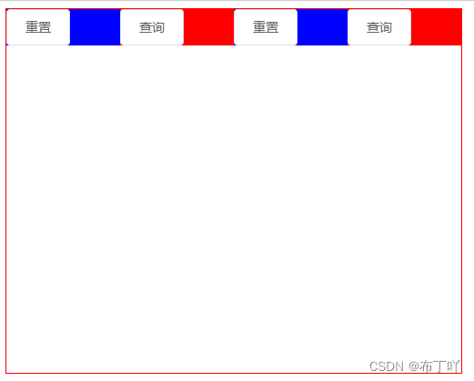
先来一个没有gutter效果的
<template>
  <div style="width: 500px; height: 400px; border: red 1px solid">
    <el-row>
      <el-row>
        <el-col :span="6" style="background: blue;">
          <el-button>重置</el-button>
        </el-col>
        <el-col :span="6" style="background: red;">
          <el-button>查询</el-button>
        </el-col>
        <el-col :span="6" style="background: blue;">
          <el-button>重置</el-button>
        </el-col>
        <el-col :span="6" style="background: red;">
          <el-button>查询</el-button>
        </el-col>
      </el-row>
    </el-row>
  </div>
</template>
效果图:
再来一个加上gutter的
<template>
  <div style="width: 500px; height: 400px; border: red 1px solid">
    <el-row>
      <el-row gutter="20">
        <el-col :span="6" style="background: blue;">
          <el-button>重置</el-button>
        </el-col>
        <el-col :span="6" style="background: red;">
          <el-button>查询</el-button>
        </el-col>
        <el-col :span="6" style="background: blue;">
          <el-button>重置</el-button>
        </el-col>
        <el-col :span="6" style="background: red;">
          <el-button>查询</el-button>
        </el-col>
      </el-row>
    </el-row>
  </div>
</template>
效果图如下:
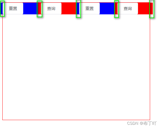
发现
是不是好像发现了什么?
没错,最后一列(el-col)短了一节。
从效果图上来看,gutter就是在每列前面加上一块来实现分栏间隔的。第1列前面加上一块,但是是在div外面,不影响里面,但是最后一列被挤出div一块,超出边界相当于被覆盖了。
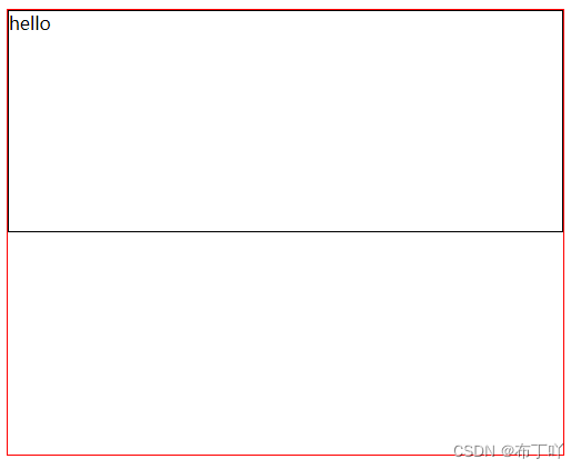
el-row行内容居中
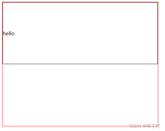
默认居左上角
为了能跟直观的看到效果,将行高度设置为200px,加上黑色边框。
<template>
  <div style="width: 500px; height: 400px; border: red 1px solid">
    <el-row>
      <el-row style="height: 200px; border: black 1px solid">
        <span>hello</span>
      </el-row>
    </el-row>
  </div>
</template>
效果如下:
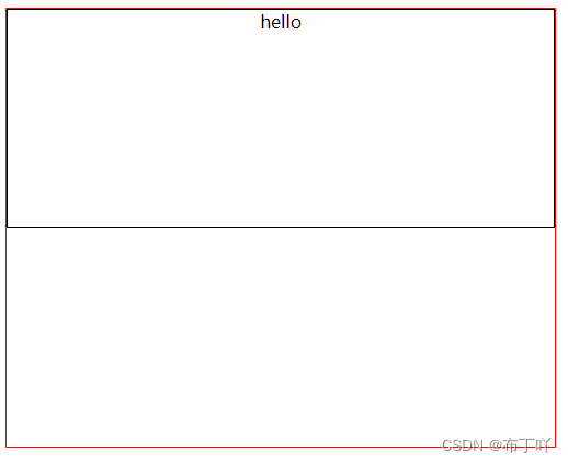
水平居中
在el-row上加上type="flex"和justify="center"就可以了。
<template>
  <div style="width: 500px; height: 400px; border: red 1px solid">
    <el-row>
      <el-row type="flex" justify="center" style="height: 200px; border: black 1px solid">
        <span>hello</span>
      </el-row>
    </el-row>
  </div>
</template>
效果图如下:
垂直居中
在el-row上加上type="flex"和align="middle"就行了。
<template>
  <div style="width: 500px; height: 400px; border: red 1px solid">
    <el-row>
      <el-row type="flex" align="middle" style="height: 200px; border: black 1px solid">
        <span>hello</span>
      </el-row>
    </el-row>
  </div>
</template>
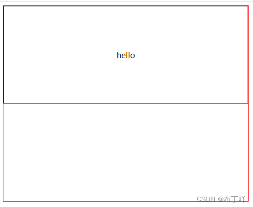
水平垂直居中
在el-row上加上type="flex"、justify="center"和align="middle"就行了。
<template>
  <div style="width: 500px; height: 400px; border: red 1px solid">
    <el-row>
      <el-row type="flex" justify="center" align="middle" style="height: 200px; border: black 1px solid">
        <span>hello</span>
      </el-row>
    </el-row>
  </div>
</template>
本次分享就结束了,有什么不对,欢迎指正!也欢迎大家补充。