参考:
https://blog.csdn.net/qq_41080850/article/details/83829045
https://blog.csdn.net/aijiudu/article/details/89387328
python绘制箱线图boxplot():https://blog.csdn.net/weixin_44052055/article/details/121442449
一、简介
如下灰色框里的就是箱形图(英文:Box plot):又称为盒须图、盒式图、盒状图或箱线图,是一种用作显示一组数据分散情况资料的统计图。因型状如箱子而得名。
箱形图最大的优点就是不受异常值的影响,可以以一种相对稳定的方式描述数据的离散分布情况。
五数概括法:即用下面的五个数来概括数据(最小值;第1四分位数(Q1);中位数(Q2);第3四分位数(Q3);最大值),箱形图与之类似。

箱型图的特点:
- 箱线图判断异常值的标准以四分位数和四分位距为基础,四分位数具有一定的耐抗性,多达25%的数据可以变得任意远而不会很大地扰动四分位数,所以异常值不会影响箱形图的数据形状,箱线图识别异常值的结果比较客观。由此可见,箱线图在识别异常值方面有一定的优越性。
- 对于标准正态分布的样本,只有极少值为异常值。异常值越多说明尾部越重,自由度越小(即自由变动的量的个数);而偏态表示偏离程度,异常值集中在较小值一侧,则分布呈左偏态;异常值集中在较大值一侧,则分布呈右偏态。
- 同一数轴上,几批数据的箱线图并行排列,几批数据的中位数、尾长、异常值、分布区间等形状信息便昭然若揭。所以箱型图有助于比较几批数据形状。
- 局限:不能精确地衡量数据分布的偏态和尾重程度;对于批量比较大的数据,反映的信息更加模糊以及用中位数代表总体评价水平有一定的局限性。
二、绘制与提取
python 中已经提供了很多种箱型图的绘制方法,为我们使用者带来了极大的便利,可用的方法有
- 方法1:利用
pandas包中的Series.plot()、DataFrame.plot()或DataFrame.boxplot()方法; - 方法2:利用
seaborn包中的cataplot()或者boxplot(),其中seaborn.boxplot()是seaborn.cataplot()的参数kind='box'时的一种情况; - 方法3:利用
matplotlib包中axes对象的boxplot()方法。
这么多种方法,具体的使用可以参看:https://blog.csdn.net/qq_41080850/article/details/83829045,这里只贴两个个人感觉比较简洁的。
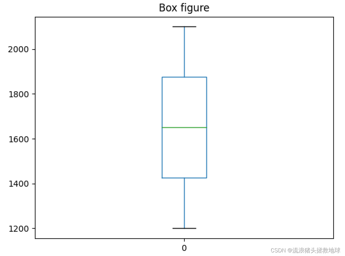
1、图形绘制
import numpy as np
import pandas as pd
import matplotlib.pyplot as plt

data = [1200, 1300, 1400, 1500, 1600, 1700, 1800, 1900, 2000, 2100]

df = pd.DataFrame(data)
df.plot.box(title="Box figure")
plt.show()
import numpy as np
import pandas as pd
import matplotlib.pyplot as plt

data = [1200, 1300, 1400, 1500, 1600, 1700, 1800, 1900, 2000, 2100]

fig,ax=plt.subplots(figsize=(6, 6), dpi=100, facecolor='w')
ax.boxplot(data,sym='rd',positions=[2])
plt.show()
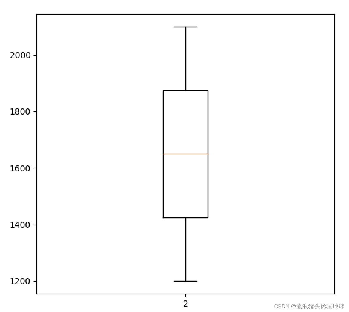
我更倾向于后者,下面详细研究一下函数的参数
2、ax.boxplot 函数的使用
(发现有人已经做了,拿来轮子直接用)
https://blog.csdn.net/weixin_44052055/article/details/121442449
上面的博客,对这个函数的参数介绍非常详细,常用的参数下面列一下:
| 参数 | 含义 |
|---|---|
| x | 指定要绘制箱线图的数据,可以是一组数据也可以是多组数据; |
| notch | 是否以凹口的形式展现箱线图,默认非凹口; |
| sym | 指定异常点的形状,默认为蓝色的+号显示; |
| vert | 是否需要将箱线图垂直摆放,默认垂直摆放; |
| whis | 指定上下须与上下四分位的距离,默认为1.5倍的四分位差; |
| positions | 指定箱线图的位置,默认为range(1, N+1),N为箱线图的数量; |
| widths | 指定箱线图的宽度,默认为0.5; |
| patch_artist | 是否填充箱体的颜色,默认为False; |
| meanline | 是否用线的形式表示均值,默认用点来表示; |
| showmeans | 是否显示均值,默认不显示; |
| showcaps | 是否显示箱线图顶端和末端的两条线,默认显示; |
| showbox | 是否显示箱线图的箱体,默认显示; |
| showfliers | 是否显示异常值,默认显示; |
| boxprops | 设置箱体的属性,如边框色,填充色等; |
| labels | 为箱线图添加标签,类似于图例的作用; |
| flierprops | 设置异常值的属性,如异常点的形状、大小、填充色等; |
| medianprops | 设置中位数的属性,如线的类型、粗细等; |
| meanprops | 设置均值的属性,如点的大小、颜色等; |
| capprops | 设置箱线图顶端和末端线条的属性,如颜色、粗细等; |
| whiskerprops | 设置须的属性,如颜色、粗细、线的类型等; |
| manage_ticks | 是否自适应标签位置,默认为True; |
| autorange | 是否自动调整范围,默认为False; |
可以看到,这个函数也可以绘制多个箱型图,下面是笔者常用的设置:
	pos1=list(range(1,10))
    wid1=2;wid2=1
    tmp=ax.boxplot(datagroup,sym='rd',showmeans=True,meanline=False,
    positions=pos1,
    medianprops={

    'color': 'blue','linewidth': str(wid1)},   # medium setting
    flierprops={

    "marker": "o", "markerfacecolor": "red", "markersize": 2},  # error points
    #meanprops={'color': 'blue', 'ls': '--', 'linewidth': str(wid)},
    meanprops={

    "marker": "^", "markerfacecolor": "green", "markersize": 12},# mean setting
    capprops={

    'linewidth': str(wid2)},      # caps
    boxprops={

    'linewidth': str(wid1)},      # box
    whiskerprops={

    'linewidth': str(wid2)},  # whisker
    )
3、特征值提取
绘图很简单,但是我得到图形后并不能确切的知道这些箱型图的特征值(均值、中位数等),怎么才能得到这些值呢?首先找了一下,发现有个前辈写了个函数可以满足这一需要
def BoxFeature(input_list):
    """
    get the feature of box figure.

    > @param[in] input_list:    the series
    return:
    < @param[out] out_list:     the feature value
    < @param[out_note]:         [ave,min,Q1,Q2,Q3,max,error_number]
    """
    percentile = np.percentile(input_list, (25, 50, 75), interpolation='linear')
    Q1 = percentile[0]  # upper quartile
    Q2 = percentile[1]
    Q3 = percentile[2]  # lower quartile
    IQR = Q3 - Q1       # Interquartile range
    ulim = Q3 + 1.5*IQR # upper limit
    llim = Q1 - 1.5*IQR # lower limit
    # llim = 0 if llim < 0 else llim
    # out_list = [llim,Q1,Q2,Q3,ulim]
    # ------- count the number of anomalies ----------
    right_list = []     # normal data
    Error_Point_num = 0
    value_total = 0
    average_num = 0
    for item in input_list:
        if item < llim or item > ulim:
            Error_Point_num += 1
        else:
            right_list.append(item)
            value_total += item
            average_num += 1
    average_value =  value_total/average_num
    out_list = [average_value,min(right_list), Q1, Q2, Q3, max(right_list), Error_Point_num]
    return out_list
后来,笔者对ax.boxplot函数的返回值进行了详细研究发现可以从它的返回值得到我想要的东西
ave = tmp['means'][0]._y
med = np.mean(tmp['medians'][0]._y)
min_value = tmp['caps'][2*i]._y[0]
Q1 = tmp['boxes'][0]._y[0]
Q3 = tmp['boxes'][0]._y[3]
max_value = tmp['caps'][2*i+1]._y[0]
error_num = len(tmp['fliers'][0]._y)
值得注意的是,上面的小函数和根据画图函数返回结果得到的特征值有些微差别(均值),不过影响不大。至此,大功告成!
三、多箱型图绘制
1、一种类型
就是好多个箱子,这些箱子是同一种类型,只不过有好多组。
2、多种类型
绘制多种类型的箱型图,每一种类型都有好多组。其实可以存在两种方式:一种是同组箱子放在一起,legend给类型;另一种是同类型的箱子放在一起,legend给组。这两种方式可以通过positions来控制和区分。
下面的这种是同类型的放在一起,用不同的颜色表示不同的组,图例给组。
def multiBox():
    #data是acc中三个箱型图的参数
    data = [
    [0.8676,0.8484,0.8293,0.8917,0.9151,0.9470,0.8935,0.8078,0.9081,0.8555,0.8897,0.9062,0.9190,0.8964,0.8520,0.8697,0.8738],
        [0.8512,0.8026,0.7911,0.8787,0.9131,0.9532,0.8656,0.8159,0.9187,0.8421,0.8758,0.9096,0.9128,0.8951,0.8748,0.8537,0.8750],
        [0.9161,0.9047,0.8635,0.9026,0.9328,0.9490,0.8911,0.8669,0.9227,0.8683,0.9114,0.9372,0.9475,0.9053,0.8839,0.9364,0.9032]]
    #data2 是F1 score中三个箱型图的参数
    data2=[
    [0.9291,0.9180,0.9067,0.9427,0.9557,0.9728,0.9438,0.8937,0.9518,0.9221,0.9416,0.9508,0.9578,0.9454,0.9201,0.9303,0.9327],
           [0.9196,0.8905,0.8834,0.9354,0.9546,0.9760,0.9279,0.8986,0.9576,0.9143,0.9338,0.9527,0.9544,0.9447,0.9332,0.9211,0.9333],
           [0.9562,0.9500,0.9267,0.9488,0.9652,0.9738,0.9424,0.9287,0.9598,0.9295,0.9536,0.9676,0.9731,0.9503,0.9384,0.9672,0.9491]]
	#data3 是IoU中三个箱型图的参数
    data3 = [
    [0.8733,0.8624,0.8673,0.8815,0.9363,0.9433,0.9163,0.8350,0.9094,0.8878,0.8956,0.9050,0.9238,0.9077,0.8686,0.8747,0.8877],
             [0.8563,0.8368,0.8618,0.8743,0.9406,0.9479,0.8866,0.8473,0.9195,0.8679,0.8922,0.9091,0.9225,0.9111,0.8857,0.8629,0.8910],
             [0.9172,0.9091,0.8864,0.9029,0.9503,0.9530,0.9200,0.8857,0.9211,0.9033,0.9201,0.9391,0.9430,0.9227,0.9056,0.9360,0.9145]]
	#箱型图名称
    labels = ["A", "B", "C"]
    #三个箱型图的颜色 RGB (均为0~1的数据)
    colors = [(202/255.,96/255.,17/255.), (255/255.,217/255.,102/255.), (137/255.,128/255.,68/255.)]
	#绘制箱型图
	#patch_artist=True-->箱型可以更换颜色,positions=(1,1.4,1.8)-->将同一组的三个箱间隔设置为0.4,widths=0.3-->每个箱宽度为0.3
    bplot = plt.boxplot(data, patch_artist=True,labels=labels,positions=(1,1.4,1.8),widths=0.3)
	#将三个箱分别上色
    for patch, color in zip(bplot['boxes'], colors):
        patch.set_facecolor(color)

    bplot2 = plt.boxplot(data2, patch_artist=True, labels=labels,positions=(2.5,2.9,3.3),widths=0.3)

    for patch, color in zip(bplot2['boxes'], colors):
        patch.set_facecolor(color)

    bplot3 = plt.boxplot(data3, patch_artist=True, labels=labels,positions=(4,4.4,4.8),widths=0.3)

    for patch, color in zip(bplot3['boxes'], colors):
        patch.set_facecolor(color)

    x_position=[1,2.5,4]
    x_position_fmt=["acc","F1 score","IoU"]
    plt.xticks([i + 0.8 / 2 for i in x_position], x_position_fmt)

    plt.ylabel('percent (%)')
    plt.grid(linestyle="--", alpha=0.3)  #绘制图中虚线 透明度0.3
    plt.legend(bplot['boxes'],labels,loc='lower right')  #绘制表示框,右下角绘制
    plt.savefig(fname="pic.png",figsize=[10,10])
    plt.show()
绘制结果如下:
