nuxt3封装全局confirm对话框
本文采用的nuxt3是rc.12。在plugins下,新建文件夹confirm。下边新建index.ts和index.vue。话不多说,直接上代码吧
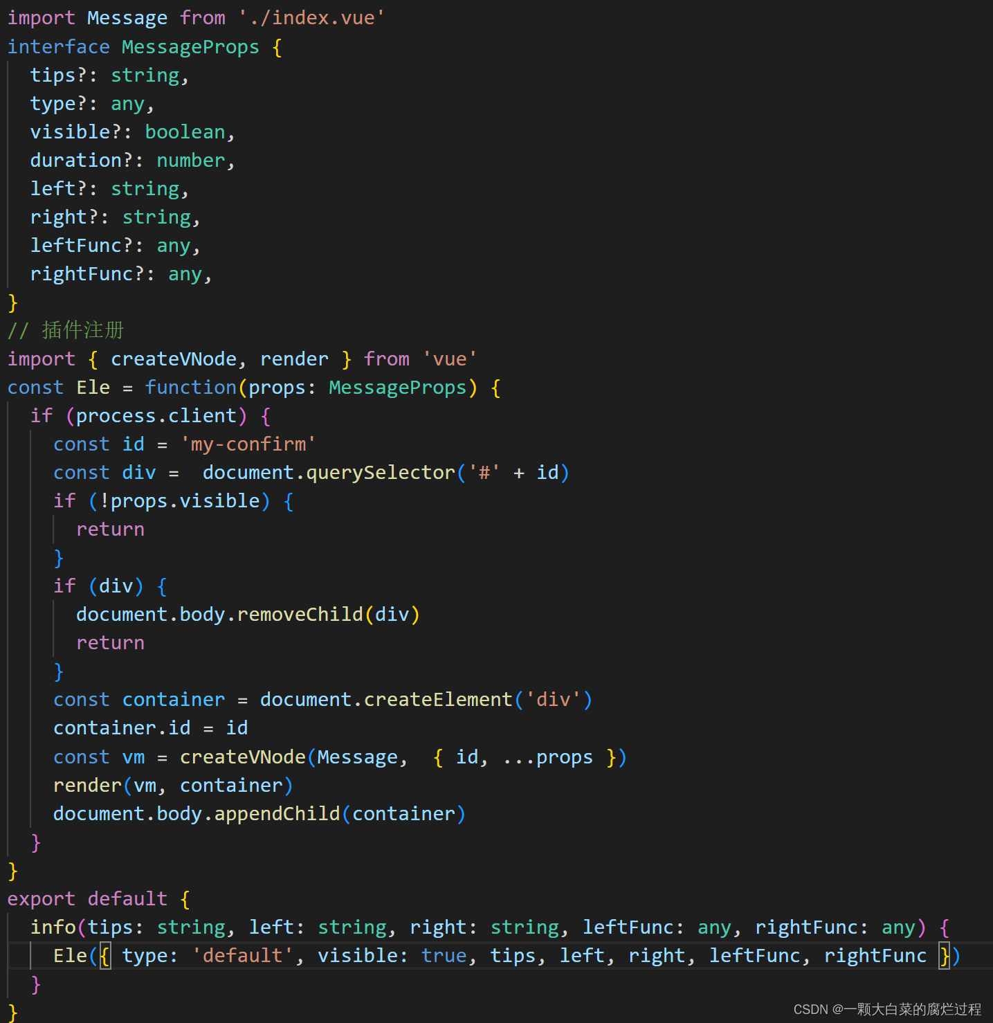
index.ts
// index.ts
index.vue
<script setup lang="ts">
type MessageType = 'default' | 'success' | 'warning' | 'error'

interface MessageProps {


  tips?: string,
  type?: MessageType,
  visible?: boolean,
  duration?: number,
  id?: string,
  left?: string,
  right?: string,
  leftFunc?: any,
  rightFunc?: any,
}

const props = withDefaults(defineProps<MessageProps>(), {


  tips: '',
  type: 'default',
  visible: false,
  duration: 500,
  id: 'my-message',
  left: '确定',
  right: '取消',
  leftFunc: () => {

     },
  rightFunc: () => {

     },
})

const state = ref(false)
const mes = ref(props.tips)
const left = ref(props.left)
const right = ref(props.right)
// status 可以用来区分default、success、warning、error的图标等
const status = ref(props.type)
const lock = ref(false)
const timer1 = ref(undefined)
const timer2 = ref(undefined)


watch(() => props.visible, (val: boolean) => {


  state.value = val
  show()
})

const hide = () => {


  timer1.value = setTimeout(() => {


    lock.value = false
  }, props.duration - 300)

  timer2.value = setTimeout(() => {


    state.value = false
    document.body.removeChild(document.querySelector('#' + props.id))
  }, props.duration - 200)
}

const show = () => {


  if (state.value) {


    return
  }

  clearTimeout(timer1.value)
  clearTimeout(timer2.value)

  state.value = true
  lock.value = true
}

onMounted(() => show())

function leftCallBack() {


  props.leftFunc()
  hide()
}

function rightCallBack() {


  props.rightFunc()
  hide()
}

</script>

<template>
  <div v-if="state" class="message-wrap">
    <div class="meesage-box zoomIn" :class="{ zoomOut: !lock }">
      <div class="message-header">温馨提示</div>
      <div class="message-body">
        <p>{

    {

     mes }}</p>
      </div>
      <div class="message-footer flex justify-end">
        <div @click="leftCallBack" class="btn left-btn">{

    {

     left }}</div>
        <div @click="rightCallBack" class="btn">{

    {

     right }}</div>
      </div>
    </div>
  </div>
</template>

<style scoped lang="scss">
.message-wrap {


  position: fixed;
  left: 0;
  right: 0;
  top: 0;
  bottom: 0;
  display: flex;
  justify-content: center;
  align-items: center;
  margin: auto;
  z-index: 9999;
  background-color: rgba(0, 0, 0, .3);

  .meesage-box {


    width: 400px;
    padding: 8px 15px;
    border-radius: 5px;
    background-color: #fff;
    color: #333;
    font-size: 16px;
  }

  .message-header {


    line-height: 40px;
    border-bottom: 1px solid #eee;
  }

  .message-body {


    padding: 20px 0;
    min-height: 80px;
    border-bottom: 1px solid #eee;
  }

  .message-footer {


    padding: 20px 0 10px;

    .btn {


      margin-left: 20px;
      padding: 5px 15px;
      border-radius: 3px;
      background-color: #f4f5f5;
      cursor: pointer;
      line-height: 20px;
      color: #666;

      &:hover {


        background-color: #ececef;
      }
    }

    .left-btn {


      color: #fff;
      background-color: #aa0000;

      &:hover {


        background-color: #c40505;
      }
    }
  }
}

.zoomIn {


  animation: zoomIn 0.1s linear;
}

.zoomOut {


  animation: zoomOut 0.3s linear;
}

@keyframes zoomIn {


  0%,
  30% {


    opacity: 0;
    transform: scale(0.8);
  }

  100% {


    opacity: 1;
    transform: scale(1);
  }
}

@keyframes zoomOut {


  0% {


    opacity: 1;
    transform: scale(1);
  }

  100% {


    opacity: 0;
    transform: scale(0.7);
  }
}
</style>
样式可以自己调一调。以上,算是完成了一大半了。接下来,在plugins新建confirm.client.ts
confirm.client.ts
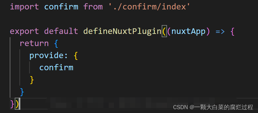
nuxt.config.ts
// nuxt.config.ts
plugins: [
    '~/plugins/confirm',
  ],
如何使用
例如在xxx.vue下
<script setup lang="ts">
const {

     $confirm } = useNuxtApp()
const handleConfirm = () => {


  $confirm.success('我是内容', '左边', '右边',
    () => {


      console.log('left')
    },
    () => {


      console.log('right')
    })
}
</script>
大同小异,n秒消息提示框也这样,改一下index.vue
对你有用就点个赞吧【笔芯】