前话
好久没写教程了(可能会误导新手的菜鸟教程( ̄▽ ̄)”)。
这是我的github,欢迎前端大大们和我一起学习交流
https://github.com/pwcong
最近入职公司做前端实习,这几个星期来学到了移动端H5页面适配。(以前根本没做过移动端网页/(ㄒoㄒ)/~~,还是微信端的)
所以把我学到的一个小知识点写下来,也分享给前端新手们。
正文
0x00 大概说明
做移动端网页和pc端很大不同的便是现在移动端窗口分辨率繁多。
很多时候UI给的设计图只有一份,还是按照iphone6设计的,这就让前端适配其他例如6plus或安卓等其他移动端头疼。
还好,阿里巴巴2015年底公开了其成熟的适配方案,lib-flexible,至于其可靠性可参考每年天猫活动的移动端页面。
这个方案的用法大概是这样的,HTML 头部引入 lib-flexible 的样式和js库,容器或组件宽高主要使用单位 rem ,字体大小则不变仍然使用单位 px。
还有一个约束是,因为只面向移动端,因此我们限制最外层包裹的div最大宽度为 640px
我这里只简单介绍怎么使用
lib-flexible实现移动端适配,如果需要深入解释的知识,请阅读如下文章:
https://github.com/amfe/article/issues/17
0x01 引入 lib-flexible
最新的库文件可以到这里下载:
https://github.com/amfe/lib-flexible

clone 下来后在 build 目录下找到 flexible.css 和 flexible.js 在HTML头部引入即可,例如:
<!DOCTYPE html>
<html lang="zh-CN">

    <head>
        <title>lib-flexible demo</title>
        <meta charset="UTF-8">
        <meta name="viewport" content="width=device-width,initial-scale=1,maximum-scale=1,user-scalable=no">

        ...

        <link href="css/flexible.css" rel="stylesheet">
        <script src="js/flexible.js"></script>

    </head>

    <body>

        ...

    </body>

</html>- 1
- 2
- 3
- 4
- 5
- 6
- 7
- 8
- 9
- 10
- 11
- 12
- 13
- 14
- 15
- 16
- 17
- 18
- 19
- 20
- 21
- 22
0x02 计算rem值
谷歌 rem 的用法后很多人应该大概了解 rem 的原理了,大概就是 rem 依赖 font-size 的值,例如默认下 1rem = 16px,因此通过在不同分辨率修改 font-size 就可以达到适配不同分辨率的移动端了。
需要详细了解 rem 值计算可参考这篇文章 http://www.cnblogs.com/azhai-biubiubiu/p/6003597.html
rem 来做宽高定型有个最大的问题是,font-size 如何计算的问题,如何算得的 font-size 可以在不同分辨率下显示效果一致呢?
不用担心,lib-flexible 已经帮你算好了,在你调整窗口大小的时候自动计算调整 rem 的基准,你只要做的是,按照设计图算出能适配不同分辨率的移动端的 rem 值。
这里有个关系图:
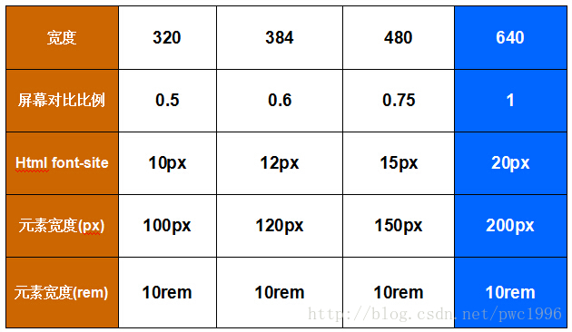
看不懂没关系,看那么多flexible的教程都放了我也就跟着放出来好了。
假如UI给了这个设计图(找不到工作的UI (/▽\)):
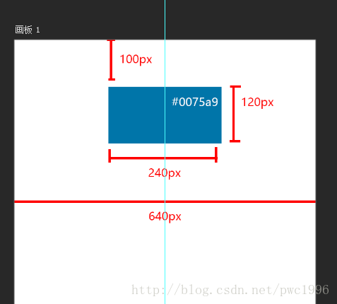
好,我这辣鸡一眼看出了:
- 这是以iphone5为标准的ui设计稿,设备窗口宽度为
640px - 中间一个色块,居中,背景色为
#0075a9,margin-top 为100px, width 为240px,height 为120px
接下来,我们来计算rem值,计算公式很简单:
需转换的px值 / 设计稿宽度px值 * 10
上面的尺寸计算一下转换成下面的说法:
1. 这是以iphone5为标准的ui设计稿,设备窗口宽度为 10rem
2. 中间一个色块,居中,背景色为 #0075a9,margin-top 为 1.5625rem, width 为 3.75rem,height 为 1.875rem
0x03 按照找不到工作的UI给的设计稿敲出代码
<!DOCTYPE html>
<html lang="en">

<head>
    <title></title>
    <meta charset="UTF-8">
    <meta name="viewport" content="width=device-width, initial-scale=1">
    <link href="css/flexible.css" rel="stylesheet">
    <script src="js/flexible.js"></script>

    <style>
        html, body{
            width: 100%;
            height: 100%;
            position: relative;
            padding: 0;
            margin: 0;
            overflow: hidden;
        }

        body{
            background: #333;
        }

        .container{
            overflow-x: hidden;
            overflow-y: auto;
            position: relative;
            height: 100%;
            max-width: 640px;
            background-color: white;
            margin: 0 auto;
        }

        .block{

            margin: 0 auto;
            margin-top: 1.5625rem;

            width: 3.75rem;
            height: 1.875rem;

            background-color: #0075a9;

        }

    </style>

</head>

<body>

    <div class="container">

        <div class="block"></div>

    </div>

</body>

</html>
- 1
- 2
- 3
- 4
- 5
- 6
- 7
- 8
- 9
- 10
- 11
- 12
- 13
- 14
- 15
- 16
- 17
- 18
- 19
- 20
- 21
- 22
- 23
- 24
- 25
- 26
- 27
- 28
- 29
- 30
- 31
- 32
- 33
- 34
- 35
- 36
- 37
- 38
- 39
- 40
- 41
- 42
- 43
- 44
- 45
- 46
- 47
- 48
- 49
- 50
- 51
- 52
- 53
- 54
- 55
- 56
- 57
- 58
- 59
- 60
- 61
- 62
0x04 不同分辨率移动端下浏览效果
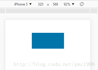
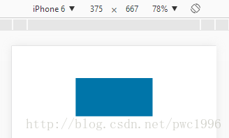
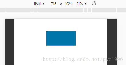
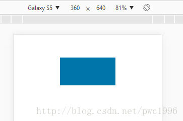
可以看到,在多个不同设备间,效果基本差不多
后话
也许你会说,我这个案例 内容太少,没有什么说服力。
那么,大佬们快动起手来,在你的移动端网页项目中用上 lib-flexible 看看能否解决移动端页面适配问题吧。