前言
message弹窗组件在开发中使用非常频繁,很多操作的成果,警告,失败都需要进行提示,虽然大部分ui组件库都很方便的message提示弹窗,但是在ui定制化开发中,封装自己的组件是很有必要的,并且学会封装组件也是学习前端过程中必不可少的一部分。
实现效果
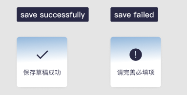
这里展示两种实现的效果,举一反三,其它类型同理
组件编写
首先来编写组件,这种组件的结构比较简单,外层popup做一个蒙版遮罩,popup-info就是组件主体,内部就是一个提示的icon和下面的提示文字。我们使用type参数来控制展示的icon,然后这里的提示文字messageText也是从父组件传入。
<template>
	<view>
		<view class="popup" v-show="show">
			<view class="popup-info">
				<!-- type为 success 为成功图标
				type为 info 为提醒图标 -->
				<image v-if="type == 'success'" :src="img" class="imgebae"></image>
				<image v-if="type == 'info'" src="@/static/common_icons_info.png" class="imgebae1"></image>
				<view class="info-text" >{

   {messageText}}</view>
			</view>
		</view>
	</view>
</template>
图片使用本地地址或是base64都行,然后下面是组件的接收参数部分props,首先show控制组件的展示和消失,messageText控制展示的文字,type控制提示的类型。因为一般的message组件是弹出来几秒之后自动消失,实现这种功能的逻辑很多,我这里使用的是展示1s之后,使用this.$emit触发组件的绑定的close事件,在父组件中通过这个close就可以进行关闭显示
<script>
	export default {


		name:"my-message",
		props: {


			show: {


				type:Boolean,
				default: false
			},
			messageText: {


				type: String,
				default: ''
			},
			type: {


				type: String,
				default: ''
			}
		},
		data() {


			return {


				img:'data:image/png;base64,这里是base64编码不作展示'
			};
		},
		watch:{


			show: {


				immediate: true,
				handler(newVal, oldVal) {


				  if(newVal){


					  setTimeout(() => this.$emit('close'), 1000);
				  }
				}
			}
		},
	}
</script>
Css部分也展示一下:
<style lang="scss">
.popup {


		position: fixed;
		left: 0;
		right: 0;
		top: 0;
		height: 100vh;
		background-color: rgba(0,0,0,0.4) !important;
		z-index: 9998;
	}

	.popup-info{


		position: fixed;
		width: 136px;
		height: 136px;
		top: 50%;
		left: 50%;
		transform: translate(-50%,-50%);
		font-size: 17px;
		z-index: 9999;
		background: linear-gradient(176.71deg, #1F6AB5 -53.25%, #FFFFFF 50%);
		box-shadow: 0px 1px 13px -6px rgba(0, 0, 0, 0.25);
		border-radius: 7px;

		display: flex;
		flex-direction: column;
		align-items: center;
		justify-content: space-between;
		.imgebae {


			width: 31.82px;
			height: 21.57px;
			margin-top: 36.33px;
		}
		.imgebae1 {


			width: 66.66rpx;
			height: 66.66rpx;
			margin-top: 31.33px;
		}
		.info-text {


			font-family: 'PingFang SC';
			font-style: normal;
			font-weight: 400;
			font-size: 17px;
			line-height: 24px;
			text-align: center;
			margin-bottom: 28px;
			/* text */

			color: #292945;

			mix-blend-mode: normal;
			opacity: 0.9;
		}
	}

</style>
父组件的使用
在父组件中引入子组件并注册之后,便可以进行使用了
<mymessage :show="show_loginMessage" type="success" :messageText="loginMessageText"
@close="cancel_message"></mymessage>
然后写对应需要的属性:
show_loginMessage: false,
loginMessageText:'登录成功',
关闭触发的方法:
cancel_message() {


	this.show_loginMessage = !this.show_loginMessage
}
这样一个简易的的message提示框就完成了,还有很多地方可以去扩展,比如控制展示的时长,弹窗渐入渐出的动画等等,大家可以自行去完善实现更多功能~