操作效果:

原理:
准备2张图片,一张是打开状态的,一个是关闭状态的,点击时不断切换图片,并通知父组件更新状态值。
准备素材:
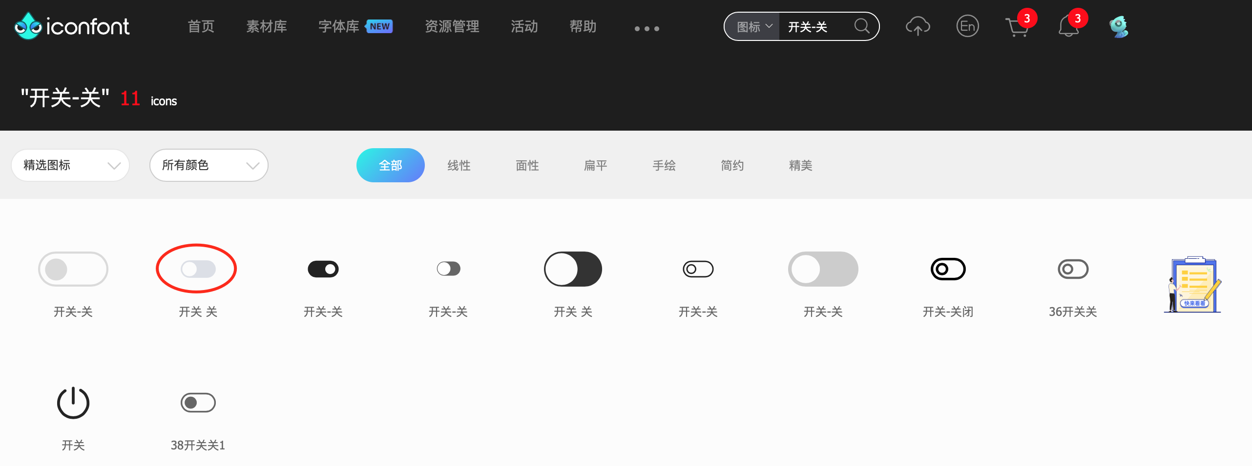
去阿里图标库https://www.iconfont.cn 下载精美图标

子组件代码
<template>
    <div class="pointer h30" @click="openSw" >
        <div v-if="active"><img style="width: 40px;" src="@/assets/images/kaiguankai.png"/></div>
        <div v-if="!active"><img  style="width: 40px;" src="@/assets/images/kaiguanguan.png"/></div>
    </div>
  </template>

  <script>


  export default {
      name: 'MySwitch',
      props: {
          open: {},
      },
      created() {
        this.active = this.open
      },
      data() {
          return {
            active: false,
          }
      },
      methods: {

        openSw() {
            this.active = !this.active;
            this.$emit("change", this.active);
        }
      }
  }
  </script>
几点注意:
1、 created() 生命周期,当组件创建完毕后会调用该事件,目的是将组件的属性值传给组件的变量
2、通过$emit("change", this.active),调用父组件的方法将状态值传给父组件,这样父组件就知道了开关到底是打开了还是关闭了
父组件代码
<template>
    <div class="body">
      <div class="table">
        <div class="filter font-bold">组件库(一) 开关</div>
        <div class="margin-top-l margin-left-l flex flex-center-cz">
          <my-switch :open="true" @change="acitveChange"></my-switch>
          <div class="margin-left-l">状态:{

    {status}}</div>
        </div>
      </div>
    </div>
</template>

<script>
/*
       名称:组件库(一) 开关
       作者:唐赢
       时间:2023-3-12
*/

  import MySwitch from '@/components/switch/Switch'
  export default {
    name: 'Main',
    components: {
      MySwitch
    },
    data () {
      return {
        status:'开'

      }
    },
    methods: {
      acitveChange(val) {
        if (val== true) {
          this.status = "开"
        } else {
          this.status = "关"
        }

      }
    }
  }
</script>

<style scoped>
  .body {
    display: flex;
    justify-content: center;
    margin-top: 73px;
    width: 100%;
  }
  .table {
    background-color: #fff;
    width: 1080px;
    min-height: 800px;
    box-shadow: 0px 3px 6px rgba(0, 0, 0, .1);
    margin-bottom: 10px;
  }
  .filter {
    display: flex;
    height: 60px;
    align-items:center;
    background-color: #fff;
    font-size: 18px;
    justify-content: center;
    border-bottom: 1px solid rgba(0, 0, 0, .2);;
  }

</style>
代码中用到了很多公共样式,如flex margin-left-l pointer h30 等,在base.css中可以找到,将常用的样式写成class,方便以后调用,减少重复代码,养成好的代码风格,强列推荐使用flex布局,之前本人对前端真是一点办法没有,后来通过再三熟悉,掌握了flex布局后,前端布局将不是难事。
源码下载:https://download.csdn.net/download/gdgztt/87564008