我数据分析的时候主要是stacked bar、bar和line形式的放在一张图上。stacked bar若用matplotlib实现的话会比较复杂(多组)
先上图吧
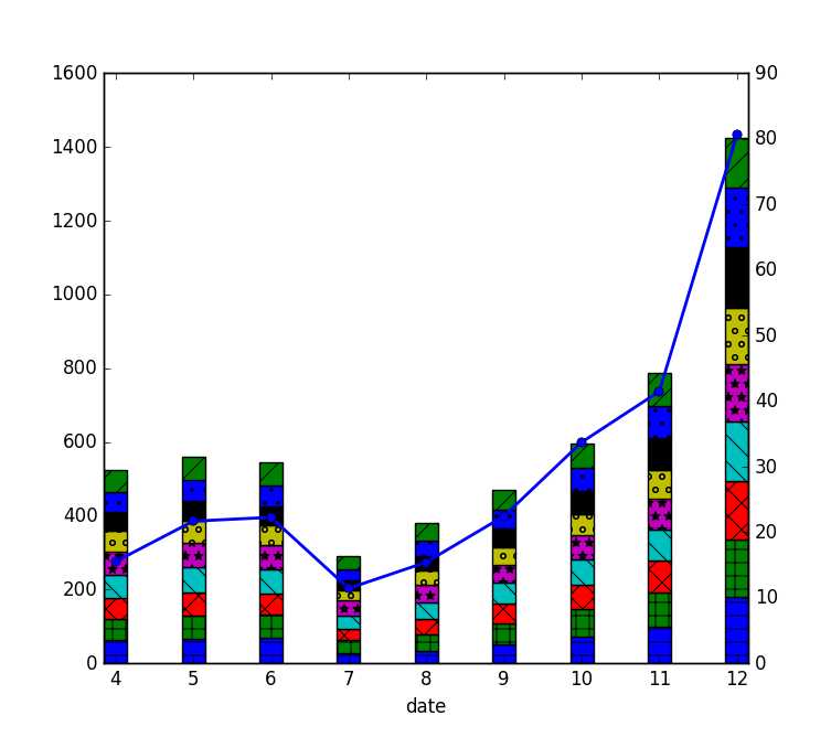
def plot_stacked_bar(left_data, right_data):
    width = .3
    axe = plt.subplot(111)
    axe = left_data.plot(kind=‘bar‘, stacked=True, ax=axe, width=width, use_index=True, legend=False)
    axe.set_xticklabels(left_data.index, rotation=0)

    #add patches to the stacked bar
    patterns = (‘-‘, ‘+‘, ‘x‘, ‘\\‘, ‘*‘, ‘o‘, ‘O‘, ‘.‘, ‘/‘)
    bars = axe.patches
    hatches = ‘‘.join(h*len(left_data) for h in patterns)
    for bar, hatch in zip(bars, hatches):
        bar.set_hatch(hatch)

    #plottint the line sharing the same x-axis on the secondary y-axis
    axf = axe.twinx()
    axf.plot(axe.get_xticks(), right_data, linestyle=‘-‘, marker=‘o‘, linewidth=2.0)
    axf.set_ylim((0, 90))
另一种形式的图形:
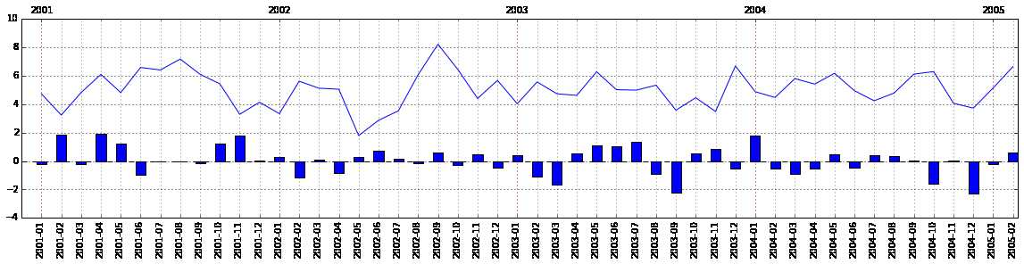
from matplotlib import pyplot as plt
import pandas as pd
from pandas import Series
import numpy as np
n = 50
x = pd.period_range(‘2001-01-01‘, periods=n, freq=‘M‘)
y1 = (Series(np.random.randn(n)) + 5).tolist()
y2 = (Series(np.random.randn(n))).tolist()
df = pd.DataFrame({‘bar‘:y2, ‘line‘:y1}, index=x)

# let‘s plot
plt.figure(figsize=(20, 4))
ax1 = df[‘bar‘].plot(kind=‘bar‘, label=‘bar‘)
ax2 = ax1.twiny()
df[‘line‘].plot(kind=‘line‘, label=‘line‘, ax=ax2)
ax2.grid(color="red", axis="x")

def align_xaxis(ax2, ax1, x1, x2):
    "maps xlim of ax2 to x1 and x2 in ax1"
    (x1, _), (x2, _) = ax2.transData.inverted().transform(ax1.transData.transform([[x1, 0], [x2, 0]]))
    xs, xe = ax2.get_xlim()
    k, b = np.polyfit([x1, x2], [xs, xe], 1)
    ax2.set_xlim(xs*k+b, xe*k+b)

align_xaxis(ax2, ax1, 0, n-1)
#参考#
- http://stackoverflow.com/questions/19952290/how-to-align-the-bar-and-line-in-matplotlib-two-y-axes-chart?newreg=4f241248a9f44c34a467216c0a6cf099
- http://stackoverflow.com/questions/22833404/how-do-i-plot-hatched-bars-using-pandas
- http://stackoverflow.com/questions/24227650/multiple-plots-on-same-figure-with-dataframe-plot/24237358#24237358
- http://stackoverflow.com/questions/22623324/plot-bar-graph-and-timeseries-plot-on-different-axis-using-pandas
- http://stackoverflow.com/questions/19060144/more-efficient-matplotlib-stacked-bar-chart-how-to-calculate-bottom-values