python可视化神器
今天介绍一个python库altair,它的语法与r的ggplot有点类似
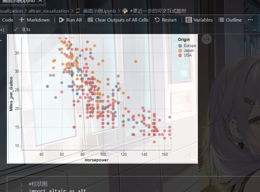
对中文的兼容性也很好,以一幅简单的散点图举例:
安装说明:
pip install altair
pip install vega-datasets#注意这里是"-"不是"_",我们要使用到其中的数据
import altair as alt
from vega_datasets import data
cars = data.cars()
cars

alt.Chart(cars).mark_point().encode(
    x='Horsepower',
    y='Miles_per_Gallon',
    color='Origin',
    shape='Origin'
).interactive()
输出以下图形,点击旁边的三个点,还能将其保存为各种形式的图片。

可以发现它的语法也是及其简单:
-
cars是我们所需要的数据,他是一个数据框(dataframe的形式)
-
make-point 就是散点图
-
x=‘Horsepower’ , y='Miles_per_Gallon’分别对应我们的x轴和y轴数据
-
color=‘Origin’ 根据产地来映射颜色,这与ggplot的语法很相似
-
shape=‘Origin’,这里就是根据产地来映射点的形状
-
interactive() 生成交互式图片,效果如下
一.些简单图形的绘制
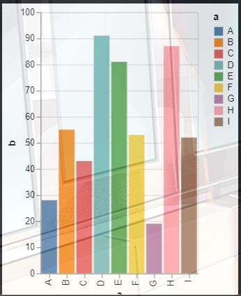
(一).柱状图
语法很简单
import altair as alt
import pandas as pd

source = pd.DataFrame({


    'a': ['A', 'B', 'C', 'D', 'E', 'F', 'G', 'H', 'I'],
    'b': [28, 55, 43, 91, 81, 53, 19, 87, 52]
})

alt.Chart(source).mark_bar().encode(
    x='a',
    y='b',
    color="a"
)
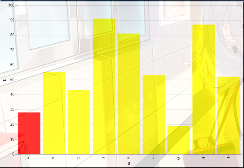
1. 然后我们还可以设置高亮柱状图的某一根柱子,其他柱子设置为一样的颜色:
import altair as alt
import pandas as pd

source = pd.DataFrame({


    'a': ['A', 'B', 'C', 'D', 'E', 'F', 'G', 'H', 'I'],
    'b': [28, 55, 43, 91, 81, 53, 19, 87, 52]
})

alt.Chart(source).mark_bar().encode(
    x='a:O',
    y='b:Q',
    color=alt.condition(
        alt.datum.a=="A",#这里设置条件,如果a的值是"A",需要改动的只有a这个地方和"A"这个地方,后者是前者满足的条件
        alt.value("red"),#如果满足上面的条件颜色就变成红色
        alt.value("yellow")#如果不满足就变成黄色
    )
).properties(width=600,height=400)#这里的height和width分别设置图片的大小和高度
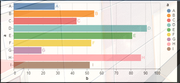
2. 翻转图片,同时添加图片标注,在图上加上数据
呃呃呃,其实翻转图片,就是x和y轴数据互换
import altair as alt
import pandas as pd

source = pd.DataFrame({


    'a': ['A', 'B', 'C', 'D', 'E', 'F', 'G', 'H', 'I'],
    'b': [28, 55, 43, 91, 81, 53, 19, 87, 52]
})

bars=   alt.Chart(source).mark_bar().encode(
    x='b:Q',
    y='a:O',
    color="a")
text = bars.mark_text(
    align='right',#在这里选择一个['left', 'center', 'right']
    baseline='middle',
    dx=10  # Nudges text to right so it doesn't appear on top of the bar
).encode(
    text='a'#这里是添加数据
)
bars+text
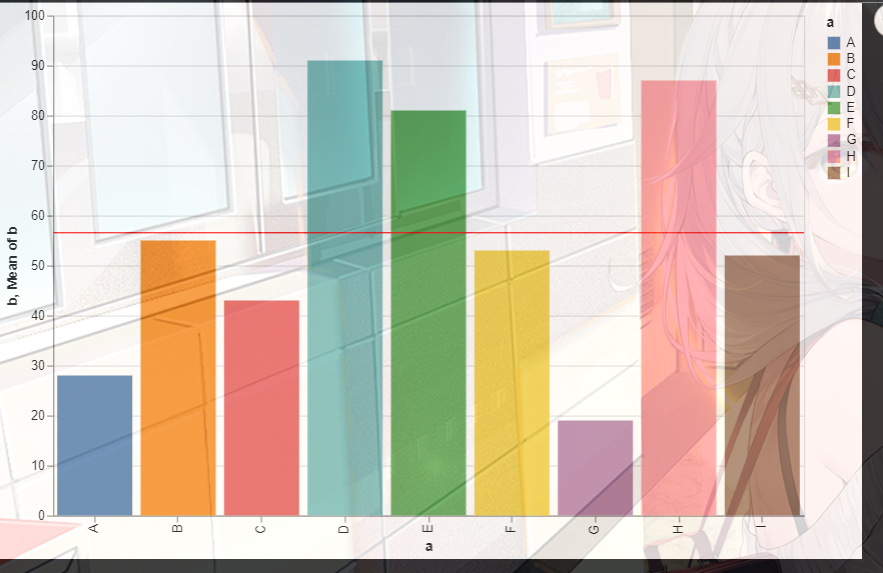
3.在图形上添加线条
import altair as alt
import pandas as pd

source = pd.DataFrame({


    'a': ['A', 'B', 'C', 'D', 'E', 'F', 'G', 'H', 'I'],
    'b': [28, 55, 43, 91, 81, 53, 19, 87, 52]
})

bars=   alt.Chart(source).mark_bar().encode(
    x='a',
    y='b',
    color="a")

rule = alt.Chart(source).mark_rule(color='red').encode(
    y='mean(b)',
)
(bars+rule).properties(width=600,height=400)
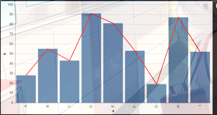
4. 组合图,柱状图+折线图
首先我们需要固定好x轴
import altair as alt
from vega_datasets import data
import pandas as pd

source = pd.DataFrame({


    'a': ['A', 'B', 'C', 'D', 'E', 'F', 'G', 'H', 'I'],
    'b': [28, 55, 43, 91, 81, 53, 19, 87, 52]
})
base = alt.Chart(source).encode(x='a:O')

bar = base.mark_bar().encode(y='b:Q')

line =  base.mark_line(color='red').encode(
    y='b:Q'
)

(bar + line).properties(width=600)
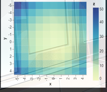
(二).热力图
import altair as alt
import numpy as np
import pandas as pd

# Compute x^2 + y^2 across a 2D grid
x, y = np.meshgrid(range(-5, 5), range(-5, 5))
z = x ** 2 + y ** 2

# Convert this grid to columnar data expected by Altair
source = pd.DataFrame({

    'x': x.ravel(),
                     'y': y.ravel(),
                     'z': z.ravel()})

alt.Chart(source).mark_rect().encode(
    x='x:O',
    y='y:O',
    color='z:Q'
)
(三).直方图
统计不同范围的数字出现的次数
这里还是以我们一开始cars数据举例说明:
import altair as alt
from vega_datasets import data
cars = data.cars()
cars
alt.Chart(cars).mark_bar().encode(
    alt.X("Displacement", bin=True),
    y='count()',
    color="Origin"
)

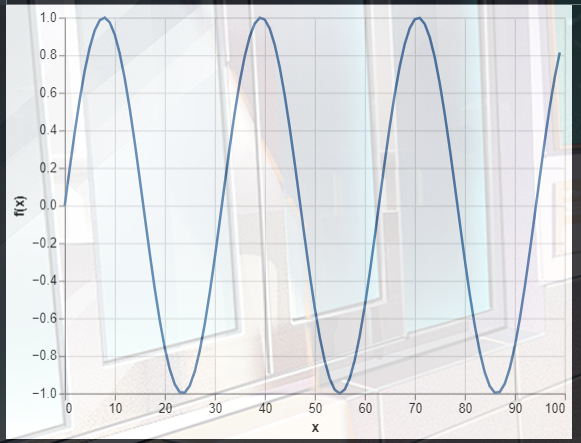
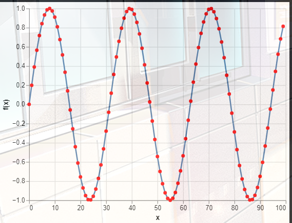
(四).线图
可以用来画函数曲线,比如:
y = sin x 5 \displaystyle y=\frac{\sin x}{5} y=5sinx
import altair as alt
import numpy as np
import pandas as pd

x = np.arange(100)
source = pd.DataFrame({


  'x': x,
  'f(x)': np.sin(x / 5)
})

alt.Chart(source).mark_line().encode(
    x='x',
    y='f(x)'
)
(五).带有鼠标提示的散点图
就是当你点击某个位置的时候,会给你相应的信息,比如说它的坐标
比如我在下面的代码中设置了tooltip,当我点击某个点时就会显示出相应的名称,归属地,马力
import altair as alt
from vega_datasets import data

source = data.cars()

alt.Chart(source).mark_circle(size=60).encode(
    x='Horsepower',
    y='Miles_per_Gallon',
    color='Origin',
    tooltip=['Name', 'Origin', 'Horsepower', 'Miles_per_Gallon']
).interactive()

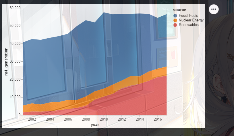
(六).堆积面积图
比如下面的代码,这里的x就是不同的年份,y就是使用不同原料的净发电量
import altair as alt
from vega_datasets import data

source = data.iowa_electricity()
source
alt.Chart(source).mark_area().encode(
    x="year:T",
    y="net_generation:Q",
    color="source:N"
)
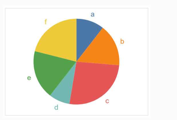
(七).扇形图
import pandas as pd
import altair as alt

source = pd.DataFrame({

    "category": [1, 2, 3, 4, 5, 6], "value": [4, 6, 10, 3, 7, 8]})

alt.Chart(source).mark_arc(innerRadius=50).encode(
    theta=alt.Theta(field="value", type="quantitative"),
    color=alt.Color(field="category", type="nominal"),
)

二.进阶操作
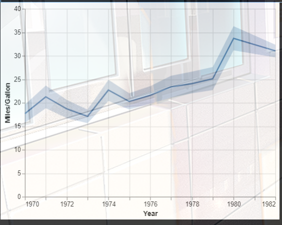
1. 折线图
1.制作一个带有95%置信区间带的折线图。
## 带有置信区间
import altair as alt
from vega_datasets import data

source = data.cars()

line = alt.Chart(source).mark_line().encode(
    x='Year',
    y='mean(Miles_per_Gallon)'
)

band = alt.Chart(source).mark_errorband(extent='ci').encode(
    x='Year',
    y=alt.Y('Miles_per_Gallon', title='Miles/Gallon'),
)

band + line
2.折线图标记
#折线图标记
import altair as alt
import numpy as np
import pandas as pd

x = np.arange(100)
source = pd.DataFrame({


  'x': x,
  'f(x)': np.sin(x / 5)
})

alt.Chart(source).mark_line(
    point=alt.OverlayMarkDef(color="red")
).encode(
    x='x',
    y='f(x)'
)
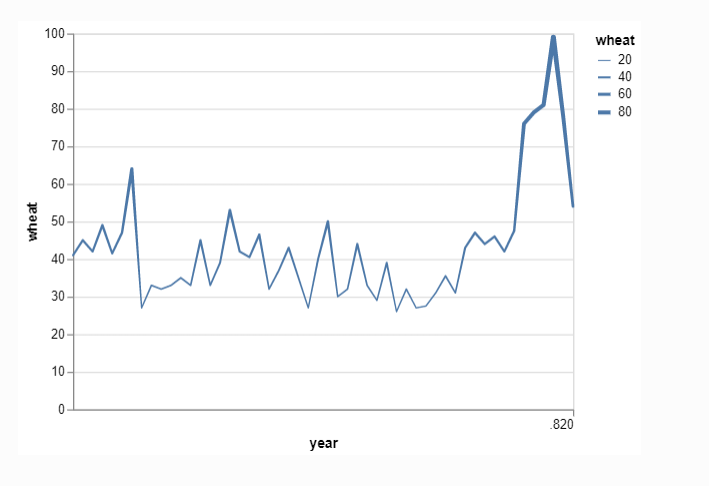
3.在不同的位置设置折线图线条的粗细
#线条粗细随之变化
import altair as alt
from vega_datasets import data

source = data.wheat()

alt.Chart(source).mark_trail().encode(
    x='year:T',
    y='wheat:Q',
    size='wheat:Q'
)
2.标准的面积堆积图
区别就是他会堆满整个图片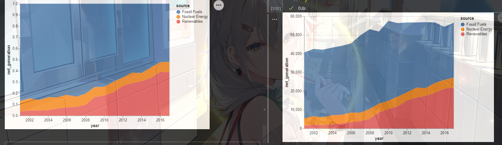
import altair as alt
from vega_datasets import data

source = data.iowa_electricity()

alt.Chart(source).mark_area().encode(
    x="year:T",
    y=alt.Y("net_generation:Q", stack="normalize"),
    color="source:N"
)
3. 带有缺口的扇形图
import numpy as np
import altair as alt

alt.Chart().mark_arc(color="gold").encode(
    theta=alt.datum((5 / 8) * np.pi, scale=None),
    theta2=alt.datum((19 / 8) * np.pi),
    radius=alt.datum(100, scale=None),
)

1.饼图
import pandas as pd
import altair as alt

source = pd.DataFrame({

    "category": [1, 2, 3, 4, 5, 6], "value": [4, 6, 10, 3, 7, 8]})

alt.Chart(source).mark_arc().encode(
    theta=alt.Theta(field="value", type="quantitative"),
    color=alt.Color(field="category", type="nominal"),
)
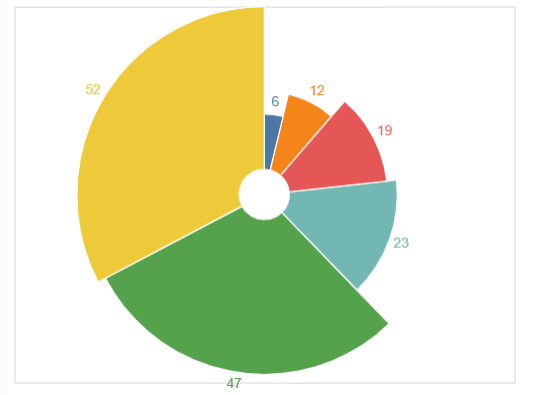
2.辐射状的饼图
import pandas as pd
import altair as alt

source = pd.DataFrame({

    "values": [12, 23, 47, 6, 52, 19]})

base = alt.Chart(source).encode(
    theta=alt.Theta("values:Q", stack=True),
    radius=alt.Radius("values", scale=alt.Scale(type="sqrt", zero=True, rangeMin=20)),
    color="values:N",
)

c1 = base.mark_arc(innerRadius=20, stroke="#fff")

c2 = base.mark_text(radiusOffset=10).encode(text="values:Q")

c1 + c2
4.散点图进阶
1.带有误差棒的散点图
import altair as alt
import pandas as pd
import numpy as np

# generate some data points with uncertainties
np.random.seed(0)
x = [1, 2, 3, 4, 5]
y = np.random.normal(10, 0.5, size=len(x))
yerr = 0.2

# set up data frame
source = pd.DataFrame({

    "x": x, "y": y, "yerr": yerr})

# the base chart
base = alt.Chart(source).transform_calculate(
    ymin="datum.y-datum.yerr",
    ymax="datum.y+datum.yerr"
)

# generate the points
points = base.mark_point(
    filled=True,
    size=50,
    color='black'
).encode(
    x=alt.X('x', scale=alt.Scale(domain=(0, 6))),
    y=alt.Y('y', scale=alt.Scale(zero=False))
)

# generate the error bars
errorbars = base.mark_errorbar().encode(
    x="x",
    y="ymin:Q",
    y2="ymax:Q"
)

points + errorbars

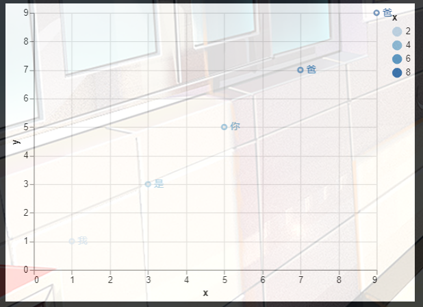
2. 散点图加标签
#散点图加标签
import altair as alt
import pandas as pd

source = pd.DataFrame({


    'x': [1, 3, 5, 7, 9],
    'y': [1, 3, 5, 7, 9],
    'label': ['我', '是', '你', '爸', '爸']
})

points = alt.Chart(source).mark_point().encode(
    x='x:Q',
    y='y:Q'
)

text = points.mark_text(
    align='left',
    baseline='middle',
    dx=7
).encode(
    text='label'
)

points + text
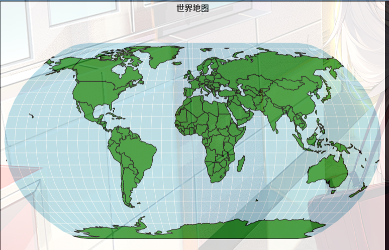
5. 世界地图
import altair as alt
from vega_datasets import data

# Data generators for the background
sphere = alt.sphere()
graticule = alt.graticule()

# Source of land data
source = alt.topo_feature(data.world_110m.url, 'countries')

# Layering and configuring the components
alt.layer(
    alt.Chart(sphere).mark_geoshape(fill='lightblue'),
    alt.Chart(graticule).mark_geoshape(stroke='white', strokeWidth=0.5),
    alt.Chart(source).mark_geoshape(fill='ForestGreen', stroke='black')
).project(
    'naturalEarth1'
).properties(width=600, height=400).configure_view(stroke=None)

三.图片的保存
你可以将其保存为svg,png,html,pdf,json等格式
import altair as alt
from vega_datasets import data

chart = alt.Chart(data.cars.url).mark_point().encode(
    x='Horsepower:Q',
    y='Miles_per_Gallon:Q',
    color='Origin:N'
)

chart.save('chart.json')
chart.save('chart.html')
chart.save('chart.png')
chart.save('chart.svg')
chart.save('chart.pdf')
同时设置保存图片的大小
chart.save('chart.png', scale_factor=2.0)
四.图片一些属性的配置
比如说给图片添加标题:
#世界地图
import altair as alt
from vega_datasets import data

# Data generators for the background
sphere = alt.sphere()
graticule = alt.graticule()

# Source of land data
source = alt.topo_feature(data.world_110m.url, 'countries')

# Layering and configuring the components
alt.layer(
    alt.Chart(sphere).mark_geoshape(fill='lightblue'),
    alt.Chart(graticule).mark_geoshape(stroke='white', strokeWidth=0.5),
    alt.Chart(source).mark_geoshape(fill='ForestGreen', stroke='black')
).project(
    'naturalEarth1'
).properties(width=600, height=400,title="世界地图").configure_view(stroke=None)
| Property | Type | Description |
|---|---|---|
| arc | RectConfig |
Arc-specific Config |
| area | AreaConfig |
Area-Specific Config |
| aria | boolean |
A boolean flag indicating if ARIA default attributes should be included for marks and guides (SVG output only). If false, the "aria-hidden" attribute will be set for all guides, removing them from the ARIA accessibility tree and Vega-Lite will not generate default descriptions for marks.Default value: true. |
| autosize | anyOf(AutosizeType, AutoSizeParams) |
How the visualization size should be determined. If a string, should be one of "pad", "fit" or "none". Object values can additionally specify parameters for content sizing and automatic resizing.Default value: pad |
| axis | AxisConfig |
Axis configuration, which determines default properties for all x and y axes. For a full list of axis configuration options, please see the corresponding section of the axis documentation. |
| axisBand | AxisConfig |
Config for axes with “band” scales. |
| axisBottom | AxisConfig |
Config for x-axis along the bottom edge of the chart. |
| axisDiscrete | AxisConfig |
Config for axes with “point” or “band” scales. |
| axisLeft | AxisConfig |
Config for y-axis along the left edge of the chart. |
| axisPoint | AxisConfig |
Config for axes with “point” scales. |
| axisQuantitative | AxisConfig |
Config for quantitative axes. |
| axisRight | AxisConfig |
Config for y-axis along the right edge of the chart. |
| axisTemporal | AxisConfig |
Config for temporal axes. |
| axisTop | AxisConfig |
Config for x-axis along the top edge of the chart. |
| axisX | AxisConfig |
X-axis specific config. |
| axisXBand | AxisConfig |
Config for x-axes with “band” scales. |
| axisXDiscrete | AxisConfig |
Config for x-axes with “point” or “band” scales. |
| axisXPoint | AxisConfig |
Config for x-axes with “point” scales. |
| axisXQuantitative | AxisConfig |
Config for x-quantitative axes. |
| axisXTemporal | AxisConfig |
Config for x-temporal axes. |
| axisY | AxisConfig |
Y-axis specific config. |
| axisYBand | AxisConfig |
Config for y-axes with “band” scales. |
| axisYDiscrete | AxisConfig |
Config for y-axes with “point” or “band” scales. |
| axisYPoint | AxisConfig |
Config for y-axes with “point” scales. |
| axisYQuantitative | AxisConfig |
Config for y-quantitative axes. |
| axisYTemporal | AxisConfig |
Config for y-temporal axes. |
| background | anyOf(Color, ExprRef) |
CSS color property to use as the background of the entire view.Default value: "white" |
| bar | BarConfig |
Bar-Specific Config |
| boxplot | BoxPlotConfig |
Box Config |
| circle | MarkConfig |
Circle-Specific Config |
| concat | CompositionConfig |
Default configuration for all concatenation and repeat view composition operators (concat, hconcat, vconcat, and repeat) |
| countTitle | string |
Default axis and legend title for count fields.Default value: 'Count of Records. |
| customFormatTypes | boolean |
Allow the formatType property for text marks and guides to accept a custom formatter function registered as a Vega expression. |
| errorband | ErrorBandConfig |
ErrorBand Config |
| errorbar | ErrorBarConfig |
ErrorBar Config |
| facet | CompositionConfig |
Default configuration for the facet view composition operator |
| fieldTitle | [‘verbal’, ‘functional’, ‘plain’] | Defines how Vega-Lite generates title for fields. There are three possible styles: - "verbal" (Default) - displays function in a verbal style (e.g., “Sum of field”, “Year-month of date”, “field (binned)”). - "function" - displays function using parentheses and capitalized texts (e.g., “SUM(field)”, “YEARMONTH(date)”, “BIN(field)”). - "plain" - displays only the field name without functions (e.g., “field”, “date”, “field”). |
| font | string |
Default font for all text marks, titles, and labels. |
| geoshape | MarkConfig |
Geoshape-Specific Config |
| header | HeaderConfig |
Header configuration, which determines default properties for all headers.For a full list of header configuration options, please see the corresponding section of in the header documentation. |
| headerColumn | HeaderConfig |
Header configuration, which determines default properties for column headers.For a full list of header configuration options, please see the corresponding section of in the header documentation. |
| headerFacet | HeaderConfig |
Header configuration, which determines default properties for non-row/column facet headers.For a full list of header configuration options, please see the corresponding section of in the header documentation. |
| headerRow | HeaderConfig |
Header configuration, which determines default properties for row headers.For a full list of header configuration options, please see the corresponding section of in the header documentation. |
| image | RectConfig |
Image-specific Config |
| legend | LegendConfig |
Legend configuration, which determines default properties for all legends. For a full list of legend configuration options, please see the corresponding section of in the legend documentation. |
| line | LineConfig |
Line-Specific Config |
| lineBreak | anyOf(string, ExprRef) |
A delimiter, such as a newline character, upon which to break text strings into multiple lines. This property provides a global default for text marks, which is overridden by mark or style config settings, and by the lineBreak mark encoding channel. If signal-valued, either string or regular expression (regexp) values are valid. |
| mark | MarkConfig |
Mark Config |
| numberFormat | string |
D3 Number format for guide labels and text marks. For example "s" for SI units. Use D3’s number format pattern. |
| padding | anyOf(Padding, ExprRef) |
The default visualization padding, in pixels, from the edge of the visualization canvas to the data rectangle. If a number, specifies padding for all sides. If an object, the value should have the format {"left": 5, "top": 5, "right": 5, "bottom": 5} to specify padding for each side of the visualization.Default value: 5 |
| params | array(Parameter) |
Dynamic variables that parameterize a visualization. |
| point | MarkConfig |
Point-Specific Config |
| projection | ProjectionConfig |
Projection configuration, which determines default properties for all projections. For a full list of projection configuration options, please see the corresponding section of the projection documentation. |
| range | RangeConfig |
An object hash that defines default range arrays or schemes for using with scales. For a full list of scale range configuration options, please see the corresponding section of the scale documentation. |
| rect | RectConfig |
Rect-Specific Config |
| rule | MarkConfig |
Rule-Specific Config |
| scale | ScaleConfig |
Scale configuration determines default properties for all scales. For a full list of scale configuration options, please see the corresponding section of the scale documentation. |
| selection | SelectionConfig |
An object hash for defining default properties for each type of selections. |
| square | MarkConfig |
Square-Specific Config |
| style | StyleConfigIndex |
An object hash that defines key-value mappings to determine default properties for marks with a given style. The keys represent styles names; the values have to be valid mark configuration objects. |
| text | MarkConfig |
Text-Specific Config |
| tick | TickConfig |
Tick-Specific Config |
| timeFormat | string |
Default time format for raw time values (without time units) in text marks, legend labels and header labels.Default value: "%b %d, %Y" Note: Axes automatically determine the format for each label automatically so this config does not affect axes. |
| title | TitleConfig |
Title configuration, which determines default properties for all titles. For a full list of title configuration options, please see the corresponding section of the title documentation. |
| trail | LineConfig |
Trail-Specific Config |
| view | ViewConfig |
Default properties for single view plots. |
优缺点
优点:语法简单,对中文的兼容性好,与r语言的ggplot很类似。
缺点:生成图片不能直接复制,需要保存到本地,这一点不如matplotlib
有兴趣的研究的话:点击此链接
展示一下部分图片

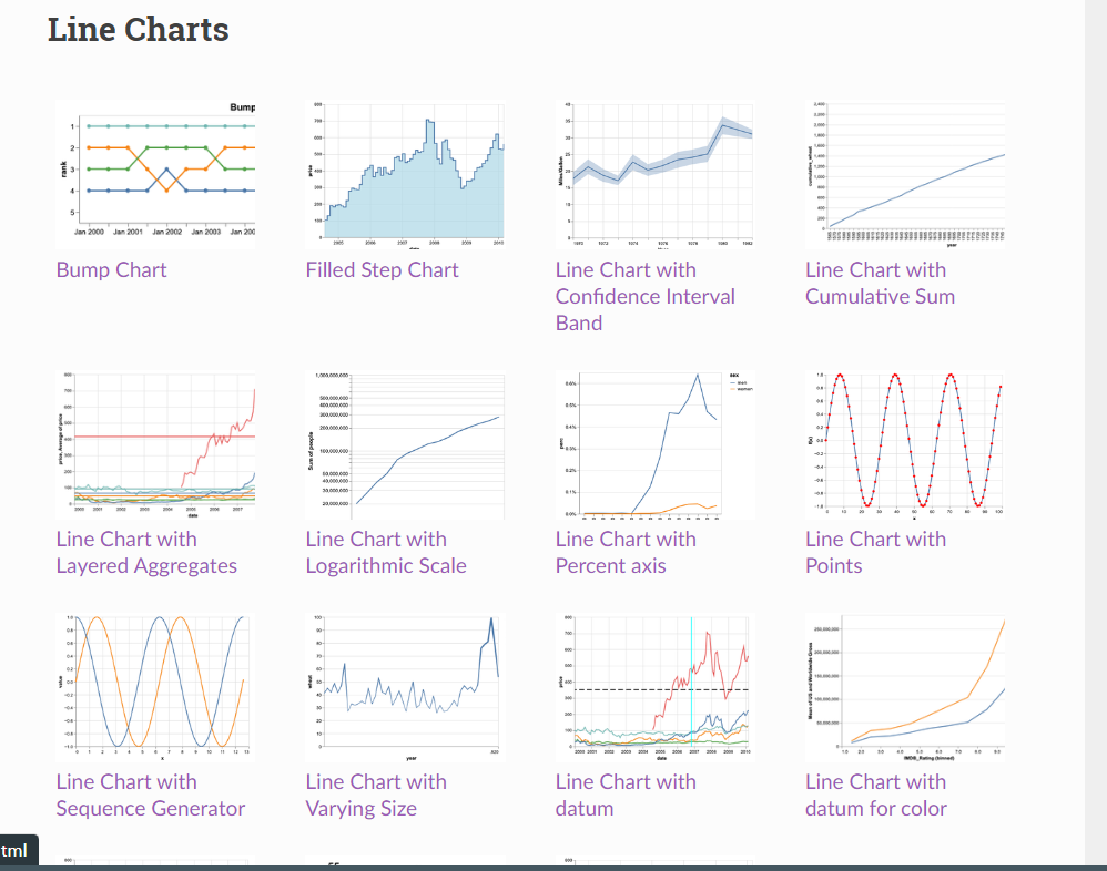
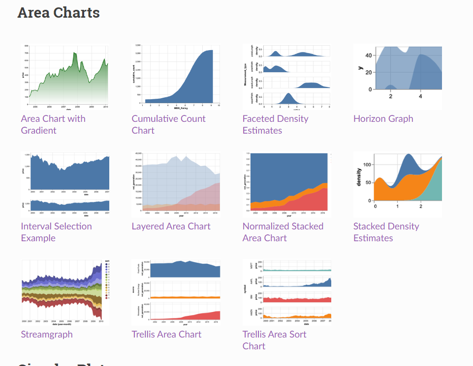
参考:更多内容请点我:https://altair-viz.github.io/gallery/index.html