本文要点:
- 常见表单
- 表单的性质
- 表单CSS美化
- 使用 radio 实现 Tab 选项卡
什么是表单
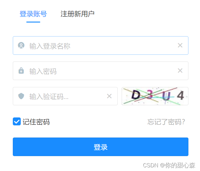
用户通过表单填写信息,然后通过计算机网络传送给服务器。表单标签不是一个标签,而是一组标签,因为不同格式的数据的交互界面有区别,如果是文字就是一个输入框,传送文件就会打开文件选择窗口,如果是时间或日期就会弹出一个日历供用户选择。大家熟悉的登录页面包含了若干输入框:
一组输入框一般由 form 元素组织,其中还包括了用于提交数据的按钮:
<form action="/api/to/handle/form" method="get/post">
  <!-- 单标签  type 决定显示效果 行内块级元素 -->
  <!-- text输入框  --- 单行输入 -->
  <input type="text">
  <!-- password 密码框 -->
  <input type="password">

  <br>
  请选择性别
  <!-- radio 单选框   必须在标签上添加属性 name  值必须是一样的 -->
  <input type="radio" name="1">男
  <input type="radio" name="1">女

  <br>

  请选择爱好
  <!-- checkbox 复选框  多选 -->
  <input type="checkbox"> 干饭
  <input type="checkbox"> 睡觉
  <input type="checkbox"> 撸代码

  <br>

  <!-- file 文件上传 默认只能传一个文件  multiple可以实现多文件上传 -->
  <input type="file" multiple>

  <br>

  <!-- 文本域   多行输入   -->
  <!-- cols列数  rows行数  不建议使用    一般使用css确定宽高 -->
  <textarea name="" id="" cols="10" rows="5"></textarea>

  <br>

  <!-- 按钮   button / submit / reset -->

  <!-- button 普通按钮 -->
  <input type="button" value="确定">

  <!-- submit 提交的 -->
  <input type="submit" value="提交">

  <!-- reset 重置 --- 清空 -->
  <input type="reset" value="清空">
</form>
【解读】form 元素有两个重要的属性:
action: 处理数据的路由,需要后端支持method:提交数据的HTTP方法,一般是 POST。
【提示】目前大多使用 JavaScript ajax 或 fetch API 提交数据,而不直接使用 form 元素提交数据,此时这俩属性可以省略,甚至form元素都可以不要,只留下输入框。
【提示】更多案例请参考1。
input 性质
上述例子演示了不同 type 的 输入框,本小节主要讲解 input 标签的性质:
input元素是inline-block,它可以与其他非块级元素处在同一行,并且能设置高宽与上下内外边距。input标签也叫置换元素(标签和属性共同决定页面的显示效果)。
<style>
  .big {


    width: 500px;
    height: 40px;
    font-size: 1.5rem;
  }
</style>

<input type="text" class="big">
- input 元素必须设置 type 属性,如果不设置默认为 text,如果不使用 JavaScript 提交数据,还必须设置 name 属性,因为服务器会根据 name 获取相应字段的值。input 元素的 value 属性表示输入框的值,可以通过 JavaScript 获取或设置。除此之外,给 input 添加 id 属性能够方便 JavaScript 获取输入框,然后读取或设置输入框的数据。
<input type="text" name="username" id="username" value="默认值" placeholder="提示信息" >
input 样式
默认的表单是一个黑框框,点击会出现一个更粗的黑框框,检查元素表单自带 2 像素的边框和 2像素左右内边距和1像素上下内边距(Chrome浏览器):

接下来,通过模仿百度 的输入框来说明输入框的样式调整。
1)用 HTML 搭好结构:
<style>

</style>

<div class="form">
  <input class="text" type="text">
  <input class="btn" type="submit" value="百度一下">
</div>

2)设置好宽高:
<style>
  .form {


    width: 600px;
    height: 44px;
  }

  .text {


    width: 500px;
    height: 44px;
  }

  .btn {


    width: 100px;
    height: 44px;
  }
</style>

<div class="form">
  <input class="text" type="text">
  <input class="btn" type="submit" value="百度一下">
</div>

此时你会发现按钮掉到下面了,这是因为 input 是行内块级元素,两个 input 之间存在空白字符就会到这一个小空隙。采用浮动消除间隙:
  .text {


    width: 500px;
    float: left;
  }

  .btn {


    width: 100px;
    float: left;
  }
此时依然问题还没有解决,这是因为 input 为 text 的输入框才在内边距与边框,它的实际宽度是:500+2+2+2+2,取消边框与内边距:
  .text {


    width: 500px;
    float: left;
    border: none;
    padding: 0;
  }

【重点】input[type=submit] 表现为按钮,它的边框与内外边距不会撑大盒子宽与高,原因在于它默认属于怪异盒子模型 (border-box),并且其中的文字自动居中。
3)设置外边框与背景颜色。为了简单,外边框设置到外面的容器上
.form {


	...
    border: 2px solid #4569ff;
    border-radius: 10px;
    overflow: hidden; /*必要的,不然圆角会溢出*/
  }

.btn {


    ...
    border: none;
    background-color: #4e6ef2;
    color: #fff;
  }

4)设置点击时的样式,点击时表单处于 focus 状态,会触发伪类 :focus:
  .text:focus {


    outline: none;
  }
5)点击时,光标是顶格的,看起来很不舒服,重新调整内边距:
  .text {


    width: 468px;
    ...
    padding: 0 16px;
  }
6)最后给 btn 加点样式:
  .btn {


   	...
    cursor: pointer;
  }
  .btn:hover {


    background-color: #4662d9;
  }
最终结果:

完整代码:
<style>
  .form {


    width: 600px;
    height: 44px;
    border: 2px solid #4569ff;
    border-radius: 10px;
    overflow: hidden;
  }

  .text {


    width: 468px;
    height: 44px;
    float: left;
    border: none;
    padding: 0 16px;
  }

  .text:focus {


    outline: none;
  }

  .btn {


    width: 100px;
    height: 44px;
    float: left;
    border: none;
    background-color: #4e6ef2;
    color: #fff;
    cursor: pointer;
  }

  .btn:hover {


    background-color: #4662d9;
  }
</style>

<div class="form">
  <input class="text" type="text">
  <input class="btn" type="submit" value="百度一下">
</div>
是不是很简单呢?只需要设置几个简单的样式,就实现了一个完美的输入框。
radio表单
input[type=radio] 表示单选输入,说白了就是单选题,一组按钮只能选择一个。因为老式的收音机上有一种开关,多个按键排在一起,但每次只能按下一个,换句话说,按下任意一个键,其他按键全部弹起,所以 GUI 的单选按键也就被形象地称作收音机按键。
【知识点1】一组 radio 表单需要设置同样的 name 才能体现单选效果:
<input type="radio" value="a" name="1">
<input type="radio" value="b" name="1">
<input type="radio" value="c" name="1">
<input type="radio" value="d" name="1">
【知识点2】可以通过 label 添加提示信息,并让 label 的 for 属性指向 radio 的 id 属性。
<input type="radio" name="1" id="a"><label for="a">A</label>
<input type="radio" name="1" id="b"><label for="b">B</label>
<input type="radio" name="1" id="c"><label for="c">B</label>
<input type="radio" name="1" id="d"><label for="d">B</label>
当 label 的 for 属性 指向相应的 id 之后,它们就绑定在一起了,点击 label 也能选中。
【知识点3】当 radio 被选中时会处于 checked 状态,可以通过 :checked 添加样式:
<style>
  input[type=radio]:checked+label {


    color: green;
    font-size: 2rem;
  }
</style>

<div><input type="radio" name="1" id="a"><label for="a">A</label></div>
<div><input type="radio" name="1" id="b"><label for="b">B</label></div>
<div><input type="radio" name="1" id="c"><label for="c">C</label></div>
<div><input type="radio" name="1" id="d"><label for="d">D</label></div>
【知识点4】输入框有一类开关属性,这类属性只考虑存在性,而不考虑它的属性值:
<input type="text" disabled>
disabled 表示禁用元素,当该属性出现时,该输入框不起作用。
【思考】尝试给 disable 属性添加一些值,看看输入框的禁用效果是否会改变,例如 disabled="false", disabled="disabled" 。
开关属性还有 hidden, required,有些类型的输入框拥有某些特殊属性,例如 radio 与 checkbox 有 checked,下拉菜单有 selected。
radio 实现选项卡[视频]
Tab 选项卡是一种UI组件,在同一个时间只能展示一个卡片,而其他卡片会隐藏起来。当点击另一个卡片的头部时,相应的卡片会展开,其他卡片会隐藏。Tab 选项卡与 radio 都存在单选这一性质,因此可以使用 radio 实现 Tab选项卡:
<style>
  .tabs {


    position: relative;
  }

  .tab-hd {


    background-color: tan;
    display: inline-block;
    padding: 8px 12px;
    float: left;
  }

  .tab-bd {


    width: 350px;
    height: 200px;
    background-color: wheat;
    position: absolute;
    top: 110%;
    left: 0;
    visibility: hidden;
  }

  .clearfix::after {


    content: "";
    display: block;
    clear: both;
  }

  input[name=tabs]:checked+.tab-hd {


    background-color: orange;
  }

  input[name=tabs]:checked~.tab-bd {


    visibility: visible;
  }
</style>

<div class="tabs clearfix">
  <div class="tab">
    <input type="radio" name="tabs" id="tab1" hidden checked>
    <label for="tab1" class="tab-hd">选项卡1</label>
    <div class="tab-bd">选项卡1的内容</div>
  </div>
  <div class="tab">
    <input type="radio" name="tabs" id="tab2" hidden>
    <label for="tab2" class="tab-hd">选项卡2</label>
    <div class="tab-bd">选项卡2的内容</div>
  </div>
  <div class="tab">
    <input type="radio" name="tabs" id="tab3" hidden>
    <label for="tab3" class="tab-hd">选项卡3</label>
    <div class="tab-bd">选项卡3的内容</div>
  </div>
  <div class="tab">
    <input type="radio" name="tabs" id="tab4" hidden>
    <label for="tab4" class="tab-hd">选项卡4</label>
    <div class="tab-bd">选项卡4的内容</div>
  </div>
</div>
实现效果:

【视频讲解】
使用表单元素实现 Tab 选项卡效果
【要点】
- 利用 radio 实现单选效果
- 利用
:checked设置选中样式 - 利用绝对定位与元素隐藏实现 Tab 内容的展示与隐藏。
- 利用浮动去除空格。
参考文章
♥ 我是前端工程师:你的甜心森。非常感谢大家的点赞与关注,欢迎大家参与讨论或协作。
★ 本文开源,采用 CC BY-SA 4.0 协议,转载请注明出处:前端工程师的自我修养. GitHub.com@xiayulu.
★ 创作合作或招聘信息请发私信或邮件:[email protected],注明主题:创作合作或招聘前端工程师。