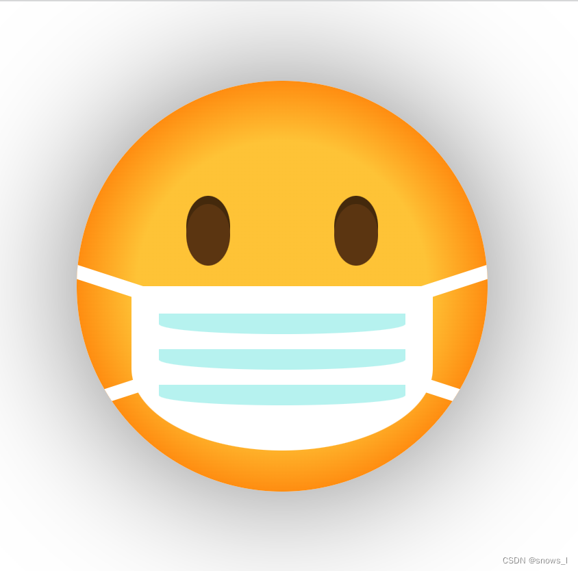
效果如下:
template:
<div class="emoji">
  <div class="mask">
    <div class="line"></div>
  </div>
</div>
css:
.emoji {
  width: 300px;
  height: 300px;
  position: relative;
  overflow: hidden;
  background-image: radial-gradient(#feca3e 50%, #ff8000 80%);
  border-radius: 50%;
  box-shadow: 0 0 100px rgba(0, 0, 0, 0.5);
}
.emoji::before,
.emoji:after {
  content: '';
  position: absolute;
  width: 32px;
  height: 45px;
  background-color: #663d0f;
  top: 90px;
  border-radius: 50%;
  box-shadow: 0 -6px #4d2e08;
}
.emoji::before {
  left: 80px;
}
.emoji::after {
  right: 80px;
}
.emoji > .mask {
  width: 220px;
  height: 120px;
  background-color: #ffffff;
  position: absolute;
  left: 0;
  right: 0;
  margin: auto;
  border-radius: 5px 5px 50% 50%;
  bottom: 30px;
}
.emoji > .mask::before,
.emoji > .mask::after {
  content: '';
  width: 300px;
  height: 10px;
  position: absolute;
  background-color: #fff;
  z-index: 1;
}
.emoji > .mask::before {
  left: -30px;
  top: 30px;
  transform: rotate(-18deg);
}
.emoji > .mask::after {
  left: -50px;
  top: 30px;
  transform: rotate(18deg);
}
.emoji > .mask > .line {
  width: 180px;
  height: 15px;
  background: #bef4f1;
  position: absolute;
  left: 0;
  right: 0;
  top: 20px;
  margin: auto;
  border-radius: 0 0 50% 50%;
  box-shadow: 0 26px #bef4f1, 0 52px #bef4f1;
  z-index: 2;
}
全部代码emoji.html:
<!--
 * @Description: ------------ fileDescription -----------
 * @Author: snows_l [email protected]
 * @Date: 2023-06-19 00:34:43
 * @LastEditors: snows_l [email protected]
 * @LastEditTime: 2023-06-19 16:12:00
 * @FilePath: /undefined/Users/userDoc/work/Demo/emoji.html
-->
<!DOCTYPE html>
<html lang="en">
  <head>
    <meta charset="UTF-8" />
    <meta http-equiv="X-UA-Compatible" content="IE=edge" />
    <meta name="viewport" content="width=device-width, initial-scale=1.0" />
    <title>Document</title>
    <style>
      .emoji {
        width: 300px;
        height: 300px;
        position: relative;
        overflow: hidden;
        background-image: radial-gradient(#feca3e 50%, #ff8000 80%);
        border-radius: 50%;
        box-shadow: 0 0 100px rgba(0, 0, 0, 0.5);
      }
      .emoji::before,
      .emoji:after {
        content: '';
        position: absolute;
        width: 32px;
        height: 45px;
        background-color: #663d0f;
        top: 90px;
        border-radius: 50%;
        box-shadow: 0 -6px #4d2e08;
      }
      .emoji::before {
        left: 80px;
      }
      .emoji::after {
        right: 80px;
      }
      .emoji > .mask {
        width: 220px;
        height: 120px;
        background-color: #ffffff;
        position: absolute;
        left: 0;
        right: 0;
        margin: auto;
        border-radius: 5px 5px 50% 50%;
        bottom: 30px;
      }
      .emoji > .mask::before,
      .emoji > .mask::after {
        content: '';
        width: 300px;
        height: 10px;
        position: absolute;
        background-color: #fff;
        z-index: 1;
      }
      .emoji > .mask::before {
        left: -30px;
        top: 30px;
        transform: rotate(-18deg);
      }
      .emoji > .mask::after {
        left: -50px;
        top: 30px;
        transform: rotate(18deg);
      }
      .emoji > .mask > .line {
        width: 180px;
        height: 15px;
        background: #bef4f1;
        position: absolute;
        left: 0;
        right: 0;
        top: 20px;
        margin: auto;
        border-radius: 0 0 50% 50%;
        box-shadow: 0 26px #bef4f1, 0 52px #bef4f1;
        z-index: 2;
      }
    </style>
  </head>
  <body>
    <div class="emoji">
      <div class="mask">
        <div class="line"></div>
      </div>
    </div>
  </body>
</html>