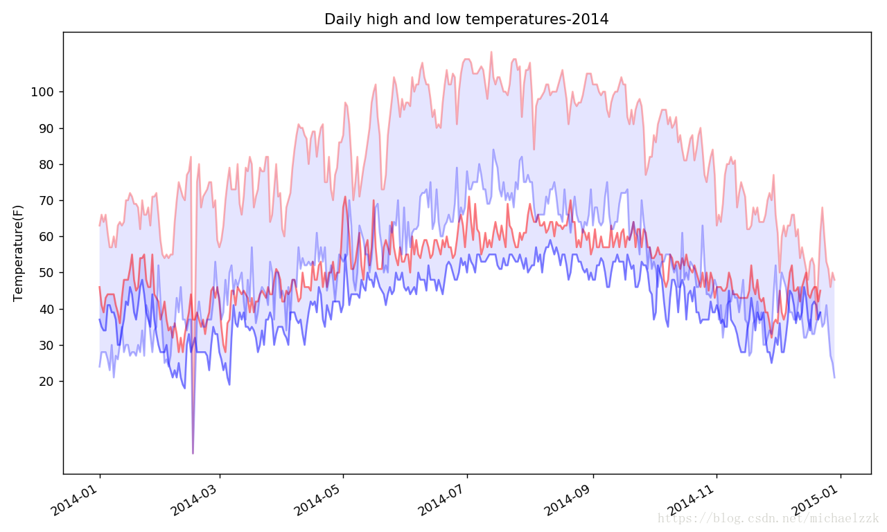
16-2 比较锡卡特和死亡谷的气温
使y轴具有固定的刻度,并将两个温度的数据集展示在同一个图当中。
Thinking:最直接的方法就是用不同的变量名在同一个py下,将两个数据集的数据传给plot,即可在一个图中展示。
我尝试使用了重构的思想,将获取数据单独写了一个Class出来,然后创建两个对象,原理上是一样的,只是为了锻炼下自己类及函数的使用,见笑。
另外,图中的颜色可以自行调整,会更明显的看出两个地区的温度差异。
#Get_info.py
import csv
from datetime import datetime
"""在缺失代码处,为了偷懒,所以将缺失的数据置为0,从图中可明显看出"""

class Get_info():
    """获取数据集当中的日期、最高温度及最低温度的数据"""
    def __init__(self, filename):
        self.dates = []
        self.highs = []
        self.lows = []
        self.filename = filename

    def get_dates(self):
        with open(self.filename) as f:
            reader = csv.reader(f)
            header_row = next(reader)
            for row in reader:
                try:
                    current_date = datetime.strptime(row[0], '%Y-%m-%d')
                except ValueError:
                    print('missing data')
                else:
                    self.dates.append(current_date)

    def get_highs(self):
        with open(self.filename) as f:
            reader = csv.reader(f)
            header_row = next(reader)
            for row in reader:
                try:
                    high = int(row[1])
                except ValueError:
                    self.highs.append(0)
                else:
                    self.highs.append(high)

    def get_lows(self):
        with open(self.filename) as f:
            reader = csv.reader(f)
            header_row = next(reader)
            for row in reader:
                try:
                    low = int(row[3])
                except ValueError:
                    self.lows.append(0)
                else:
                    self.lows.append(low)
#text.py
from matplotlib import pyplot as plt
from chapter16.Get_info import Get_info
"""创建两个实例对象,使用plot绘制图形"""
filename1='sitka_weather_2014.csv'
filename2='death_valley_2014.csv'
files1=Get_info(filename1)
files2=Get_info(filename2)
files1.get_dates()
files1.get_highs()
files1.get_lows()
files2.get_dates()
files2.get_highs()
files2.get_lows()

#根据数据绘制图形
fig=plt.figure(dpi=128,figsize=(10,6))
plt.plot(files1.dates,files1.highs,c='red',alpha=0.5)
plt.plot(files1.dates,files1.lows,c='blue',alpha=0.5)
plt.plot(files2.dates,files2.highs,c='red',alpha=0.3)
plt.plot(files2.dates,files2.lows,c='blue',alpha=0.3)
plt.fill_between(files2.dates,files2.highs,files2.lows,facecolor='blue',alpha=0.1)
plt.fill_between(files1.dates,files1.highs,files1.lows,facecolor='blue',alpha=0.1)
plt.title("Daily high and low temperatures-2014")
plt.xlabel('',fontsize=16)
fig.autofmt_xdate()
plt.ylabel("Temperature(F)")
plt.yticks([20,30,40,50,60,70,80,90,100])

plt.show()