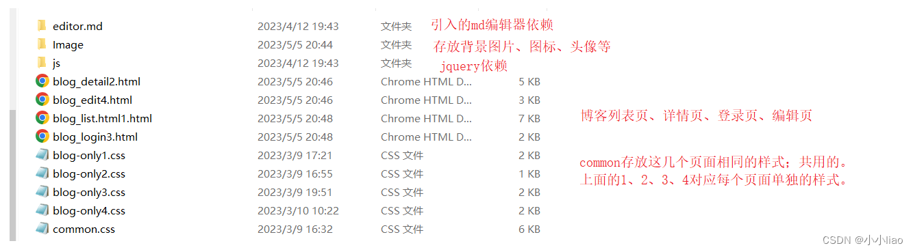
目录结构
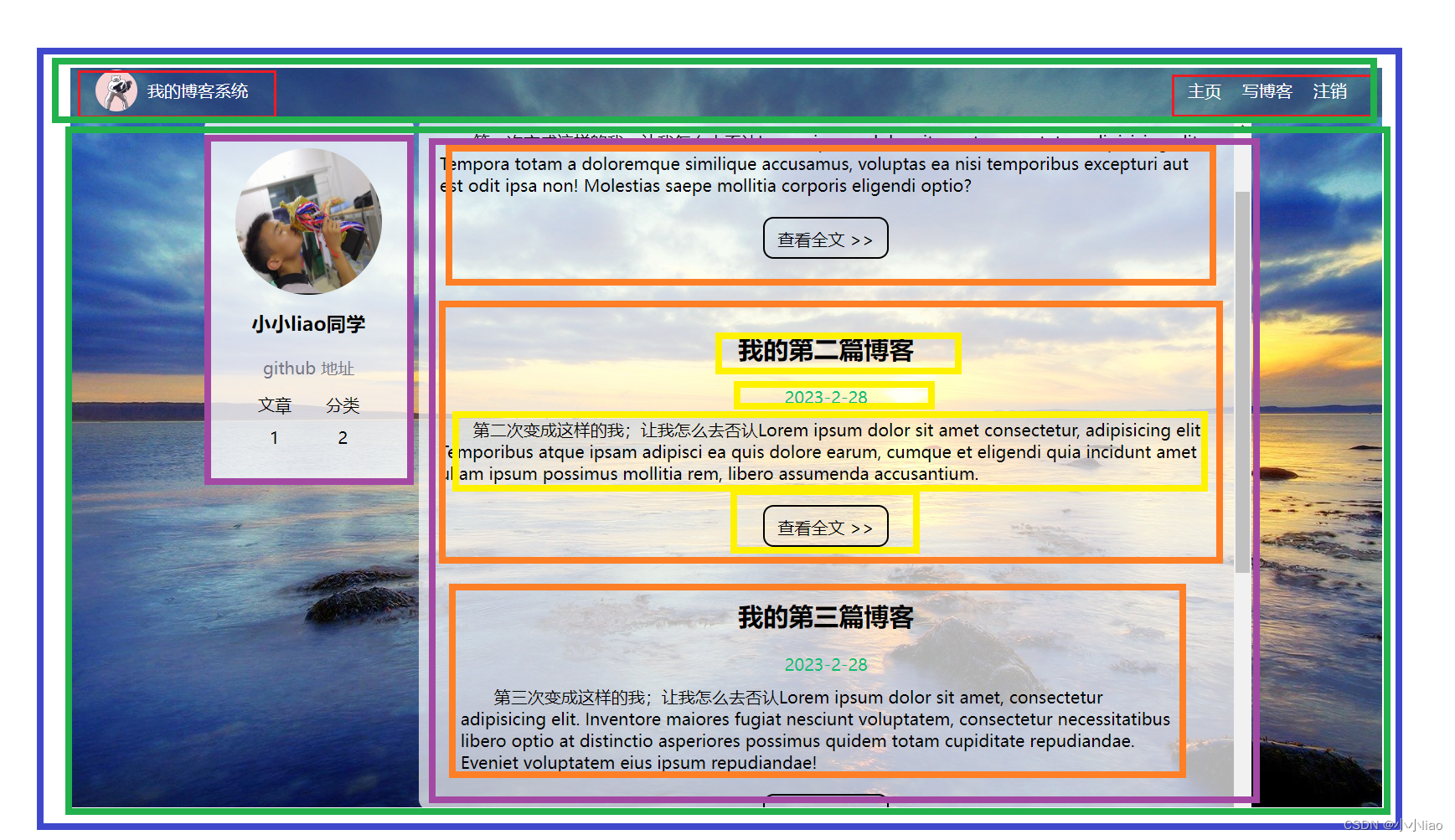
博客列表页:
页面效果:
代码:
<!-- 博客列表页 -->
<!DOCTYPE html>
<html lang="en">
<head>
<meta charset="UTF-8">
<meta http-equiv="X-UA-Compatible" content="IE=edge">
<meta name="viewport" content="width=device-width, initial-scale=1.0">
<title>博客列表页</title>
<link rel="stylesheet" href="common.css">
<link rel="stylesheet" href="blog-only1.css">
</head>
<body>
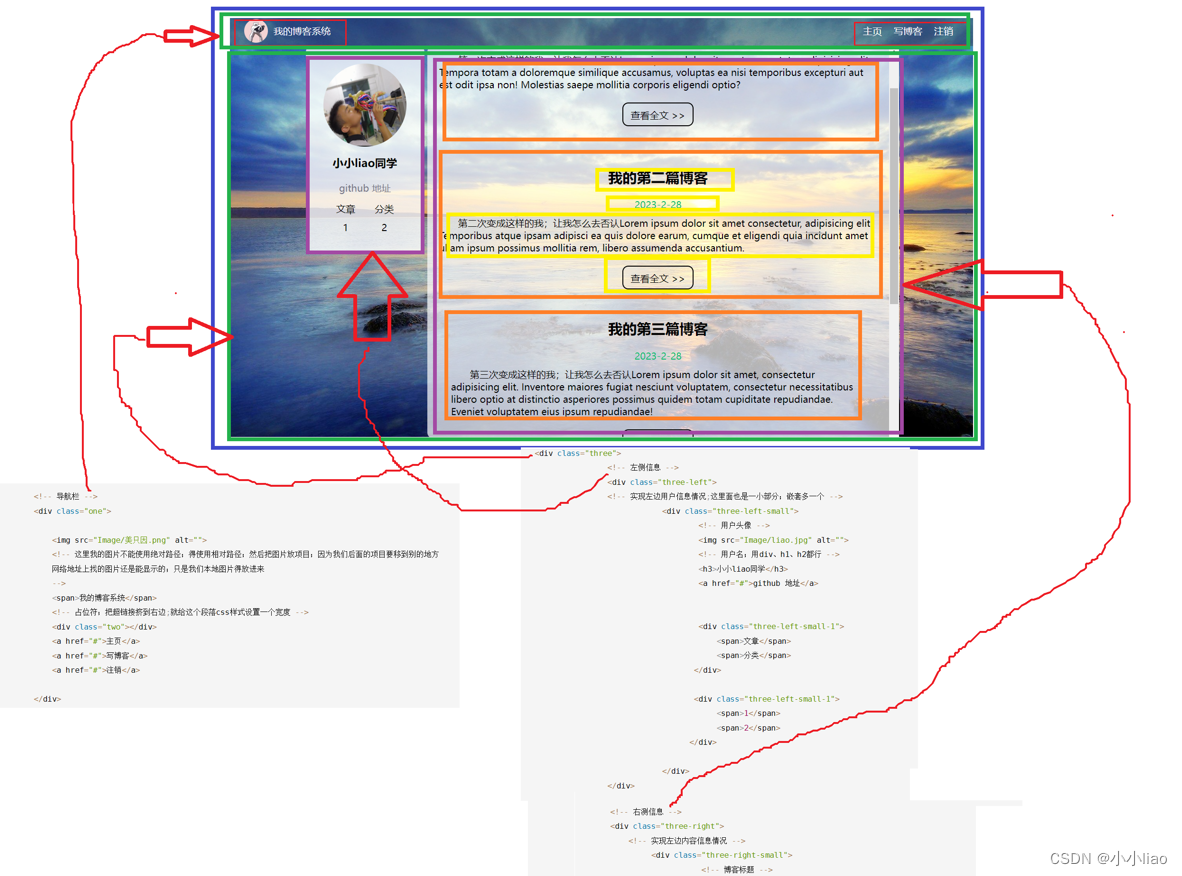
<!-- 导航栏 -->
<div class="one">
<img src="Image/美只因.png" alt="">
<!-- 这里我的图片不能使用绝对路径;得使用相对路径;然后把图片放项目;因为我们后面的项目要移到别的地方
网络地址上找的图片还是能显示的;只是我们本地图片得放进来
-->
<span>我的博客系统</span>
<!-- 占位符;把超链接挤到右边;就给这个段落css样式设置一个宽度 -->
<div class="two"></div>
<a href="#">主页</a>
<a href="#">写博客</a>
<a href="#">注销</a>
</div>
<!-- 页面主体部分 -->
<div class="three">
<!-- 左侧信息 -->
<div class="three-left">
<!-- 实现左边用户信息情况;这里面也是一小部分;嵌套多一个 -->
<div class="three-left-small">
<!-- 用户头像 -->
<img src="Image/liao.jpg" alt="">
<!-- 用户名;用div、h1、h2都行 -->
<h3>小小liao同学</h3>
<a href="#">github 地址</a>
<div class="three-left-small-1">
<span>文章</span>
<span>分类</span>
</div>
<div class="three-left-small-1">
<span>1</span>
<span>2</span>
</div>
</div>
</div>
<!-- 右测信息 -->
<div class="three-right">
<!-- 实现左边内容信息情况 -->
<div class="three-right-small">
<!-- 博客标题 -->
<div class="three-right-small-title">
我的第一篇博客
</div>
<!-- 标题发布时间 -->
<div class="three-right-small-time">
2023-2-28
</div>
<!-- 博客摘要部分 -->
<div class="three-right-small-part">
第一次变成这样的我;让我怎么去否认Lorem ipsum dolor sit ……
</div >
<!-- 查看全文按钮 ;大于号>得这样子写;转义字符,不然就被认为是标签的>-->
<a href="#">查看全文 >></a>
</div>
</div>
</div>
</body>
</html>
博客列表页唯一样式代码:
类名就是按照盒子来进行匹配区域
/* 列表项唯一的博客列表;专属样式;common里的样式是个个页面都会用到样式 */
.three-right-small{
/* 设置里面内容样式;里面的宽度和这个右侧盒子一样大;
高度按浏览器分(类似段落与段落之间)*/
width: 100%;
/* 博客与博客之间;博客与边框之间靠的太近;设置内边距 */
padding: 20px;


}

.three-right-small-title{
/* 标题居中设置大小且加粗 */
text-align: center;
font-size: 24px;
font-weight: bold;
/* 把标题与下面内容拉开点 */
padding: 10px;

}
.three-right-small-time{
/* 设置时间样式;居中和颜色 */
text-align: center;
/* 当我们在看到目标图时;怎么知道这个颜色号数是多少?截图工具上有显示 */
color: rgb(15,189, 114);
/* 设置点距离美 */
padding: 10px;

}
.three-right-small-part{
/* 摘要部分;主要是缩进 */
text-indent: 2em;

}
.three-right-small a{
/* 查看全文链接处理;先转成块级元素 */
display: block;
width: 120px;
height: 40px;
/* 针对整个元素;设置上方20px边距;左右居中 */
margin:20px  ;
margin-left: auto;
margin-right:auto ;
/* 设置一个边框 */
border:2px solid black ;


/* 针对文字;让里面文字水平居中;且去掉下划线 */
text-align: center;
text-decoration: none;
/* 设置垂直居中;通过行高设置;40px行高占整个元素高度;这个是针对文字的垂直居中(行高与盒子高度一样就有这样效果) */
line-height: 40px;
color: black;

/* 鼠标悬停有个过度效果;挺好玩的 */
transition: all 0.8s;

/* 圆角矩形 */
border-radius: 10px;
}
/* 为了更好的效果;鼠标滑到查看文章就变红色;背景变绿 */
.three-right-small a:hover{

    color: red;
    background-color: green;
}
所有页面共同的样式代码:
比如导航栏这些在多个页面存在就放这里;共同去引用
/* 导航栏样式 */
/* 写样式起手都是这个;*通配符所以的元素都能用这个属性
除去浏览器公共样式;内外边距都是0;并且避免盒子被边框撑大*/
*{
margin: 0;
padding: 0;
box-sizing: border-box;
}

/* 先给整体搞个背景 */
/* 并集选择器 ;100%相对父元素大小;html的父元素浏览器窗口;body的父元素是html;
这时body和html和浏览器窗口都是一样高。。如果不设置高度;元素的默认高度取决于内部内容*/
html,body{
height: 100%;
}


/* 给body设置背景图片 */
body{

background-image: url(https://ts1.cn.mm.bing.net/th/id/R-C.3fc85100924dfd75cdb2ea4aeb240a36?rik=iearfjgakUbrNQ&riu=http%3a%2f%2fpic.bizhi360.com%2fbbpic%2f68%2f5968.jpg&ehk=Qx0JqJ%2f%2f%2bExztrOA3tH%2flFZUaiysGdPSNqvv3CI%2fhkE%3d&risl=&pid=ImgRaw&r=0);
 /* 设置不平铺 */
background-repeat: no-repeat;
/* 设置尽可能填满 */
background-size: cover;
/* 设置大小与位置;;垂直水平都居中 */
background-position: center center;


}

/*给导航栏设置样式  */
.one{

/* 这个导航栏得和父元素body一样宽;也就是和窗口一样宽
对于块级元素默认就是和窗口一样大小 */
width: 100%;
/* 宽度不关键;但是高度很关键;常见导航栏是50px左右 */
height: 50px;
/* 导航栏也有个背景色;与下面区分开;深色背景白色文字 */
background-color: rgba(50 ,50,50 ,0.4);
color: white;

/* 导航栏里面元素是水平排列;使用使用弹性布局 */
display: flex;

/* 设置子元素垂直居中;不让它跑导航栏顶部 */
align-items: center;
/* 图片两边是有一段距离;通过设置边距可以设置 */


}


/* 当下这张图片非常不和谐;占很大位置;但是还发现这个图片是在导航栏顶部;使用得设置这些子元素在导航栏垂直居中 */
.one img{
    /* 设置图片的大小 */
width: 40px;
height: 40px;

/* 设置图片的左边距和右边距 */

margin-left: 30px;
margin-right: 10px;
/* 设置圆角矩形;变圆 */
border-radius: 50%;
}

.one a{

/* 把a标签的文字也改白色;默认是蓝色还带下划线; */
    color: white;
    /* 去掉下划线 */
    text-decoration:none ;
    /* 但是当下问题;这些字与超链接紧挨一起;想让超链接最右边
    所以我们在原文上加个占位标签;把它挤到右边*/

/* 把这些超链接分开;设置内边距10px */
    padding: 10px;


}
.two{

width: 70%;
/* 现在虽然它们分开了;但是这几个超链接也要分开;
加个内边距/外边距;内边距更好;因为能增大用户点击范围 */

/*  按需求;导航栏背景还需半透明的效果;在最开始的背景颜色改成rgba
;加多一个透明度;这里得逗号隔开才有效果;亲测用空格没效果*/
}


.three{
/* 要让这个three的内容整体居中;然后设置左右一定的尺寸 */
/* 设置主体部分宽度、高度和水平居中;我觉得这里还是有%好;因为浏览器窗口大小会变的 */
width: 1000px;
/*高度: 整个页面高度(会随浏览器窗口的变化而变化;所以这里得写百分数
calc是css提供的函数;可以针对%和数值进行混合运算;减号两侧必须有空格;因为减号可以是
标识符一部分;所以必须有空格区分开)减去导航栏  */
height: calc(100% - 50px);
margin: 0 auto;

/* background-color: black;为了看设置效果用的 */


/* 现在要在这个段落水平方向排列;开启弹性布局 */
display: flex;
/* 垂直居中 */
align-items: center;
/* 水平排列;两侧带个空白 */
justify-content: space-between;

}
.three-left{
    height: 100%;
    width: 200px;
    /* background-color: red;为了看设置效果用的 */
}
.three-right{
  height: 100%;
  /* 瓜分留下5px作为中间的缝隙 */
  width: 795px;
  /* background-color: red;为了看设置效果用的 */


}

.three-left-small{
      /* 背景颜色 */
      background-color:rgba(255 ,255,255 ,0.8) ;
      /* 设置圆角矩形 */
      border-radius: 10px;

/* 左右和上下都有边距 */
padding: 30px;


}
.three-left-small img{
     /*子选择器 把头像缩小点 */
width: 140px;
height: 140px;
/* 头像设置半圆 */
border-radius: 50%;

}
.three-left-small h3{
/* 让用户名字居中 */
text-align: center;
/* 让文字和上下都有边距(内外边距都可;内边距更好;范围大;外边距有特殊规则) */
padding: 10px;

}


.three-left-small a{
    /* 让这个github链接;居中;灰色文字;去掉下划线;有边距 */
text-align: center;
color: #778;
/* 去掉下划线 */
text-decoration: none;
/* 现在运行测试结果;发现下划线和颜色变了;但是设置的水平居中并没有效果 */
/* a标签是行内元素;比较个异;这里效果指定行内元素没什么作用;转成块级元素 */
/*设置为块级元素 */
display: block;
padding: 10px;
}


.three-left-small-1{

/* 针对最下面两行文字;水平排列;弹性布局 */
    display: flex;
    /* 水平方向排列开;这个操作下去就对齐了 */
    justify-content: space-around;
    /* 让元素之间产生5px距离美;上下5px;中间相隔就是10px;左右还是5px */
    padding: 5px;

    }

    .three-right{
/* 给这个区域设置一个背景白色;半透明;不然文字看不清楚 */

        background-color:rgba(255 ,255,255 ,0.7) ;
        /* 设置圆角矩形;比较好看 */
        border-radius: 10px;

        /* 滚动条问题;让这个元素能带上滚动条;避免滚动时;
        浏览器窗口一起滚;把我们内容卸妆了 */
        /* 如果内容没溢出没滚动条;如果溢出则自动加上 */
        overflow:auto ;


    }

    /* 接下来设置博客里面的样式;这部分内容只是在列表项中存在;
    不可能在用到;所以我们写在别处 */
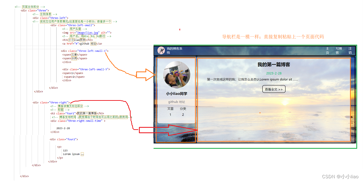
博客详情页
这个页面很多内容样式都是很列表页差不多;复制粘贴一下;特殊修改即可。
<!DOCTYPE html>
<html lang="en">
<head>
    <meta charset="UTF-8">
    <meta http-equiv="X-UA-Compatible" content="IE=edge">
    <meta name="viewport" content="width=device-width, initial-scale=1.0">
    <title>博客详情页</title>
    <link rel="stylesheet" href="common.css">
    <link rel="stylesheet" href="blog-only2.css">
    <link rel="stylesheet" href="blog-only1.css">
</head>

<body>
    <div class="one">
        <!-- 因为导航栏都是在同一栏 -->
        <img src="Image/美只因.png" alt="">
        <span>我的博客系统</span>
        <!-- 占位符;把超链接挤到右边;就给这个段落css样式设置一个宽度 -->
        <div class="two"></div>
        <a href="#">主页</a>
        <a href="#">写博客</a>
        <a href="#">注销</a>

    </div>


<!-- 页面主体部分 -->
    <div class="three">
            <!-- 左侧信息 -->
            <div class="three-left">
            <!-- 实现左边用户信息情况;这里面也是一小部分;嵌套多一个 -->
                        <div class="three-left-small">
                                <!-- 用户头像 -->
                                <img src="Image/liao.jpg" alt="">
                                <!-- 用户名;用div、h1、h2都行 -->
                                <h3>小小liao同学</h3>
                                <a href="#">github 地址</a>

                               <div class="three-left-small-1">
                                <span>文章</span>
                                <span>分类</span>
                                </div>

                                <div class="three-left-small-1">
                                <span>1</span>
                                 <span>2</span>
                                </div>

                       </div>
             </div>


            <div class="three-right">
                        <!-- 博客详情页右边部分 -->
                        <!-- 标题 -->
                        <h3 class="four1">我的第一篇博客</h3>
                         <!-- 博客发布时间 ;我觉得这个时间也可以用之前的;我就用-->
                        <div class="three-right-small-time" >

                            2023-2-28
                        </div>

                        <div class="four2">

                             <p>
                                 123
                                 Lorem ipsum ……
                             </p>
                       </div>
            </div>


    </div>

</body>
</html>
样式代码:
/* 博客详情页的唯一样式; */
.four1{
/* 设置标题的样式;标题按以前设置不就好了;标题和时间样式都能复用啊 */
/* 标题居中设置大小且加粗 */
text-align: center;
font-size: 24px;
font-weight: bold;
/* 把标题与下面内容拉开点 */
padding: 10px;

}

/* 所有的段落前面空两个 */
.four2 p{
/* 设置文章的样式 */
text-indent: 2em;
/* 段落之间设置点内边距分开 */

padding: 10px 30px;
}
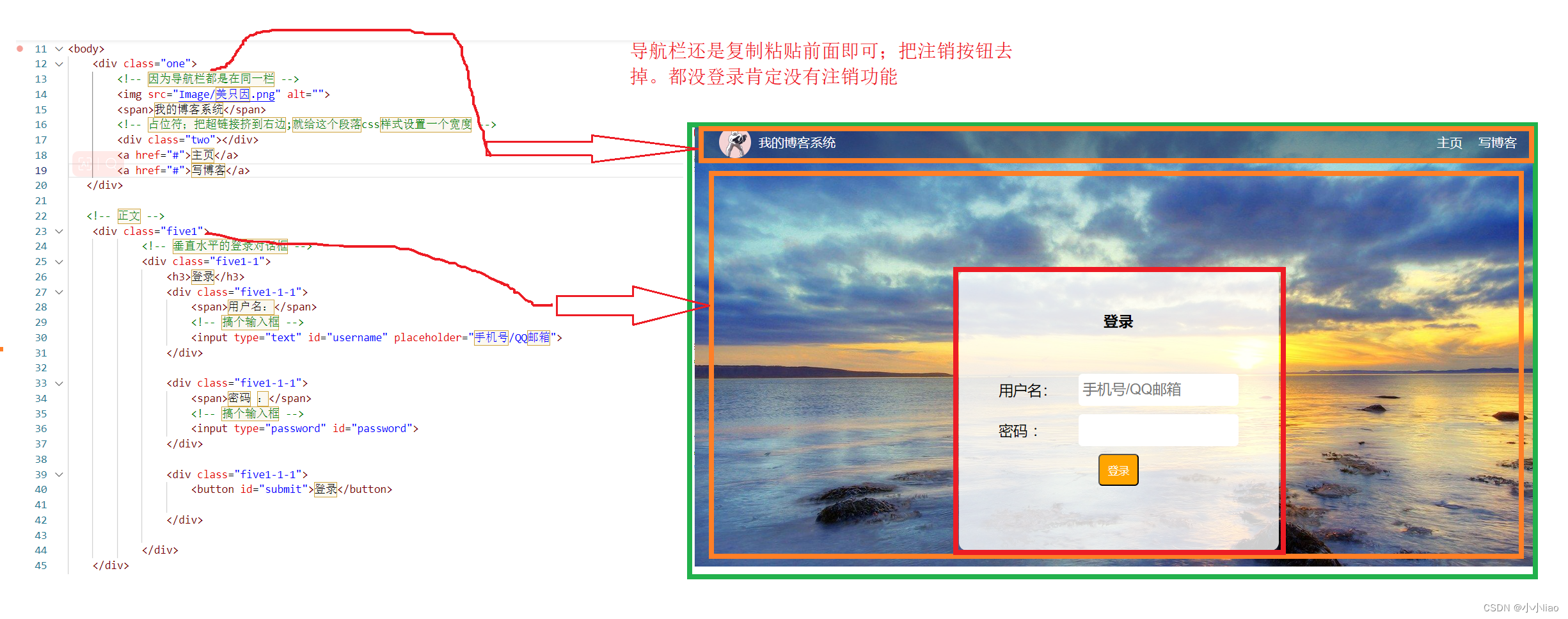
博客登录页
<!DOCTYPE html>
<html lang="en">
<head>
    <meta charset="UTF-8">
    <meta http-equiv="X-UA-Compatible" content="IE=edge">
    <meta name="viewport" content="width=device-width, initial-scale=1.0">
    <title>登录页</title>
    <link rel="stylesheet" href="common.css">
    <link rel="stylesheet" href="blog-only3.css">
</head>
<body>
    <div class="one">
        <!-- 因为导航栏都是在同一栏 -->
        <img src="Image/美只因.png" alt="">
        <span>我的博客系统</span>
        <!-- 占位符;把超链接挤到右边;就给这个段落css样式设置一个宽度 -->
        <div class="two"></div>
        <a href="#">主页</a>
        <a href="#">写博客</a>
   </div>

   <!-- 正文 -->
    <div class="five1">
            <!-- 垂直水平的登录对话框 -->
            <div class="five1-1">
                <h3>登录</h3>
                <div class="five1-1-1">
                    <span>用户名:</span>
                    <!-- 搞个输入框 -->
                    <input type="text" id="username" placeholder="手机号/QQ邮箱">
                </div>

                <div class="five1-1-1">
                    <span>密码 :</span>
                    <!-- 搞个输入框 -->
                    <input type="password" id="password">
                </div>

                <div class="five1-1-1">
                    <button id="submit">登录</button>

                </div>

            </div>
    </div>


</body>
</html>
样式代码:因为这里登录框比较特殊;是其它页面没有的;所以单独的样式会多一点
/* 登录页面的唯一样式 */

.five1{


width: 100%;
height: calc(100% - 50px);
/* 注意减号两边要空格 */
/* background-color: yellow;为了查看设置效果 */
/* 开启弹性布局;为后续设置垂直水平居中准备 */
display: flex;
/* 水平和垂直居中 */
justify-content: center;
align-items: center;
}

.five1-1{
width: 400px;
height: 350px;
/* background: green; 为了查看设置效果*/
background-color: rgba(255, 255, 255, 0.8);
border-radius: 10px;

}
.five1-1 h3{
/* 标题样式 */
/* 水平居中 */
text-align: center;
/* 边距设置 */
padding: 50px 0;


}

.five1-1-1{
    /* 一行的高度是50px */
    height: 50px;
    /* 水平方向弹性布局 */
display: flex;
/* 水平居中和垂直居中 */
justify-content: center;
align-items: center;
font-size: 18px;


}
/* 调整里面几个元素样式 */
.five1-1-1 span{
    /* 这个操作后就对齐了 */
width: 100px;


}
#username,#password {
/* 把输入框调大一点;可以使用id选择器 */
width: 200px;
height: 40px;
/* 圆角矩形 */
border-radius: 5px;
/* 去掉边框;input默认带边框 */
border: none;
/* 放大字体 */
font-size: 18px;
/* 内边距;希望输入的文字不要太靠边 */
padding: 5px;
}

.five1-1-1 button{
/* 把登录按钮放大一点 */
width: 50px;
height: 40px;
color: white;
background-color: orange;
border-radius: 5px;

}

.five1-1-1 button:active{
/* 搞一个鼠标点击效果;一点就变红 */

background-color: red;

}
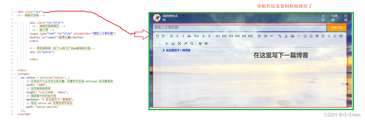
博客编辑页
<!DOCTYPE html>
<html lang="en">
<head>
  <meta charset="UTF-8">
  <meta http-equiv="X-UA-Compatible" content="IE=edge">
  <meta name="viewport" content="width=device-width, initial-scale=1.0">
  <title>博客编辑页</title>
  <link rel="stylesheet" href="common.css">
  <link rel="stylesheet" href="blog-only4.css">
  <script src="js/jquery.min.js"></script>

  <!-- <script src="js/jquery.min.js"></script> -->
  <script src="https://cdn.bootcdn.net/ajax/libs/jquery/3.6.3/jquery.min.js"></script>
  <!-- 引入 editor.md 的依赖 -->
  <link rel="stylesheet" href="editor.md/css/editormd.min.css" />
  <script src="editor.md/lib/marked.min.js"></script>
  <script src="editor.md/lib/prettify.min.js"></script>
  <script src="editor.md/editormd.js"></script>

</head>
<body>

  <div class="one">
          <!-- 因为导航栏都是在同一栏 -->
          <img src="Image/美只因.png" alt="">
          <span>我的博客系统</span>
          <!-- 占位符;把超链接挤到右边;就给这个段落css样式设置一个宽度 -->
          <div class="two"></div>
          <a href="#">主页</a>
          <a href="#">写博客</a>
          <a href="#">注销</a>

</div>


<div class="six">
<!-- 编辑区容器 -->

        <div class="six-title">
          <!-- 博客标题编辑区 -->
          <!-- 输入框 -->
        <input type="text" id="title" placeholder="请输入文章标题">
        <button id="submit">发布文章</button>
        </div>

        <!-- 博客编辑器 ;这个id是为了和md编辑器对接-->
        <div id="editor">

        </div>


</div>
<script>
  var editor = editormd("editor", {


      // 这里的尺寸必须在这里设置. 设置样式会被 editormd 自动覆盖掉.
      width: "100%",
      // 设定编辑器高度
      height: "calc(100% - 50px)",
      // 编辑器中的初始内容
      markdown: "# 在这里写下一篇博客",
      // 指定 editor.md 依赖的插件路径
      path: "editor.md/lib/"
  });
</script>

</body>
</html>
博客编辑页单独样式代码
.six{
/* 编辑区容器样式 */
width: 1000px;
height: calc(100% - 50px);
/* 水平居中 */
margin: 0 auto;

}
.six-title{
/* 标题样式 */
height: 50px;
display: flex;
align-items: center;
justify-content: space-between;

}
#title{
/* 标题输入框样式 */
height: 40px;
width: 896px;
/* 去掉输入框边框 */
    border: none;
    /* 让输入字体与输入框有个距离美 */
    padding-left: 5px; ;
    font-size: 18px;
    border-radius: 5px;
    /* 去掉轮廓线;就是鼠标选中后输入框有个黑圈 */
    outline: none;
background-color: rgba(255, 255, 255, 0.7);

}
/* 获取到焦点;鼠标到这个输入框就变成下面的背景颜色 */
#title:focus{

background-color: rgb(255, 255, 255);

}

#submit{
height: 40px;
width: 100px;
border-radius: 5px;
background-color: orange;
color: white;
/* 去掉边框 */
border: none;
}


#submit:active{
/* 让点击后有一个效果 */

background-color: yellow;
}
#editor{
/* 编辑框样式;圆角矩形 */

border-radius: 10px;
/* 半透明效果 ;但是md编辑器是经过很多填充;所以没法显示;所以换一种方式设置*/
/* background: rgba(255, 255, 255, 0.7); */
/* 能让里面的子元素也半透明;用百分数 */
opacity: 80%;
}