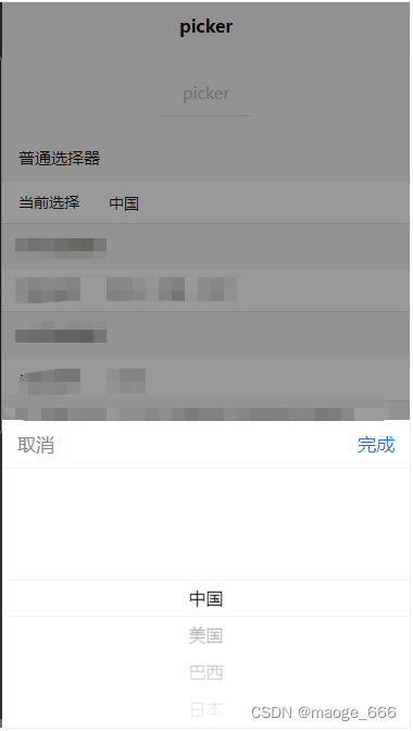
模拟下拉下单
原样式示例:
1、第一种:修改为自己需要的样式及功能:
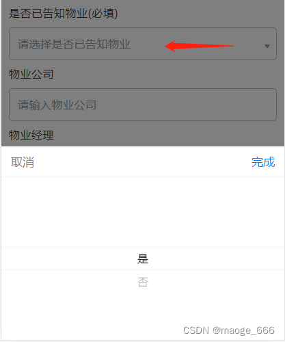

<view class="items select-box">
	<view class="items-text">是否已告知物业(必填)</view>
	<picker @change="bindPickerChange" :value="index" :range="array" class="picker-box" v-if="pickerShow">
		<input class="select-input" type="text" placeholder="请选择是否已告知物业" v-if="index == -1" disabled="disabled"></input>
		<view class="select-input" type="text" v-else>{

    {

    array[index]}}</view>
	</picker>
	<view class="icon-img">
		<!-- 下拉角标图片 -->
		<image src="../../static/img/select-icon.png"></image>
	</view>
</view>

data() {


	return {


		index: -1,
		array: ['是', '否'],
	}
},


methods: {


	// 下拉列表
	bindPickerChange: function(e) {


		console.log('picker发送选择改变,携带值为', e.detail.value)
		this.index = e.detail.value
	},
},

<style>
/* 下拉列表 start */
.select-box{


	position: relative;
}
.picker-box{


	width:100%;
	height: 88rpx;
	line-height: 88rpx;
	border-radius: 10rpx;
	box-sizing:border-box;
}
.select-input{


	width:100%;
	height: 88rpx;
	line-height: 88rpx;
	border-radius: 10rpx;
	border: 1rpx solid #BDBDBD;
	padding-left: 22rpx;
	box-sizing:border-box;
}
.icon-img{


	position: absolute;
	top: 84rpx;
	right: 18rpx;
	width: 18rpx;
	height: 18rpx;
}
.icon-img image{


	width:100%;
	height:100%;
}
/* 下拉列表 end */
</style>
2、第二种
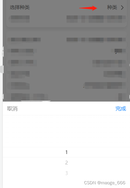
<view class="other-item">
	<view>选择种类</view>
	<view class="right-box">
		<picker @change="bindPickerChange" :value="index" :range="array">
			<view v-if="index == -1">请选择种类</view>
			<view v-else>{

    {

    array[index]}}</view>
		</picker>
		<view class="right-icon">
			<image src="../../static/img/more.png"></image>
		</view>
	</view>
</view>


data() {


	return {


		index: -1,
		array: ['1', '2', '3'],
	}
},


methods: {


	// 下拉列表
	bindPickerChange: function(e) {


		console.log('picker发送选择改变,携带值为', e.detail.value)
		this.index = e.detail.value
	},
},

<style>
.other-item{


	font-size: 30rpx;
	color: #666666;
	padding-top: 12rpx;
	display: flex;
	justify-content:space-between;
	align-items: center;
	margin-bottom: 17rpx;
}
.right-box{


	display: flex;
	align-items: center;
}
.right-icon{


	width: 16rpx;
	height: 28rpx;
	margin-left: 24rpx;
}
.right-icon image{


	width: 100%;
	height: 100%;
}
</style>