Flex布局也叫弹性布局。
<!DOCTYPE html>
<html lang="en">
<head>
  <meta charset="UTF-8">
  <title>Document</title>
  <style type="text/css">
  *{
  	margin: 0;
  	padding: 0;
  }
  li{
  	width: 50px;
  	height: 50px;
  	background: #18A15E;
  	display: inline-block;
  }

  </style>
</head>
<body>
  <div class="wrap">
  	<ul>
  		<li></li>
  		<li></li>
  		<li></li>
  		<li></li>
  	</ul>
  </div>
</body>
</html>
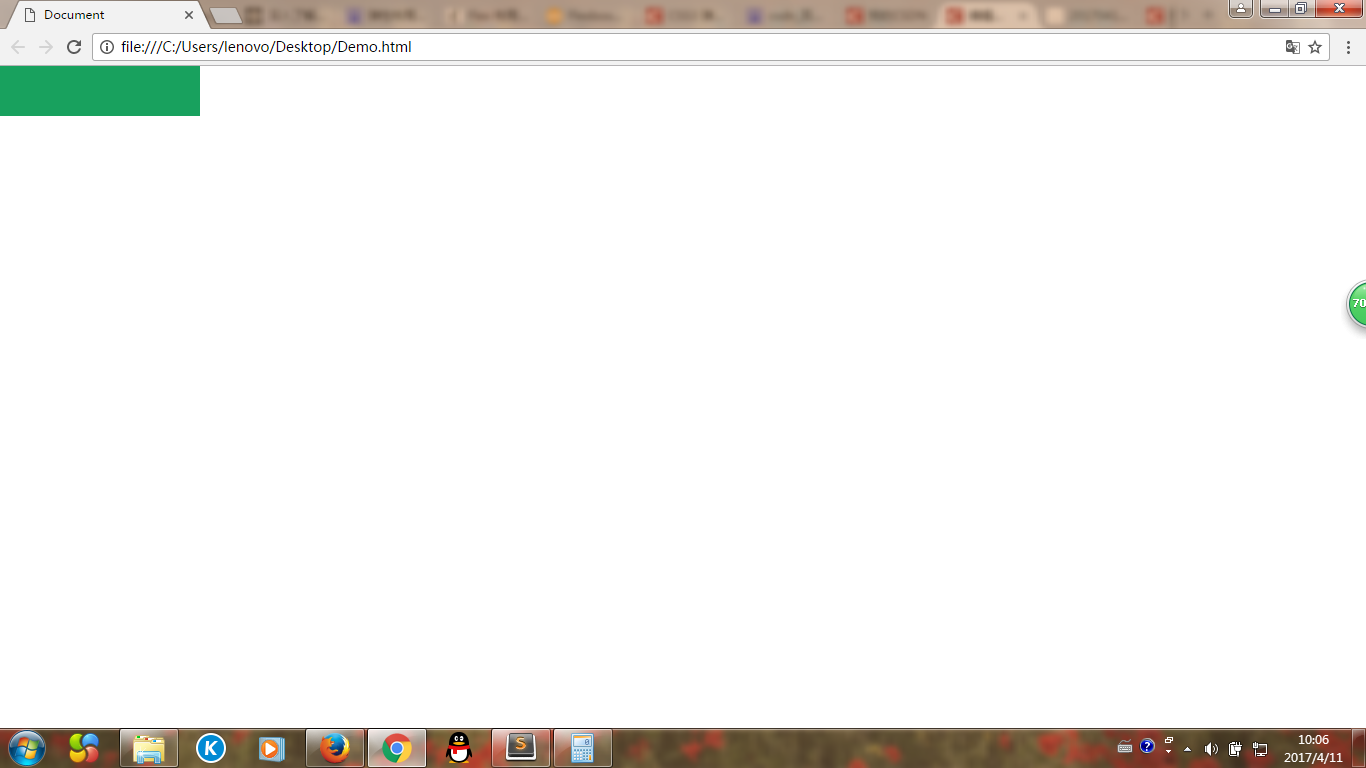
这段代码的运行结果如下图:
我们会发现li使用了display:inline-block;后li之间会有边距,如何消除那些边距呢?答案是在li的父容器上使用弹性布局。
代码如下:
<!DOCTYPE html>
<html lang="en">
<head>
  <meta charset="UTF-8">
  <title>Document</title>
  <style type="text/css">
  *{
  	margin: 0;
  	padding: 0;
  }
  ul{
  	display: flex;
  }
  li{
  	width: 50px;
  	height: 50px;
  	background: #18A15E;
  	display: inline-block;
  }

  </style>
</head>
<body>
  <div class="wrap">
  	<ul>
  		<li></li>
  		<li></li>
  		<li></li>
  		<li></li>
  	</ul>
  </div>
</body>
</html>
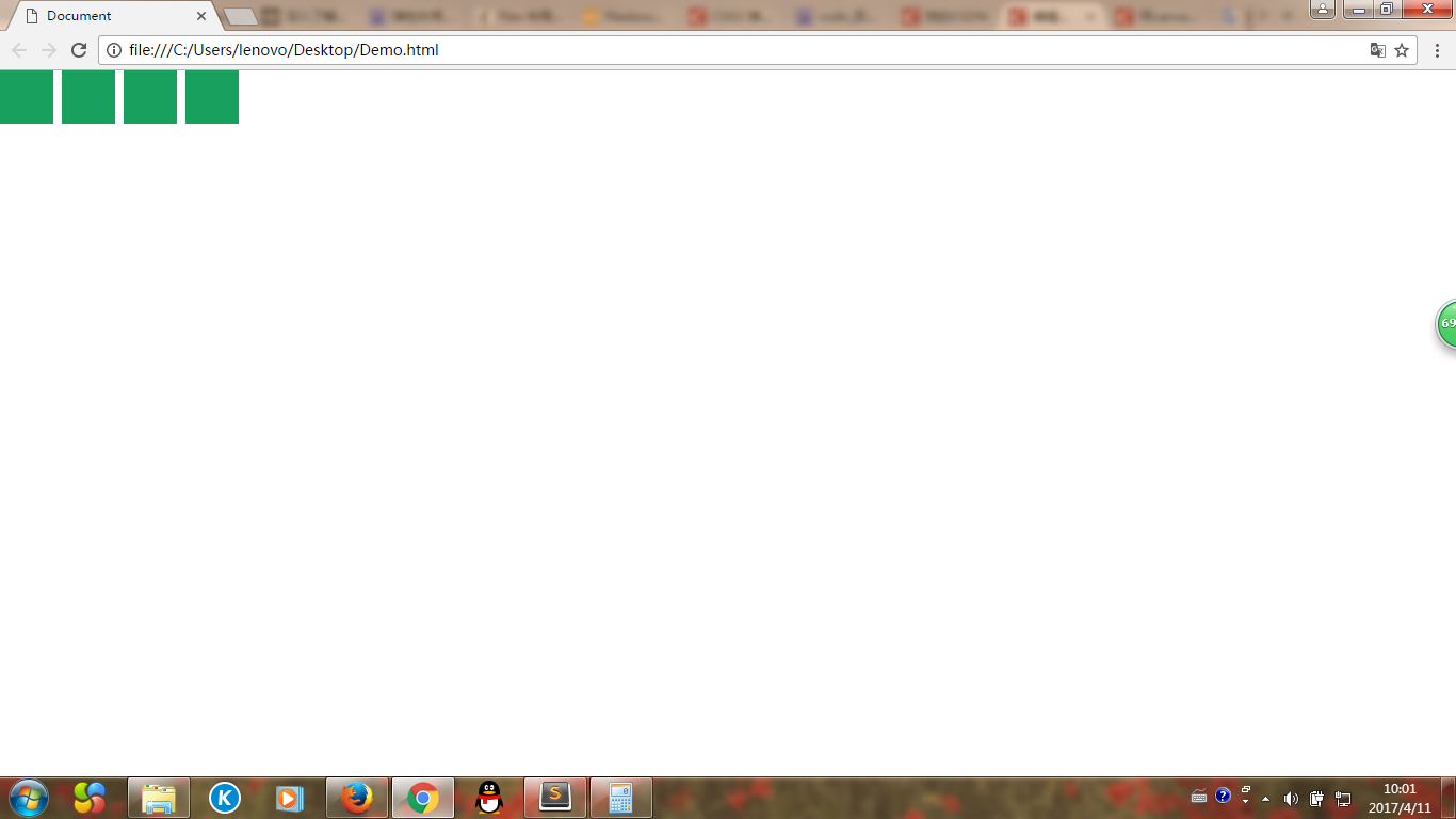
我们在ul上使用了样式display:flex;
此时li之间的边距也就消失了